

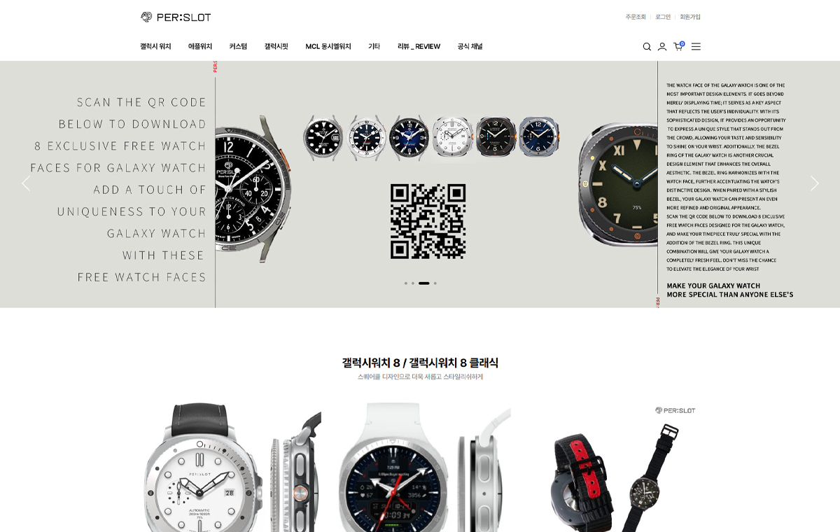

손목 위에서 먼저 보이는 메탈의 흐름
퍼슬랏 리뷰는 실제 착용 사진에서 가장 솔직하게 읽힙니다. 제품을 손에 들었을 때의 광택, 워치 본체와 스트랩이 만나는 지점, 베젤링이 화면 가장자리를 정리하는 방식은 상세 이미지보다 실제 사진에서 더 분명하게 보입니다.
이번 리뷰는 N42 링크브레이슬릿과 갤럭시워치 베젤링을 함께 살펴보는 흐름입니다. 메탈 스트랩은 손목 아래까지 이어지는 무게감과 선을 만들고, 베젤링은 전면에서 워치의 얼굴을 정리합니다. 두 파츠가 같은 금속 톤으로 맞춰질 때 스마트워치가 조금 더 시계다운 형태로 바뀌는 점이 핵심입니다.
리뷰 사진에는 패키지, 링크 구조, 실제 착용 컷, 베젤링 부착 후 전면 비율이 함께 담겨 있습니다. 거창한 표현보다 사진 속에서 확인되는 간격, 반사, 두께감, 보호감이 더 중요합니다. 그래서 본문도 실제 후기를 먼저 두고, 이어서 그 사진에서 볼 수 있는 부분을 차분하게 풀어갑니다.
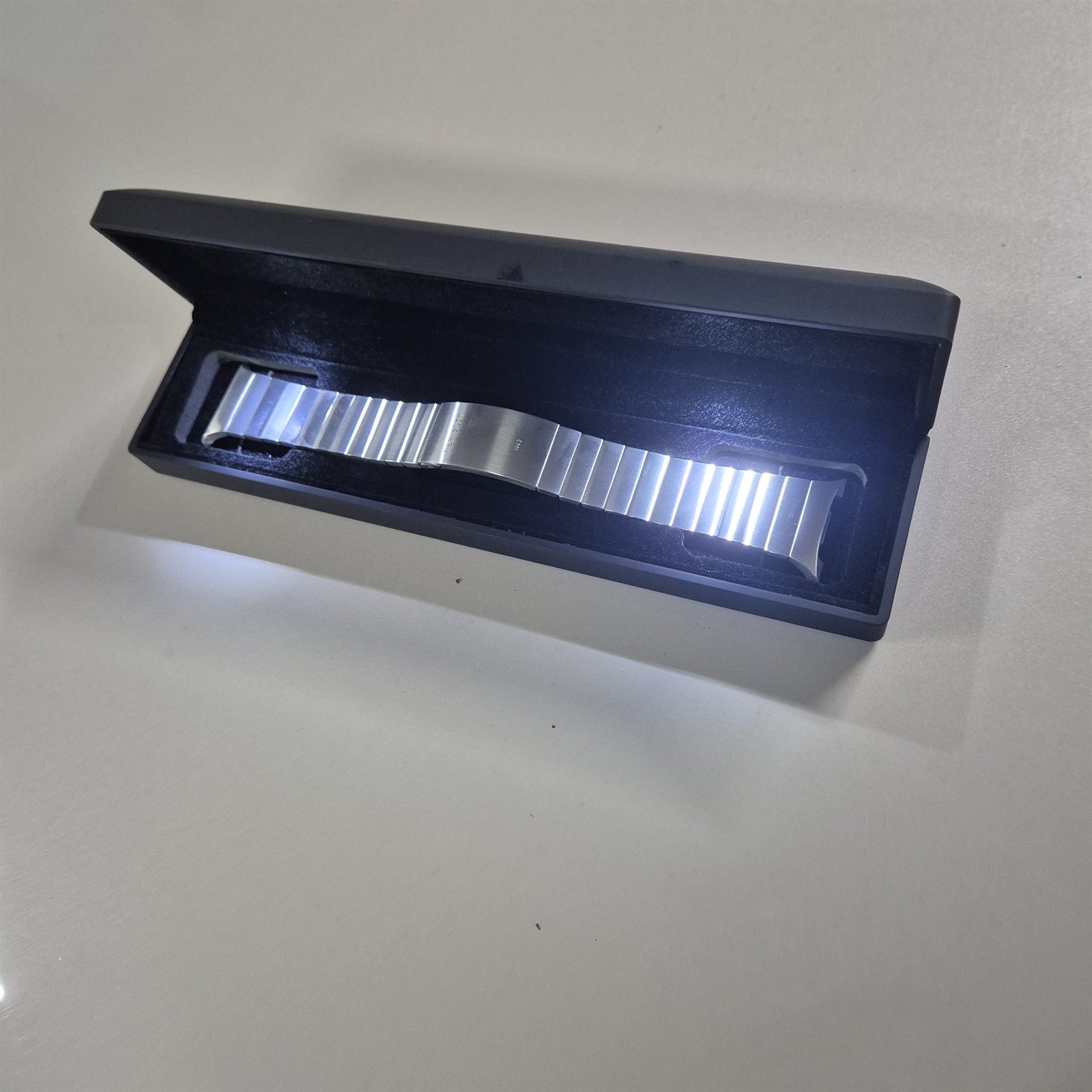
워치6 클래식 유저로써 만족할만한 워치8용 브레이슬릿을 찾지 못해 매일 품절이 언제 풀리나 사이트를 들락날락하다 바로 구매해버렸습니다. 처음 케이스를 열어보니 케이스 내부 LED 조명의 빛이 스트랩을 반사시켜…
케이스를 열었을 때 보이는 첫 광택
메탈 스트랩은 첫 순간의 빛 반사가 중요합니다. 사진 속 N42 링크브레이슬릿은 케이스 안에서 일정한 방향으로 빛을 받으며 링크의 폭과 표면감을 드러냅니다. 단순히 반짝이는 느낌이 아니라, 링크가 나뉘는 간격과 금속 표면의 정돈된 선이 함께 보이는 장면입니다.
브레이슬릿 계열은 손목에 착용하기 전부터 구조가 눈에 들어옵니다. 링크가 너무 얇으면 워치 본체와 균형이 약해지고, 반대로 지나치게 투박하면 스마트워치의 화면과 따로 놀 수 있습니다. 이 컷에서는 링크의 밀도와 패키지 안에서 보이는 반사가 먼저 읽히며, 실제 착용 전 기대감이 생기는 이유도 여기에 있습니다.
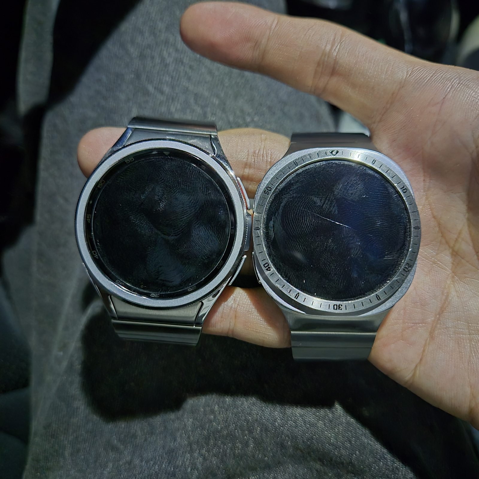
본체와 나란히 놓였을 때의 비율
워치 본체와 브레이슬릿을 나란히 놓으면 전체 비율이 더 쉽게 보입니다. 링크브레이슬릿은 스트랩만 따로 예쁜 것보다 본체 러그 쪽에서 자연스럽게 이어지는지가 중요합니다. 특히 갤럭시워치처럼 원형 케이스를 가진 모델은 스트랩 폭이 조금만 어긋나도 손목 위에서 균형이 흐트러질 수 있습니다.
사진에서는 브레이슬릿의 금속 톤이 워치 본체의 실버 계열과 가까운 방향으로 이어집니다. 화면이 꺼져 있을 때는 검은 디스플레이와 메탈 테두리의 대비가 커지고, 화면이 켜졌을 때는 다이얼 주변의 선이 더 또렷하게 정리됩니다. 실제로 착용하면 이 차이는 작은 부품 하나가 아니라 전체 인상의 차이로 느껴집니다.
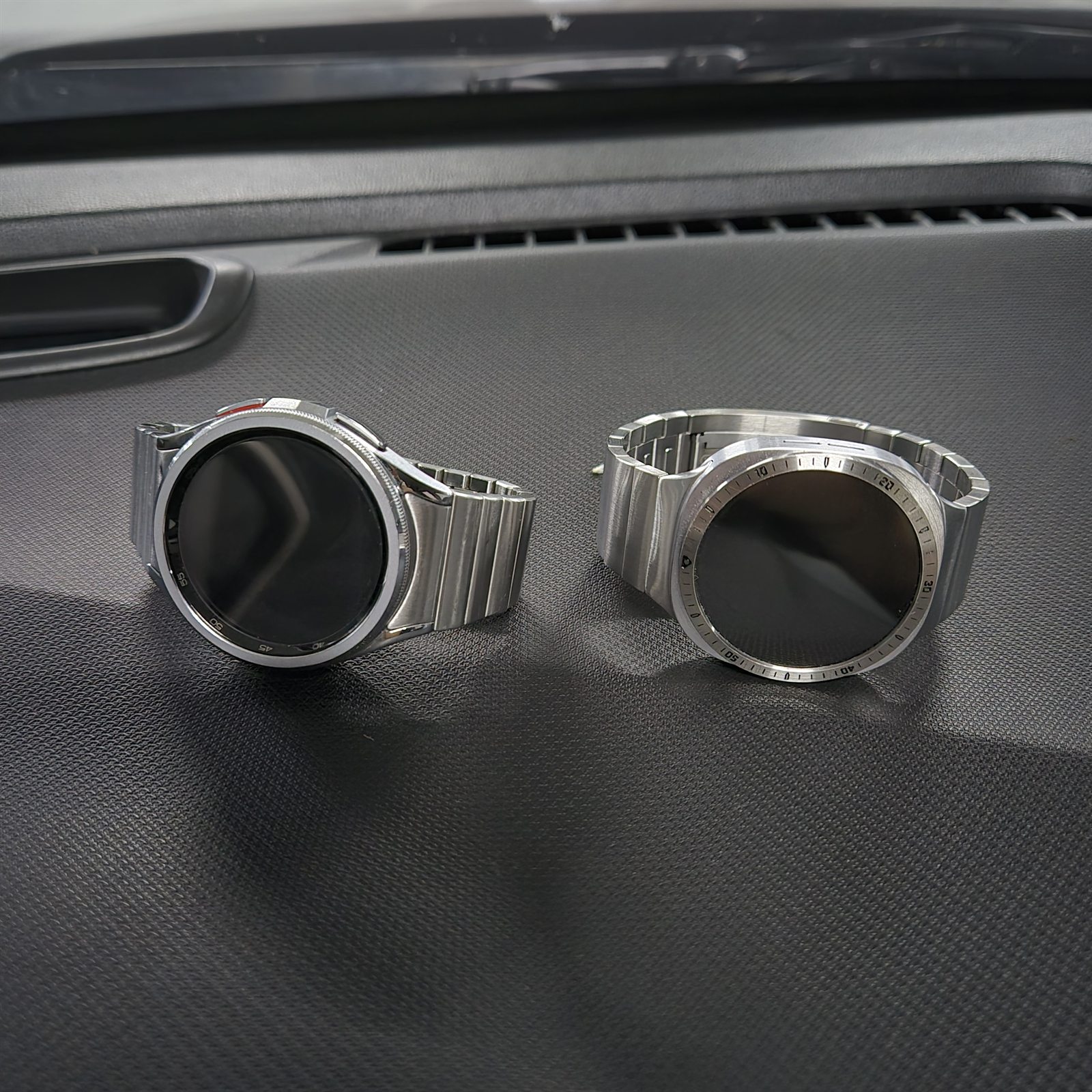
두 개의 워치가 보여주는 스타일 차이
같은 손 위에 두 개의 워치를 놓으면 스트랩과 베젤링의 차이가 바로 보입니다. 기본 밴드가 가볍고 캐주얼한 쪽이라면, 링크브레이슬릿과 베젤링 조합은 전면과 측면의 선을 더 단정하게 잡아줍니다. 화면 주변의 금속 라인이 생기면 스마트워치의 디지털 느낌이 줄고, 손목시계에 가까운 비율이 살아납니다.
이 사진에서 눈여겨볼 부분은 베젤링이 화면을 크게 덮지 않으면서 외곽선을 잡아주는 방식입니다. 베젤링이 과하면 화면이 답답해 보이고, 너무 얇으면 존재감이 약해집니다. 적당한 두께의 링은 시계의 얼굴을 한 번 정리해주고, 메탈 스트랩은 그 인상을 손목 아래까지 이어줍니다.
베젤링만 추가했는데 시계가 엄청 고급져 보이네요. 완전 맘에듭니다.!!
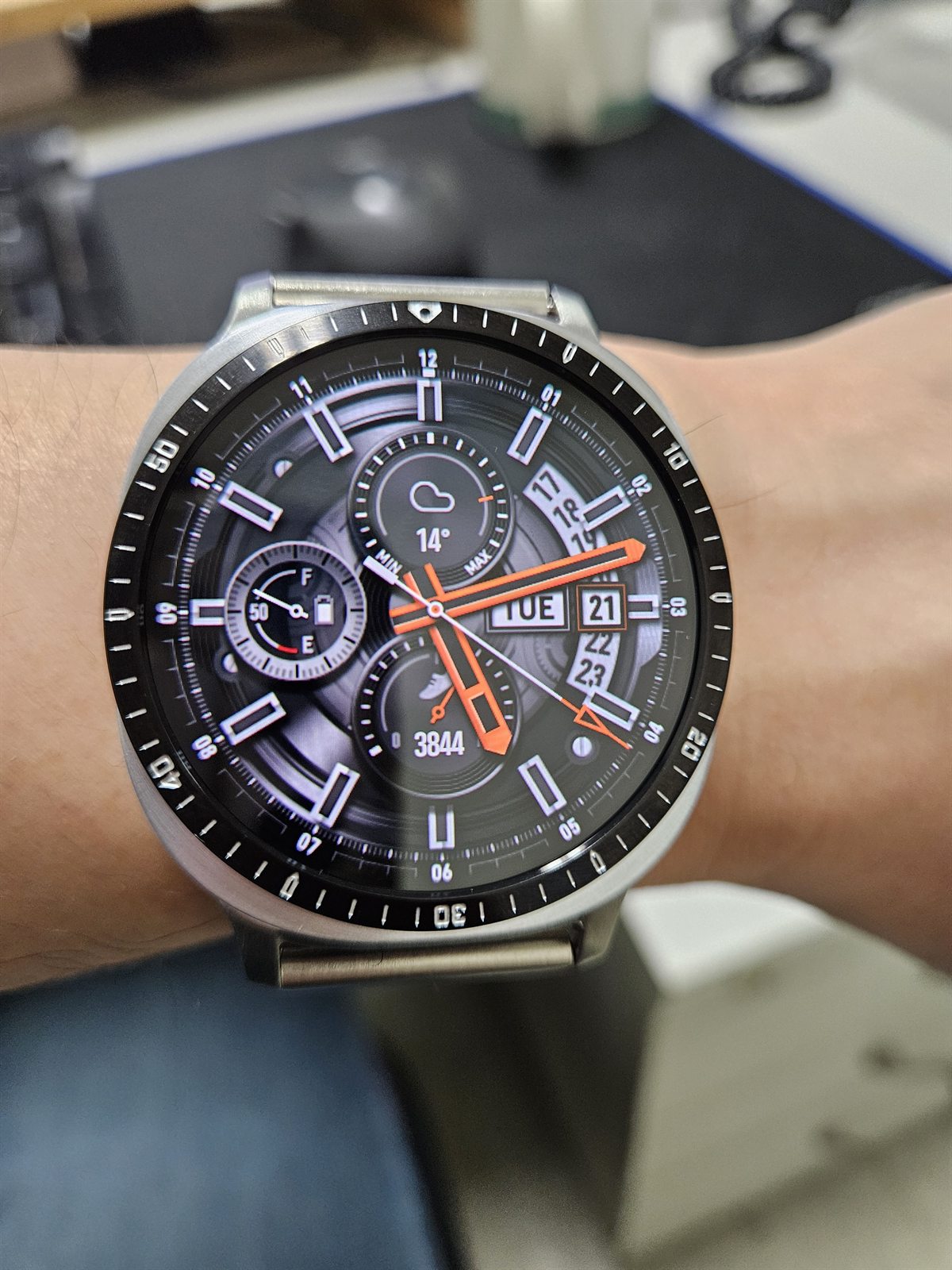
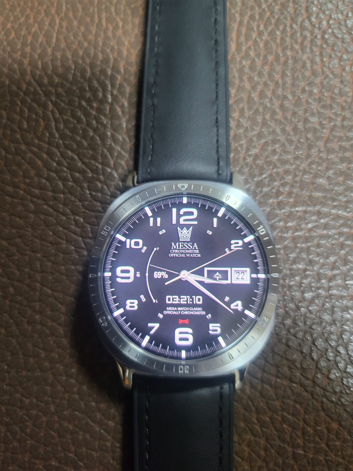
베젤링 하나로 달라지는 전면
베젤링은 부품 크기만 보면 작지만, 실제로는 워치 전면에서 가장 먼저 보이는 테두리입니다. 화면 가장자리에 금속 라인이 더해지면 검은 디스플레이와 외곽 케이스 사이의 경계가 분명해집니다. 그래서 스트랩을 바꾸지 않아도 워치의 얼굴이 먼저 달라집니다.
사진 속 착용 컷은 이 변화를 잘 보여줍니다. 다이얼이 복잡한 워치페이스를 사용해도 바깥쪽 링이 시선을 정리해주기 때문에 전체가 산만해 보이지 않습니다. 특히 실버 톤 베젤링은 크로노그래프 계열 화면이나 아날로그 시계형 워치페이스와 잘 맞아, 손목 위에서 한층 정돈된 분위기를 만듭니다.
배송도 빠르고 약간 비싼 느낌은 있었지만 제품은 상당히 맘에 드네요. 액정보호는 물론이거니와 디자인도 고급집니다. 워치에는 필수네요^^.
보호감과 디자인의 균형
베젤링을 고를 때 많은 사용자가 보는 부분은 디자인만이 아닙니다. 화면 주변부가 생활 스크래치에 노출되기 쉬운 만큼, 전면 가장자리를 한 번 감싸주는 구조는 심리적인 안정감도 줍니다. 보호를 이유로 두꺼운 케이스를 씌우면 워치가 둔해 보일 수 있는데, 베젤링은 외곽선을 살리면서 필요한 부분만 정리하는 쪽에 가깝습니다.
이 사진에서는 링이 화면 안쪽까지 과하게 들어오지 않고, 다이얼 주변에 얇은 경계선을 만드는 방식이 보입니다. 손목 위에서 보면 보호와 스타일이 따로 나뉘지 않습니다. 화면을 덮어버리는 부품이 아니라, 워치가 가진 원형 실루엣을 조금 더 분명하게 잡아주는 디테일로 작동합니다.
오래 기다렸던 제품인데 드디어 구매했네요. 케이스는 LED까지 있고, 고급스럽네요. 일체감 좋습니다. 기다린 보람이 있어요.
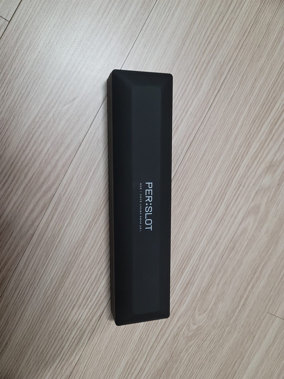
패키지에서 이어지는 제품 인상
패키지는 제품을 처음 만나는 장면입니다. 특히 메탈 스트랩과 베젤링처럼 표면 마감이 중요한 액세서리는 상자 안에서 보이는 첫 정돈감이 실제 제품 인상과 이어집니다. 사진 속 블랙 케이스는 제품의 반사를 과하게 흩뜨리지 않고, 안쪽 조명이 금속 표면의 라인을 보여줍니다.
리뷰에서 언급된 일체감은 착용 후에만 생기는 표현이 아닙니다. 포장을 열었을 때부터 제품이 어떤 톤으로 정리되어 있는지, 부품이 흔들리지 않게 담겨 있는지, 표면이 어떻게 빛을 받는지가 먼저 보입니다. 작은 액세서리일수록 이런 첫인상이 전체 만족도에 꽤 크게 남습니다.
보호적인 측면 + 깔끔함 두 가지를 다 만족하는 게 맘에 드네요.
깔끔하게 남는 보호 디테일
베젤링의 좋은 점은 크게 드러나지 않으면서도 계속 보인다는 데 있습니다. 손목을 움직일 때 화면 가장자리의 금속 테두리가 빛을 받고, 책상이나 문 손잡이처럼 워치가 자주 닿는 환경에서는 외곽부가 한 번 더 정리되어 있다는 느낌을 줍니다. 보호용 액세서리지만 워치의 형태를 해치지 않는 것이 중요합니다.
사진 속 패키지 컷은 제품이 단순한 소모품처럼 보이지 않도록 정돈되어 있습니다. 실제 착용 사진과 함께 보면 베젤링이 과장된 장식보다 차분한 외곽선에 가까운 부품이라는 점이 더 분명해집니다. 갤럭시워치의 기본 실루엣을 유지하면서 약간의 금속감과 보호감을 더하고 싶은 사용자에게 이런 리뷰가 도움이 됩니다.
작은 부품이 남기는 확실한 차이
이번 퍼슬랏 리뷰에서 공통적으로 보이는 부분은 일체감입니다. N42 링크브레이슬릿은 손목 아래까지 메탈의 흐름을 이어주고, 베젤링은 전면에서 워치의 원형 라인을 정리합니다. 각각 따로 봐도 역할이 있지만, 함께 맞췄을 때 스마트워치가 더 단정한 시계처럼 보이는 차이가 생깁니다.
후기 문장에서도 광택, 패키지, 보호감, 고급스러움, 기다린 보람 같은 표현이 반복됩니다. 모두 실제 사용자가 제품을 받아 보고 손목에 올렸을 때 먼저 느끼는 부분입니다. 퍼슬랏 리뷰가 의미 있는 이유도 여기에 있습니다. 제품 사진만으로는 알기 어려운 착용 비율과 표면감, 그리고 작은 부품이 전체 분위기를 어떻게 바꾸는지를 실제 손목 위에서 확인할 수 있습니다.
The Metal Flow That Shows First On The Wrist
A PERSLOT review becomes clearest when it begins with real wearing photos. The way a metal surface catches light, the point where the watch body meets the strap, and the way a bezel frames the edge of the display are easier to understand in actual customer photos than in a studio image.
This review follows the N42 link bracelet and Galaxy Watch bezel styling together. The metal bracelet extends the weight and line of the watch down the wrist, while the bezel organizes the face of the watch from the front. When both parts sit in a similar metal tone, the smartwatch begins to feel closer to a refined wristwatch.
First Reflection Inside The Case
As a Watch 6 Classic user, I kept checking the site because I could not find a satisfying bracelet for Watch 8. I bought it as soon as it became available. When I opened the case, the LED light inside reflected on the strap…
For a metal bracelet, the first reflection matters. In the LED case photo, the N42 link bracelet shows its width, rhythm and surface finish before it is even installed on the watch. The impression is not only about brightness. It is about the regular spacing of the links and the clean direction of the metal surface.
A bracelet style strap has to look balanced before it reaches the wrist. If the links feel too thin, the watch body can look heavier than the strap. If they feel too bulky, the display can appear disconnected from the bracelet. This photo shows why the first look inside the case can build confidence in the product.
Proportion Beside The Watch Body
When the watch body and bracelet are placed side by side, the proportion becomes easier to read. A link bracelet should not simply look good as a separate strap. It has to continue naturally from the lug area of the watch body. With a round Galaxy Watch case, even a small mismatch in strap width can change the whole balance on the wrist.
In the photo, the bracelet tone sits close to the silver direction of the watch body. When the screen is off, the contrast between the black display and the metal edge becomes stronger. When the screen is on, the outer line of the dial appears cleaner. This is the kind of difference that feels larger in daily use than the size of the accessory itself.
Two Watches, Two Different Impressions
Placing two watches in one frame makes the difference between strap and bezel styling easy to see. A basic band can feel lighter and more casual, while a link bracelet and bezel combination sharpens both the front and the side profile. Once a metal ring is added around the display, the digital look softens and the watch-like proportion becomes clearer.
The important detail here is that the bezel does not visually cover too much of the screen. A bezel that is too heavy can make the display feel cramped, while a bezel that is too thin may not change the impression enough. A well-balanced ring organizes the watch face, and the metal bracelet carries that impression down the wrist.
A Front View Changed By One Bezel
Only adding the bezel made the watch look much more premium. I really like it.
A bezel is a small part, but it is one of the first details visible on the watch face. When a metal line is added around the edge of the display, the boundary between the black screen and the outer case becomes clearer. This means the face of the watch can change even before the strap is replaced.
The wearing photo shows that change well. Even with a detailed chronograph-style watch face, the outer ring helps control the visual weight. A silver-tone bezel works especially well with analog-style dials because it gives the screen a crisp metal outline.
Protection And Design In One Detail
Delivery was fast. It felt a little expensive, but I really like the product. It protects the display area and the design looks premium. It feels essential for the watch.
Many users do not look at a bezel only as a design piece. The outer edge of a smartwatch is exposed to daily contact, so a part that frames the display can also make the watch feel more protected. A thick case may make the watch look heavy, but a bezel keeps the outline clean while focusing on the area that matters most visually.
In this photo, the ring does not move too far into the display area. It creates a clear boundary around the dial without overwhelming the watch face. On the wrist, protection and design do not feel separate. They work as one small detail around the circular shape of the Galaxy Watch.
Package Impression Before Wearing
I waited a long time and finally bought it. The case even has LED lighting, and it feels premium. The integration is good. It was worth the wait.
The package is the first moment a customer meets the product. For accessories where metal finish matters, the first impression inside the box can carry into the wearing experience. The black case in the photo keeps the product visually organized, while the internal light reveals the line of the metal surface.
The sense of integration mentioned in the review does not begin only after installation. It starts with how the product is presented, whether each part sits securely, and how the finish appears under light. For a small accessory, that first impression can stay with the user longer than expected.
Clean Protection That Stays Quiet
I like that it satisfies both protection and a clean look.
The strength of a bezel is that it stays visible without becoming loud. When the wrist moves, the metal edge catches light, and in daily situations where the watch may touch a desk or door handle, the framed outer edge gives a more settled feeling. It is a protective accessory, but it should not damage the original shape of the watch.
The package photo keeps the product looking organized rather than disposable. Together with the wearing photos, it shows that the bezel is closer to a clean outline than a dramatic decoration. For users who want to keep the basic Galaxy Watch silhouette while adding metal detail and edge protection, these real review photos are useful.
The Difference Left By Small Parts
The shared impression across this PERSLOT review is integration. The N42 link bracelet extends the metal line down the wrist, and the bezel organizes the circular outline from the front. Each part has its own role, but together they make the smartwatch look more composed and closer to a traditional watch.
The review phrases repeatedly mention reflection, packaging, protection, premium impression and the feeling that the wait was worth it. These are the details customers notice when they open the package and wear the product for the first time. That is why real PERSLOT review photos matter. They show fit, surface finish and the way a small accessory can change the entire mood of the watch.
추가 정보
퍼슬랏 리뷰 핵심 정리
이 글은 실제 고객 사진을 바탕으로 퍼슬랏 N42 링크브레이슬릿과 갤럭시워치 베젤링의 일체감, 메탈 표면감, 패키지 첫인상, 보호감을 함께 살펴본 리뷰입니다. 제품을 손목 위에 올렸을 때 보이는 비율, 화면 가장자리의 정리감, 스트랩과 본체가 이어지는 톤이 주요 포인트입니다.
리뷰 사진은 단순한 착용 컷이 아니라 구매자가 실제로 궁금해하는 부분을 보여줍니다. 메탈 스트랩의 링크 간격, 베젤링의 두께감, 화면 주변 여백, 패키지 완성도, 보호필름과의 조합 같은 디테일을 함께 볼 수 있습니다.
사진별 체크 포인트
LED 패키지와 첫 광택
케이스 안에서 보이는 링크브레이슬릿의 반사와 링크 간격은 제품의 첫인상을 결정합니다. 메탈 표면이 어떤 방향으로 빛을 받는지 보면 실제 착용 시 분위기를 더 쉽게 예상할 수 있습니다.
워치 본체와 스트랩 폭
링크브레이슬릿은 러그 쪽에서 워치 본체와 자연스럽게 이어지는지가 중요합니다. 스트랩 폭이 본체보다 가볍거나 무거워 보이면 손목 위 균형이 달라질 수 있습니다.
베젤링 전면 비율
베젤링은 화면을 과하게 덮지 않으면서 외곽선을 정리해야 합니다. 전면 컷에서는 화면 안쪽 여백과 링의 두께를 함께 보는 것이 좋습니다.
보호감과 디자인
베젤링은 화면 주변부를 한 번 더 감싸는 구조라 보호감과 디자인 인상이 동시에 생깁니다. 두꺼운 케이스처럼 워치를 둔하게 만들지 않는지도 중요한 확인 지점입니다.
리뷰에서 반복되는 만족 포인트
- 메탈 스트랩과 베젤링이 같은 톤으로 이어질 때 생기는 시계다운 일체감
- LED 패키지 안에서 먼저 보이는 링크브레이슬릿의 광택과 정돈감
- 베젤링만 추가해도 워치 전면이 더 선명하고 고급스럽게 보이는 변화
- 액정 주변 보호와 외관 스타일링을 동시에 기대할 수 있는 구조
- 실제 손목 착용 컷에서 확인되는 두께감, 화면 여백, 워치페이스와의 조화
- 기다린 보람, 패키지 만족도, 마감 인상이 리뷰 문장에 함께 나타나는 흐름
착용 전 확인하면 좋은 부분
베젤링은 모델별 외형과 사이즈에 맞춰 선택해야 합니다. 갤럭시워치는 세대와 크기에 따라 화면 지름, 케이스 곡률, 버튼 주변 간격이 다를 수 있으므로 옵션명과 상세 호환 모델을 함께 확인하는 과정이 필요합니다.
보호필름이나 강화유리를 함께 사용할 때는 링 안쪽 여백도 중요합니다. 필름이 너무 바깥쪽까지 올라오거나 베젤링 안쪽과 간섭이 생기면 부착 위치와 터치감에 영향을 줄 수 있습니다. 실제 리뷰에서 보호감과 액정 주변 이야기가 함께 나오는 이유도 이 때문입니다.
메탈 스트랩과 베젤링 조합
메탈 스트랩은 손목 아래쪽까지 이어지는 무게감과 선을 만들고, 베젤링은 화면 전면의 원형 라인을 정리합니다. 두 제품을 함께 맞추면 스마트워치가 액세서리를 여러 개 얹은 느낌보다 하나의 작은 시계처럼 보이는 효과가 커집니다.
실버 계열 조합은 밝은 금속 라인이 선명하게 보이고, 블랙 다이얼이나 크로노그래프형 워치페이스에서는 대비가 더 또렷합니다. 캐주얼한 밴드와 달리 메탈 조합은 셔츠, 재킷, 니트 같은 옷차림에서도 자연스럽게 이어집니다.
자주 묻는 질문
퍼슬랏 리뷰 사진에서 가장 먼저 봐야 할 부분은 무엇인가요?
워치 본체와 액세서리가 만나는 경계를 먼저 보는 것이 좋습니다. 베젤링은 화면 가장자리와의 간격, 링크브레이슬릿은 러그와 스트랩 폭의 연결감이 중요합니다.
베젤링은 디자인용인가요, 보호용인가요?
두 성격을 함께 갖습니다. 화면 외곽선을 정리해 디자인 인상을 바꾸면서, 생활 중 자주 닿는 전면 가장자리를 한 번 더 의식하게 만드는 역할을 합니다.
메탈 스트랩과 베젤링을 함께 맞추면 어떤 차이가 있나요?
스트랩은 손목 아래까지 이어지는 금속의 흐름을 만들고, 베젤링은 전면에서 워치의 얼굴을 정리합니다. 두 톤이 맞으면 스마트워치가 더 단정한 시계처럼 보입니다.
패키지 사진도 제품 선택에 도움이 되나요?
도움이 됩니다. 패키지 안에서 제품이 어떻게 고정되어 있는지, 메탈 표면이 어떤 식으로 빛을 받는지 보면 첫인상과 보관 상태를 함께 확인할 수 있습니다.
베젤링을 부착하면 화면이 답답해 보일 수 있나요?
모델과 베젤링 형태에 따라 다르게 느껴질 수 있습니다. 링이 화면 안쪽으로 너무 깊게 들어오지 않는지, 워치페이스와 외곽선이 잘 맞는지 사진으로 확인하는 편이 좋습니다.
보호필름과 베젤링을 함께 사용할 때 주의할 점은 무엇인가요?
필름의 외경과 베젤링 안쪽 여백이 맞아야 합니다. 필름이 링 안쪽과 간섭되면 부착 위치가 어긋나거나 가장자리 들뜸이 생길 수 있으므로 모델별 호환성을 함께 확인하는 것이 좋습니다.
N42 링크브레이슬릿은 어떤 분위기에 잘 어울리나요?
메탈 링크 구조가 있는 만큼 캐주얼보다 단정한 스타일에서 더 힘이 납니다. 셔츠, 재킷, 니트처럼 손목 주변이 보이는 옷차림에서 워치가 작은 시계처럼 정리되어 보입니다.
퍼슬랏 제품 정보는 어디서 확인할 수 있나요?
색상, 옵션, 호환 모델은 퍼슬랏 공식몰에서 확인할 수 있습니다. 브랜드 방향성과 스마트워치 액세서리 라인업은 퍼슬랏 공식 브랜드 사이트에서 함께 볼 수 있습니다.


