


갤럭시워치 베젤링 후기, 정면보다 측면에서 드러나는 핏
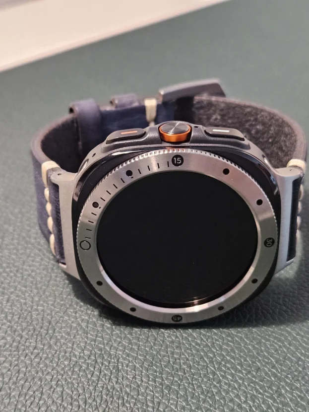
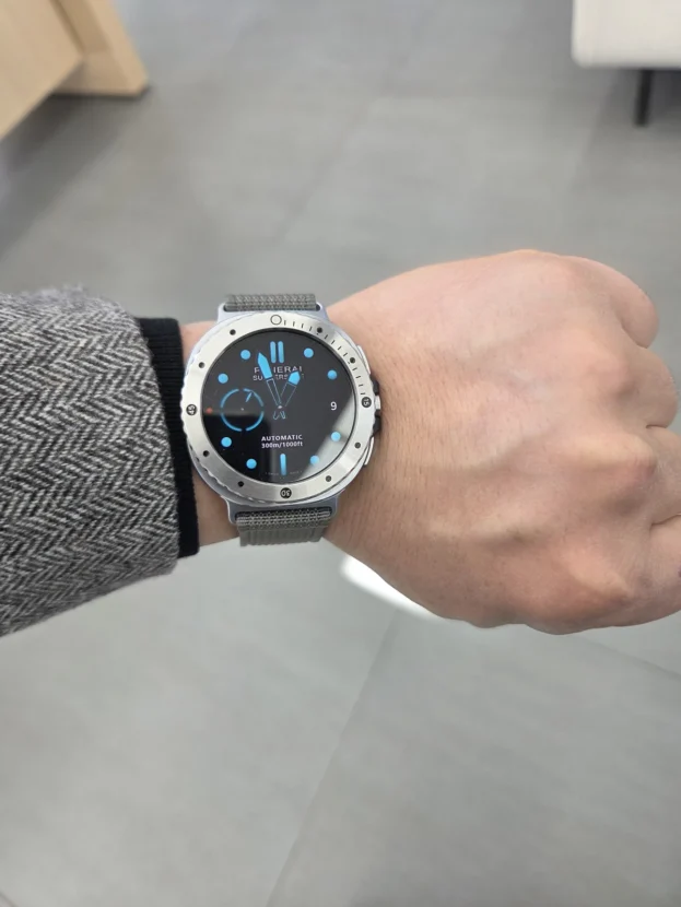
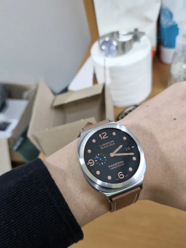
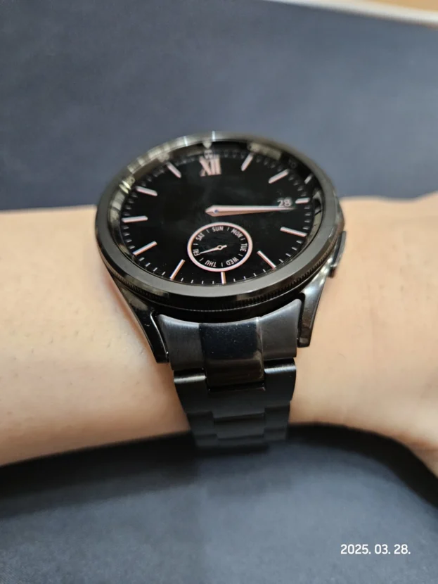
갤럭시워치 베젤링 후기, 정면과 측면을 함께 보면 핏의 차이가 한층 분명해집니다. 갤럭시워치의 전면은 작은 각도 차이만으로도 링의 두께와 케이스의 높이가 다르게 보입니다. 정면에서는 화면 바깥의 원을 얼마나 고르게 잡는지가 먼저 보이고, 사선에서는 베젤링과 본체가 만나는 단차가 그대로 드러납니다. 손목에 올렸을 때 자연스러운지는 이 두 각도를 함께 봐야 분명해집니다.
얇은 베젤링은 워치 전체를 덮지 않습니다. 화면 가장자리의 취약한 외곽선을 따라 금속 테두리를 더하고, 버튼과 러그 주변은 원래 형태로 남깁니다. 그래서 색상보다 먼저 확인할 부분은 안쪽 원의 간격, 바깥 원이 케이스와 만나는 위치, 손목을 기울였을 때 보이는 측면 높이입니다.

순정 같은 핏. 워치7이 더 고급져 보입니다.
갤럭시워치 베젤링 후기, 원형 비율을 살리는 얇은 테두리
실버 베젤링은 워치 본체와 비슷한 밝기를 유지하면서 다이얼 바깥에 한 겹의 금속선을 더합니다. 화면을 크게 덮지 않기 때문에 검은 다이얼의 면적은 그대로 남고, 외곽만 또렷해집니다. 원래 케이스의 둥근 형태를 바꾸기보다 테두리의 밀도를 높이는 방식입니다.
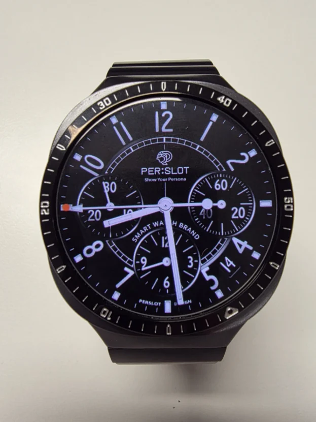
눈금이 있는 링은 아날로그 워치페이스와 잘 어울리지만, 워치페이스의 숫자와 링의 눈금이 지나치게 겹치지 않는지도 함께 봐야 합니다. 다이얼 안쪽 정보와 바깥쪽 눈금 사이에 검은 여백이 남으면 화면이 복잡해 보이지 않고 시계다운 원형 구조가 선명해집니다.
블랙 베젤이 다이얼과 연결되는 방식
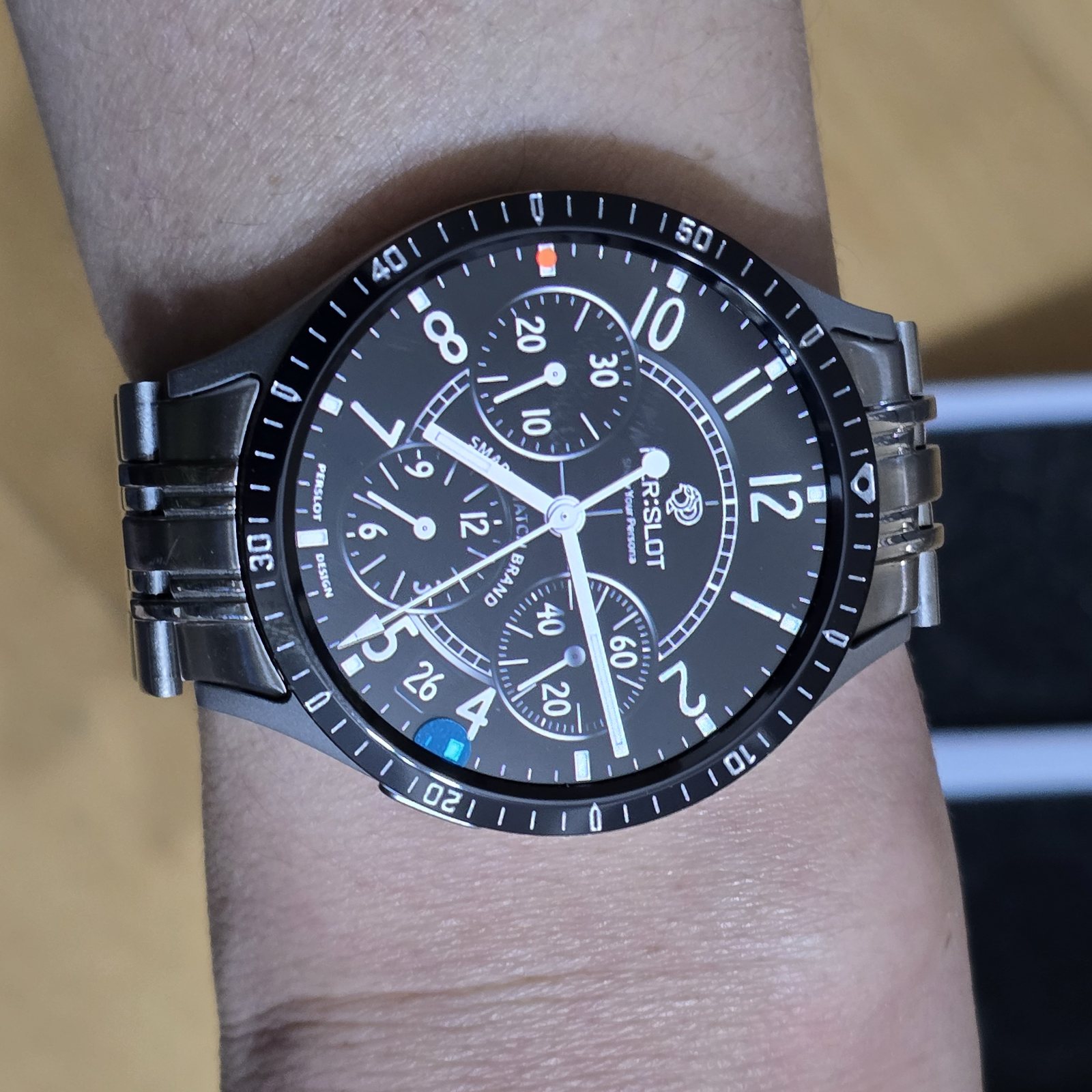
같은 워치에 블랙 베젤링을 더하면 링이 장식처럼 따로 드러나기보다 검은 다이얼의 연장선으로 보입니다. 실버가 금속의 경계를 밝게 강조한다면 블랙은 화면과 케이스 사이의 색 차이를 줄여 전면을 한 덩어리로 묶습니다.
밝은 인덱스와 흰색 눈금은 검은 바탕에서 또렷하게 남습니다. 워치 본체와 다이얼의 색이 달라도 검은 링이 중간에서 경계를 정리해 전면 중심이 흔들리지 않습니다. 화면을 껐을 때도 검은 원이 이어져 스마트워치 특유의 넓은 디스플레이가 조금 더 단정하게 보입니다.
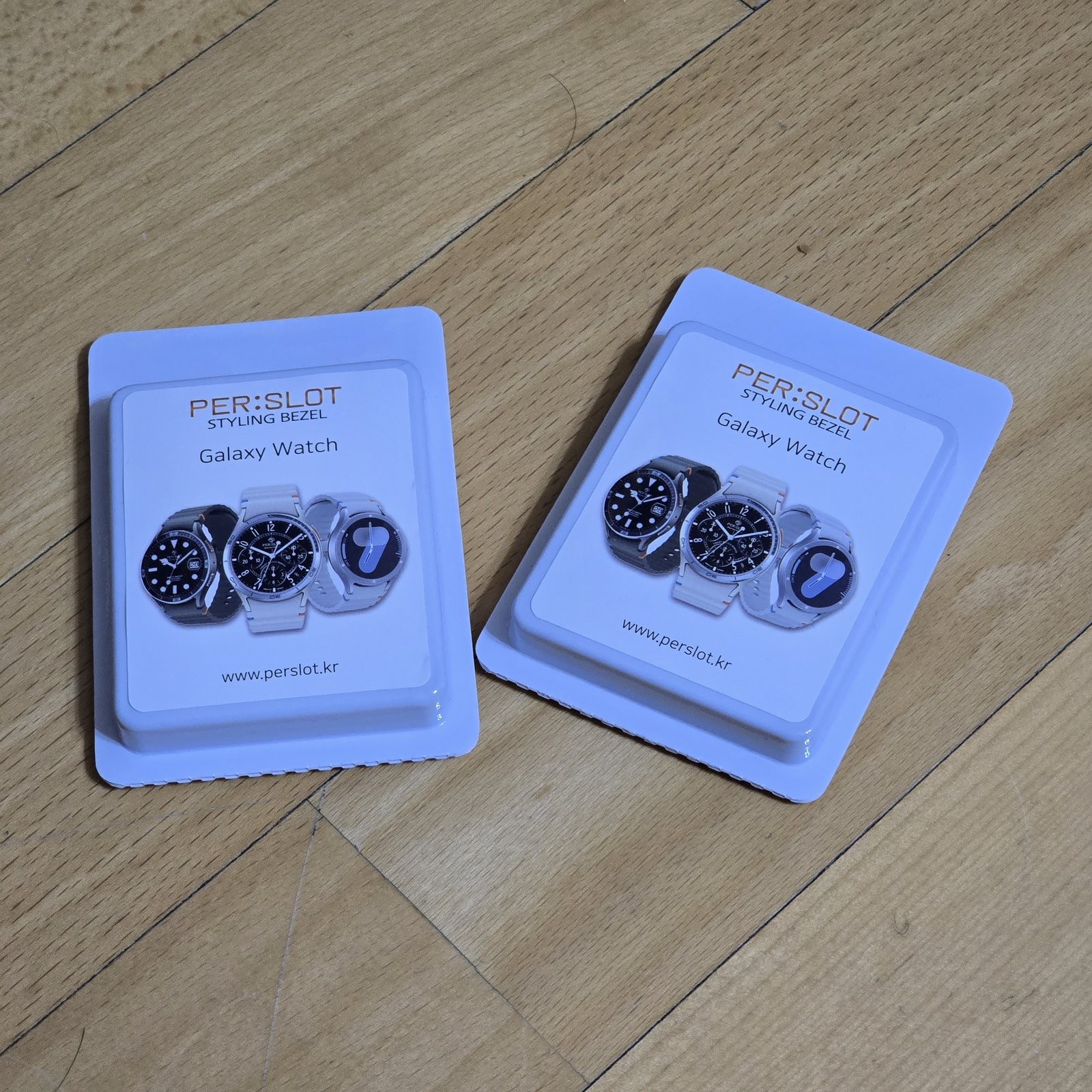
실버와 블랙, 손목에서 달라지는 색의 무게
실버와 블랙은 같은 형태라도 손목에서 차지하는 무게가 다릅니다. 실버는 빛을 받아 링의 외곽을 먼저 보여주고, 블랙은 화면과 이어져 다이얼을 조금 더 크게 보이게 합니다. 한쪽만 정답으로 두기보다 자주 쓰는 워치페이스의 밝기와 워치 본체 색을 함께 보는 편이 자연스럽습니다.
밝은 케이스에는 실버가 매끄럽게 이어지고, 검은 워치페이스에는 블랙이 차분하게 녹아듭니다. 서로 다른 색을 조합하면 다이얼 바깥의 경계가 더 선명해집니다. 두 색 모두 눈금의 간격과 외곽선은 같지만, 실제 손목에서는 반사량과 명암 때문에 전혀 다른 인상을 남깁니다.

부착 전 확인하는 안쪽 원과 눈금의 방향
베젤링을 손목 위에서 자연스럽게 보이게 만드는 핵심은 부착 전 정렬입니다. 보호 필름을 떼기 전에 12시 방향의 기준점을 먼저 맞추고, 화면과 링 사이의 간격이 좌우에서 같은지 살펴보면 원이 한쪽으로 치우치는 것을 줄일 수 있습니다.
실버와 블랙처럼 색이 다른 제품도 안쪽 원의 위치가 맞아야 화면 가장자리의 여백이 고르게 남습니다. 접착면을 한 번에 강하게 누르기보다 위치를 잡은 뒤 원을 따라 고르게 눌러 주면 링의 높이와 바깥선이 안정적으로 자리 잡습니다.
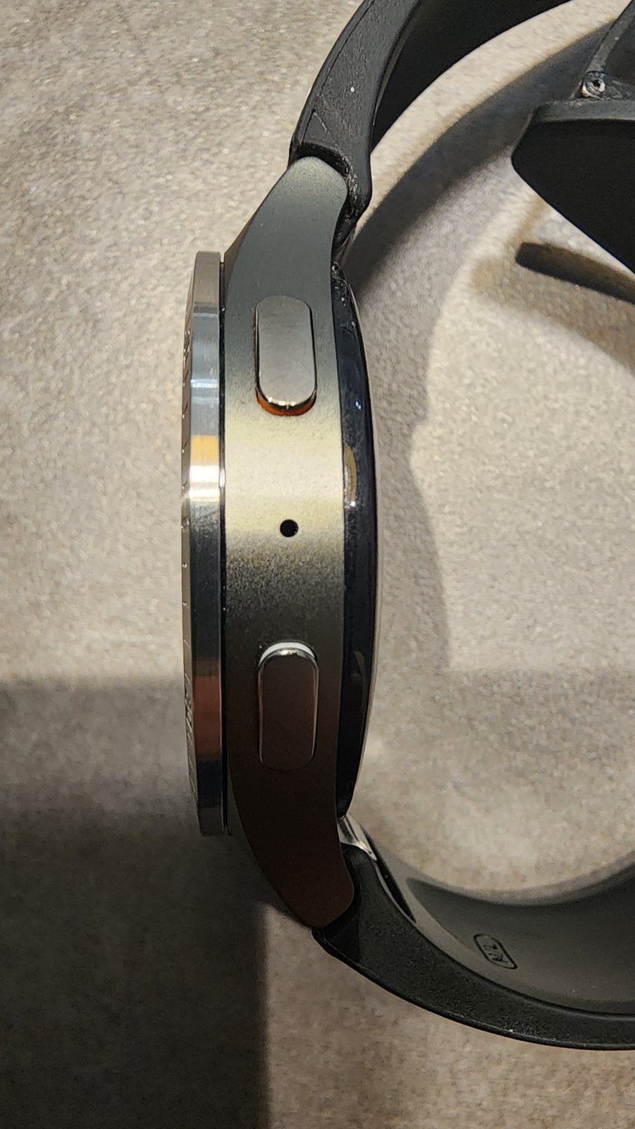
생각했던것보다 괜찮아요 단차도 크지않고 워치와 꼭 맞습니다 구매하고자 하시는분들에게 추천드리고 싶네요 후회는 없을듯
사선에서 확인하는 높이와 단차
베젤링의 핏은 정면보다 사선에서 더 솔직하게 드러납니다. 버튼 옆에서 바라보면 링의 윗면이 화면보다 얼마나 올라오는지, 바깥쪽 끝이 워치 케이스를 벗어나지 않는지, 접착층이 틈처럼 보이지 않는지를 한 번에 확인할 수 있습니다.
링이 지나치게 높으면 손목을 움직일 때 장식이 따로 얹힌 듯 보이고, 너무 안쪽으로 들어오면 화면 가장자리의 터치 영역이 답답해질 수 있습니다. 본체 외곽선을 따라 얇게 올라오고 측면에서 간격이 고르게 이어질 때 베젤링과 워치가 한 부품처럼 보입니다.
부착 뒤 핏을 만드는 준비 과정
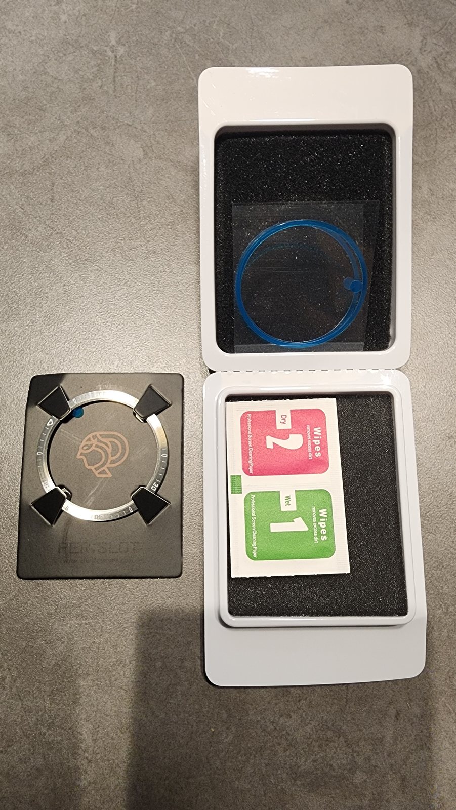
베젤링을 부착하기 전에는 워치 전면의 유분과 먼지를 먼저 닦아야 합니다. 클리닝 와이프로 표면을 정리한 뒤 수분이 완전히 마른 상태에서 링을 올려 보면 접착면이 들뜨는 것을 줄일 수 있습니다. 안쪽 원이 화면 가장자리를 고르게 따라가는지도 이때 함께 확인합니다.
접착 보호지를 떼기 전 12시 방향과 좌우 간격을 맞추고, 위치가 정해진 뒤 원을 따라 고르게 눌러 주면 됩니다. 처음부터 한쪽을 강하게 고정하면 반대쪽 간격이 달라질 수 있습니다. 부착 전의 짧은 확인이 정면의 원형 정렬과 측면 단차를 함께 좌우합니다.
정면과 측면이 함께 맞을 때 남는 완성도
갤럭시워치 베젤링은 크기가 작은 부품이지만 전면의 인상을 결정하는 위치에 놓입니다. 정면에서 화면과 링 사이의 여백이 고르고, 사선에서 케이스와 링의 단차가 얇게 이어지면 워치의 원래 비율을 해치지 않으면서 다이얼의 존재감만 또렷해집니다.
실버와 블랙 중 어떤 색을 고르더라도 모델과 사이즈가 먼저 맞아야 합니다. 그다음 워치페이스의 밝기, 워치 본체 색, 손목을 기울였을 때 보이는 측면 높이를 함께 보면 오래 보아도 어색하지 않은 조합을 고를 수 있습니다.
Fit Revealed From The Front And The Side
The height of a bezel and the thickness of a watch case can look different with only a small change in viewing angle. From the front, the eye first notices whether the circle around the display is even. From an oblique angle, the step between the bezel and the watch body becomes visible. A natural fit depends on both views.
A slim bezel does not wrap the entire watch. It follows the vulnerable outer edge of the display while leaving the buttons and lugs close to their original form. Before color, the important details are the inner clearance, the point where the outer ring meets the case, and the height that remains visible when the wrist turns.
A Thin Border That Preserves The Watch 7 Proportion
The fit looks close to the original design. It makes the Watch 7 look more refined.
A silver bezel keeps a brightness close to the watch body and adds one controlled metal line around the dial. Because it does not cover much of the screen, the dark area of the watch face remains open while the outer circle becomes clearer. It strengthens the edge rather than changing the original round shape.
A numbered ring works naturally with an analogue watch face, but the indices on the display and the markings on the bezel should not compete. A narrow dark space between them keeps the front from looking crowded and gives the dial a more distinct watch-like structure.
How A Black Bezel Connects With The Dial
On the same watch, a black bezel behaves less like a separate ornament and more like an extension of the dark display. Silver highlights the boundary with reflected light, while black reduces the color break between the screen and the case and makes the front feel more continuous.
Bright indices and white markings stay crisp against the dark surface. The center of the watch remains visually stable because the black ring continues the boundary of the display. When the screen is off, the uninterrupted dark circle also makes the large digital face look calmer.
The Different Visual Weight Of Silver And Black
Silver and black can share the same dimensions yet carry different weight on the wrist. Silver catches light and makes the outer ring visible first. Black merges with the display and can make the dial feel slightly larger. The watch face used most often and the color of the watch body are practical starting points when choosing between the two.
Silver flows easily into a bright case, while black settles naturally beside a dark watch face. A contrasting combination makes the boundary around the dial more explicit. Their markings may be identical, but the amount of reflection and contrast creates a noticeably different result in daily wear.
Inner Clearance And Alignment Before Attachment
Alignment is what allows a bezel to look settled on the wrist. Before removing the protective layer, it helps to place the twelve o’clock reference first and compare the visible gap on both sides. This reduces the chance of the circle leaning to one side.
The inner opening needs the same care regardless of color. Once the position is set, pressing evenly around the circumference is better than forcing one area down first. An even attachment keeps both the height and the visible outer line consistent.
The Step Seen From An Oblique Angle
It looks better than I expected. The step between the parts is small and it fits the watch closely. I would recommend it to anyone considering one, and I do not think they will regret the choice.
The fit of a bezel is often more honest from the side than from the front. Beside the buttons, it becomes possible to judge how far the upper surface rises above the display, whether the outer edge extends past the case, and whether the adhesive layer appears as a visible gap.
If the ring sits too high, it can look like a separate decoration placed on top of the watch. If it reaches too far inward, the display edge can feel confined. A slim rise that follows the original case line makes the bezel and the watch read as one assembly.
Preparation Before Final Attachment
Oil and dust on the watch surface should be removed before the bezel is attached. After cleaning, the surface needs to dry completely before the ring is placed over it. This helps the adhesive sit evenly and makes it easier to compare the visible clearance around the inner circle.
Before removing the protective layer, the twelve o’clock position and the left and right spacing can be checked once more. After the position is settled, pressure should be applied evenly around the circle rather than strongly on one side. This short preparation affects both the front alignment and the step visible from the side.
A Small Part That Controls The Front Proportion
A Galaxy Watch bezel is small, but it sits where the character of the front is decided. When the gap around the display is even and the step into the case remains slim, the bezel can clarify the dial without disturbing the original proportions of the watch.
Model and size compatibility come before the choice between silver and black. After that, the brightness of the watch face, the color of the watch body, and the side profile seen in motion make it easier to choose a combination that continues to look natural through daily wear.
추가 정보
갤럭시워치 베젤링 후기에서 확인할 핏
갤럭시워치 베젤링 핏은 바깥지름 하나만으로 결정되지 않습니다. 화면과 맞닿는 안쪽 원, 케이스 외곽을 따라가는 바깥 원, 접착층을 포함한 높이, 12시 방향의 기준점이 함께 맞아야 정면과 측면 모두에서 안정적인 비율이 남습니다.
- 사용 중인 갤럭시워치의 정확한 모델명과 크기
- 화면 가장자리와 베젤링 안쪽 원 사이의 간격
- 버튼과 마이크 홀 주변에 남는 측면 여유
- 보호필름을 함께 사용할 때 필름의 외경
- 12시 기준 눈금과 워치페이스 인덱스의 정렬
- 실버 또는 블랙 워치 본체와의 색온도 차이
- 베젤링 표면과 워치 케이스가 이어지는 반사
정면과 측면을 함께 보는 이유
정면은 원형 정렬과 화면 여백을 확인하기 좋고, 측면은 링의 높이와 접착층이 보이는 정도를 확인하기 좋습니다. 정면만 맞아 보여도 한쪽이 높게 들리면 손목을 움직일 때 단차가 크게 보일 수 있습니다. 부착 직후에는 12시와 6시, 3시와 9시 방향을 번갈아 눌러 원 전체의 높이를 고르게 잡는 것이 좋습니다.
보호필름과 안쪽 원
보호필름을 함께 사용할 때는 필름의 외경이 베젤링 내경보다 커서는 안 됩니다. 화면 전체를 넓게 덮는 일반 필름은 링 안쪽과 겹칠 수 있으므로, 베젤링 사용을 고려한 필름인지 먼저 확인해야 합니다. 겹침이 생기면 링이 평평하게 붙지 않거나 필름 가장자리가 들릴 수 있습니다.
실버와 블랙의 선택
실버는 금속의 반사와 눈금을 밝게 보여주고, 블랙은 다이얼과 연결되어 전면을 한 덩어리처럼 보이게 합니다. 밝은 워치페이스를 자주 쓰면 블랙이 경계를 또렷하게 잡고, 검은 워치페이스에는 실버가 얇은 금속 포인트로 남습니다.
부착 전 표면 정리
유분과 먼지가 남아 있으면 접착면이 고르게 닿지 않습니다. 마른 천과 알코올 솜으로 표면을 닦은 뒤 수분이 완전히 마른 상태에서 위치를 맞춥니다. 부착 직후 강한 물 접촉이나 반복적인 탈착은 피하는 편이 안정적입니다.
자주 묻는 질문
갤럭시워치 베젤링은 세대가 달라도 함께 사용할 수 있나요?
세대와 크기가 달라지면 케이스 외경, 화면 가장자리, 버튼 주변 구조가 달라질 수 있습니다. 같은 숫자 크기로 보여도 실제 호환 옵션이 다를 수 있으므로 모델명과 크기에 맞는 제품을 선택해야 합니다.
베젤링이 화면 터치에 영향을 주나요?
모델에 맞는 내경과 정확한 중심 정렬이 이루어지면 화면 정보 영역을 덮지 않습니다. 한쪽으로 치우치거나 호환되지 않는 필름과 겹치면 화면 가장자리의 손가락 움직임이 답답하게 느껴질 수 있습니다.
갤럭시워치 베젤링 후기에서 측면 단차는 어떻게 확인하나요?
버튼이 있는 측면과 반대쪽을 각각 낮은 각도에서 확인합니다. 링의 윗면이 한쪽만 높지 않은지, 바깥선이 케이스보다 튀어나오지 않는지, 접착층이 틈처럼 보이지 않는지를 함께 봅니다.
12시 방향을 쉽게 맞추는 방법은 무엇인가요?
아날로그 워치페이스를 켜고 12시 인덱스와 베젤링의 기준점을 먼저 맞춥니다. 그 상태에서 6시 방향을 확인한 뒤 좌우 간격이 같은지 살펴보면 눈금의 회전을 줄일 수 있습니다.
일반 보호필름과 함께 쓸 수 있나요?
필름 외경이 베젤링 안쪽 원보다 작고 겹침이 없어야 합니다. 전면 전체를 넓게 덮는 필름은 링 접착면과 만날 수 있으므로 실제 외경과 베젤링 내경을 비교하는 과정이 필요합니다.
실버와 블랙 중 어떤 색이 더 자연스러운가요?
워치 본체 색과 같게 맞추면 연결감이 자연스럽고, 반대 색을 고르면 다이얼 외곽이 더 분명해집니다. 자주 사용하는 워치페이스와 본체의 색을 함께 놓고 비교하면 선택이 쉬워집니다.
베젤링 표면의 지문은 어떻게 관리하나요?
마른 극세사 천으로 눈금 방향을 따라 가볍게 닦습니다. 강한 연마제나 거친 천은 표면의 결을 바꿀 수 있으므로 사용하지 않는 편이 좋습니다.
모델별 옵션은 어디에서 비교할 수 있나요?
퍼슬랏 공식몰에서 모델명, 크기, 색상 옵션을 비교할 수 있습니다. 실제 부착과 착용 각도는 퍼슬랏 공식 유튜브의 영상 자료도 함께 참고할 수 있습니다.
베젤링의 색상과 측면 높이가 실제 손목에서 어떻게 달라지는지는 퍼슬랏 리뷰의 다른 착용 기록과 함께 비교할 수 있습니다. 같은 워치라도 다이얼 색상과 본체 마감에 따라 외곽선의 인상이 달라집니다.