


아홉 부대의 상징을 새긴 군부대 오마주 베젤링
군부대 오마주 베젤링, 그 출발점은 부대 마크를 장식처럼 옮기는 데 있지 않습니다. 맹호, 백마, 전진, 백골, 열쇠, 청성, 칠성, 오뚜기, 번개라는 이름에는 창설 이후 쌓인 시간과 전우의 기억, 임무를 끝까지 이어온 사람들이 함께 들어 있습니다. 퍼슬랏 Imagine은 그 무게를 손목 위의 작은 원 안에 담아 보았습니다.
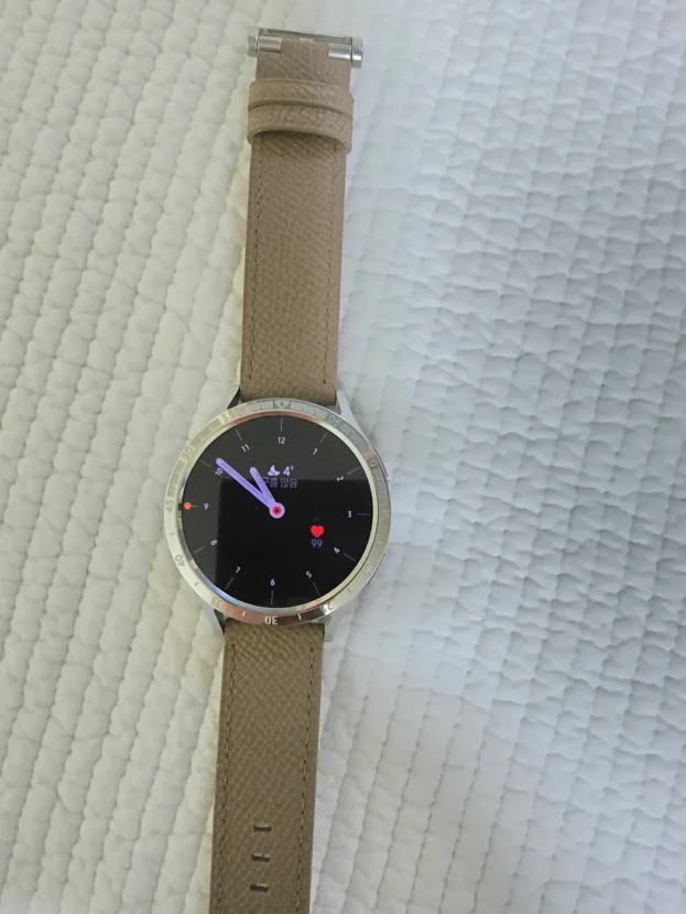
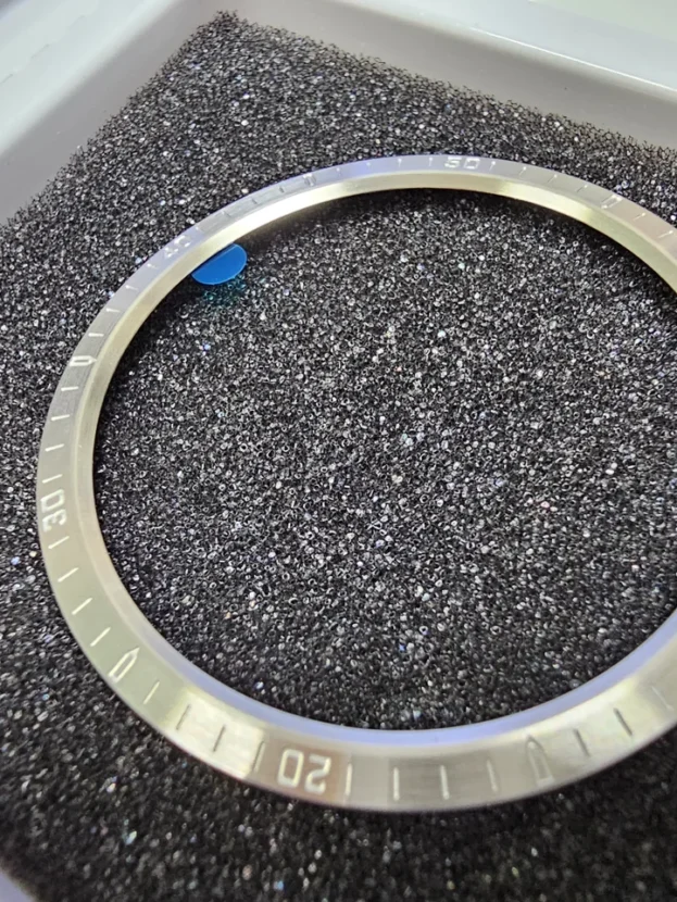
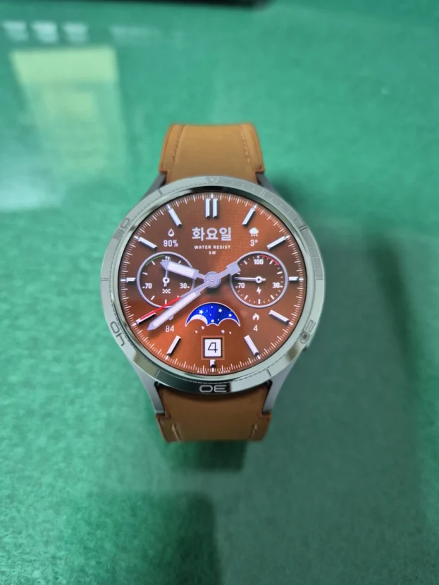
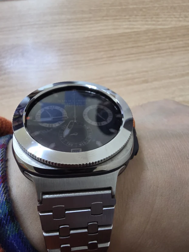
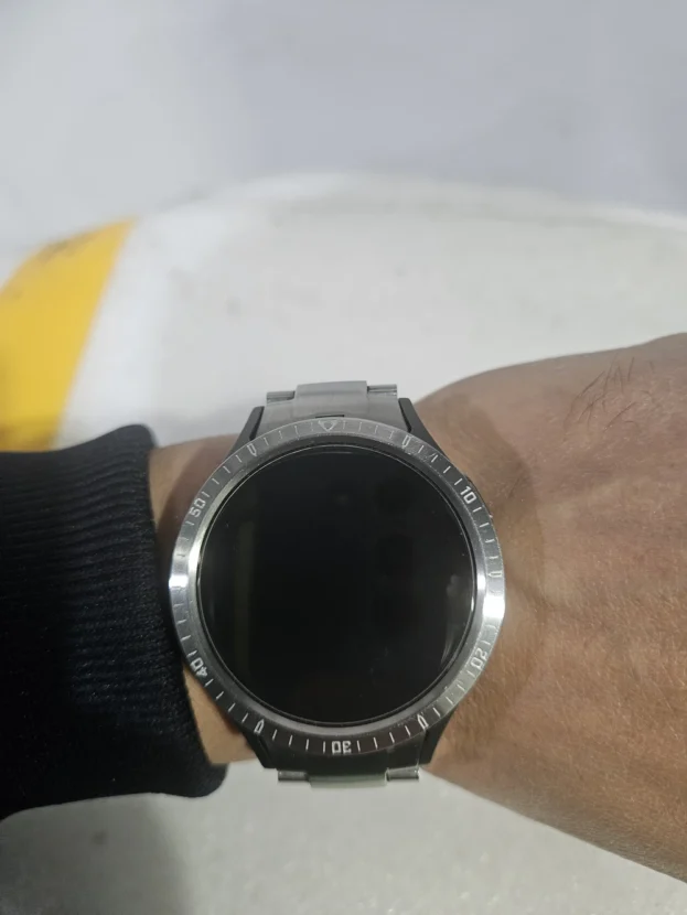
스마트워치는 하루의 시간과 걸음, 이동 경로를 기록하며 가장 자주 눈이 닿는 물건입니다. 베젤링은 그 화면을 가리지 않으면서도 워치의 첫인상을 바꾸는 얇은 외곽선입니다. 부대의 상징을 커다란 문양으로 과시하기보다 별 하나, 화살 하나, 짧은 색면과 각인으로 절제하면 복무했던 사람에게는 익숙한 표식이 되고, 가족에게는 오래 기억할 수 있는 손목 위 기념물이 됩니다.
이 페이지의 아홉 디자인은 대한민국 육군이나 각 부대와 진행한 공식 협업, 승인, 보급 관계가 없는 퍼슬랏 Imagine의 비판매 오마주 콘셉트입니다. 실제 부대 표식을 상업 제품처럼 다루기보다 공개된 전사와 장병의 헌신을 존중하는 방향으로 재해석했습니다. 이미지에 표현된 소재와 치수, 가공 문구 역시 출시 사양이 아니라 상상을 구체화하기 위한 시각적 장치입니다.
전쟁의 역사를 다루는 목적도 승리를 화려하게 소비하는 데 있지 않습니다. 다부동과 춘천, 백마고지와 가칠봉처럼 지금의 일상을 지키기 위해 누군가 버텼던 장소를 기억하고, 수십 년 뒤 가족 품으로 돌아온 전사자의 이름까지 함께 바라보는 일입니다. 아홉 개의 링은 서로 다른 색을 갖지만 끝내 같은 문장으로 모입니다. 지켜낸 시간은 사라지지 않는다는 뜻입니다.
맹호, 강인함과 기동성을 품은 황금의 방패
수도기계화보병사단의 맹호는 이름만으로도 힘과 속도를 동시에 떠올리게 합니다. 수도사단의 전통을 이은 맹호부대는 1965년 10월 베트남 퀴논에 상륙한 한국군 전투부대의 선발대 가운데 하나였습니다. 그 긴 역사에서 호랑이는 단순한 맹수 문양이 아니라, 전우를 지키며 앞으로 나아가는 기동부대의 기세를 상징해 왔습니다.
검은 링 위의 황금 호랑이는 넓은 면을 번쩍이게 채우지 않고 12시 방향의 문장과 양쪽 발톱 자국으로 힘을 나눕니다. 하단의 태극색 포인트는 중심을 낮게 붙잡고, 방패처럼 각을 세운 바깥선은 갤럭시워치의 둥근 화면에 긴장을 더합니다. 골드가 지나치게 장식적으로 흐르지 않도록 검정의 빈 면을 충분히 남긴 구성이 맹호의 절도와 잘 맞습니다.
맹호의 자랑은 전사에만 머물지 않습니다. 최근에는 휴가 중 의식을 잃은 시민을 응급조치로 구하고, 부대 인근 창고 화재를 초기에 진압한 장병들의 이야기도 국방부를 통해 알려졌습니다. 호랑이 문장의 강함이란 결국 사람을 지키는 빠른 판단과 행동에서 완성됩니다. 이 링의 금빛은 전투의 과시보다 그 책임감에 더 가깝습니다.
백마, 열흘의 고지를 건넌 흰 말
제9보병사단을 대표하는 백마의 이름은 1952년 10월 백마고지 전투와 떼어 놓기 어렵습니다. 국가기록원 자료에는 열흘 남짓 이어진 전투에서 열두 차례의 쟁탈전이 벌어졌고, 고지의 주인이 일곱 번 바뀌었다고 기록돼 있습니다. 포격으로 능선의 형상이 흰 말처럼 보였다는 이름까지 더해지며 백마는 집요한 방어와 끈기의 상징이 됐습니다.
백마 오마주 링은 흰 말의 실루엣을 중앙에 크게 그리지 않습니다. 12시의 작은 백마 문장과 네 방향의 별 인덱스, 무광에 가까운 은빛 표면만으로 고지의 차가운 공기를 남깁니다. 작은 점각은 흙과 파편이 뒤섞인 능선의 거친 질감을 연상시키고, 매끈한 외곽선은 시간이 흐른 뒤에도 잊히지 않는 이름을 또렷하게 둘러쌉니다.
백마고지는 승패만으로 요약하기 어려운 장소입니다. 수많은 장병이 같은 능선을 오르내린 끝에 지켜낸 자리였고, 그 희생은 휴전선의 오늘과 이어져 있습니다. 그래서 백마 링은 날카로운 장식보다 비어 있는 은빛 면을 더 넓게 남겼습니다. 말의 속도보다 끝까지 자리를 지킨 사람들의 침묵을 기억하는 디자인입니다.
전진, 다부동에서 지켜낸 길목
제1보병사단 전진부대의 역사에서 다부동 전투는 가장 굵은 장면 가운데 하나입니다. 1950년 8월부터 9월까지 대구로 향하는 길목에서 국군 제1사단은 북한군 세 개 사단의 공세에 맞섰습니다. 국가기록원은 이 전투가 낙동강 방어선의 핵심을 지키고 대구 방어에 결정적으로 기여했다고 기록합니다.
전진의 표식은 방향이 분명해야 합니다. 붉은 화살은 12시에서 화면 안쪽을 향해 곧게 내려오고, 좌우의 짧은 사선은 전선이 밀리고 다시 회복되는 긴장을 보여줍니다. 검은 바탕은 전진이라는 단어를 과장하지 않으면서 화살 하나의 힘을 선명하게 만듭니다. 워치페이스가 복잡해도 붉은 축이 시선을 잡아 주기 때문에 기능과 상징이 충돌하지 않습니다.
다부동의 전진은 무작정 앞으로 나아간다는 뜻과 다릅니다. 더 이상 물러설 수 없는 길목을 지킨 뒤 반격의 시간을 만든 전진입니다. 부대 마크를 손목 위에 놓을 때도 이 맥락이 중심에 남아야 합니다. 눈에 띄는 빨강보다 방향을 잃지 않는 한 줄, 그것이 전진부대 오마주 링의 핵심입니다.
백골, 10월 1일을 기억하는 흰 선
1950년 10월 1일, 국군 제3보병사단 제23연대는 동부전선에서 38선을 넘어 북진했습니다. 이 날을 기념해 10월 1일이 국군의 날로 제정됐습니다. 백골부대의 흰 해골 문장은 죽음을 과장하는 장식이 아니라, 가장 어려운 순간에도 물러서지 않겠다는 결연함과 그날의 역사적 전진을 함께 품고 있습니다.
흰 해골과 교차된 뼈는 검은 링 위에서 단 한 번만 강하게 등장합니다. 주변에는 장식을 거의 두지 않고 짧은 흰 인덱스와 얕은 점각만 남겼습니다. 흑백의 대비가 선명한 만큼 링의 두께와 여백은 더욱 절제되어야 합니다. 바깥선이 두꺼워지면 워치가 무거워 보이지만, 얇은 검정 테두리 안에 흰 문장을 정확히 앉히면 백골 특유의 냉정한 인상이 살아납니다.
10월 1일의 의미는 하나의 부대가 먼저 선을 넘었다는 사실에만 있지 않습니다. 전쟁의 흐름이 바뀌던 순간, 이름을 남기지 못한 수많은 장병이 같은 방향으로 걸었다는 데 있습니다. 백골 링은 그 기억을 짧고 강한 흰 선으로 남깁니다. 많은 말을 덧붙이지 않아도 알아보는 사람에게는 충분한 표식입니다.
열쇠, 피의 능선과 가칠봉을 잇는 기억
제5보병사단 열쇠부대는 6·25전쟁의 피의 능선과 가칠봉을 비롯한 격전의 역사와 함께 기억됩니다. 열쇠라는 이름은 길을 열고 요충을 지킨다는 의미를 동시에 가집니다. 산악전의 거친 능선에서 한 고지를 넘는 일은 다음 진로를 여는 일이었고, 그 과정에는 전우를 잃은 무거운 대가가 따랐습니다.
붉은 열쇠는 원의 중심을 세로로 가르되, 손잡이 안쪽에 태극색을 작게 남깁니다. 바깥 링의 사각 마디는 산등성이를 이어 붙인 듯한 리듬을 만들고, 검정과 빨강의 대비는 긴장감을 낮추지 않습니다. 열쇠 머리를 지나치게 크게 키우지 않고 워치의 인덱스처럼 정돈하면 군 표식의 상징성과 시계 부품의 질서가 함께 살아납니다.
가칠봉 전투의 참전용사가 수십 년 뒤 다시 현장을 찾고 후배 장병과 만난 이야기는 전적이 사람의 기억으로 이어지는 방식을 보여줍니다. 지도 위의 고지명은 한 줄로 끝나지만, 그곳을 지나온 사람에게는 평생의 시간이 됩니다. 열쇠 링의 붉은 선은 문을 여는 도구이면서, 잊히지 않도록 기억을 잠그는 장치이기도 합니다.
청성, 춘천에서 벌어준 결정적인 시간
제6보병사단 청성부대는 6·25전쟁 발발 직후 춘천지구전투에서 북한군의 수도권 우회 포위 계획을 늦추고 무너뜨렸습니다. 열세한 장비와 넓은 방어 정면 속에서도 방어진지를 준비하고 보병과 포병의 화력을 집중했습니다. 춘천을 지킨 시간은 후방의 병력이 전열을 정비하고 다음 방어선을 세우는 데 결정적인 여유가 됐습니다.
청성의 파란 별은 이 이야기와 잘 어울립니다. 밝은 청색 링 중앙에 별 하나를 놓고, 양쪽에는 별빛이 퍼지는 듯한 짧은 방사선을 더했습니다. 전체를 광택으로 덮기보다 중심의 별만 빛을 받게 하면 푸른 표면이 깊어지고, 실버 워치 바디와 만났을 때 차가운 금속의 경계가 또렷해집니다.
춘천지구전투는 개전 초기 국군이 거둔 중요한 승전으로 평가됩니다. 그러나 이 오마주가 붙잡는 장면은 승전보보다 준비와 협동입니다. 장병뿐 아니라 방어진지 구축을 도운 춘천 시민과 학생의 손도 기록에 남아 있습니다. 청성의 별은 한 부대의 표식인 동시에, 도시와 군이 함께 지켜낸 밤을 비추는 작은 빛입니다.
칠성, 별 사이에 돌아온 이름
제7보병사단 칠성의 일곱 별은 북두칠성처럼 방향을 잃지 않는 표식입니다. 6·25전쟁 당시 칠성부대는 낙동강 방어선의 기계·안강 전투에 참전했습니다. 1950년 9월 그 전투에서 전사한 고 서갑출 일병의 유해는 신원 확인을 거쳐 75년 만인 2025년 가족의 품으로 돌아왔습니다.
이 이야기를 담은 링에서 별은 계급이나 화려함을 뜻하지 않습니다. 서로 떨어진 일곱 개의 별을 가는 선으로 잇고, 중앙의 빈 원에는 돌아오지 못한 이름을 위한 여백을 남겼습니다. 붉은 외곽과 푸른 안쪽 링은 태극의 두 색을 직접 복제하지 않고 온도 차이로만 보여줍니다. 손목이 움직일 때 별이 한꺼번에 반짝이지 않고 차례로 드러나는 구성이 더 깊은 인상을 남깁니다.
75년은 한 가족이 기다리기에는 너무 긴 시간입니다. 유해가 돌아온 뒤에야 끝난 인사가 있고, 아직도 돌아오지 못한 이름이 있습니다. 칠성 오마주 베젤링은 전투의 숫자보다 귀환의 순간을 기억합니다. 밤하늘에서 길을 알려주는 별처럼, 이름을 잃지 않게 이어 주는 일곱 개의 점입니다.
오뚜기, 다시 일어서는 이름과 두 형제의 기록
1949년 창설된 제8기동사단은 6·25전쟁 기간 158회의 전투를 치른 단일 사단 최다 전투 기록을 갖고 있습니다. 오뚜기라는 이름에는 넘어져도 다시 일어나 임무를 이어가는 백절불굴의 정신이 담겨 있습니다. 숫자 8의 둥근 구조 역시 끊어지지 않고 이어지는 힘을 자연스럽게 보여줍니다.
검은 링 위의 붉은 8은 상하 두 원이 정확히 맞물리며, 바깥쪽의 금속 마디는 여러 번 끊겼다가 다시 이어진 전선을 연상시킵니다. 12시와 6시의 짧은 흰 인덱스가 중심을 잡아 주고, 빨강은 숫자 안쪽에만 머물러 전체가 장난스럽게 보이지 않도록 절제했습니다. 스포츠 밴드와 메탈 스트랩 어느 쪽에서도 8의 실루엣이 선명하게 남습니다.
2026년에는 전쟁 당시 제8사단 제10연대 소속으로 횡성 전투에서 전사한 고 유제용 일병의 유해가 75년 만에 가족에게 돌아왔습니다. 같은 사단에서 싸우다 전사한 형 고 유제경 일병의 유해는 아직 찾지 못했습니다. 한 형제의 이야기는 오뚜기의 불굴이 추상적인 구호가 아니라 가족이 감당한 긴 기다림 위에 서 있음을 보여줍니다.
그래서 이 링의 8은 승리의 숫자가 아닙니다. 돌아온 동생과 아직 돌아오지 못한 형, 끝나지 않은 발굴과 기억을 두 개의 원으로 잇습니다. 다시 일어선다는 말은 잊지 않고 찾는 일까지 포함합니다. 오뚜기 문장이 가진 가장 깊은 힘도 그 지속성에 있습니다.
번개, 전후의 시간을 지켜온 노란 궤적
제17보병사단 번개부대는 정전 이후인 1955년 3월 제33사단으로 창설됐고, 같은 해 인천 지역으로 이동했습니다. 1982년 제17보병사단으로 명칭을 바꾼 뒤 수도권 서부의 방위를 이어왔습니다. 다른 여덟 부대와 달리 6·25전쟁의 특정 전투보다 전후 재편과 오랜 지역 방위의 시간이 번개의 역사에 놓여 있습니다.
노란 번개는 검은 링을 대각선으로 가르며 매우 빠르게 읽힙니다. 번개 양옆의 작은 실버 마디는 전류가 퍼지는 순간을 잡고, 바깥 테두리의 검정은 색이 흩어지지 않도록 단단히 묶습니다. 화면 안쪽에 정보가 많을 때도 한 줄의 노랑만 남기 때문에 시선이 복잡해지지 않습니다. 속도를 말하되 형태는 간결한 이유입니다.
전후의 방위는 눈에 띄는 한 장면보다 반복되는 대비와 훈련, 지역사회와 함께한 시간이 쌓여 만들어집니다. 번개 오마주 링은 찰나의 섬광을 그리지만 그 바탕에는 수십 년의 지속성이 있습니다. 빠르게 움직여야 할 때를 위해 오랫동안 준비해 온 부대의 시간을 검정과 노랑의 가장 명료한 대비로 남겼습니다.
군부대 오마주 베젤링, 전적을 장식이 아닌 기억으로
아홉 개의 부대 마크는 서로 다른 모양을 가졌지만, 모두 사람이 지켜낸 시간에서 태어났습니다. 맹호의 호랑이, 백마의 흰 말, 전진의 화살, 백골의 흰 문장, 열쇠의 붉은 축, 청성과 칠성의 별, 오뚜기의 8, 번개의 노란 궤적은 복무한 사람에게 단순한 그래픽이 아닙니다. 훈련과 경계, 전우의 얼굴, 가족이 기다린 계절까지 함께 떠오르는 표식입니다.
퍼슬랏 Imagine의 군부대 오마주 베젤링은 전쟁을 멋으로 소비하지 않습니다. 공개 기록에 남은 전투는 사실에 맞게 짚고, 그보다 오래 남는 장병의 헌신과 귀환의 이야기를 함께 담았습니다. 금속의 반사와 색은 영웅담을 부풀리기 위한 장식이 아니라, 잊지 않기 위한 작은 기억 장치입니다.
이 아홉 디자인은 판매 제품도, 각 부대의 공식 굿즈도 아닙니다. 다만 언젠가 복무의 시간을 품위 있게 기억하는 워치 액세서리가 만들어진다면 어떤 태도를 가져야 하는지 보여주는 상상입니다. 부대의 명예를 존중하고, 전우의 희생을 가볍게 다루지 않으며, 매일 보는 손목 위에서 조용히 기억할 수 있어야 합니다.
오늘의 평범한 시간은 누군가 지켜낸 시간 위에 놓여 있습니다. 퍼슬랏 Imagine은 그 사실을 아홉 개의 작은 원으로 남깁니다. 화면은 계속 새로운 기록을 보여주지만, 바깥의 링은 오래된 이름을 잊지 않도록 붙잡습니다.
Nine Division Emblems Reimagined As A Wrist-Worn Homage
A military insignia is never only a graphic. The tiger of Mangho, the white horse of Baekma, the arrow of Jeonjin, the white skull of Baekgol, the key of Yeolsoe, the stars of Cheongseong and Chilseong, the resilient eight of Ottugi and the lightning of Beongae hold years of service, the memory of comrades and the responsibility of guarding everyday life. PERSLOT Imagine brings those layers into nine small circles around a smartwatch display.
A smartwatch records time, distance and movement, and it remains one of the objects seen most often throughout the day. A bezel can change its outer character without covering the information on screen. When an emblem is reduced to one star, one arrow or a controlled field of color, it can become a personal reminder for veterans and a quiet object of remembrance for their families.
These concepts are non-commercial PERSLOT Imagine studies. They are not official collaborations, approved merchandise or issued equipment of the Republic of Korea Army or any division. The material labels, dimensions and production language visible in the artwork are part of the visualization and do not represent confirmed product specifications.
The history is treated with the same restraint. Battles at Dabudong, Chuncheon, White Horse Hill and Gachilbong are not used as decorative drama. They are remembered as places where people held their ground, bought time for others and left names that families continued to seek for decades. The nine bezels differ in color, but they share one sentence: time that was defended should not disappear.
Mangho, Strength And Mobility Inside A Golden Shield
The Capital Mechanized Infantry Division carries the tiger as a symbol of power in motion. Its history includes the Capital Division tradition and the 1965 deployment to Quy Nhon in South Vietnam as one of the first Korean combat formations sent there. Within that long record, the tiger is more than an aggressive motif. It represents speed directed toward protecting the people beside it.
A gold tiger sits against black without filling the entire ring. Claw marks divide the energy across both sides, while a small red-and-blue point anchors the lower edge. The dark empty surface keeps the gold from becoming ornamental and allows the angular shield line to sharpen the round profile of a Galaxy Watch.
The spirit also appears away from battle history. Recent Ministry of National Defense reports described Mangho soldiers saving an unconscious civilian during leave and stopping a nearby warehouse fire before it spread. The brightest part of this bezel belongs to that same idea: strength becomes meaningful when it is used quickly and responsibly to protect another person.
Baekma, A White Horse Across Ten Days Of Battle
The name Baekma is inseparable from the Battle of White Horse Hill in October 1952. National Archives records describe roughly ten days of fighting, twelve repeated contests for the position and seven changes of control. The devastated ridge came to resemble a white horse, and the name became a lasting symbol of endurance for the 9th Infantry Division.
The imagined bezel avoids a large literal horse. A small white-horse crest at twelve, four star indexes and a near-matte silver field carry the cold atmosphere of the ridge. Fine stippling recalls broken earth, while the clean outer edge holds the name in a quiet and durable frame.
White Horse Hill cannot be reduced to victory alone. It was held through repeated movement over the same ground and immense human cost. For that reason, empty silver carries as much weight as the emblem. The design remembers the soldiers who remained on the ridge, not simply the speed of the horse in the division name.
Jeonjin, The Road Held At Dabudong
The Battle of Dabudong remains one of the defining chapters of the 1st Infantry Division. From August into September 1950, the division faced the advance of three North Korean divisions along the route toward Daegu. The defense became a decisive part of holding the Nakdong River line and preserving the time needed for the wider counteroffensive.
Jeonjin requires a clear direction. A red arrow descends from twelve toward the display, while short diagonal marks on both sides retain the tension of a line that bent but did not break. Black space keeps the red axis precise even beside a complicated watch face.
Advance at Dabudong did not mean moving forward without thought. It began by refusing to abandon a critical road and then turning defense into the possibility of counterattack. On the wrist, the meaning remains in one disciplined line rather than a field of red: a direction held when retreat was no longer possible.
Baekgol, A White Line Remembering October First
On 1 October 1950, the 23rd Regiment of the 3rd Infantry Division crossed the 38th parallel on the eastern front. The date later became Armed Forces Day in the Republic of Korea. The white skull of Baekgol therefore carries both an uncompromising regimental identity and the memory of a turning point in the war.
The skull and crossed bones appear once against a black ring. Almost everything else is removed except short white indexes and shallow stippling. Because the contrast is already strong, the ring must remain slim. A controlled black boundary and exact placement give the emblem its severe character without making the watch unnecessarily heavy.
The importance of October first is not limited to one formation moving across a line. It also belongs to the many soldiers who advanced in the same direction without leaving widely known names. The Baekgol bezel holds that memory in a short white mark that needs no additional ornament for those who recognize it.
Yeolsoe, The Memory Between Bloody Ridge And Gachilbong
The 5th Infantry Division is remembered through hard-fought ground including Bloody Ridge and Gachilbong. A key can open a route and secure a vital point, two meanings that fit a formation shaped by mountain warfare. Each ridge gained access to the next, but every movement carried a cost measured in comrades rather than distance alone.
A red key divides the circle vertically, with a restrained red-and-blue detail inside its head. Squared segments around the outer ring create the rhythm of connected ridgelines. When the key remains close to the scale of a watch index, the military symbol and the order of a precision accessory can coexist without becoming theatrical.
Veterans returning to Gachilbong decades later and meeting younger soldiers show how a place on a military map becomes a lifetime of memory. The red line can be read in two ways: a tool that opens a road and a device that keeps remembrance safely locked in place.
Cheongseong, The Time Secured At Chuncheon
At the beginning of the Korean War, the 6th Infantry Division delayed and disrupted the North Korean plan to move through Chuncheon and encircle the capital region. It concentrated infantry and artillery despite inferior equipment and a broad defensive front. The time secured around Chuncheon allowed other formations to reorganize and build the next defensive lines.
A blue star is the natural center of this story. Short radial marks spread from a single point across a deep blue ring. Most of the surface remains subdued so that only the star catches light, creating a clear boundary against a silver watch case.
The Battle of Chuncheon is remembered as an important early success, yet preparation and cooperation are equally significant. Local citizens and students assisted with defensive construction before the war. The Cheongseong star can therefore represent not only one division, but also a city and its soldiers holding the same night together.
Chilseong, A Name Returning Between Seven Stars
The seven stars of the 7th Infantry Division act like a constellation that preserves direction. During the Korean War, the division fought along the Nakdong River defense line at Kigye and Angang. Private First Class Seo Gap-chul was killed there in September 1950. His remains were identified and returned to his family in 2025, seventy-five years after his death.
Seven separated stars are joined by fine lines, while an empty center is reserved for names that have not yet returned. Red along the outside and blue within suggest the temperature of the national colors without copying a flag. As the wrist moves, the stars appear one after another instead of flashing at once.
Seventy-five years is longer than any family should have to wait for a final farewell. Some names have returned, while others remain missing. This imagined Chilseong bezel remembers the return rather than a tally of battle. Its seven points function as a quiet map back home.
Ottugi, Resilience And The Record Of Two Brothers
Founded in 1949, the 8th Maneuver Division fought 158 engagements during the Korean War, a record described by the Ministry of National Defense as the highest number for a single division. Ottugi represents the refusal to remain down after a fall. The continuous upper and lower circles of the number eight make that resilience immediately visible.
A red eight locks into a black ring, while segmented metal around the edge suggests a line repeatedly broken and restored. White marks at twelve and six steady the composition. Red stays inside the number so the symbol remains forceful without turning playful, and it can retain its identity with either a sport band or metal bracelet.
In 2026, the remains of Private First Class Yoo Je-yong, who served with the division’s 10th Regiment and died in the Battle of Hoengseong, returned to his family after seventy-five years. His older brother Yoo Je-gyeong also served in the division and was killed, but his remains have not yet been found.
The eight is therefore not a score of victory. Its two circles connect one brother who returned and another who is still being sought. Resilience includes the work of remembering, identifying and bringing people home. That continuity gives the Ottugi emblem its deepest weight.
Beongae, A Yellow Trajectory Across The Postwar Years
The 17th Infantry Division began in March 1955 as the 33rd Division after the armistice and moved to the Incheon region that same year. It received the 17th Division designation in 1982 and continued the defense of the western capital region. Unlike the other eight emblems, its story is defined less by one Korean War battle and more by postwar reorganization and decades of regional duty.
A yellow lightning bolt cuts diagonally through black and becomes readable at once. Small silver segments capture the moment an electrical charge disperses, while the dark outer boundary keeps the color contained. Even when the display carries dense information, one yellow line is enough to preserve the identity.
Postwar defense is built through repeated readiness, training and time spent with surrounding communities rather than a single dramatic scene. The Beongae ring depicts an instant of speed, but its foundation is long preparation. Black and yellow express the simple truth that a rapid response is possible only after years of quiet vigilance.
History Worn As Memory, Never As Decoration
The nine emblems differ in form, yet every one was shaped by human time. Tiger, horse, arrow, skull, key, stars, eight and lightning can recall training, guard duty, the faces of comrades and seasons of waiting at home. For those who served, they are never merely graphic elements.
The military unit homage bezels imagined by PERSLOT do not turn war into style. Public battle records establish the historical ground, while the stories of service members and their return to families carry the greater emotional weight. Reflection, color and engraving become small instruments of remembrance rather than spectacle.
None of these designs is a product or official unit merchandise. They imagine the care required if a watch accessory were ever made to preserve military service with dignity: respect the honor of the unit, never reduce sacrifice to decoration and allow memory to remain quietly present in daily life.
Ordinary time exists because someone protected it. The display continues to show new records, while the ring holds names that should not be lost. PERSLOT Imagine leaves that relationship inside nine small circles on the wrist.
추가 정보
오마주 콘셉트 한눈에 보기
군부대 오마주 베젤링은 맹호, 백마, 전진, 백골, 열쇠, 청성, 칠성, 오뚜기, 번개 아홉 부대의 공개된 역사와 상징을 갤럭시워치의 얇은 외곽선으로 상상한 퍼슬랏 Imagine 콘텐츠입니다. 공식 협업이나 판매 제품이 아니며, 실제 부대 굿즈와 구분됩니다.
각 디자인은 로고를 크게 복제하기보다 호랑이, 흰 말, 화살, 열쇠, 별, 숫자 8, 번개처럼 부대를 알아보게 하는 최소한의 표식을 남깁니다. 전투 기록은 장식의 근거가 아니라 장병의 헌신과 가족의 기다림을 기억하기 위한 역사적 맥락으로 다뤘습니다.
아홉 개 상징에 담긴 기억
- 맹호는 기동성과 강인함을, 백마는 백마고지에서 이어진 끈질긴 방어를 상징합니다.
- 전진은 다부동에서 지켜낸 길목을, 백골은 1950년 10월 1일 38선 돌파의 역사를 품습니다.
- 열쇠는 피의 능선과 가칠봉의 격전을, 청성은 춘천지구전투에서 확보한 결정적인 시간을 기억합니다.
- 칠성은 75년 만에 가족 품으로 돌아온 고 서갑출 일병의 이름을 일곱 별 사이에 남깁니다.
- 오뚜기는 158회 전투의 불굴과 유제용·유제경 두 형제의 기다림을, 번개는 전후 수도권 서부를 지켜온 긴 시간을 상징합니다.
오마주를 다루는 기준
- 전쟁을 미화하거나 전적을 과장하지 않고 공개된 기록의 범위 안에서 서술합니다.
- 부대명과 표식은 장병의 헌신을 기억하는 맥락에서만 사용하며 공식 승인이나 협업을 암시하지 않습니다.
- 현역 부대의 위치, 편성, 장비 운용처럼 공개 오마주에 필요하지 않은 정보는 다루지 않습니다.
- 이미지 속 소재, 수치, 가공 표현은 상상 속 디자인 언어이며 실제 제품 사양으로 읽지 않습니다.
- 전사자의 귀환 이야기는 숫자보다 개인의 이름과 가족의 기다림을 존중하는 방향으로 다룹니다.
자주 묻는 질문
이 베젤링은 실제 판매 제품인가요?
아닙니다. 아홉 디자인 모두 퍼슬랏 Imagine에서 상상한 비판매 콘셉트입니다. 퍼슬랏 공식몰의 실제 판매 제품이나 군부대 공식 굿즈와는 별개입니다.
대한민국 육군이나 각 부대와 협업한 콘텐츠인가요?
공식 협업, 승인, 보급 관계가 없는 오마주 콘텐츠입니다. 특정 부대의 명칭과 상징은 공개된 역사와 장병의 헌신을 기리는 범위에서 재해석했습니다.
왜 부대 표식을 베젤링으로 상상했나요?
스마트워치는 매일 착용하고 자주 바라보는 물건입니다. 화면을 가리지 않는 얇은 베젤링은 복무의 기억을 과하게 드러내지 않으면서 손목 위에 오래 남길 수 있는 형태입니다.
전투 기록은 어떤 기준으로 넣었나요?
국가기록원, 국방부, 군사편찬연구소와 국방부 유해발굴감식단 발표를 바탕으로 공개된 사건만 사용했습니다. 전투의 승패보다 오늘의 평화를 위해 감당한 시간과 사람의 이야기에 무게를 두었습니다.
이미지에 적힌 소재와 치수는 실제 사양인가요?
아닙니다. 이미지 안의 소재와 치수, 가공 용어는 상상 속 디자인을 구체적으로 보이게 하는 시각 요소입니다. 실제 개발이나 판매가 진행된 제품 스펙으로 볼 수 없습니다.
부대별 색을 다르게 사용한 이유는 무엇인가요?
각 부대는 오랫동안 고유한 문장과 별칭, 색의 인상을 쌓아 왔습니다. 검정과 금색의 맹호, 은빛 백마, 푸른 청성, 붉은 오뚜기처럼 한눈에 읽히는 차이를 남기되 워치 화면과 충돌하지 않도록 색면을 줄였습니다.
참전용사 귀환 이야기를 함께 담은 이유는 무엇인가요?
부대 역사는 전투명과 전적만으로 완성되지 않습니다. 75년 만에 가족에게 돌아온 고 서갑출 일병과 고 유제용 일병의 이야기는 한 사람의 이름을 끝까지 찾고 기억하는 일이 왜 중요한지 보여줍니다.
실제 굿즈로 제작하려면 무엇이 필요할까요?
부대명과 표식 사용에 관한 정식 권한, 장병과 참전용사를 존중하는 기획 기준, 워치 모델별 호환 설계가 먼저 필요합니다. 상징을 소비하는 장식보다 복무의 의미를 품위 있게 보존하는 기념품이어야 합니다.
퍼슬랏의 실제 베젤링은 어디에서 볼 수 있나요?
퍼슬랏 공식몰에서 현재 판매 중인 모델과 호환 옵션을 살펴볼 수 있습니다. Imagine 콘텐츠의 디자인과 실제 제품은 반드시 구분해 확인합니다.
퍼슬랏 Imagine과 실제 제품
퍼슬랏 Imagine은 스마트워치 액세서리가 문화, 기억, 스포츠, 지역과 만날 수 있는 가능성을 상상하는 카테고리입니다. 브랜드의 실제 베젤링과 스트랩 방향은 퍼슬랏 브랜드 사이트에서 이어서 볼 수 있습니다.