


갤럭시워치 베젤링 후기, 가까이서 본 마감과 손목 위 비율
갤럭시워치 베젤링 후기에 자주 등장하는 ‘깔끔하다’와 ‘얇다’는 막연한 인상이 아닙니다. 링의 안쪽 원이 디스플레이와 고르게 맞고 바깥 모서리가 본체보다 과하게 튀어나오지 않을 때, 화면은 넓게 남으면서 케이스의 외곽선은 한층 또렷해집니다. 손목 위에서 먼저 느껴지는 차이는 화려한 장식보다 정확한 비율에 가깝습니다.
가까이 들여다보면 표면의 성격이 보입니다. 매끈하게 빛을 돌려보내는 면, 각인을 따라 짧게 끊어지는 반사, 검은 유리와 이어지는 어두운 금속선이 서로 다른 분위기를 만듭니다. 몇 걸음 떨어져 보면 세부 각인보다 워치페이스와 링, 본체가 이루는 원의 크기가 먼저 들어옵니다.
가까운 마감과 멀리서 남는 비율
실버는 본체와 밴드 사이에 밝은 경계를 남기고, 블랙은 화면 바깥의 검은 영역을 이어 전면을 단단하게 묶습니다. 숫자와 미닛 마커가 있는 디자인은 아날로그 워치페이스의 바깥 눈금처럼 작동하고, 장식을 덜어낸 플레인은 정보가 많은 디지털 화면을 조용히 받쳐 줍니다.
퍼슬랏 베젤링은 워치 전면의 얇은 폭을 다루는 액세서리입니다. 그래서 색상만큼 모델과 크기, 안쪽 여백, 부착 중심이 중요합니다. 정확하게 맞춘 링은 버튼과 측면을 열어 둔 채 디스플레이 가장자리만 정리하며, 본체가 지닌 원래의 부피와 실루엣을 그대로 살립니다.
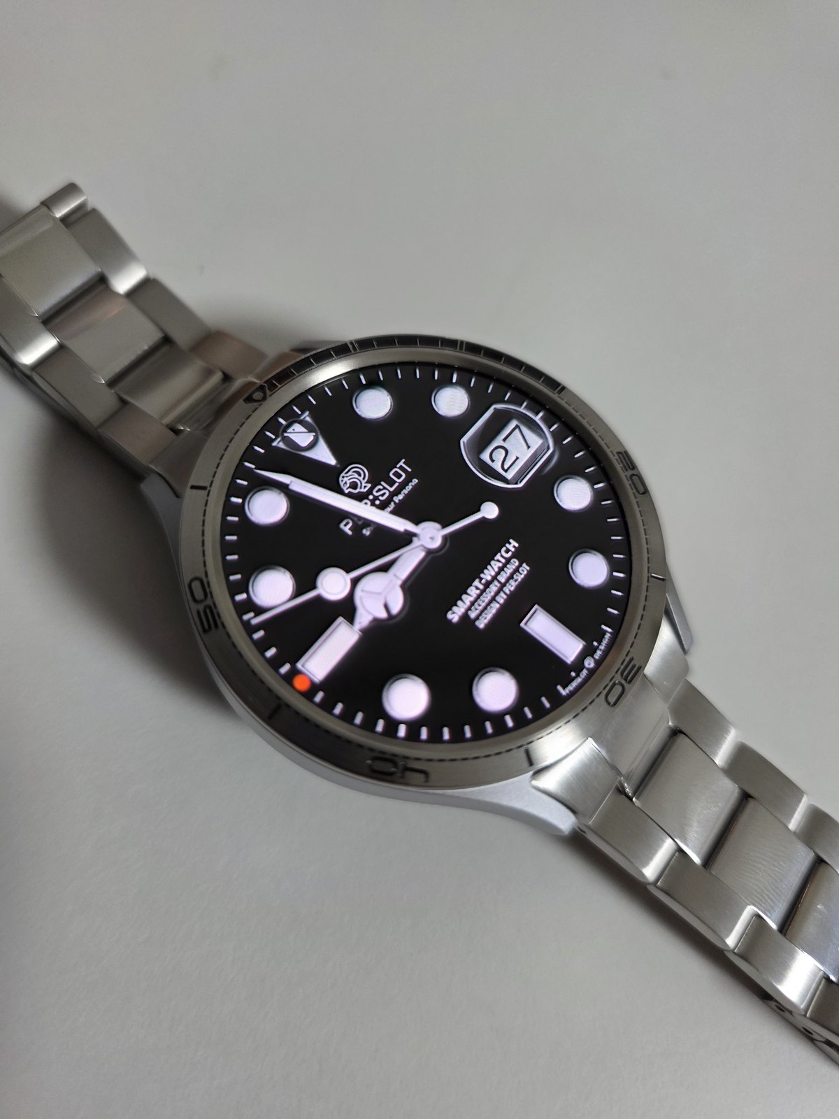
좋아요. 만족합니다.
다이얼 바깥까지 이어지는 실버 인덱스
검은 다이얼을 둘러싼 실버 인덱스는 화면 안의 아워 마커와 바깥 금속 눈금을 한 흐름으로 묶습니다. 숫자와 짧은 선이 원을 따라 이어지지만 다이얼의 정보 영역을 침범하지 않아, 화면은 깊게 남고 외곽만 시계 베젤처럼 또렷해집니다. 손목을 돌리면 각인보다 먼저 얇은 모서리에 빛이 닿고, 곧이어 브러시드 면의 차분한 결이 드러납니다.
메탈 브레이슬릿과 함께 놓였을 때는 앞면과 손목 아래쪽의 금속 농도가 자연스럽게 이어집니다. 다만 모든 면을 같은 광택으로 맞추지 않아도 됩니다. 베젤링의 세밀한 눈금, 케이스의 부드러운 곡면, 링크의 넓은 면이 서로 다른 반사를 만들기 때문에 실버 한 색 안에서도 충분한 깊이가 생깁니다.
가까이에서는 링 안쪽의 여백과 바깥 원의 중심이 마감의 완성도를 좌우합니다. 네 방향의 간격이 고르게 맞으면 각인이 기울어 보이지 않고, 디스플레이와 금속 테두리가 하나의 원처럼 읽힙니다. 표면은 마른 극세사 천으로 결을 따라 가볍게 닦고, 땀이 많이 닿은 날에는 안쪽 가장자리의 수분도 함께 정리해 줍니다.
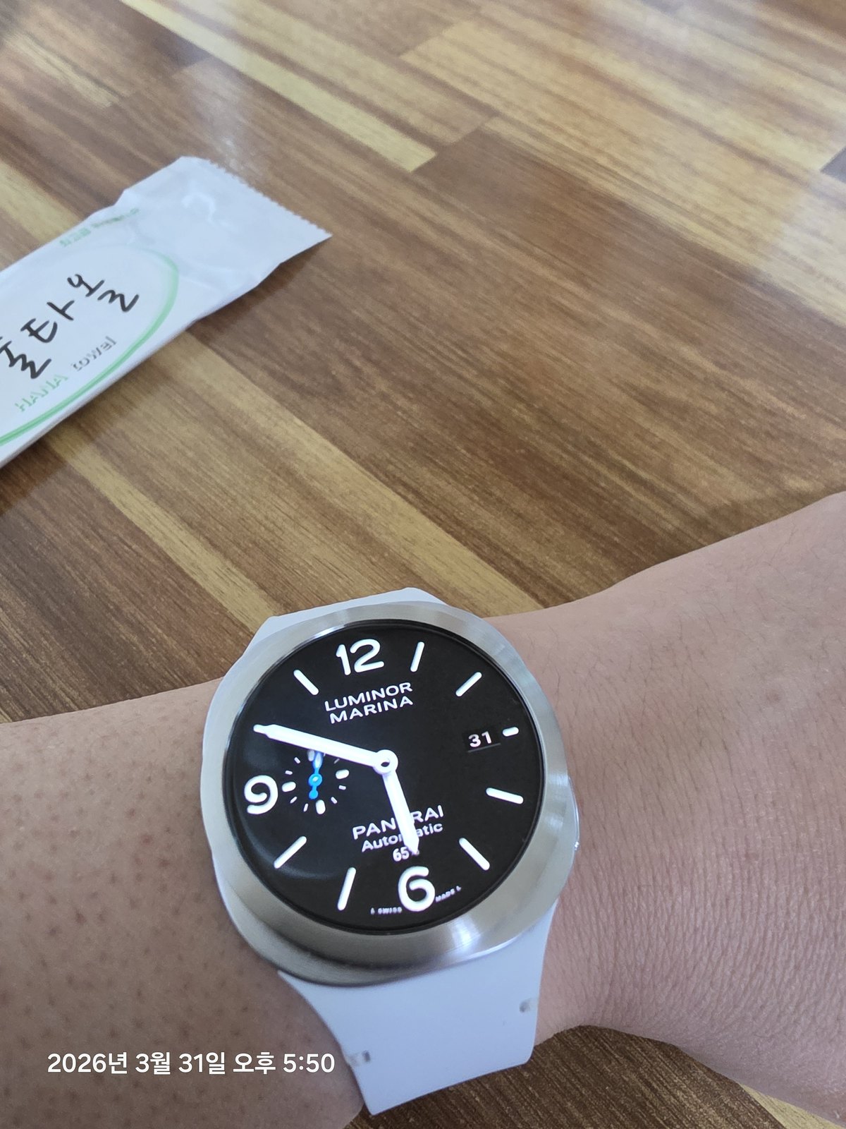
빠른 배송에 잘 워치랑 어울리는 거 같아요.
밝은 밴드 위에 남는 선명한 금속 윤곽
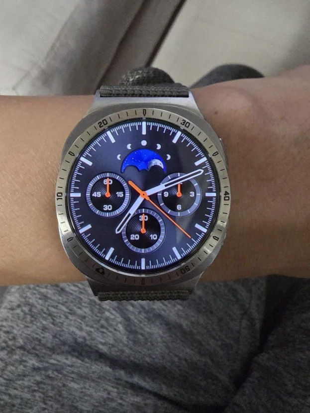
밝은 밴드는 손목 아래쪽의 무게를 가볍게 만들고, 실버 베젤링은 검은 화면의 바깥선을 또렷하게 잡습니다. 색의 대비는 분명하지만 금속 폭이 얇아 전면이 무겁게 닫히지 않습니다. 워치페이스의 큰 숫자와 바늘은 화면 안에 넉넉하게 남고, 바깥쪽에는 케이스와 밴드를 연결하는 밝은 윤곽만 더해집니다.
정면에서는 다이얼의 크기가 먼저 보이지만 사선으로 기울이면 베젤링의 높이와 케이스 측면이 함께 드러납니다. 링이 본체보다 과하게 넓거나 높지 않아야 소매를 지날 때 걸림이 덜하고, 화면 가장자리에서 시작하는 터치 동작도 편안합니다. 이런 비율은 스포츠 밴드의 간결한 표면과도 잘 맞습니다.
부착 뒤에는 화면을 켠 상태와 끈 상태를 번갈아 보며 안쪽 여백을 살피는 편이 정확합니다. 밝은 화면에서는 원의 중심을, 검은 화면에서는 금속 외곽선의 두께를 확인할 수 있습니다. 작은 먼지와 손자국은 실버 표면에서 쉽게 드러나므로 마른 천으로 원을 따라 닦아 두면 깨끗한 대비가 오래 유지됩니다.
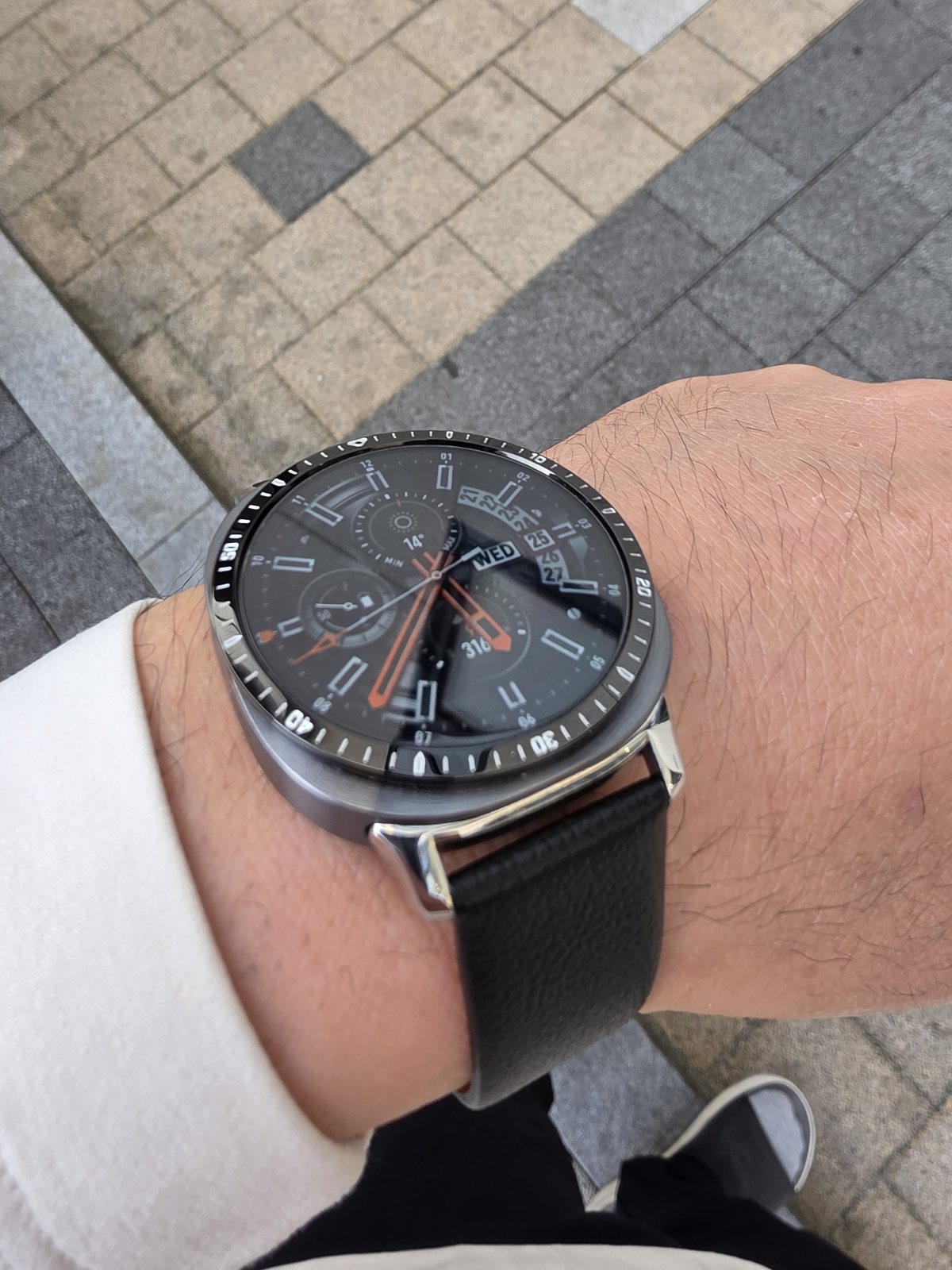
깔끔하고 얇아서 좋아요~
가죽 밴드 위에서 또렷해지는 검은 인덱스
검은 인덱스 베젤링은 어두운 워치페이스의 면적을 바깥으로 넓혀 줍니다. 링 위의 숫자와 눈금이 화면 속 바늘 및 서브 다이얼과 이어지면 디스플레이와 액세서리가 따로 보이지 않고, 정면에는 하나의 시계 다이얼처럼 단단한 중심이 생깁니다. 화면이 꺼진 뒤에도 바깥 눈금이 남아 원형의 윤곽을 이어 줍니다.
가죽의 부드러운 표면과 베젤링의 또렷한 각인은 서로 같은 질감을 반복하지 않습니다. 손목 아래에서는 가죽이 차분하게 감기고, 전면에서는 금속 눈금이 작은 빛을 받아 존재감을 남깁니다. 검은색을 중심으로 묶인 조합이지만 소재가 달라 단조롭게 가라앉지 않습니다.
숫자와 방향성이 있는 디자인은 부착 전에 워치페이스의 수직축을 곧게 세우는 과정이 필요합니다. 12시와 6시를 먼저 맞춘 뒤 3시와 9시의 안쪽 여백을 비교하고, 중심이 맞았을 때 둘레를 고르게 눌러야 눈금이 기울지 않습니다. 아날로그 다이얼을 띄워 놓으면 화면과 링의 축을 한눈에 대조하기 쉽습니다.
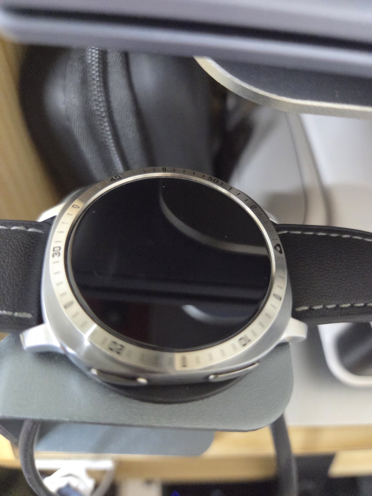
만족합니다 추천해요
밝은 밴드와 실버 각인의 온도
밝은 밴드 위에 실버 베젤링을 올리면 워치 전체가 가벼워 보이지만 전면의 중심은 흐려지지 않습니다. 숫자 각인이 검은 화면과 대비를 만들고, 바깥쪽의 실버 면은 본체와 밴드 사이에서 자연스러운 중간 톤을 맡습니다. 화면이 꺼져도 금속 눈금이 남아 원형 다이얼의 윤곽을 이어 줍니다.
밝은 조합일수록 안쪽 원의 간격과 작은 오염이 쉽게 보입니다. 부착 전에 유분과 먼지를 정리하고, 워치페이스 둘레의 검은 여백이 좌우에서 같은지 살펴본 뒤 압착하면 실버 테두리가 한쪽으로 두꺼워 보이는 현상을 줄일 수 있습니다. 부착 뒤에는 밝은 화면과 어두운 화면을 번갈아 켜 간격을 다시 살펴보는 편이 좋습니다.
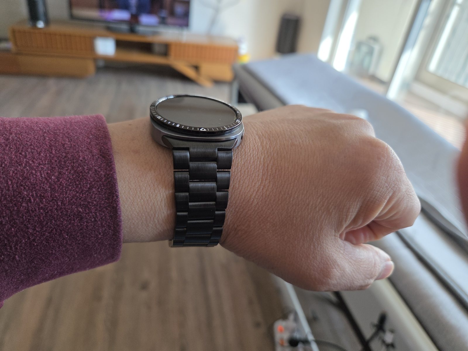
베젤이 깔끔하고 두께가 얇아 좋습니다.
장식을 덜어낸 블랙 플레인
블랙 플레인은 베젤링 자체를 크게 드러내기보다 검은 디스플레이의 외곽을 정돈합니다. 색상과 정보가 많은 워치페이스를 사용할 때 바깥 링까지 숫자로 채우지 않아 화면의 복잡함이 늘지 않습니다. 화면이 켜지면 조용한 테두리로 물러나고, 꺼지면 유리와 케이스 사이의 높이 차이를 자연스럽게 감춥니다.
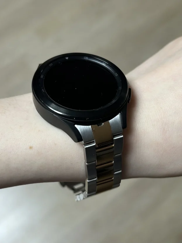
메탈 브레이슬릿처럼 넓고 단단한 소재를 연결해도 전면이 지나치게 무거워 보이지 않는 이유도 여기에 있습니다. 손목 아래의 금속 링크가 충분한 존재감을 만들기 때문에 위쪽은 얇은 검은 원만으로 균형을 잡습니다. 광택을 줄인 링은 셔츠나 니트 소매 안에서도 차분하게 이어집니다.
두께가 얇다는 장점은 정면보다 일상 동작에서 더 분명합니다. 손을 굽혔을 때 링이 과하게 떠 보이지 않고, 소매 끝을 스칠 때 부피감이 덜합니다. 전체를 감싸는 케이스와 달리 본체 측면이 열려 있어 갤럭시워치의 원래 비율도 유지됩니다. 화면 가장자리에서 시작하는 제스처 역시 넓게 남아 일상 조작이 답답하지 않습니다.
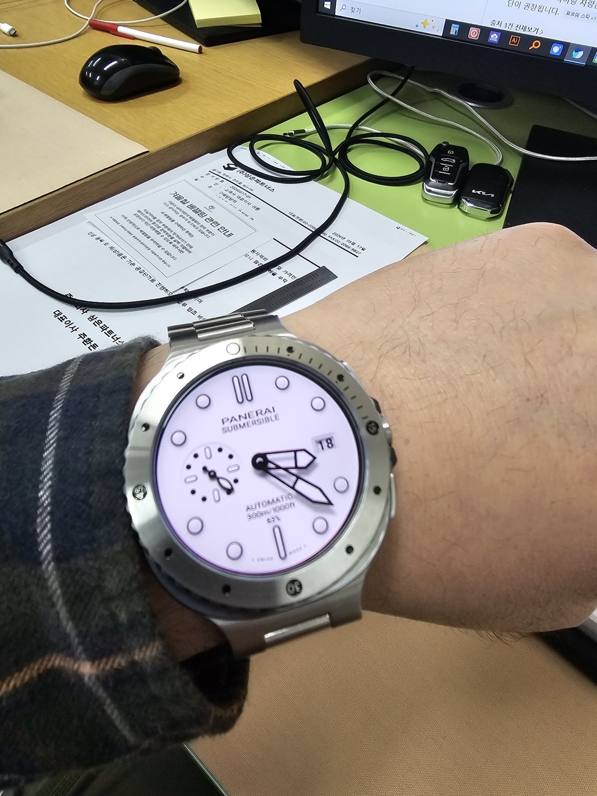
여러 형태로 착용하고자 추가 테이프와 이번엔 실버모델을 구입했습니다. 너무 멋져요~
교체해 쓰는 즐거움을 남긴 실버
베젤링은 한 번 정한 조합으로만 머물 필요가 없습니다. 밝은 다이얼과 실버 메탈 밴드에는 각인이 살아 있는 실버가 자연스럽고, 워치페이스나 옷차림을 바꾼 날에는 다른 표면과 색으로 전면의 분위기를 조절할 수 있습니다. 작은 원 하나를 바꿨을 뿐인데 손목 위에서 보이는 금속의 밀도와 다이얼의 크기가 달라집니다.
교체를 계획할 때는 새 점착 테이프를 준비하고 기존 테이프와 유분을 깨끗하게 제거합니다. 링을 비틀어 떼기보다 가장자리를 천천히 분리한 뒤 부착면을 정리해야 원형이 흐트러지지 않습니다. 새 테이프는 한쪽으로 치우치지 않게 붙이고, 링을 올리기 전에 모델과 방향을 다시 맞춥니다.
여러 스타일을 오가는 재미는 규격이 정확할 때 오래 이어집니다. 디스플레이 가장자리의 여백, 버튼과 링 사이의 거리, 손목을 움직일 때 느껴지는 높이까지 편안해야 베젤링의 디자인도 일상 속에서 자연스럽게 남습니다. 교체한 뒤에는 둘레를 다시 눌러 점착면이 고르게 밀착됐는지도 살펴봅니다.
한눈에는 비율, 가까이서는 마감
갤럭시워치의 전면은 작지만 그 안에서 화면, 케이스, 베젤링이 차지하는 비율은 분명합니다. 멀리서는 실버와 블랙이 만드는 원의 크기가 먼저 보이고, 가까이서는 각인의 깊이와 모서리의 반사, 안쪽 여백이 제품의 완성도를 좌우합니다. 얇은 링이 워치 전체의 인상을 바꾸는 이유도 이 두 거리에서 모두 자연스럽게 읽히기 때문입니다.
숫자와 눈금이 있는 베젤링은 단정한 아날로그 워치페이스와 호흡이 좋고, 플레인은 디지털 정보가 많은 화면에 여유를 남깁니다. 실버는 밝은 금속 연결을 만들며 블랙은 유리와 하나의 면처럼 이어집니다. 평소 자주 사용하는 화면과 옷차림을 떠올리면 색과 표면을 고르는 과정도 한결 선명해집니다.
정확한 모델과 사이즈를 고르고, 부착면을 깨끗하게 닦은 뒤, 상하 축과 좌우 간격을 맞추는 일이 먼저입니다. 사용 중에는 마른 극세사 천으로 표면을 관리하고 물이나 땀이 많이 닿은 날에는 링 가장자리에 수분이 오래 머물지 않도록 닦아 줍니다. 이런 작은 관리가 금속의 선과 점착 상태를 오래 깔끔하게 유지합니다.
Galaxy Watch Bezel Finish And Wrist Proportion
Words such as “clean” and “slim” appear frequently in Galaxy Watch bezel reviews, but they describe more than a general impression. When the inner circle follows the display evenly and the outside edge does not project too far beyond the case, the screen remains open while the watch gains a more definite outline. The first difference on the wrist is one of proportion rather than decoration.
At close range, the surface begins to matter. Polished planes return light smoothly, engraved sections break reflections into shorter lines, and dark metal connects with the black glass. From farther away, those details recede and the relative size of display, bezel and case becomes the stronger visual signal.
Silver leaves a bright boundary between case and band, whereas black holds the outer display area together as one surface. Engraved numerals can extend an analogue dial beyond the screen, while a plain ring gives a dense digital watch face more breathing room.
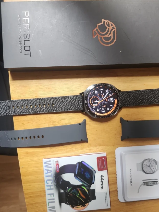
A PERSLOT bezel works within the narrow band around the front of the watch. Model, size, inner clearance and centring therefore matter as much as colour. A correctly fitted ring keeps the controls and sides open while refining the edge of the display without changing the original volume of the watch.
Silver Indices Extending Beyond The Dial
I like it. I am satisfied.
Silver indices around a black dial connect the hour markers on the screen with a physical scale outside it. Numerals and short lines follow the circle without intruding into the information area, so the display retains its depth while the perimeter gains the clarity of a conventional watch bezel. As the wrist turns, light reaches the narrow edge first and then reveals the quieter brushed surface.
With a metal bracelet, the amount of metal at the front and below the wrist feels continuous. Every surface does not need the same polish. Fine bezel markings, a softly curved case and broader bracelet links return light at different intensities, creating depth within one silver palette.
At close range, even inner clearance and a concentric outer circle determine how refined the result looks. Balanced spacing keeps the index from appearing tilted and lets the display and bezel read as one circle. A dry microfibre cloth is sufficient for routine care, including moisture that settles along the inside edge after active wear.
A Clear Metal Outline Above A Light Band
Delivery was fast, and it seems to suit the watch very well.
A light band reduces visual weight below the wrist, while a silver bezel gives the black display a definite perimeter. The contrast is clear, yet the narrow metal width prevents the front from feeling closed or heavy. Large numerals and hands remain spacious within the display, with only a bright outline added between case and band.
From directly above, the dial size remains the dominant feature. At an angle, the bezel height and case side become visible together. Keeping the ring restrained in both width and height reduces contact with sleeves and leaves edge gestures comfortable, a proportion that also works naturally with the simple surface of a sport band.
After fitting, alternate between an active display and a dark screen to check the inner spacing. A bright face makes the circular centre easier to compare, while a dark screen reveals whether the metal outline has an even thickness. Wiping dust and fingerprints along the circle preserves the clean contrast of the silver surface.
Black Indices Above A Leather Band
It looks clean, and I like how slim it is.
A black indexed bezel expands the dark watch face beyond the screen. Numerals and minute marks connect with hands and sub-dials, allowing the display and accessory to read as one dial rather than two separate parts.
The soft surface of leather does not repeat the crisp engraving of the bezel. Leather settles quietly below the wrist, while the metal markings catch small highlights at the front. The colour remains restrained, yet the contrast in texture prevents the combination from becoming flat.
Directional designs need a clear vertical axis before installation. Align twelve and six o’clock first, compare the inner clearance at three and nine, and press the circumference only after the ring is centred. This keeps the index scale from leaning away from the watch face.
Silver Engraving With A Light Band
I am satisfied and would recommend it.
A silver bezel above a light band makes the watch feel lighter without losing its centre. The engraved numerals contrast with the dark screen, while the outer metal surface becomes a natural middle tone between case and band. Even when the display is off, the scale preserves the outline of a circular dial.
Bright combinations reveal inner clearance and small marks easily. Cleaning away dust and oil before installation, then comparing the dark border on both sides of the display, prevents the silver ring from appearing heavier on one edge.
Black Plain Metal With Less Ornament
The bezel looks clean, and its slim thickness is excellent.
A black plain bezel refines the outside of the display without calling attention to itself. When a watch face already carries colour, weather data and multiple complications, leaving the ring unmarked prevents the front from becoming busier. It recedes while the screen is on and softens the transition between glass and case when the display turns dark.
Even beside a substantial metal bracelet, the upper part of the watch does not become overly heavy. The links already establish enough presence below the wrist, so a narrow black circle is sufficient at the front. A restrained finish also sits calmly beneath a shirt or knit cuff.
The advantage of a slim profile appears during ordinary movement. It projects less when the wrist bends and is less likely to catch on a sleeve. Unlike a full cover, it leaves the body sides visible and preserves the original proportions of the Galaxy Watch.
Silver That Can Return In A New Combination
I bought extra adhesive tape and chose the silver model this time so I could wear the watch in several different ways. It looks excellent.
A bezel does not have to remain in one combination. Engraved silver sits naturally between a bright dial and a metal band, while another surface or colour can change the density of the front when the watch face or clothing changes. Replacing one small circle alters both the apparent dial size and the amount of metal visible on the wrist.
When changing a bezel, use fresh adhesive tape and remove the previous tape and oil completely. Separate the ring gradually rather than twisting it, clean the mounting surface, centre the new tape and check the model and orientation once again before pressing the bezel into place.
The pleasure of changing styles lasts only when the fit remains accurate. Clearance around the display, distance from the controls and the height felt during wrist movement all need to remain comfortable for the design to settle naturally into daily use.
Proportion At A Glance, Finish Up Close
The front of a Galaxy Watch is compact, yet the relationship between screen, case and bezel is unmistakable. From a distance, the size of the silver or black circle comes first. Up close, engraving depth, edge reflection and inner clearance determine the level of finish. A narrow ring can change the whole watch because it remains coherent at both viewing distances.
Indexed designs work naturally with restrained analogue faces, while plain bezels leave room for digital screens filled with information. Silver creates a bright metal connection and black joins the glass as a single dark plane. Thinking about the display and clothing used most often makes the choice of colour and surface much clearer.
Choose the correct model and size, clean the mounting surface, and balance the vertical axis with the left-to-right clearance before applying pressure. For routine care, wipe the surface with a dry microfibre cloth and remove moisture from the edge after exercise or contact with water. These small habits preserve both the metal line and the adhesive condition.
추가 정보
마감과 비율을 함께 보는 방법
갤럭시워치 베젤링 후기는 가까운 거리의 마감과 손목 전체의 비율을 함께 볼 때 훨씬 유용합니다. 근접한 곳에서는 각인의 선명도, 표면의 결, 안쪽 원과 화면 사이의 간격을 살피고, 착용 상태에서는 링의 두께가 본체와 밴드 사이에서 과하지 않은지 봅니다.
플레인과 인덱스, 실버와 블랙은 같은 워치에서도 전혀 다른 역할을 맡습니다. 화면에 정보가 많다면 장식을 덜어낸 링이 편안하고, 단순한 아날로그 다이얼에는 숫자나 미닛 마커가 화면 밖의 시간 눈금으로 이어집니다.
- 안쪽 원과 디스플레이 사이의 검은 여백이 네 방향에서 고른지 살핍니다.
- 링의 바깥 원이 케이스보다 한쪽으로 튀어나오지 않아야 합니다.
- 각인이 있는 디자인은 12시와 6시 방향이 워치페이스의 축과 맞아야 합니다.
- 실버는 본체와 밴드 사이에 밝은 금속 연결을 만듭니다.
- 블랙은 화면과 이어져 전면의 면적을 작고 단단하게 정리합니다.
- 플레인은 정보가 많은 화면에 여백을 남기고 인덱스는 단순한 다이얼을 확장합니다.
- 부착 전에는 모델, 크기, 점착면의 청결 상태를 함께 확인합니다.
- 교체할 때는 새 점착 테이프를 사용하고 기존 잔여물을 완전히 제거합니다.
자주 묻는 질문
베젤링이 얇으면 보호 효과도 줄어드나요?
얇은 베젤링은 워치 전체를 감싸는 풀커버와 역할이 다릅니다. 화면 가장자리와 전면 외곽에 금속 경계를 더해 일상에서 자주 스치는 테두리를 받쳐 주면서, 측면과 버튼은 열어 두어 본체의 비율을 유지합니다.
플레인과 인덱스는 어떻게 고르나요?
컴플리케이션과 색상이 많은 디지털 워치페이스에는 플레인이 잘 어울립니다. 바늘과 큰 아워 마커가 중심인 단순한 다이얼에는 인덱스가 바깥 눈금을 이어 주어 시계다운 구조를 선명하게 만듭니다.
실버와 블랙 중 어떤 색이 더 자연스러운가요?
실버는 밝은 본체나 메탈 밴드와 연결되며 손목을 움직일 때 모서리의 반사가 또렷합니다. 블랙은 검은 유리와 어두운 워치페이스에 이어져 전면을 하나의 면처럼 정리합니다. 평소 사용하는 워치페이스와 본체 색을 함께 보는 편이 정확합니다.
부착 중심은 어떻게 맞추나요?
점착 보호지를 제거하기 전에 12시와 6시 방향을 먼저 맞추고, 3시와 9시의 안쪽 간격을 비교합니다. 화면을 끈 상태에서 네 방향의 검은 여백이 같은지 살핀 뒤 위치가 맞을 때 둘레를 고르게 눌러 줍니다.
보호필름과 함께 사용할 수 있나요?
퍼슬랏 베젤링에는 링의 내경에 맞춰 외경을 줄인 전용 보호필름을 사용합니다. 일반 시중 제품이나 삼성 스토어의 전면형 필름은 베젤링 없이 화면 전체를 덮는 규격이라 가장자리가 링 아래에 겹치거나 눌릴 수 있습니다.
베젤링을 교체할 때 점착 테이프를 다시 써도 되나요?
한 번 분리한 점착 테이프는 먼지와 유분이 묻고 형태가 늘어날 수 있어 새 테이프로 교체하는 편이 안정적입니다. 기존 잔여물을 깨끗하게 제거한 뒤 새 테이프를 한쪽으로 치우치지 않게 붙입니다.
부착 후 화면 가장자리 터치는 어떻게 점검하나요?
링을 붙인 뒤 상하좌우 가장자리에서 시작하는 스와이프와 자주 쓰는 제스처를 직접 실행합니다. 안쪽 원이 한쪽으로 치우쳐 손가락 동선을 방해하지 않는지, 보호필름 가장자리가 눌리지 않는지 함께 살핍니다.
금속 표면은 어떻게 관리하나요?
마른 극세사 천으로 원의 결을 따라 부드럽게 닦습니다. 물이나 땀이 많이 닿은 날에는 링 가장자리의 수분을 제거하고, 거친 연마제와 금속 도구는 각인과 표면 처리를 바꿀 수 있으므로 피합니다.
손목 위에서 달라지는 세부 차이
근접한 거리의 표면
유광 면은 넓고 부드러운 반사를 만들고, 각인과 모서리는 빛을 짧게 끊어 냅니다. 검은 표면은 손자국이 잘 보일 수 있고 밝은 실버는 작은 오염과 안쪽 간격이 눈에 띄므로, 색마다 관리할 지점도 조금씩 달라집니다.
착용 거리의 원형 비율
손목 전체에서는 각인 하나보다 화면과 링, 본체가 만드는 원의 크기가 먼저 보입니다. 베젤링이 너무 넓으면 화면이 작아 보이고, 지나치게 높으면 측면 부피가 커집니다. 안쪽 여백과 바깥 원이 고르게 맞을 때 워치의 원래 실루엣이 가장 자연스럽게 남습니다.
워치페이스와 바깥 눈금
인덱스 베젤링은 화면 안쪽의 바늘과 눈금이 같은 축을 사용할 때 연결감이 좋습니다. 플레인은 날씨, 운동, 일정처럼 정보가 많은 화면에 별도의 표시를 더하지 않아 디지털 워치페이스의 가독성을 유지합니다.
교체와 재부착
링을 떼어낼 때는 한쪽을 힘으로 비틀지 않고 가장자리를 천천히 분리합니다. 점착면을 정리한 뒤 새 테이프를 사용하고, 모델과 크기 및 방향을 다시 확인해야 여러 스타일을 바꿔 쓰면서도 원형과 부착 상태를 깔끔하게 유지할 수 있습니다.
모델별 베젤링의 크기와 디자인은 퍼슬랏 공식몰에서 구분할 수 있습니다. 다양한 손목 조합은 퍼슬랏 리뷰에서 이어서 볼 수 있으며, 부착 방향과 실제 움직임은 퍼슬랏 공식 유튜브의 영상으로 살펴볼 수 있습니다.