


손목 위에서 먼저 달라지는 금속 라인
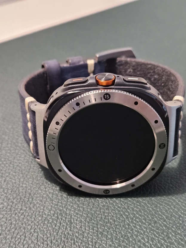
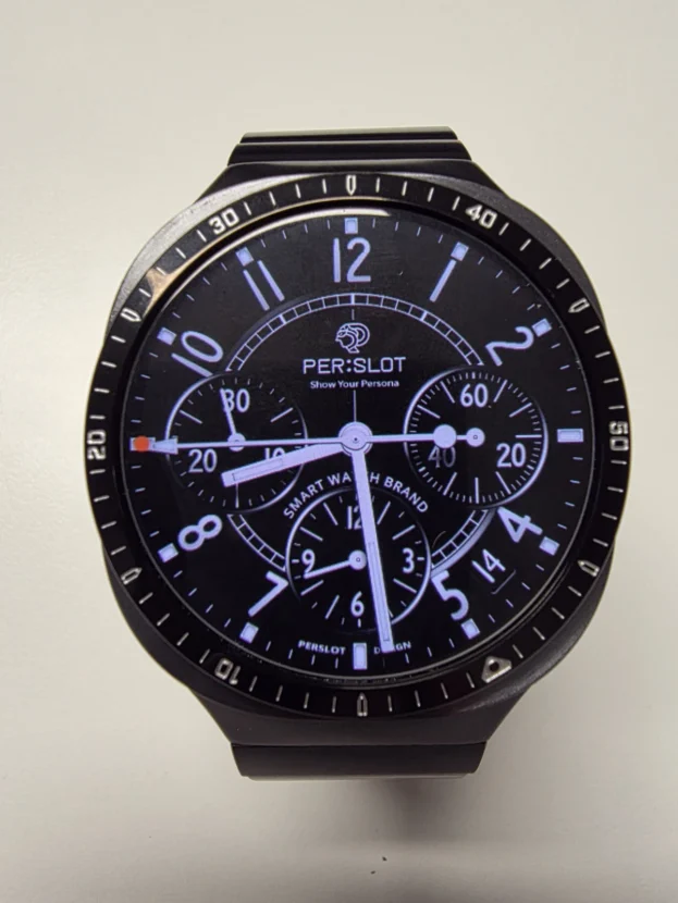
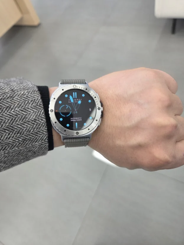
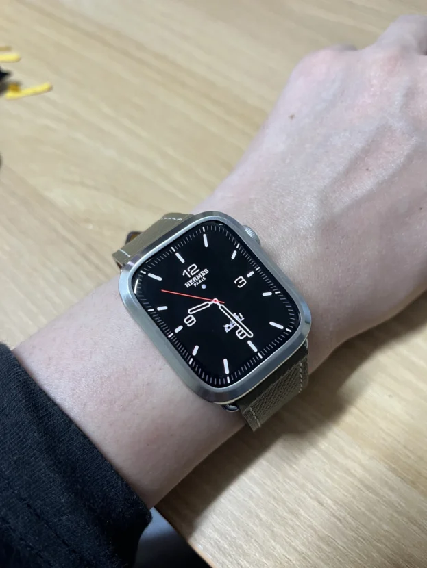
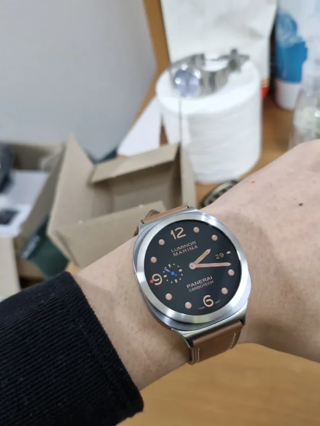
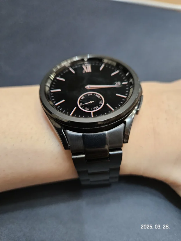
퍼슬랏 갤럭시워치 베젤링을 실제 착용 사진으로 보면 가장 먼저 들어오는 부분은 화면 가장자리의 금속 라인입니다. 갤럭시워치는 화면이 중심이 되는 기기지만, 손목 위에서는 바디 색상, 스트랩 소재, 다이얼 색감, 외곽선이 함께 보입니다. 베젤링은 그중에서도 가장 앞쪽에 놓이는 작은 테두리라 전체 인상을 빠르게 바꿉니다.
사진마다 확인되는 부분은 조금씩 다릅니다. 메탈 스트랩과 베젤링을 함께 맞췄을 때의 무게감, 베젤링을 붙이기 전후의 차이, 무광 베젤링의 차분한 보호감, 밀레니즈 스트랩 체결부의 맞물림, 순정처럼 이어지는 측면 핏, 패키지와 표면 마감, 필름과 베젤링 사이의 간격까지 실제 착용 사진 안에서 이어집니다.
리뷰 글에서 중요한 것은 멋있다는 감상만 남기는 일이 아닙니다. 어떤 부분이 잘 맞아 보이는지, 어디에서 고급스러움이 느껴지는지, 보호필름이나 강화유리와 함께 쓸 때 간격이 어떤지, 스트랩까지 바꿨을 때 워치 전체가 어떻게 달라지는지까지 이어서 보는 편이 훨씬 실용적입니다.

퍼슬랏 메탈 스트랩을 베젤링과 조합해서 꾸며보니 굵고 거친 손과 손목에도 무척 어울리고, 무엇보다 고급시계를 찬 것 같아서 대만족이네요. 포장 상태도 예쁘고 안전하게 공들인 느낌이라 좋았습니다.
메탈 스트랩과 베젤링의 첫인상
메탈 스트랩과 베젤링을 함께 맞추면 갤럭시워치의 인상은 꽤 크게 달라집니다. 화면 가장자리는 베젤링이 정리하고, 손목 아래로 이어지는 금속의 흐름은 메탈 스트랩이 만듭니다. 사진에서는 거친 손목이나 두꺼운 손목에서도 조합이 과하게 떠 보이지 않고, 시계다운 무게감으로 이어지는 편입니다.
이런 조합은 단순히 반짝이는 액세서리를 더한 느낌과 다릅니다. 베젤링이 전면의 원형 라인을 잡아주고, 스트랩이 러그 쪽에서 자연스럽게 이어지면 스마트워치 특유의 디지털 기기 느낌이 조금 낮아집니다. 셔츠나 재킷처럼 단정한 옷차림에서도 워치가 따로 노는 느낌이 줄어듭니다.

베젤링 한거랑 안한거랑 차이가 많이나요 고급스럽게 보이고 마감도 깔끔해요
베젤링 착용 전후의 차이
베젤링을 붙였을 때와 붙이지 않았을 때의 차이는 사진에서 바로 보입니다. 기본 상태의 갤럭시워치는 화면과 바디가 넓고 단순하게 이어지는 쪽이라 깔끔하지만, 때로는 밋밋하게 보일 수 있습니다. 베젤링이 올라가면 다이얼 주변에 물리적인 경계가 생기면서 워치페이스가 더 또렷하게 보입니다.
고급스럽게 보인다는 말도 이 지점에서 나옵니다. 베젤링 하나가 워치 전체를 완전히 다른 제품으로 바꾸지는 않지만, 화면 가장자리의 여백과 빛 반사를 정리하면서 시선이 머무는 지점을 바꿉니다. 매일 보는 워치라면 이 작은 차이가 생각보다 오래 남습니다.

무광 베젤링 고급져 보이고 좋아요. 베젤 모서리 보호도 되고 크게 보이지 않아 더 좋아요
무광 베젤링과 모서리 보호
무광 베젤링은 반짝임보다 차분한 금속 질감이 먼저 보이는 타입입니다. 화면 주변을 너무 화려하게 만들지 않으면서도 베젤 모서리에 금속 라인을 더해 워치가 단단하게 보입니다. 사진처럼 무광 톤은 밝은 바디에서도 튀지 않고, 어두운 워치페이스와도 무난하게 이어집니다.
모서리 보호에 대한 만족감도 실제 사용에서 자주 나오는 포인트입니다. 스마트워치는 문틀, 책상, 가방 지퍼처럼 예상하지 못한 곳에 부딪히는 일이 많습니다. 베젤링은 전체를 덮는 케이스처럼 두껍게 감싸는 방식은 아니지만, 전면 가장자리의 노출을 줄여주는 작은 보호선 역할을 합니다.

결과부터 말씀드리자면 삼성 정품보다 좋습니다. 리뷰 사진에서 손가락으로 가리키고 있는 부분이 삼성 정품 밀레니즈 실버 스트랩인데, 퀄리티는 둘째치고 체결감부터 차이가 느껴집니다. 워치 본체와 맞물리는 부분이 안정적이고 실버 톤도 자연스럽게 이어집니다.
밀레니즈 스트랩 체결부와 착용감
밀레니즈 스트랩은 보기에는 단순한 메쉬 구조처럼 보여도 실제 만족도는 체결부에서 많이 갈립니다. 워치 본체와 연결되는 부분이 헐겁거나 각이 맞지 않으면 손목 위에서 미세하게 흔들리고, 착용할 때마다 작은 불편함이 쌓입니다. 사진 속 체결부는 러그 주변에서 크게 벌어지지 않고 바디와 가까운 위치를 잡고 있습니다.
리뷰에서 체결감과 퀄리티를 함께 말하는 이유도 여기에 있습니다. 밀레니즈 스트랩은 가볍고 유연해야 하지만, 연결부까지 약해 보이면 전체가 저렴하게 느껴질 수 있습니다. 퍼슬랏 밀레니즈 스트랩은 손목을 감는 메쉬의 부드러움과 워치에 연결되는 금속 부품의 안정감이 같이 보여야 장점이 살아납니다.

마치 순정처럼 옆면까지 딱 맞는 베젤링이네요. 일체감 최곱니다. 왜 이제서야 찾아졌을까 싶을 정도로 만족합니다
순정처럼 맞는 측면 핏
베젤링은 정면보다 측면에서 차이가 더 잘 보일 때가 많습니다. 앞에서 볼 때는 원형 라인의 디자인이 먼저 보이지만, 옆에서 보면 바디와 베젤링 사이의 높이, 들뜸, 외곽선이 한 번에 드러납니다. 사진 속 조합은 옆면까지 본체와 가깝게 맞아 순정 부품처럼 보인다는 평가가 자연스럽게 이어집니다.
일체감이 좋다는 말은 색만 맞는다는 뜻이 아닙니다. 바디의 곡선, 베젤링의 외경, 버튼 주변 간섭, 손목 위에서 보이는 두께가 함께 맞아야 합니다. 특히 갤럭시워치처럼 원형 바디를 가진 모델은 작은 단차도 눈에 들어오기 때문에, 측면 핏은 구매 전 꼭 살펴볼 만한 부분입니다.

제품 퀄리티와 제품포장까지 신경 썼다는 것이 느껴집니다. 메탈 스트랩 재질과 마감이 정말 좋습니다. 저렴한 제품을 쓰면 워치 본체에 스크래치가 생기거나 오래 쓰면서 표면이 거칠어지는 경우가 있는데, 퍼슬랏은 그런 부분에서 훨씬 믿음이 갑니다.
패키지와 표면 마감
메탈 스트랩은 손목에 닿는 면이 넓기 때문에 표면 마감의 차이가 빨리 느껴집니다. 패키지 안에 놓인 스트랩 사진에서는 링크의 평면과 모서리, 표면 반사가 먼저 보입니다. 지나치게 번쩍이는 느낌보다 정돈된 금속 톤으로 보일 때 실제 착용에서도 안정적인 인상을 줍니다.
제품 포장까지 신경 썼다는 후기는 작은 부분 같지만, 처음 제품을 꺼내는 순간의 신뢰와 연결됩니다. 워치 액세서리는 크기가 작아도 정밀하게 맞아야 하는 제품입니다. 패키지, 표면 마감, 체결 구조가 함께 깔끔하게 느껴질수록 손목 위에서의 기대감도 자연스럽게 올라갑니다.

깔끔하고 이쁩니다 스와핑 터치도 베젤링 없을 때보다 잘되네요 필름이랑 크기도 잘 맞아요
필름 간격과 터치 영역
베젤링과 필름을 함께 사용할 때는 화면 가장자리의 간격을 꼭 봐야 합니다. 필름이 너무 바깥쪽까지 올라오면 베젤링과 겹쳐 보일 수 있고, 반대로 너무 안쪽에 있으면 가장자리 여백이 어색하게 남습니다. 사진 속 조합은 필름과 베젤링이 서로 방해하지 않고 화면 외곽을 정리하는 방향에 가깝습니다.
스와이프 터치가 오히려 편하게 느껴졌다는 반응도 흥미로운 지점입니다. 베젤링이 화면 주변에 얇은 경계를 만들어주면 손가락이 화면 끝을 잡는 감각이 달라질 수 있습니다. 모든 사용자에게 같은 느낌으로 적용되지는 않겠지만, 화면 가장자리 조작이 많은 사용자라면 충분히 눈여겨볼 만한 부분입니다.
사진이 남긴 균형감
실제 착용 사진을 이어서 보면 공통적으로 남는 것은 균형감입니다. 베젤링은 화면을 더 크게 꾸미는 부품이라기보다, 워치의 얼굴을 정리하는 금속 라인에 가깝습니다. 스트랩은 그 분위기를 손목 아래까지 이어주고, 필름이나 강화유리는 실제 사용에서 필요한 보호감을 더합니다.
메탈 스트랩과 맞췄을 때는 시계다운 무게감이 살아나고, 밀레니즈 스트랩과 맞췄을 때는 조금 더 가볍고 섬세한 분위기가 남습니다. 무광 베젤링은 차분한 보호감을 주고, 유광이나 실버 계열 베젤링은 워치페이스 주변의 선명함을 더합니다. 같은 갤럭시워치라도 어떤 조합을 선택하느냐에 따라 손목 위의 느낌은 꽤 달라집니다.
퍼슬랏 갤럭시워치 베젤링을 고를 때는 모델과 사이즈만 맞추는 데서 끝내지 않는 편이 좋습니다. 내가 자주 쓰는 스트랩, 워치 바디 색상, 필름 사용 여부, 선호하는 워치페이스까지 함께 보면 실제 착용 후 만족도가 훨씬 안정적입니다. 사진 속 리뷰들이 보여주는 것도 결국 그 작은 조합의 차이입니다.
The Metal Line That Changes The Wrist
When a PERSLOT Galaxy Watch bezel is seen through actual wrist photos, the first change appears around the edge of the display. A Galaxy Watch is built around the screen, but on the wrist the body color, strap material, dial tone and outer line are seen together. The bezel sits at the very front of that visual structure, so even a small metal ring can change the whole impression quickly.
The selected photos show several useful points: a metal strap and bezel worn together, the difference before and after adding a bezel, the calmer feel of a matte bezel, the connector quality of a Milanese strap, side fit that looks close to an original part, packaging and surface finish, and the spacing between a film and the bezel edge.
The purpose of this review article is not to repeat that the products look good. The useful part is more specific: where the fit feels clean, where the premium impression comes from, how the bezel works with a glass protector, and how the watch changes when the strap and bezel are considered together.
Metal Strap And Bezel First Impression
The PERSLOT metal strap and bezel combination suits even a thick wrist and hand, and it feels like wearing a premium watch. The packaging also feels neat, secure, and carefully prepared.
When a metal strap and bezel are matched together, the Galaxy Watch changes quite noticeably. The bezel organizes the circular front line, while the metal strap continues that metal mood down the wrist. In the photo, the combination does not look overly decorative. It gives the watch a more grounded and watch-like weight.
This is different from simply adding a shiny accessory. The front ring defines the dial, and the strap connects naturally from the lugs. When both parts move in the same visual direction, the smartwatch feels less like a device and more like an object that can sit comfortably with shirts or jackets.
Before And After The Bezel
There is a big difference between wearing the bezel and not wearing it. It looks more premium, and the finish is clean.
The difference before and after adding a bezel is easy to read from the photo. Without a bezel, the Galaxy Watch has a simple and clean front, but it can also look a little plain. Once the bezel is attached, a physical boundary appears around the dial and the watch face becomes more defined.
The premium impression comes from this small change. A bezel does not turn the watch into a completely different product, but it changes where the eye rests. It organizes the edge of the screen and the way light reflects around the display, which is why the difference remains visible in daily use.
Matte Bezel And Edge Protection
The matte bezel looks premium and good. It also protects the bezel edge, and I like that it does not make the watch look too large.
A matte bezel gives a calmer metal impression than a glossy one. It does not make the front too bright, but it still adds a firm line around the watch face. In the photo, the matte tone works with the watch body without making the case look heavy.
The comment about edge protection is practical. A smartwatch often touches desks, doors, bags and sleeves. A bezel is not a full cover case, but it can reduce the exposed feeling of the front edge while keeping the overall shape slimmer than a bulky case.
Milanese Strap Connector And Wearing Feel
To put it simply, it feels better than the Samsung original. In the photo, the Samsung original Milanese strap is shown for comparison, and the difference is most noticeable around the connector. The fit feels steadier, and the silver tone connects more naturally with the watch body.
A Milanese strap may look simple from a distance, but the satisfaction often comes from the connector. If the part that meets the watch body feels loose or awkward, the strap can move slightly and the wearing experience becomes less stable. In the photo, the connector sits close to the body and does not appear visually weak.
A Milanese strap should feel light and flexible, but the metal connection should still feel precise. That balance is important because the strap touches the wrist all day while the connector decides how the whole strap begins from the watch body.
Side Fit Close To The Original Shape
It fits the side almost like an original part. The integrated feel is excellent. I am so satisfied that I wonder why I only found it now.
A bezel often reveals its quality more clearly from the side than from the front. From the front, the design of the ring is most visible. From the side, the height, lift, edge line and connection with the case become much easier to judge.
Good integrated fit does not only mean the color matches. The curve of the case, outer diameter of the bezel, button clearance and visible thickness all need to work together. On a round Galaxy Watch, even a small step around the edge can stand out, so the side view is worth checking carefully.
Packaging And Surface Finish
The product quality and packaging feel carefully prepared. The metal strap material and finish are excellent. Compared with cheaper alternatives, the surface and connector area feel more reliable for daily use.
A metal strap has a large contact area on the wrist, so surface finish is felt quickly. In the package photo, the flat surfaces, link edges and light reflection are visible before the strap is even worn. A clean metal tone often makes the product feel more stable than an overly shiny finish.
Packaging may seem like a small point, but it affects the first moment of trust. Watch accessories are small, yet they require precise fit. When the package, surface finish and fastening structure all feel considered, the expectation for the actual wearing experience naturally rises.
Film Spacing And Touch Area
It is clean and pretty. Swiping touch feels better than when there was no bezel, and the size matches well with the film.
When a bezel and screen film are used together, the spacing around the display edge matters. If the film reaches too far outward, it can visually fight with the bezel. If it sits too far inward, the blank gap around the edge may feel awkward.
The comment about swipe touch is also interesting. A slim bezel can create a tactile boundary around the display edge, which may change how the fingertip finds the edge of the screen. It will not feel identical for every user, but it is a detail worth noticing for people who often use edge gestures.
The Balance Left In The Photos
The common impression across these photos is balance. The bezel does not simply make the watch bigger or louder. It organizes the face of the watch. The strap carries that mood around the wrist, and the film or glass protector adds the protection needed for daily use.
With a metal strap, the watch gains a stronger watch-like weight. With a Milanese strap, the mood becomes lighter and more refined. A matte bezel gives calmer protection, while a silver or polished bezel brings more clarity around the dial. The same Galaxy Watch can feel quite different depending on the combination.
When choosing a PERSLOT Galaxy Watch bezel, model and size are only the starting point. The strap you wear most often, the watch body color, whether you use a screen film, and the watch faces you prefer all affect the final impression. That is the practical value these customer photos leave behind.
추가 정보
착용 사진으로 볼 부분
퍼슬랏 갤럭시워치 베젤링은 제품 단독 이미지보다 실제 손목 사진에서 확인할 수 있는 정보가 많습니다. 화면 가장자리 간격, 필름과의 여유, 스트랩 색상과의 연결감, 측면에서 보이는 두께, 워치페이스와의 분위기를 함께 보는 편이 좋습니다.
이 글의 사진들은 메탈 스트랩, 밀레니즈 스트랩, 무광 베젤링, 필름 조합처럼 서로 다른 상황을 보여줍니다. 같은 베젤링이라도 어떤 스트랩과 맞추는지에 따라 시계다운 무게감이 강해지기도 하고, 더 가볍고 섬세한 인상으로 보이기도 합니다.
구매 전 같이 보면 좋은 항목
- 사용 중인 갤럭시워치 모델과 사이즈가 제품 옵션과 맞는지 확인합니다.
- 필름이나 강화유리를 함께 쓰는 경우 베젤링 안쪽 간격을 같이 봅니다.
- 메탈 스트랩과 맞출 때는 바디 색상과 베젤링 색상이 자연스럽게 이어지는지 살펴봅니다.
- 밀레니즈 스트랩에는 너무 두꺼운 링보다 전면을 얇게 정리하는 타입이 잘 맞을 수 있습니다.
- 무광 베젤링은 차분한 보호감을, 유광 계열은 화면 주변의 선명한 금속감을 더합니다.
- 측면 사진에서는 들뜸, 높이, 버튼 주변 간섭, 손목 위 두께감을 확인할 수 있습니다.
자주 묻는 질문
베젤링을 붙이면 갤럭시워치가 많이 커 보이나요?
제품 타입과 색상에 따라 다르지만, 얇은 베젤링은 워치를 크게 키우기보다 화면 외곽을 정리하는 쪽에 가깝습니다. 무광 계열은 더 차분하게 보이고, 유광 실버 계열은 금속 라인이 조금 더 선명하게 드러납니다.
메탈 스트랩과 베젤링을 같이 맞추는 이유가 있나요?
베젤링은 전면을 정리하고 메탈 스트랩은 손목 아래까지 금속 톤을 이어줍니다. 두 파츠의 색상과 마감 방향이 맞으면 갤럭시워치가 더 작은 시계 오브제처럼 보입니다.
강화유리나 필름을 같이 쓰면 무엇을 봐야 하나요?
화면 가장자리에서 필름과 베젤링이 서로 겹쳐 보이지 않는지 확인하는 편이 좋습니다. 터치 영역이 답답하지 않고, 안쪽 여백이 균일하게 남는 조합이 더 깔끔하게 보입니다.
무광 베젤링은 어떤 사용자에게 잘 맞나요?
반짝임보다 차분한 금속 질감을 선호하거나, 베젤 모서리 보호감을 원하면서도 워치를 크게 보이게 만들고 싶지 않은 사용자에게 잘 맞습니다. 어두운 워치페이스와도 자연스럽게 이어집니다.
밀레니즈 스트랩에는 어떤 베젤링이 자연스럽나요?
밀레니즈 스트랩은 메쉬 질감이 가볍고 섬세하기 때문에 너무 두꺼운 베젤보다 얇게 전면을 잡아주는 타입이 자연스럽습니다. 실버 바디나 밝은 워치페이스와 맞추면 전체가 더 부드럽게 보입니다.
측면 핏은 왜 중요하나요?
정면에서는 디자인이 먼저 보이지만, 측면에서는 베젤링의 높이와 들뜸이 바로 보입니다. 바디 곡선과 베젤링 외경이 맞아야 순정처럼 이어지는 느낌이 살아납니다.