


퍼슬랏 베젤링 실사용기, 플레인부터 블랙 인덱스까지
퍼슬랏 베젤링 실사용기는 하나의 갤럭시워치가 플레인 실버, 숫자 인덱스, 블랙 베젤을 만났을 때 얼마나 다른 표정을 갖는지 보여줍니다. 폭이 좁은 금속 링이지만 화면과 케이스가 만나는 경계를 또렷하게 잡기 때문에, 워치페이스를 바꾸는 것과는 다른 방식으로 손목 위 인상을 정리합니다.
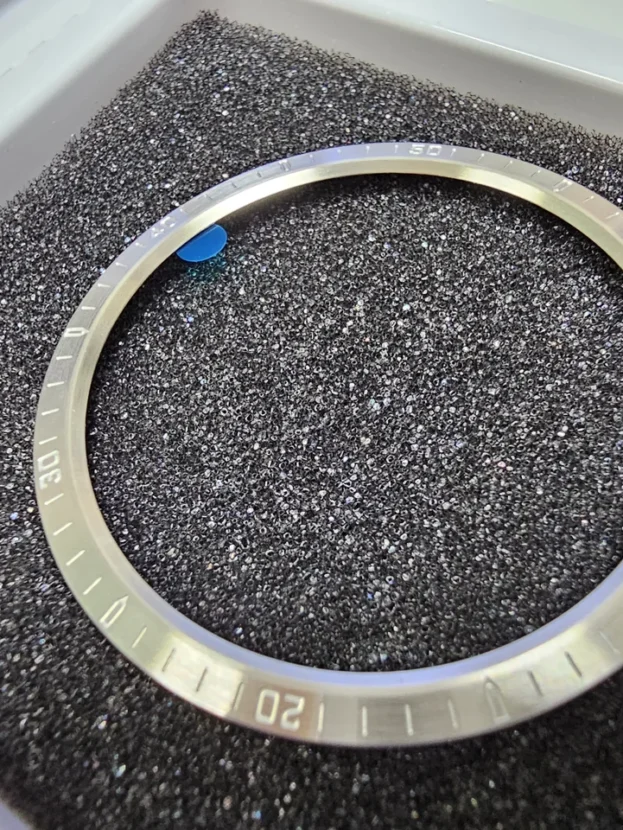
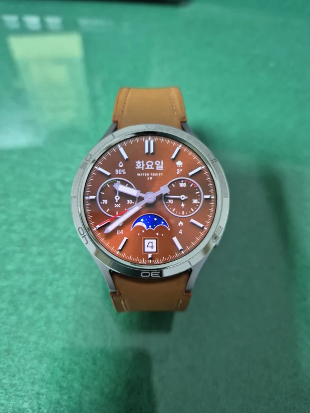
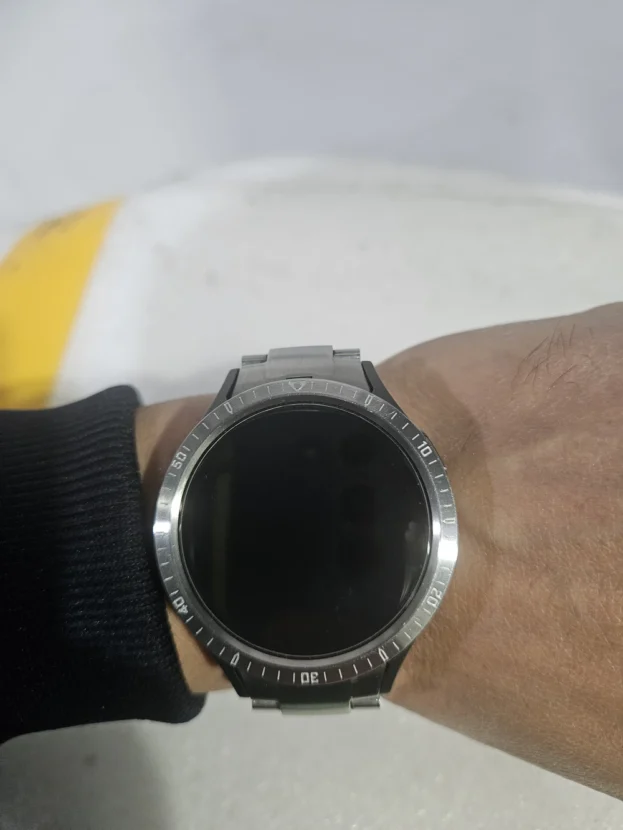
플레인 베젤링은 장식을 덜어낸 대신 표면의 결, 모서리와 원형 비율이 선명하게 남습니다. 숫자와 미닛 마커가 있는 인덱스 베젤링은 화면 안의 시곗바늘과 정보를 바깥쪽 금속 눈금으로 이어 줍니다. 실버는 케이스와 밴드 사이에 밝은 금속선을 만들고, 블랙은 검은 디스플레이와 맞닿으며 다이얼의 면적을 넓어 보이게 합니다.
화면이 켜진 순간과 꺼진 뒤의 차이
화면을 켰을 때는 워치페이스의 정보량과 베젤 각인의 밀도가 먼저 눈에 들어옵니다. 반대로 화면이 꺼지면 색상보다 링의 폭, 측면 높이와 표면 반사가 더 분명해집니다. 출근길 셔츠 소매 아래에서 보이는 얇은 외곽선과 주말의 가벼운 차림에서 드러나는 금속 질감도 서로 다른 선택 기준이 됩니다.
매일 착용하는 액세서리인 만큼 모델과 사이즈, 안쪽 원의 간격, 화면 끝 터치 영역도 디자인과 함께 살펴야 합니다. 퍼슬랏 베젤링은 워치 본체의 실루엣을 가리지 않으면서 디스플레이 가장자리와 전면 외곽선을 정돈하는 부품입니다. 정확히 맞춘 작은 원 하나가 시계 전체를 바꾸는 이유가 여기에 있습니다.
배송도 빠르고 아주 깔끔합니다
화면이 꺼진 뒤 더 또렷해지는 플레인 실버
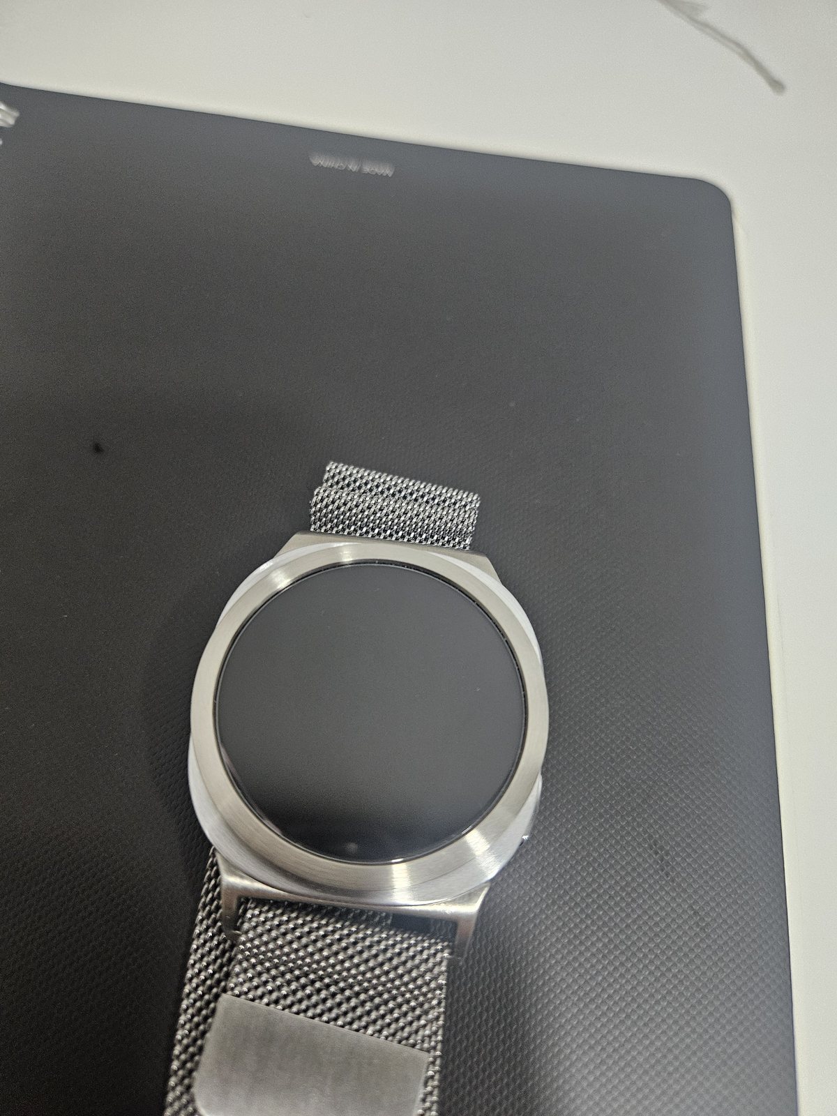
디스플레이가 검게 잠들면 플레인 실버 베젤링의 역할이 선명해집니다. 문자나 장식이 없는 표면은 화면과 경쟁하지 않고, 검은 원 둘레에 가느다란 금속 경계를 남깁니다. 은은한 브러시드 결은 빛을 한꺼번에 반사하지 않아 실버 특유의 밝기를 차분하게 낮추며, 원형 워치의 기본 실루엣을 깨끗하게 살립니다.
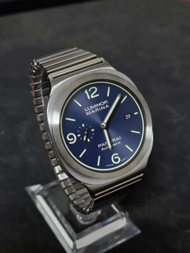
함께 보이는 메쉬 밴드는 촘촘한 금속 결로 손목 아래를 유연하게 이어 갑니다. 베젤링의 단단한 원과 밴드의 부드러운 망 구조가 대비되면서도 같은 실버 계열 안에서 자연스럽게 연결됩니다. 밴드의 소유 브랜드와 관계없이 소재의 밀도와 색온도를 맞추면 전면과 손목 아래가 따로 보이지 않습니다.
화면이 꺼진 상태에서는 먼지나 지문도 더 쉽게 드러납니다. 마른 극세사 천으로 원을 따라 가볍게 닦아 주면 표면의 결이 흐려지지 않고, 디스플레이와 금속 사이의 깨끗한 대비도 오래 유지됩니다.
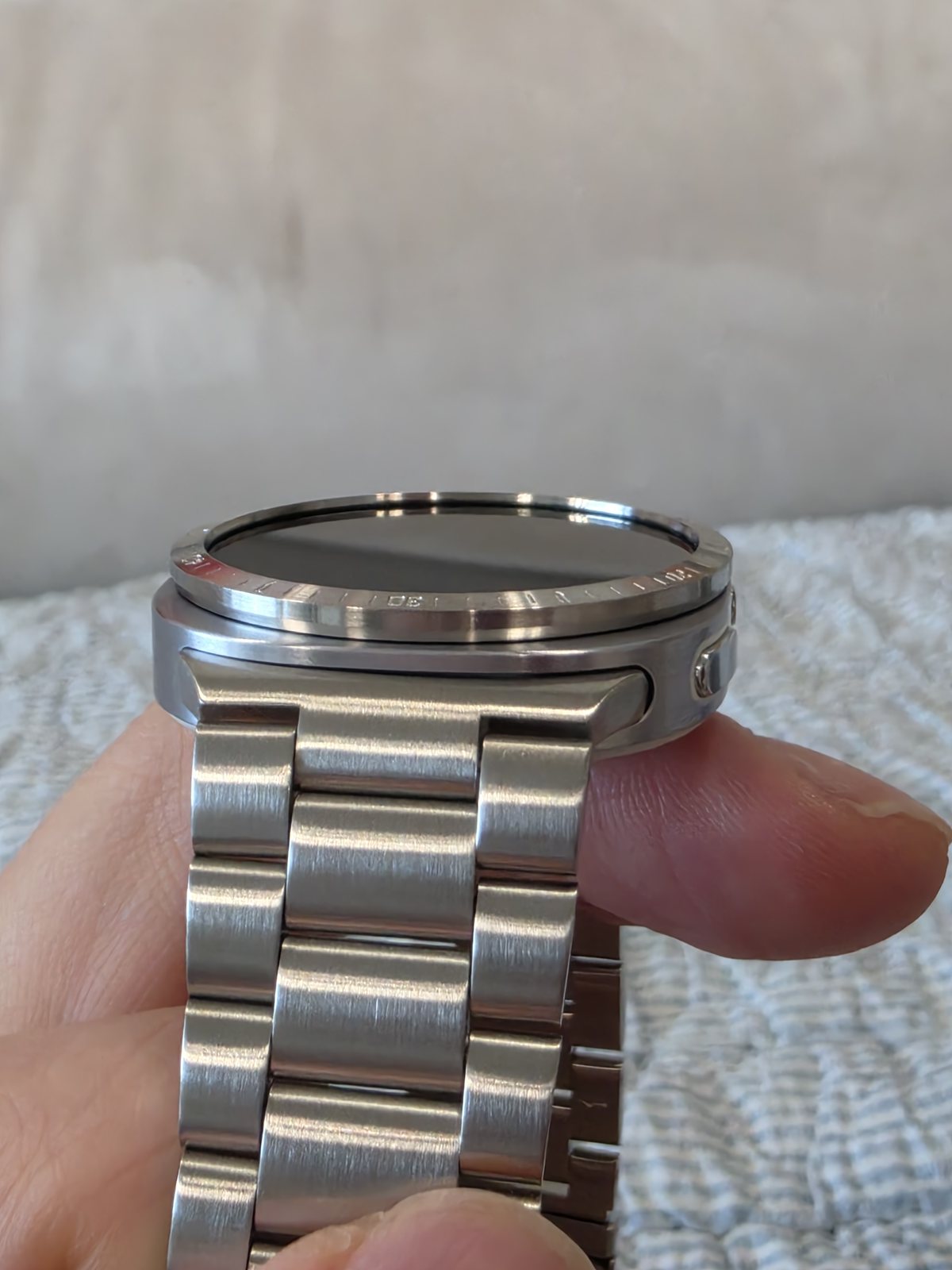
심플하고 너무 이쁘네요👍 페이스도 잘 쓸께요👍👍👍.
측면에서 읽히는 얇은 높이와 모서리
정면에서는 베젤링의 디자인이 먼저 보이지만, 실제 착용감은 측면에서 결정되는 부분이 많습니다. 링이 케이스 위로 과하게 솟지 않고 모서리가 완만하게 정리되면 셔츠나 니트 소매가 지날 때 걸리는 느낌이 줄어듭니다. 얇은 측면은 워치 본체의 두께를 불필요하게 키우지 않으면서 전면 가장자리에 필요한 금속선만 남깁니다.
비스듬한 각도에서는 케이스, 베젤링과 디스플레이가 층을 이루는 방식도 드러납니다. 안쪽 원이 화면을 침범하지 않고 바깥쪽 모서리가 본체보다 지나치게 벌어지지 않아야 전체가 한 부품처럼 보입니다. 손가락을 화면 끝에서 안쪽으로 움직였을 때 터치 동선이 답답하지 않은지도 함께 확인할 부분입니다.
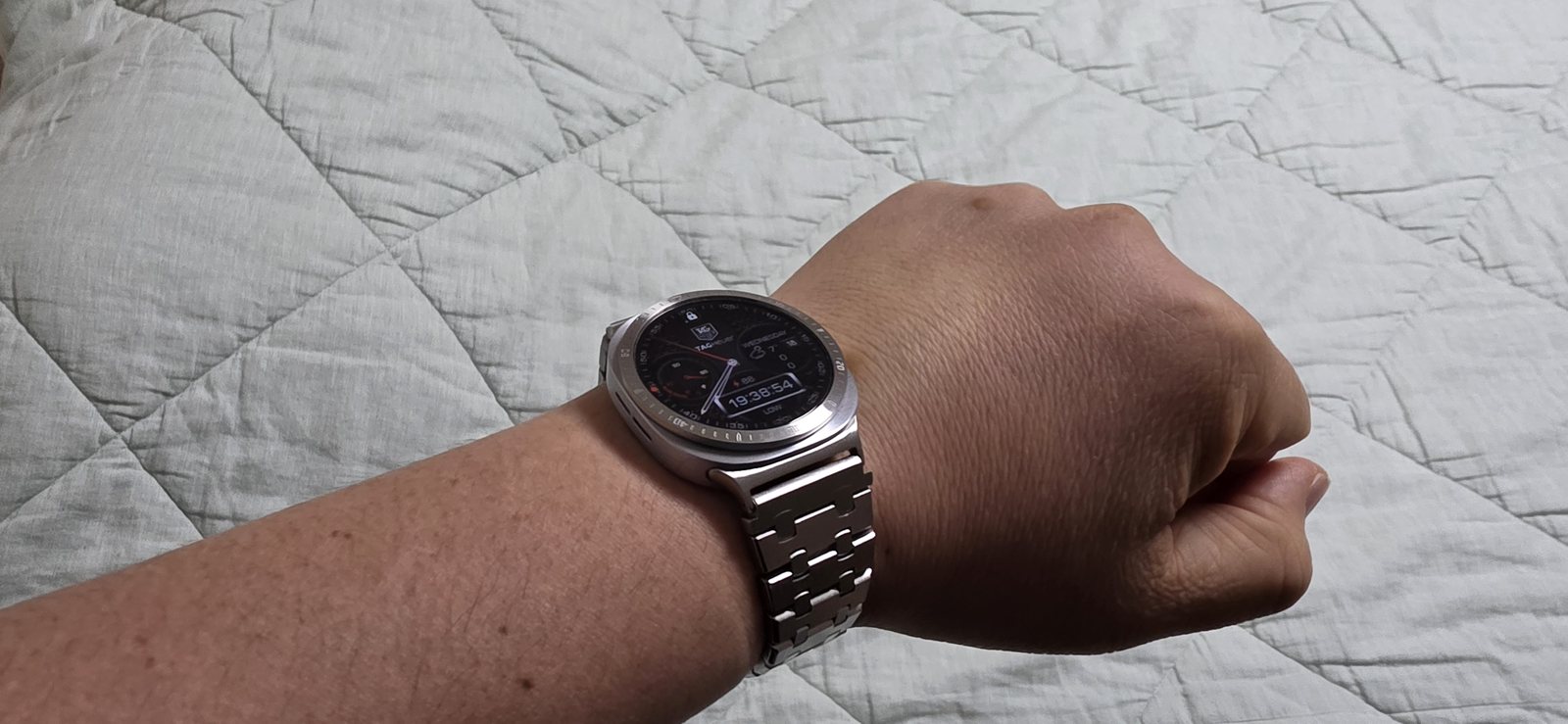
디자인이 너무 맘에 들고 다른 시계가 된것같아요. 후회없는 선택이였습니다.
메탈 브레이슬릿과 이어지는 단정한 전면
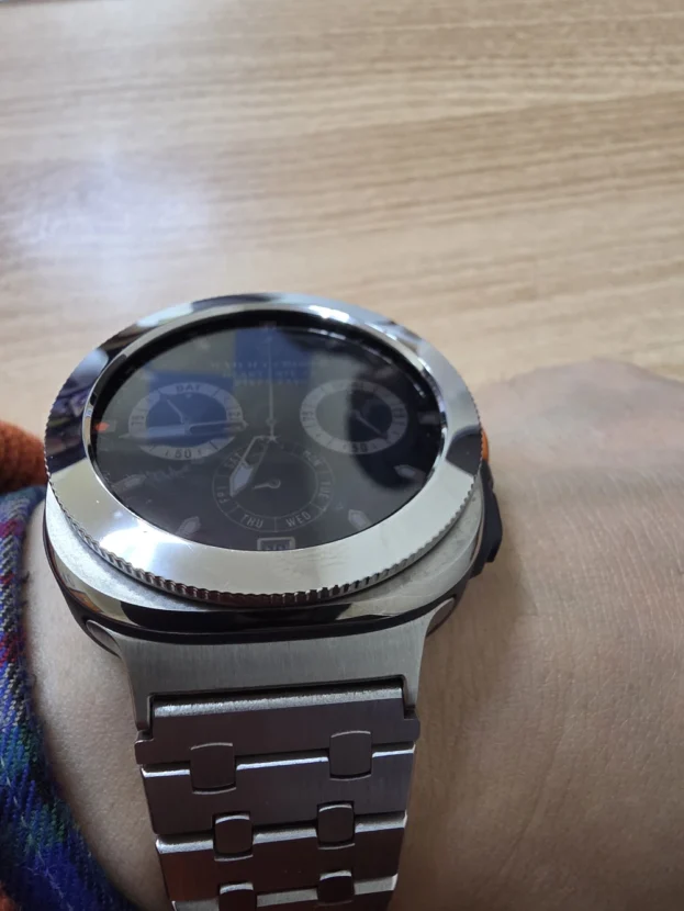
실버 베젤링과 메탈 브레이슬릿을 함께 착용하면 손목 위의 금속 면이 위아래로 이어집니다. 베젤링은 디스플레이를 감싸는 좁은 원으로 남고, 브레이슬릿은 링크마다 넓고 좁은 면을 반복하며 손목 아래로 내려갑니다. 같은 색이지만 반사되는 면적과 방향이 달라 단조롭지 않고, 워치 본체가 두 금속 요소 사이의 중심을 잡습니다.
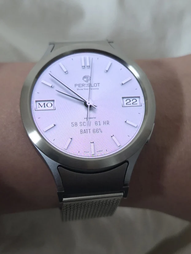
이 조합에서는 워치페이스의 색도 중요합니다. 어두운 다이얼은 실버 외곽선을 또렷하게 만들고, 밝은 다이얼은 케이스와 베젤링을 하나의 넓은 테두리처럼 보이게 합니다. 평소 사용하는 화면의 명암을 기준으로 고르면 손목에 올렸을 때 예상한 비율에 더 가깝게 맞출 수 있습니다.
금속 밴드가 묵직하게 느껴지는 날에는 화면 안의 정보량을 줄여 보는 것도 좋습니다. 단순한 바늘과 인덱스만 남긴 워치페이스는 베젤링의 마감과 브레이슬릿의 링크 구조 사이에 여백을 만들며, 셔츠와 재킷에도 자연스럽게 어울리는 단정한 시계 인상을 완성합니다.
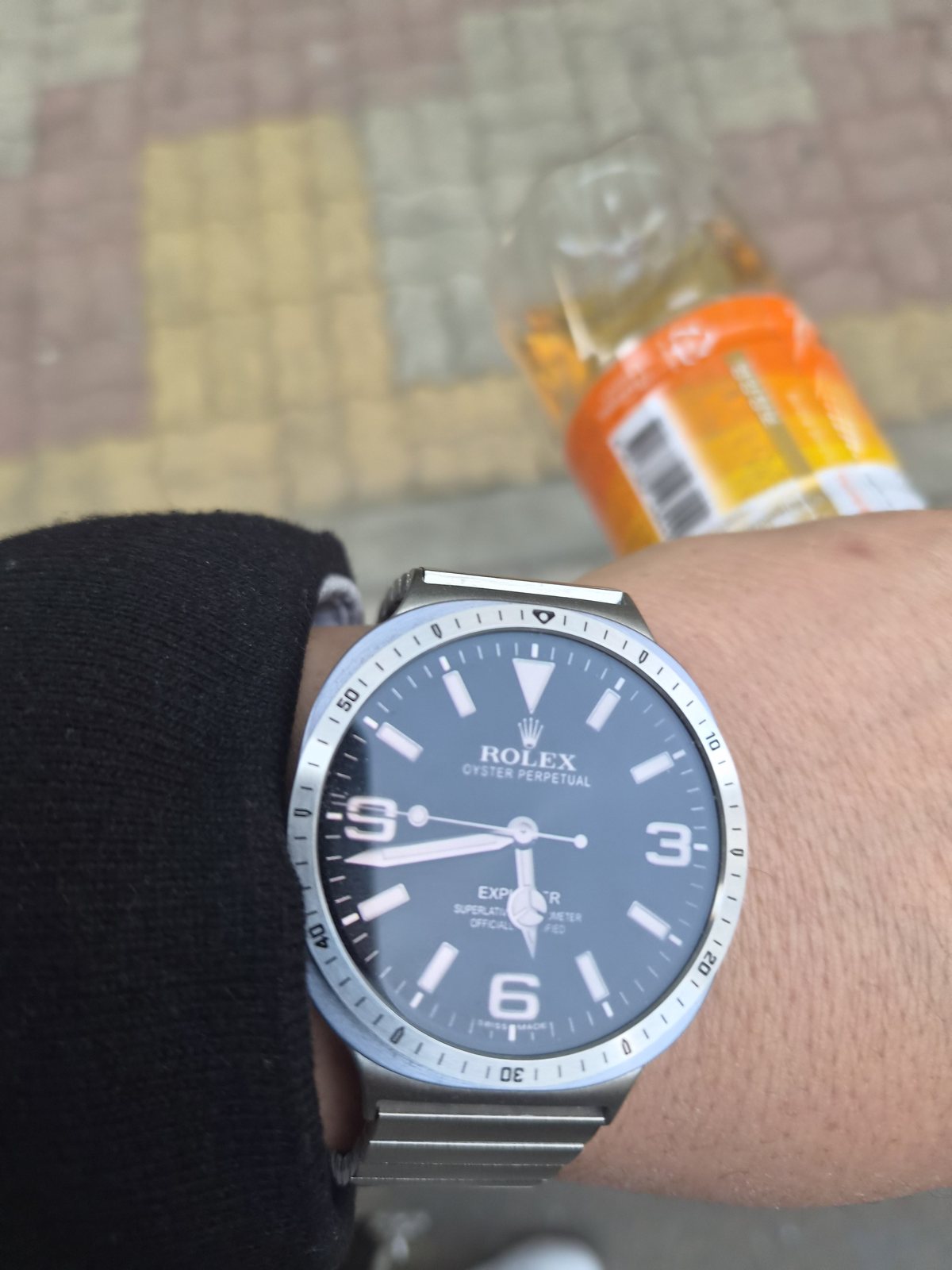
알리에서 살까 고민하다가 샀는데 잘선택한거 같아요
워치페이스 바깥으로 이어지는 숫자 인덱스
숫자 인덱스 베젤링은 디지털 화면 바깥에 물리적인 시간 눈금을 더합니다. 아날로그 스타일 워치페이스와 맞추면 화면 속 시곗바늘, 분 표시와 금속 위 숫자가 한 다이얼 안에서 이어집니다. 화면이 바뀌어도 바깥 인덱스는 그대로 남기 때문에, 갤럭시워치의 디지털 기능 위에 전통적인 시계 구성을 겹쳐 볼 수 있습니다.
숫자의 방향이 있는 디자인은 부착 위치가 조금만 틀어져도 곧바로 눈에 들어옵니다. 위아래와 좌우의 여백을 번갈아 살피고, 워치페이스의 중심선과 금속 인덱스가 수평과 수직으로 안정적으로 맞을 때 둘레를 눌러 고정합니다. 한 번에 강하게 누르기보다 위치를 충분히 확인한 뒤 압착하는 편이 마감이 깔끔합니다.
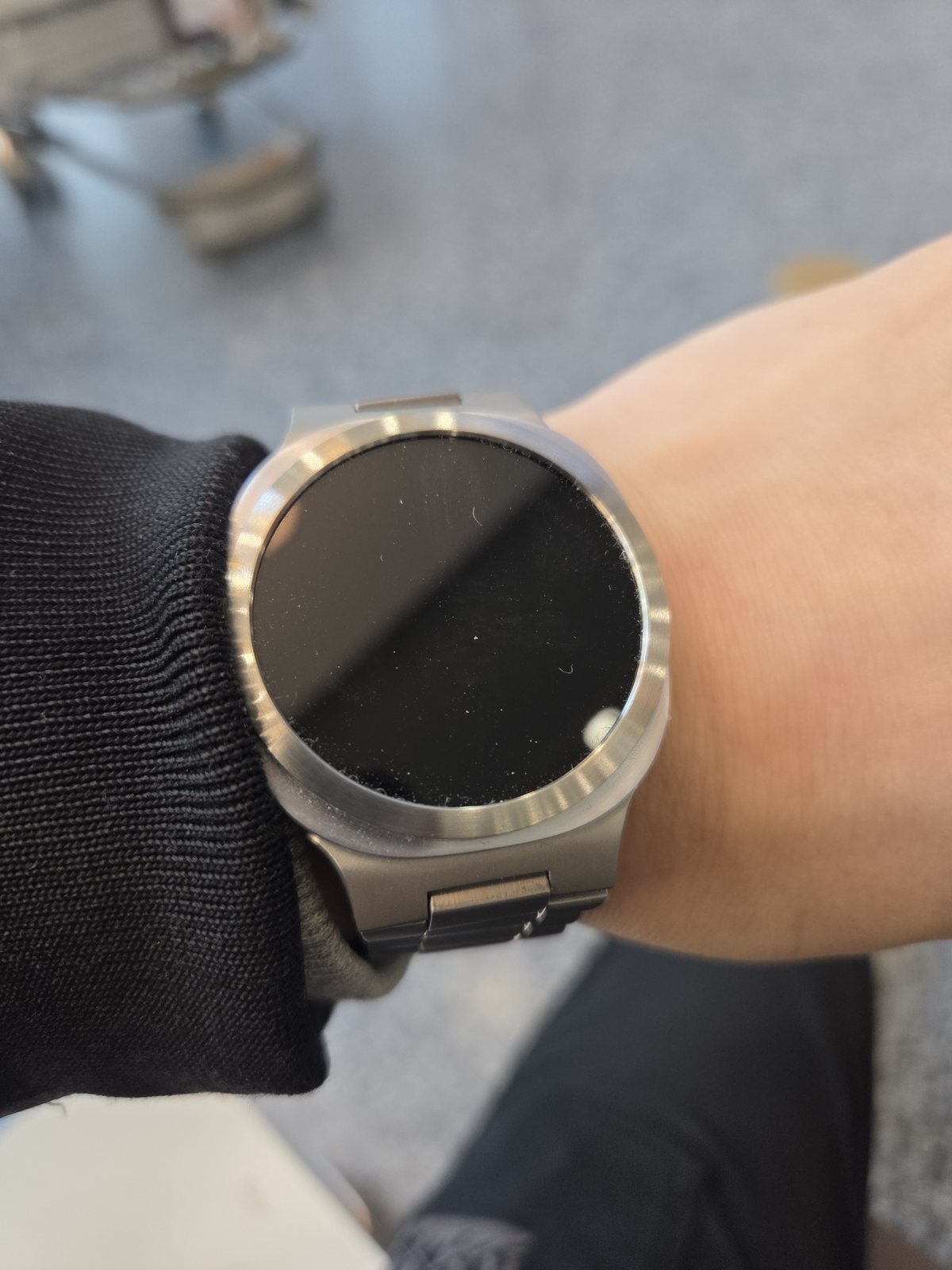
슬림하고 심플하니 깔끔해보입니다
장식을 줄였을 때 남는 선
플레인 베젤링은 숫자나 마커 대신 원의 폭과 소재 자체로 존재감을 만듭니다. 화면이 꺼진 상태에서도 외곽선은 남지만 장식성이 앞서지 않아, 워치페이스를 자주 바꾸거나 옷차림의 색이 자주 달라지는 사용자에게 폭넓게 어울립니다. 메탈 밴드와 함께했을 때도 전면이 지나치게 복잡해지지 않는 이유입니다.
손목을 돌릴 때 브러시드 면은 강한 번쩍임보다 길고 부드러운 반사를 만듭니다. 실내 조명에서는 차분하게 보이고 햇빛 아래에서는 원의 외곽이 한층 선명해집니다. 표면 장식이 적을수록 모서리의 균일함과 안쪽 원의 간격이 눈에 잘 띄므로, 모델과 사이즈를 정확히 맞추는 일이 더욱 중요합니다.
슬림한 링은 본체 측면과 버튼을 열어 둡니다. 풀커버처럼 케이스 전체를 감싸지 않으면서 전면 가장자리만 정리하기 때문에 갤럭시워치 본래의 형태와 색을 그대로 볼 수 있습니다.
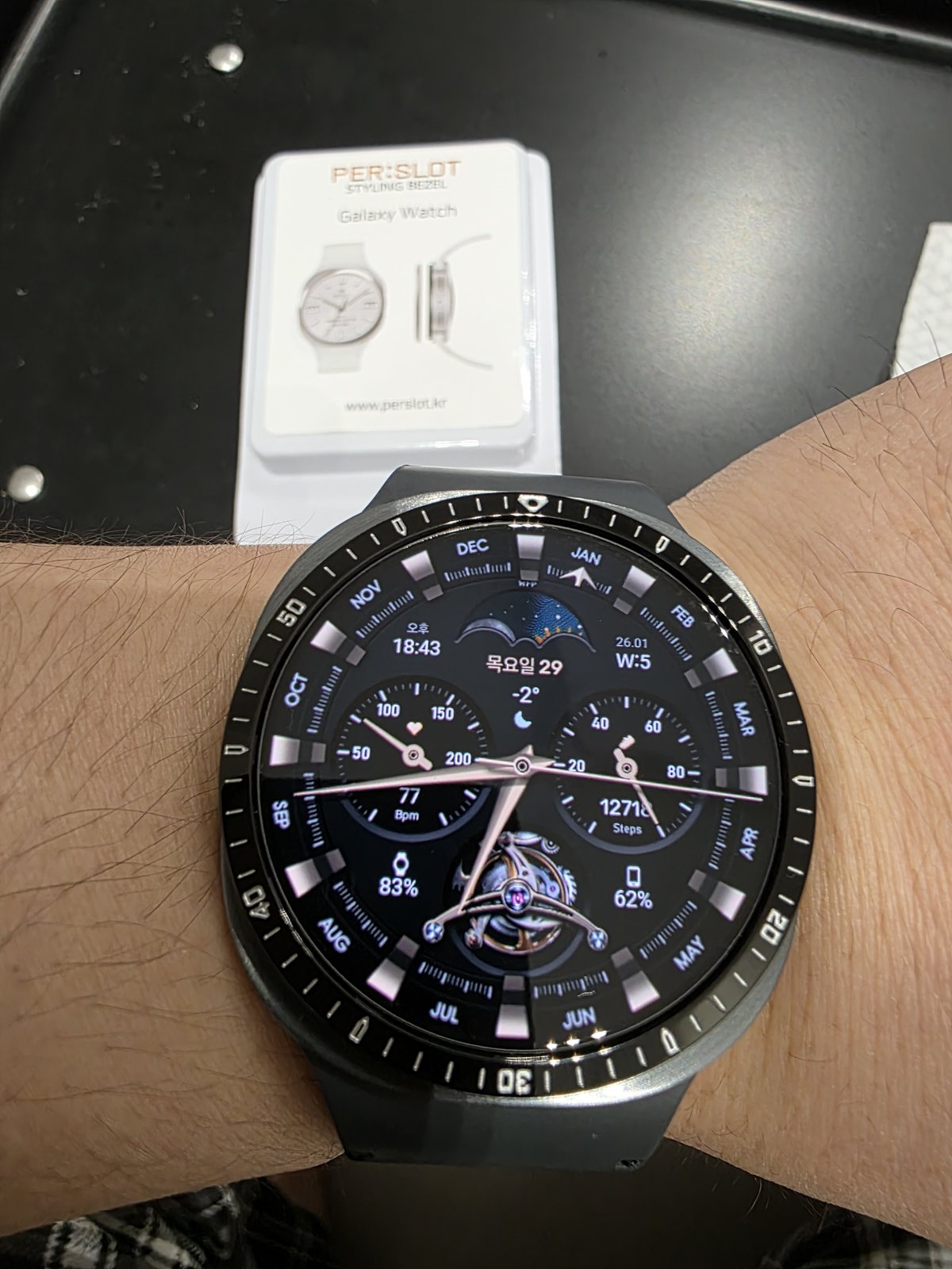
아주 잘쓰고 있어요 너무 좋아서 와이프도 구매했어요
블랙 베젤이 만드는 한 덩어리의 다이얼
블랙 인덱스 베젤링은 검은 디스플레이와 이어지며 화면의 경계를 바깥쪽으로 확장합니다. 화면을 켜면 밝은 숫자와 눈금이 워치페이스의 정보를 받쳐 주고, 화면을 끄면 링과 유리가 하나의 어두운 원처럼 정리됩니다. 실버보다 반사가 절제되어 캐주얼한 밴드나 어두운 옷차림에서도 전면이 차분하게 남습니다.
검은 표면은 먼지와 밝은 얼룩이 대비되어 보일 수 있습니다. 운동이나 외출 뒤에는 물기를 오래 남기지 말고 마른 천으로 안쪽 원과 바깥 모서리를 함께 닦는 것이 좋습니다. 작은 관리만으로도 각인의 선명함과 어두운 표면의 균일한 색감을 유지할 수 있습니다.
같은 워치라도 실버는 케이스와 밴드의 금속감을 강조하고, 블랙은 화면과 베젤링을 하나의 다이얼로 묶습니다. 평소 밝은 메탈 액세서리를 즐기는지, 검은 워치페이스를 중심으로 차분하게 착용하는지에 따라 선택의 방향이 분명하게 갈립니다.
취향은 달라도 기준은 같은 곳에 남습니다
플레인 실버의 깨끗한 외곽선, 숫자 인덱스의 시계다운 밀도, 블랙 베젤의 깊은 다이얼은 서로 다른 취향을 향합니다. 다만 손목 위에서 완성도를 좌우하는 기준은 같습니다. 화면을 가리지 않는 안쪽 간격, 케이스와 어색하게 벌어지지 않는 외경, 소매와 손동작을 방해하지 않는 높이가 먼저 안정되어야 디자인도 오래 살아납니다.
워치페이스를 자주 바꾼다면 장식이 적은 플레인이 유연하고, 아날로그 화면을 즐긴다면 인덱스 베젤링이 시계 구성을 더 풍부하게 만듭니다. 실버는 케이스와 메탈 밴드의 밝기를 연결하며, 블랙은 어두운 화면을 넓고 단단하게 묶습니다. 어느 한쪽이 우위에 있기보다 매일 사용하는 화면과 옷차림에 맞는 쪽이 자연스럽습니다.
주문 전에는 갤럭시워치의 정확한 모델과 사이즈를 확인하고, 부착면의 먼지와 유분을 제거한 뒤 중심을 맞춥니다. 보호필름을 함께 사용한다면 베젤링 내경에 맞춘 전용 규격인지도 살펴야 합니다. 잘 맞춘 퍼슬랏 베젤링은 눈에 띄기 위해 과장하지 않고, 손목을 볼 때마다 워치의 원형과 금속 마감을 또렷하게 남깁니다.
PERSLOT Bezel In Daily Wear: From Plain Silver To Black Indices
A PERSLOT bezel changes the boundary where the display meets the case. Although the metal ring occupies only a narrow area, plain silver, engraved indices and black finishes give the same Galaxy Watch distinctly different proportions. The effect is separate from changing a watch face because the physical outline remains visible whether the screen is on or off.
A plain bezel leaves the surface grain, edge and circular balance exposed. An indexed bezel extends the hands and information of an analogue watch face into a physical scale. Silver creates a bright metal line between case and band, while black joins the dark display and makes the dial appear broader.
With the display active, the amount of information on the watch face and the density of the engraving are immediately visible. When the screen turns dark, the width, side height and reflection of the ring become more prominent. These details also change between a shirt cuff during the week and a lighter casual outfit at the weekend.
Model, size, inner clearance and edge gestures matter as much as colour. A correctly fitted bezel refines the display perimeter while leaving the original case silhouette visible. That small, accurately aligned circle is what allows one watch to carry several different expressions.
Plain Silver After The Screen Turns Dark
Delivery was fast, and the finish looks very clean.
A plain silver bezel becomes especially clear when the display is off. Without numerals or decorative marks, it does not compete with the screen. Instead, a narrow metal boundary remains around the black circle. The brushed grain softens the brightness of silver and preserves the basic round silhouette of the watch.
The mesh band visible here continues below the wrist with a fine, flexible metal texture. Its dense weave contrasts with the firm circle of the bezel, yet both remain connected through a similar silver tone. Regardless of the band brand, matching material density and colour temperature keeps the front and underside of the wrist from feeling unrelated.
Dust and fingerprints are easier to see against a dark screen. A gentle wipe following the circle with a dry microfibre cloth keeps the surface grain clear and maintains the clean contrast between glass and metal.
A Slim Height And Edge Seen From The Side
It is simple and looks excellent. I will enjoy using the watch face too.
The design is most obvious from the front, but much of the wearing comfort is determined at the side. A ring that does not rise excessively above the case and has a smoothly finished edge is less likely to catch on a shirt or knit cuff. A restrained profile leaves only the necessary metal line without making the watch body appear thicker.
From an angle, the display, bezel and case form visible layers. The inner circle should not intrude into the screen, and the outside edge should not spread awkwardly beyond the body. It is also useful to check that a finger can still move naturally from the display edge towards the centre.
A Refined Front With A Metal Bracelet
I really like the design. It feels like a different watch, and I have no regrets about choosing it.
A silver bezel and metal bracelet connect the metal surfaces above and below the watch. The bezel remains a narrow circle around the display, while the bracelet repeats broad and narrow planes through each link. The matching colour does not become monotonous because every surface returns light in a different direction, with the watch case holding the centre between them.
The watch face also affects this combination. A dark dial gives the silver perimeter strong definition, while a bright dial allows the case and bezel to read as a wider frame. Choosing with the contrast of the screen used most often in mind makes the resulting wrist proportion easier to anticipate.
On days when the bracelet feels visually substantial, reducing the information on the display can restore balance. A simple face with hands and restrained markers leaves room between the bezel finish and link structure, creating a composed watch style that works naturally with shirts and jackets.
Numerical Indices Beyond The Watch Face
I considered buying one from AliExpress, but I think I made the right choice.
A numerical bezel adds a physical time scale beyond the digital screen. Paired with an analogue-style face, the hands, minute markings and engraved numerals continue within one dial composition. Even when the screen changes, the outside indices remain, layering a familiar watch structure over the functions of a Galaxy Watch.
Directional engraving makes alignment immediately noticeable. Compare the upper, lower, left and right clearance and confirm that the axes of the watch face and metal scale feel stable before pressing the circumference into place. Careful positioning followed by even pressure produces a cleaner result than pressing firmly at the start.
The Line That Remains When Ornament Is Reduced
It is slim, simple and looks clean.
A plain bezel relies on width and material rather than numerals or markers. Its outline remains visible with the screen off, yet it does not dominate the watch. This makes it flexible for users who frequently change watch faces or move between different clothing colours. It also prevents the front from becoming overly busy beside a metal band.
As the wrist turns, a brushed surface produces a long, soft reflection instead of a sharp flash. It stays quiet under indoor light and becomes more defined in sunlight. With less decoration, the consistency of the edge and the spacing around the display become easier to see, so selecting the correct model and size is especially important.
The slim ring leaves the case side and buttons exposed. Rather than enclosing the entire body like a full cover, it refines only the front perimeter and preserves the original form and colour of the Galaxy Watch.
A Single Dark Dial With A Black Bezel
I have been using it very well. I liked it so much that my wife bought one too.
A black indexed bezel extends the boundary of a dark display. When the screen is active, bright numerals and markers support the information on the watch face. When it turns off, the ring and glass settle into one dark circle. Its restrained reflection also works naturally with casual bands and darker clothing.
Dust and pale marks may show more clearly on a black surface. After exercise or a day outside, remove moisture rather than leaving it around the inner and outer edges, then finish with a dry cloth. This small habit preserves both the clarity of the engraving and the even tone of the surface.
Silver emphasises the metal connection between case and band, whereas black brings the display and bezel into a single dial. The choice becomes clearer when considered alongside the jewellery, watch faces and clothing colours worn most often.
Different Tastes, The Same Standards
The clean perimeter of plain silver, the traditional density of engraved indices and the deep dial created by black each serve a different preference. The standards that determine long-term satisfaction remain consistent: even inner clearance, an outside diameter that does not spread awkwardly beyond the case, and a height that stays comfortable through sleeves and wrist movement.
Plain designs remain flexible for frequent watch-face changes, while indexed bezels add structure to analogue layouts. Silver links the brightness of the case and metal band, and black gathers a dark screen into a firm circle. The most natural choice is the one that suits the display and clothing used every day.
Confirm the exact Galaxy Watch model and size, remove dust and oil from the mounting surface, and align the centre before installation. When using a protective film, check that it is made for the bezel inner diameter. A properly fitted PERSLOT bezel does not need exaggerated decoration; it leaves the circular form and metal finish clear every time the wrist is raised.
추가 정보
플레인과 인덱스를 고르는 세부 기준
퍼슬랏 베젤링 실사용기에서 살핀 디자인은 크게 장식을 덜어낸 플레인과 숫자 또는 미닛 마커를 더한 인덱스로 나뉩니다. 플레인은 워치페이스의 정보를 방해하지 않고 외곽선만 정리하며, 인덱스는 화면 바깥에 물리적인 시계 구조를 더합니다. 색상은 실버와 블랙이 화면, 케이스와 밴드 사이를 연결하는 방식에 따라 선택할 수 있습니다.
디자인과 별개로 모델과 사이즈, 안쪽 원의 간격, 링의 높이는 정확해야 합니다. 베젤링 안쪽과 디스플레이 사이의 여백이 상하좌우로 고르게 남고, 화면 끝 터치 동선과 측면 버튼이 자연스러울 때 외관과 사용성이 함께 안정됩니다.
- 정보가 많은 워치페이스에는 장식이 적은 플레인 베젤이 편안합니다.
- 아날로그 바늘과 단순한 다이얼에는 숫자 인덱스가 시계 구성을 이어 줍니다.
- 실버는 케이스와 메탈 밴드 사이에 밝은 금속 경계를 만듭니다.
- 블랙은 검은 디스플레이와 연결되어 전면을 하나의 다이얼처럼 묶습니다.
- 안쪽 원은 화면을 침범하지 않고 네 방향의 간격이 고르게 남아야 합니다.
- 측면 높이는 소매와 손목 움직임, 화면 끝 터치에 부담을 주지 않아야 합니다.
- 부착 전에는 모델, 사이즈와 보호필름 규격을 함께 확인합니다.
- 교체할 때는 기존 점착 잔여물을 제거하고 새 전용 테이프를 사용합니다.
자주 묻는 질문
갤럭시워치 베젤링은 모델과 사이즈가 왜 중요한가요?
세대와 크기에 따라 케이스 외경, 화면 가장자리와 버튼 주변의 구조가 달라집니다. 맞지 않는 규격은 링이 본체보다 벌어지거나 화면 쪽으로 들어올 수 있으므로 주문 전 설정 또는 제품 뒷면에서 정확한 모델과 사이즈를 확인합니다.
플레인과 숫자 인덱스 중 어떤 디자인이 잘 맞나요?
컴플리케이션과 색상이 많은 워치페이스에는 플레인이 시각적인 여백을 남깁니다. 바늘과 최소한의 마커로 구성된 화면에는 숫자 인덱스가 바깥 시간 눈금을 이어 주며 시계다운 구성을 강조합니다.
화면을 껐을 때도 조합을 확인해야 하나요?
화면이 꺼지면 워치페이스의 색보다 베젤링의 폭, 표면 반사와 안쪽 간격이 더 잘 보입니다. 켜진 화면과 어두운 화면을 번갈아 보면 디자인과 중심 정렬을 모두 확인하기 좋습니다.
실버와 블랙 베젤링은 어떻게 고르나요?
실버는 밝은 케이스나 메탈 밴드와 이어지며 원형 외곽선을 선명하게 남깁니다. 블랙은 검은 디스플레이와 맞닿아 다이얼을 넓고 차분하게 보이게 하므로 평소 쓰는 워치페이스와 옷차림을 기준으로 고를 수 있습니다.
베젤링을 붙이면 화면 끝 터치가 불편해지나요?
모델에 맞는 규격을 중심에 정확히 붙이면 화면 가장자리의 스와이프 동선을 자연스럽게 유지할 수 있습니다. 부착 뒤에는 네 방향에서 손가락을 움직여 링이 안쪽으로 치우치지 않았는지 확인합니다.
일반 보호필름과 함께 사용할 수 있나요?
퍼슬랏 전용 보호필름은 베젤링 내경에 맞춘 크기로 설계됩니다. 시중 제품이나 삼성 스토어의 일반 필름은 베젤링 없이 화면 전체를 덮는 규격이 많아 외곽이 링 아래와 겹칠 수 있으므로, 함께 사용할 때는 반드시 베젤링 전용 규격인지 확인해야 합니다.
부착 중심은 어떻게 맞추는 것이 좋나요?
점착 보호지를 완전히 제거하기 전에 위아래 기준을 먼저 맞추고 좌우 간격을 번갈아 살핍니다. 위치가 안정되면 한쪽만 세게 누르지 말고 둘레 전체에 고른 압력을 주어 고정합니다.
오래 사용하려면 어떻게 관리하나요?
마른 극세사 천으로 금속 결을 따라 닦고, 운동이나 물 접촉 뒤에는 안쪽과 바깥 모서리의 수분을 제거합니다. 교체할 때는 링을 비틀지 않고 천천히 분리한 뒤 점착 잔여물을 정리하고 새 전용 테이프를 사용합니다.
손목 위에서 달라지는 네 가지 요소
표면과 빛의 방향
브러시드 면은 길고 부드러운 반사를 만들고, 폴리시드 모서리와 각인은 짧고 선명한 빛을 남깁니다. 실내와 야외에서 금속의 밝기가 달라 보이므로 평소 착용 환경을 함께 생각하면 색상과 마감을 고르기 쉽습니다.
워치페이스의 정보 밀도
화면 안에 날씨, 운동 기록과 여러 컴플리케이션이 들어간다면 바깥 베젤은 단순할수록 전체가 편안합니다. 반대로 정보가 적은 아날로그 화면에는 숫자와 미닛 마커가 빈 공간을 채우며 다이얼 구성을 완성합니다.
밴드 소재와 손목 비율
메쉬는 가는 금속 결, 브레이슬릿은 반복되는 링크 면, 가죽과 스포츠 밴드는 부드러운 표면을 만듭니다. 베젤링은 밴드의 브랜드와 무관하게 전면의 금속 밀도를 조절하며, 손목이 가늘다면 링 폭과 밴드의 무게감이 과하지 않은지도 함께 살펴야 합니다.
장기간 사용과 교체
표면을 깨끗하게 유지하고 물기를 오래 남기지 않으면 금속 마감과 점착 상태를 안정적으로 관리할 수 있습니다. 다른 디자인으로 교체할 때는 본체를 비틀지 않도록 링의 가장자리를 천천히 들어 올리고, 새 점착 테이프를 정확히 맞춰 사용합니다.
모델별 옵션과 색상은 퍼슬랏 공식몰에서 확인할 수 있습니다. 다양한 손목 조합은 퍼슬랏 리뷰에서 이어 볼 수 있으며, 부착과 교체 과정은 퍼슬랏 공식 유튜브의 영상이 이해에 도움이 됩니다.