


갤럭시워치 베젤링 코디, 스트랩 색으로 달라지는 전면 비율
갤럭시워치 베젤링 코디는 스트랩을 모두 바꾸지 않고도 손목 위 인상을 선명하게 조절할 수 있습니다. 시선이 먼저 닿는 곳은 화면과 맞닿은 전면 외곽선입니다. 블랙 베젤링은 디스플레이의 어두운 면을 바깥으로 넓히고, 실버 베젤링은 화면과 케이스 사이에 밝은 금속 경계를 만듭니다.
여기에 어떤 스트랩을 연결하느냐에 따라 같은 베젤링도 전혀 다른 표정을 냅니다. 블랙 스트랩에서는 전면의 깊이와 숫자 눈금이 또렷해지고, 라이트 블루나 화이트 스트랩에서는 실버 링의 밝기와 원형 윤곽이 강조됩니다. 스트랩의 색과 형태는 달라도 워치 전면에 부착된 퍼슬랏 베젤링이 케이스와 디스플레이 사이의 기준선을 잡아줍니다.
밴드의 색만 맞추는 것으로 조합이 끝나지는 않습니다. 화면이 켜졌을 때 워치페이스 인덱스와 베젤 눈금이 자연스럽게 이어지는지, 화면이 꺼졌을 때 금속 외곽선이 얼마나 남는지, 측면에서 링이 과하게 높아 보이지 않는지까지 함께 봐야 합니다. 스트랩의 폭과 질감, 케이스 색, 베젤의 광택이 한 방향으로 정리되면 작은 원 하나만으로도 전면 비율이 또렷해집니다.
퍼슬랏 베젤링은 갤럭시워치 본체의 실루엣을 가리지 않으면서 디스플레이 가장자리의 얇은 선을 정돈합니다. 풀커버처럼 전면 전체를 덮지 않아 워치 고유의 형태를 남기고, 스트랩 선택에 따라 클래식한 금속 시계부터 가벼운 스포츠 워치까지 폭넓게 이어집니다.

워치랑 잘 어울리고 이쁩니다. 가성비가 좋아요.
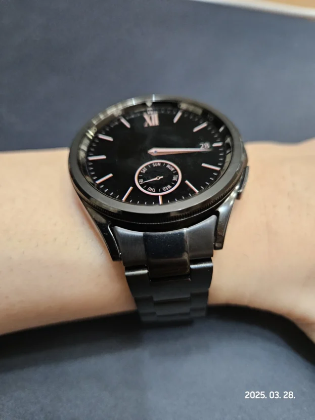
블랙 스트랩과 숫자 베젤의 연결
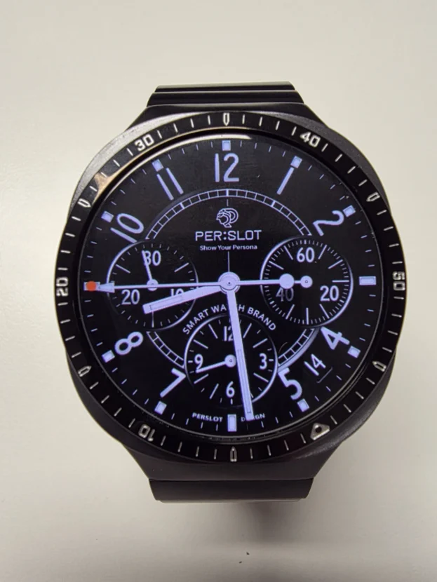
검은 스트랩은 케이스 아래에서 넓은 어두운 면을 만들고, 블랙 숫자 베젤링은 그 색을 화면 가장자리까지 끌어올립니다. 스트랩과 베젤이 같은 계열로 이어지면 밝은 워치페이스는 중앙에 선명하게 남고, 화면이 꺼졌을 때는 디스플레이와 링이 하나의 깊은 원처럼 보입니다.
외곽의 숫자와 짧은 마커는 워치페이스 바깥에서도 시간 도구의 인상을 이어갑니다. 화면 안쪽 정보가 단순한 날에는 베젤 눈금이 빈 여백을 채우고, 크로노그래프처럼 요소가 많은 화면에서는 원 둘레의 방향을 정리합니다. 익숙한 블랙 밴드의 착용감은 유지하면서 전면은 스포츠 워치에 가까운 밀도를 갖춥니다.

마감 잘되있고 이뻐요. 정말 마음에 드네요.
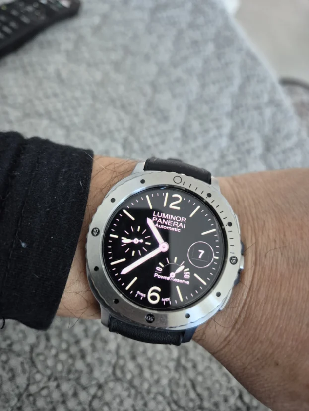
다크 톤 스트랩 위로 이어지는 전면
어두운 스트랩과 다크 베젤링을 연결하면 손목 아래에서 시작된 색이 다이얼 외곽까지 자연스럽게 이어집니다. 검은 화면 사이에 놓인 금속 눈금이 원형 다이얼의 크기를 분명하게 잡아주기 때문에 갤럭시워치가 단순한 디지털 기기보다 계기판을 갖춘 시계에 가깝게 보입니다.
다크 톤 조합에서는 표면 마감의 차이가 특히 잘 드러납니다. 블랙 면이 지나치게 번들거리면 화면보다 링이 먼저 보이고, 눈금이 너무 촘촘하면 워치페이스와 경쟁합니다. 차분한 바탕 위에 필요한 숫자와 마커만 남긴 구성이 스트랩의 단정한 색을 해치지 않으면서 전면의 밀도를 높입니다.

제품 퀄리티 만족합니다 ^^
라이트 블루 스트랩과 플레인 실버
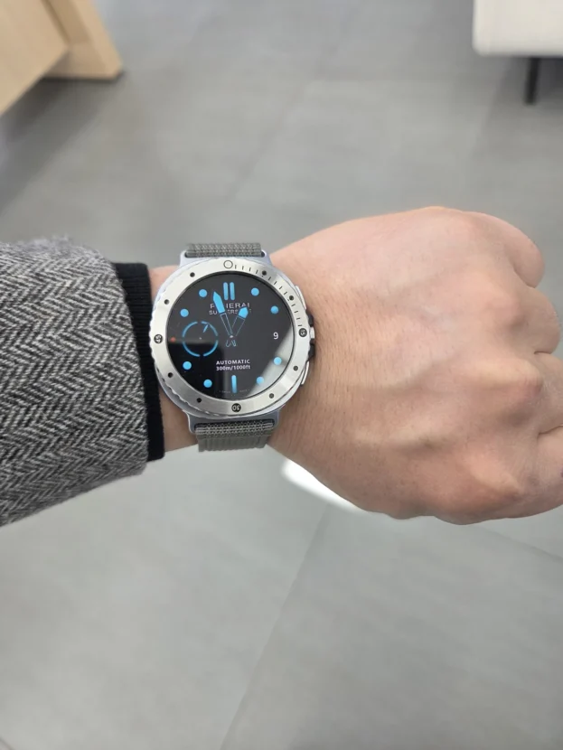
라이트 블루 스트랩은 갤럭시워치를 가볍고 활동적으로 보이게 합니다. 밝고 부드러운 색을 배경으로 플레인 실버 베젤링의 금속 외곽선이 또렷하게 드러납니다. 검은 디스플레이는 실버 링 안쪽에서 깊게 분리되고, 숫자 장식을 덜어낸 전면은 복잡한 워치페이스에도 충분한 여백을 남깁니다.
실버 표면은 정면에서 넓게 번쩍이기보다 손목을 돌릴 때 모서리와 결을 따라 짧게 빛납니다. 라이트 블루가 만드는 산뜻한 인상과 금속의 정돈된 선이 한쪽으로 치우치지 않아 운동복에는 깔끔한 포인트가 되고, 셔츠 소매 아래에서는 얇은 시계 테두리처럼 차분하게 남습니다.

블랙 스트랩에 남는 실버 외곽선
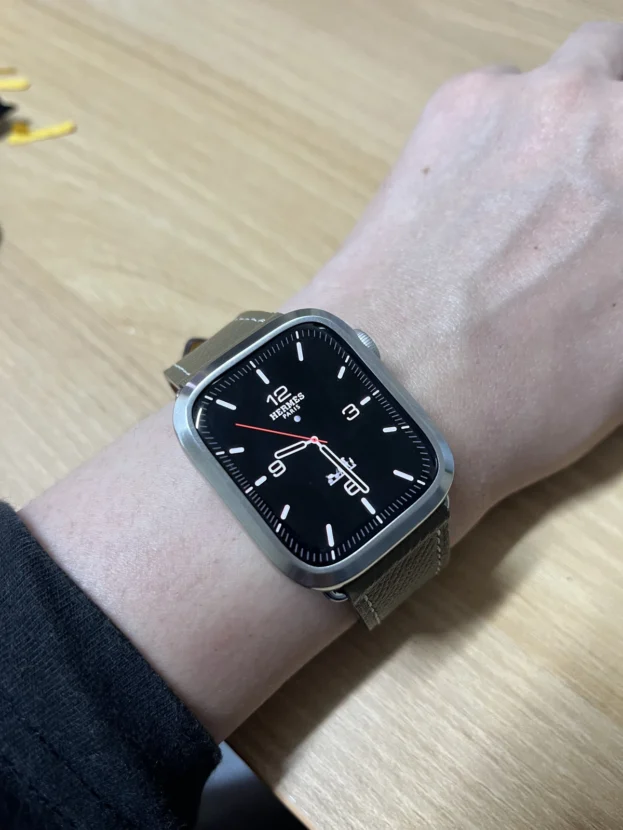
블랙 스트랩과 플레인 실버 베젤링은 명암으로 연결됩니다. 스트랩과 화면이 어두운 면을 만들고, 그 사이의 실버 링이 다이얼의 시작과 끝을 분명하게 구분합니다. 숫자나 장식이 없는 외곽은 워치페이스를 자주 바꾸어도 특정 디자인에 묶이지 않습니다.
부착 전에는 안쪽 원의 매끄러움과 바깥 모서리의 폭을 먼저 볼 수 있습니다. 부착 뒤에는 이 작은 차이가 화면 가장자리의 여백으로 나타납니다. 링이 중앙에 정확히 놓이면 상하좌우 간격이 일정해지고, 블랙 스트랩의 넓은 색면과 전면의 얇은 실버 선이 안정적인 대비를 이룹니다.

화이트 스트랩과 눈금형 베젤의 대비
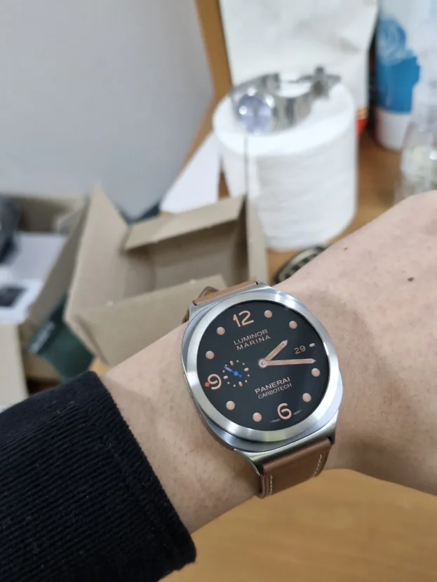
화이트 스트랩은 워치 본체의 윤곽을 가볍게 드러내고, 숫자와 미닛 마커가 들어간 베젤링은 그 위에 기능적인 다이얼을 선명하게 세웁니다. 스트랩은 부드러운 배경으로 남고 베젤이 전면의 방향을 잡아, 밝은 색 조합에서도 손목 위 중심이 흐려지지 않습니다.
눈금형 베젤은 워치페이스의 12시 축과 정확히 맞아야 합니다. 부착 전 12시와 6시 방향을 먼저 맞춘 뒤 3시와 9시의 안쪽 간격을 비교하면 숫자와 화면 인덱스가 같은 중심에서 이어집니다. 화이트처럼 밝은 스트랩은 작은 기울어짐도 쉽게 드러내므로 처음 정렬할 때 네 방향의 여백을 차분히 맞추는 것이 좋습니다.
워치에 잘어울리고 유리 보호에도 좋음
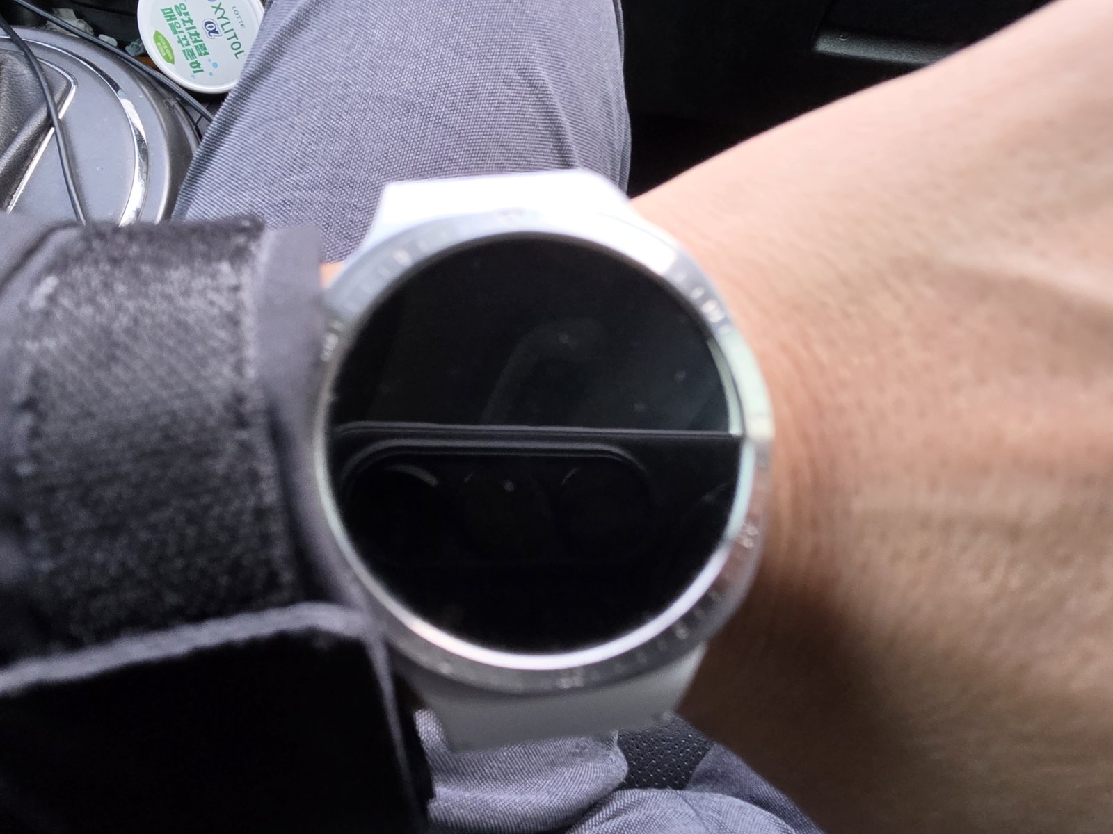
화면이 꺼진 뒤에도 남는 원형
스마트워치는 하루 종일 화면이 켜져 있지 않습니다. 화면이 검게 쉬는 동안에도 실버 베젤링은 케이스 바깥선을 따라 밝은 원을 남깁니다. 블랙 스트랩은 시선에서 한 걸음 물러나고 검은 디스플레이와 실버 외곽선이 전면에 남아, 정보가 사라진 순간에도 워치의 형태가 흐려지지 않습니다.
얇은 베젤링은 화면 전체를 덮는 풀커버와 달리 디스플레이를 그대로 열어 둡니다. 모델과 사이즈에 맞는 링을 중앙에 부착하면 화면 가장자리의 터치 공간을 남기면서 외곽선과 유리 모서리를 함께 정리할 수 있습니다. 보호필름을 사용할 때는 퍼슬랏 베젤링 내경에 맞춘 전용 필름을 선택해야 링과 필름이 겹치지 않습니다.
스트랩의 색을 살리고 전면의 중심을 잡는 베젤링
블랙 스트랩은 블랙 베젤링과 연결해 깊고 단단한 원형을 만들 수 있고, 실버 베젤링과 대비시켜 화면 바깥에 밝은 금속 경계를 남길 수 있습니다. 라이트 블루 스트랩에서는 플레인 실버가 케이스와 자연스럽게 이어지며, 화이트 스트랩에서는 숫자 눈금이 다이얼의 방향과 중심을 더욱 분명하게 만듭니다.
색상만큼 중요한 것은 안쪽 간격과 정렬입니다. 사용 중인 갤럭시워치 모델과 사이즈에 맞는 옵션을 고르고, 부착면의 먼지와 유분을 닦은 뒤 12시와 6시 축을 먼저 맞춥니다. 네 방향의 여백이 일정해야 베젤 눈금과 워치페이스가 한 다이얼처럼 이어지고 화면 가장자리의 조작 공간도 안정적으로 남습니다.
스트랩을 교체하지 않아도 전면의 성격은 달라질 수 있습니다. 반대로 색이 다른 스트랩을 연결했을 때도 베젤링이 케이스와 화면 사이의 기준선을 잡아주면 전체 조합이 흐트러지지 않습니다. 손목 아래의 색과 디스플레이 바깥의 금속선을 함께 맞추는 것, 그것이 갤럭시워치 베젤링 코디의 핵심입니다.
Galaxy Watch Bezel Styling Across Strap Colors
Galaxy Watch bezel styling can change the character of the wrist without replacing every component. The first line the eye meets is the perimeter where the display meets the case. A black bezel extends the dark surface of the screen, while a silver bezel introduces a bright metal boundary between the display and the watch body.
The result changes again with the strap underneath. Black straps emphasise depth and the precision of a numbered scale. Light blue and white straps bring the brightness and circular outline of a silver bezel forward. Although the colours and forms of the straps vary, the PERSLOT bezel establishes a consistent reference line between the case and the display.
Colour alone does not complete the combination. The indices of the watch face should relate naturally to the bezel scale when the display is active. The metal outline should remain balanced when the screen is off, and the ring should not appear unnecessarily tall from the side. Strap width, surface texture, case colour and bezel finish all contribute to the final proportion.
A PERSLOT bezel refines the narrow perimeter of the display without hiding the silhouette of the Galaxy Watch. Because it leaves the front open instead of enclosing the entire watch like a full cover, it can move between a restrained metal-watch appearance and a lighter sports-watch character according to the strap.
A Black Strap Joined To A Numbered Bezel
It looks beautiful with the watch. The value is excellent.
A black strap creates a broad dark surface below the case, and a black numbered bezel carries that colour to the edge of the display. A bright watch face remains clear at the centre, while an inactive screen and the surrounding ring become one deep circle.
Numerals and short markers continue the expression of a timekeeping instrument beyond the screen. On a simple face they fill the open perimeter; on a chronograph face they organise the direction of the outer dial. The familiar fit remains unchanged, yet the front takes on the density of a purposeful sports watch.
A Dark Strap With A More Defined Front
The finish is excellent and it looks beautiful. I am very pleased with it.
Connecting a dark strap to a dark bezel carries the colour beneath the wrist towards the outside of the dial. Metal markers between the black strap and black display define the diameter of the circular face, making the Galaxy Watch read more like an instrument with a deliberate dial.
Finish becomes particularly important in a dark combination. Excessive gloss can compete with the display, while an overly dense scale can crowd the watch face. A restrained surface with only the necessary numerals and markers gives the front more substance without disturbing the calm colour of the strap.
Plain Silver Above A Light Blue Strap
I am satisfied with the product quality.
A light blue strap forms a bright, soft background for the metal perimeter of a plain silver bezel. The black display appears deeper inside the ring, while the absence of numerals leaves enough breathing room for a detailed watch face.
The silver surface does not need to flash broadly from the front. Narrow reflections appear along the grain and edges as the wrist turns. This keeps the fresh character of the light blue strap and the refined metal outline in balance, working with active clothing as well as beneath a shirt cuff.
A Silver Boundary Above A Black Strap
The black strap and display form a dark field, while the plain silver bezel separates the beginning and end of the dial. Without fixed numerals or decorative engraving, the outer line remains compatible with a wide range of watch faces.
Before installation, the smooth inner circle and the width of the outer edge can be examined clearly. Once attached, these dimensions become the visible clearance around the display. Accurate centring leaves an even gap in every direction and creates a stable contrast between the broad black strap and the thin silver line.
A Numbered Bezel Above A White Strap
A white strap keeps the outline of the watch light, while numerals and minute markers rise clearly above the soft background and establish the direction of the dial. The strap remains visually quiet and the bezel adds the instrument character needed at the front.
A scale bezel must align accurately with the twelve o’clock axis of the watch face. Set twelve and six first, then compare the inner clearances at three and nine. Bright straps make small rotations easier to notice, so equalising all four sides produces a cleaner relationship between the digital indices and the metal scale.
A Circle That Remains After The Screen Turns Off
It suits the watch well and also helps protect the glass.
A smartwatch display is not active throughout the entire day. While the screen rests in black, a silver bezel leaves a bright circle around the case. The black strap recedes, allowing the dark centre and silver perimeter to preserve the form of the watch even when no information is visible.
A slim bezel leaves the display open instead of enclosing it like a full cover. With the correct model and size centred precisely, the perimeter remains available for touch gestures while the metal ring refines the edge of the glass. When a protector is required, use the PERSLOT film designed for the bezel’s inner diameter so that the film and ring do not overlap.
Balancing Strap Colour And The Front Of The Watch
Black with black produces a deep, continuous circle. Black with silver creates a bright boundary around the display. On a light blue strap, plain silver follows the case without adding visual noise. On a white strap, a numbered scale provides direction and keeps the centre of the watch clearly defined.
Inner clearance and alignment matter as much as colour. Select the option for the exact watch model and size, remove dust and skin oil from the attachment area, and align the twelve-to-six axis before applying full pressure. Equal spacing allows the watch face and bezel to read as one dial while preserving comfortable edge gestures.
A strap can remain familiar or introduce a completely different colour, yet the bezel continues to act as the reference line between the case and the display. Matching the surface beneath the wrist with the metal outline around the screen is what gives Galaxy Watch bezel styling its coherence.
추가 정보
스트랩 색과 베젤링의 균형
갤럭시워치 베젤링 코디는 스트랩의 출처보다 색과 질감, 케이스와의 연결 방식이 중요합니다. 블랙 스트랩은 어두운 다이얼의 깊이를 살리고, 라이트 블루와 화이트 스트랩은 실버 링의 밝은 외곽선을 앞쪽으로 끌어냅니다. 퍼슬랏 베젤링은 화면 전체를 덮지 않고 전면 가장자리만 정리하므로 스트랩이 달라져도 갤럭시워치 본체의 실루엣을 유지할 수 있습니다.
- 블랙 스트랩과 블랙 베젤링은 화면이 꺼졌을 때 하나의 깊은 원형으로 이어집니다.
- 블랙 스트랩과 실버 베젤링은 어두운 면 사이에 밝은 금속 경계를 만듭니다.
- 라이트 블루 스트랩에는 장식이 적은 플레인 실버가 가볍고 정돈된 인상을 남깁니다.
- 화이트 스트랩과 숫자 눈금 베젤은 밝은 배경 위에 다이얼의 방향을 선명하게 세웁니다.
- 눈금형 베젤은 12시와 6시 축을 먼저 맞춘 뒤 3시와 9시의 안쪽 간격을 비교합니다.
- 보호필름은 퍼슬랏 베젤링 내경에 맞춘 전용 규격을 사용해야 가장자리가 겹치지 않습니다.
- 제품 선택 전 갤럭시워치 모델명과 케이스 사이즈를 정확히 확인해야 합니다.
자주 묻는 질문
스트랩이 퍼슬랏 제품이 아니어도 베젤링을 함께 사용할 수 있나요?
베젤링은 워치 전면에 부착되므로 스트랩 브랜드와 직접적인 체결 관계가 없습니다. 사용 중인 스트랩이 워치 케이스와 정상적으로 연결되어 있다면 색과 질감에 맞춰 베젤링을 조합할 수 있습니다.
블랙 스트랩에는 블랙과 실버 중 어떤 색이 잘 맞나요?
블랙 베젤링은 스트랩과 화면을 하나의 어두운 축으로 연결합니다. 실버 베젤링은 검은 스트랩과 디스플레이 사이에 밝은 경계를 만들어 원형 다이얼을 더 선명하게 드러냅니다.
라이트 블루 스트랩에는 어떤 베젤 디자인이 어울리나요?
색 자체가 가볍고 산뜻하므로 장식이 적은 플레인 실버가 자연스럽게 이어집니다. 워치페이스가 단순하다면 숫자 눈금형으로 스포츠 워치의 긴장감을 더할 수도 있습니다.
화이트 스트랩과 숫자 베젤을 조합할 때 주의할 점은 무엇인가요?
밝은 스트랩에서는 베젤의 작은 기울어짐이 쉽게 보입니다. 12시와 6시를 먼저 맞추고 3시와 9시의 안쪽 여백을 비교한 뒤 전체를 눌러 부착하는 것이 좋습니다.
화면이 꺼져도 베젤링의 차이가 보이나요?
블랙 베젤링은 꺼진 화면과 이어져 중심을 더 깊게 만들고, 실버 베젤링은 검은 화면 바깥에 밝은 원형을 남깁니다. 디스플레이가 쉬는 시간에도 워치 전면의 비율은 그대로 유지됩니다.
눈금형 베젤링은 어떻게 중앙을 맞추나요?
접착면을 완전히 누르기 전에 12시와 6시 방향을 먼저 맞춥니다. 이어 3시와 9시의 간격이 같은지 확인하고 네 방향의 여백이 고르면 전체를 눌러 고정합니다.
일반 전면 보호필름과 함께 사용할 수 있나요?
일반 전면 필름은 베젤링이 없는 화면 전체를 기준으로 제작되어 링의 내경과 겹칠 수 있습니다. 퍼슬랏 베젤링과 함께 사용할 때는 내경에 맞춘 전용 보호필름을 선택해야 들뜸과 간섭을 줄일 수 있습니다.
부착 뒤에는 무엇을 확인해야 하나요?
상하좌우 여백이 일정한지, 측면 버튼과 간섭이 없는지, 화면 가장자리 제스처가 자연스러운지 확인합니다. 물이나 땀에 젖었다면 마른 천으로 금속 표면과 접합부 주변을 가볍게 닦아주는 것이 좋습니다.
조합을 완성하는 세부 기준
스트랩의 색면과 금속 외곽선
스트랩은 손목 아래에서 넓은 색면을 만들고 베젤링은 전면에서 얇은 원을 만듭니다. 두 색을 같게 맞추면 일체감이 강해지고, 다른 색으로 대비하면 다이얼의 경계가 또렷해집니다. 블랙, 라이트 블루, 화이트처럼 명도가 다른 스트랩일수록 실버 링이 남기는 밝기의 차이가 분명합니다.
워치페이스와 눈금 밀도
크로노그래프나 정보가 많은 워치페이스에는 장식이 적은 플레인 베젤이 여백을 남깁니다. 단순한 워치페이스에는 숫자와 미닛 마커가 바깥 공간을 채우며 시계다운 인상을 강화합니다. 화면 안쪽 정보와 바깥 눈금이 같은 중심축을 공유해야 전면이 복잡해 보이지 않습니다.
정렬과 부착 준비
부착면의 먼지와 유분을 닦고 완전히 마른 상태에서 위치를 잡습니다. 눈금형은 12시와 6시를 기준으로, 플레인형은 안쪽 원의 여백을 기준으로 중앙을 맞춥니다. 처음부터 강하게 누르기보다 네 방향을 비교한 뒤 고르게 압착해야 비대칭을 줄일 수 있습니다.
보호필름과 장기간 관리
퍼슬랏 전용 보호필름은 베젤링 내경 안에 들어가도록 설계되었습니다. 일반 전면 필름처럼 바깥까지 넓게 덮는 규격은 링과 겹칠 수 있으므로 함께 사용하지 않는 편이 안전합니다. 금속 표면은 부드러운 마른 천으로 관리하고 강한 연마제나 거친 도구는 피합니다.
모델별 옵션과 호환 사이즈는 퍼슬랏 공식몰에서 구분할 수 있습니다. 부착 위치와 실제 각도는 퍼슬랏 공식 유튜브의 착용 영상을 함께 보면 이해하기 쉽습니다.