


갤럭시워치 베젤링 조합, 스트랩 위로 이어지는 원형의 균형
갤럭시워치의 전면은 화면이 차지하는 비중이 큽니다. 스트랩을 바꿔도 다이얼 바깥이 비어 보인다고 느껴질 때가 있고, 반대로 케이스를 크게 덮으면 원래의 얇은 실루엣이 무거워 보이기도 합니다. 베젤링은 그 사이에서 화면 가장자리만 정리하는 방식입니다.
같은 실버 톤이라도 메쉬, 가죽, 나일론처럼 손목 아래로 이어지는 소재가 달라지면 전면의 인상도 달라집니다. 다이얼의 검은 면을 또렷하게 잡는 외곽선, 러그에서 스트랩으로 넘어가는 선, 손목을 돌렸을 때 남는 금속의 반사까지 함께 맞아야 조합이 자연스럽습니다.

빠른배송 너무 좋네요. 비싸서 많이 고민했는데 역시 돈질하길 잘했네요. 밍숭맹숭한 갤럭시워치가 너무 고급스러워졌어요.
검은 베젤이 정리하는 다이얼의 깊이
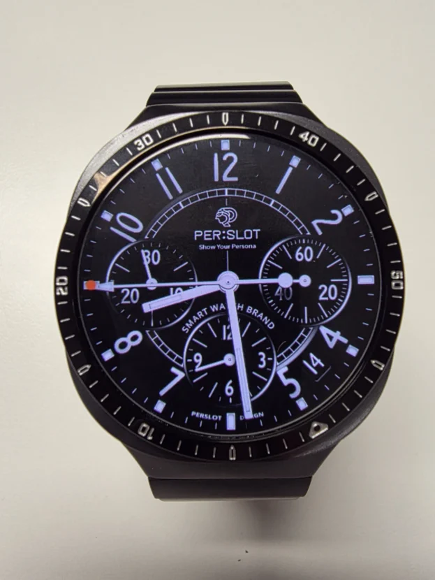
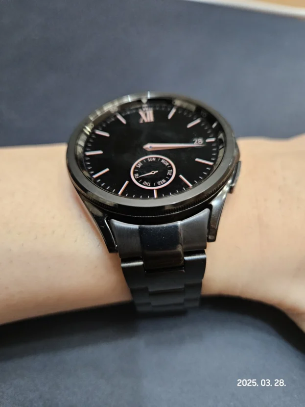
검은 베젤링은 화면 바깥을 한 번 더 또렷하게 잡아 주면서 다이얼의 중심을 깊게 남깁니다. 화면을 덮는 풀커버 케이스처럼 외곽을 두껍게 만들기보다, 원형 화면 주변에 단단한 경계를 더하는 방식입니다. 워치페이스가 어두울수록 숫자와 인덱스는 안쪽에 남고, 바깥의 검은 라인은 전면을 정리합니다.
베젤의 색은 워치페이스와 함께 봐야 합니다. 검은 바탕에는 외곽선이 자연스럽게 이어지고, 밝은 바탕에는 하드웨어의 윤곽이 한층 분명해집니다. 화면 크기와 정보 영역은 그대로 두면서도 전면의 밀도를 바꿀 수 있다는 점이 검은 베젤링 조합의 장점입니다.

케이스와 손목을 잇는 검은 외곽선
베젤링은 전면에서만 보이는 장식으로 끝나지 않습니다. 러그에서 이어지는 케이스의 곡선, 스트랩이 시작되는 위치, 다이얼 바깥의 원형 라인이 한 화면 안에 들어오기 때문에 손목 위에서는 전체 비율로 판단하게 됩니다. 검은 베젤은 이 연결부를 과하게 번쩍이지 않게 묶어 주면서도 워치의 존재감은 남깁니다.
부착 위치가 한쪽으로 치우치면 원형 라인에서는 작은 차이도 쉽게 드러납니다. 12시 방향을 기준으로 먼저 위치를 잡고 좌우 간격을 고르게 맞추면 화면 가장자리와 베젤 사이의 여백이 안정적으로 이어집니다. 손목을 돌렸을 때 짧게 남는 반사도 그때 가장 차분하게 보입니다.

똥손이라 붙이기 어려우면 어쩌지 했는데 부착 난이도랄게 없네요 예뻐요 부착 전후 비교 사진입니다
가죽 스트랩 위에서 달라지는 다이얼의 밀도
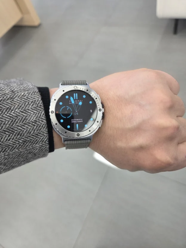
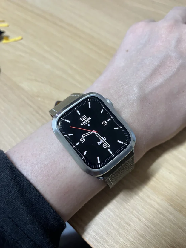
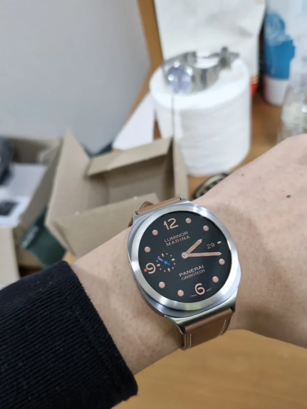
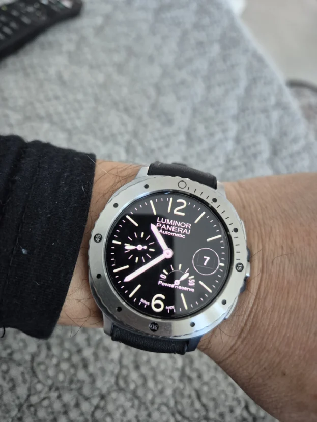
가죽 스트랩은 메탈보다 빛을 적게 반사합니다. 그래서 같은 실버 베젤링을 더했을 때 금속의 윤곽은 선명해지고, 스트랩은 다이얼을 받쳐 주는 배경처럼 차분하게 물러납니다. 검은 가죽과 검은 워치페이스를 함께 쓰면 원형 베젤의 선이 가장 먼저 시선에 들어옵니다.
가죽의 스티치와 버클은 직선적인 디테일을 만들고, 베젤링은 원형의 흐름을 완성합니다. 서로 다른 질감이지만 광택을 과하게 겹치지 않아 셔츠 소매나 재킷과 함께 착용했을 때도 스마트워치가 지나치게 스포츠 기기처럼 보이지 않습니다.

날렵한 케이스에 남는 얇은 테두리
베젤링은 케이스 전체를 감싸는 풀커버와 다릅니다. 화면 가장자리와 케이스 외곽의 간격을 따라 얇은 선을 남기기 때문에 워치의 본래 두께와 버튼 주변의 여백이 비교적 또렷하게 유지됩니다. 다이얼이 답답해 보이지 않으면서 전면의 중심은 한층 분명해집니다.
부착할 때는 화면과 링 사이의 간격이 한쪽으로 치우치지 않도록 먼저 위치를 잡는 것이 좋습니다. 원형 제품은 아주 작은 어긋남도 눈에 들어오기 때문에, 12시 방향을 기준으로 두고 좌우 간격을 천천히 맞추면 외곽선이 더 고르게 이어집니다.

퀄좋고 예쁩니다..! 믿고사는 퍼슬랏..!
손에 닿는 표면에서 시작되는 완성도
베젤링은 화면 바로 옆에 놓이는 부품이라 표면의 결, 모서리의 정리, 빛을 받았을 때의 반사가 손목 위에서 쉽게 드러납니다. 매끈한 부분과 미세한 결이 만나는 지점이 거칠면 작은 부품도 금세 투박해 보이지만, 표면이 차분하게 이어지면 검은 화면과의 대비가 한결 깔끔해집니다.
패키지를 열고 부착 전 상태를 살펴볼 때는 보호 필름이나 테이프가 닿는 안쪽 면, 전면에서 보이는 바깥쪽 면을 나누어 보는 편이 좋습니다. 화면 바깥을 정리하는 얇은 부품일수록 안쪽 간격과 바깥쪽 라인이 함께 맞아야 전체 인상이 정돈됩니다.

손목을 움직일 때 이어지는 실버 톤
손목을 기울이면 다이얼의 정보보다 먼저 베젤 가장자리에 짧은 빛이 남습니다. 이 반사는 강하게 번쩍이는 장식보다 화면의 원형을 또렷하게 보이게 하는 쪽에 가깝습니다. 밝은 곳에서는 실버 톤이 깨끗하게 드러나고, 어두운 화면에서는 외곽선이 조금 더 깊게 보입니다.
스트랩의 색을 바꾸더라도 실버 베젤링은 중간에서 톤을 연결하는 역할을 합니다. 회색과 검정 계열에는 단정하게, 색감 있는 나일론이나 가죽에는 작은 금속 포인트처럼 남습니다. 한 가지 스트랩에 고정되지 않고 여러 조합을 쓰는 사용자라면 이 차이가 매일의 분위기를 바꾸는 기준이 됩니다.
하루의 옷차림에 따라 달라지는 하나의 원형
스마트워치는 하루 동안 가장 자주 보게 되는 물건입니다. 화면을 켜는 순간에는 정보가 중심이지만, 화면이 꺼진 뒤에는 케이스의 외곽과 스트랩의 소재감이 그대로 남습니다. 베젤링은 그 경계를 얇게 다듬어 워치가 가진 원형 비율을 또렷하게 만듭니다.
메쉬처럼 가볍게 흐르는 금속, 가죽처럼 차분한 질감, 색감 있는 스트랩은 서로 다른 분위기를 만듭니다. 그 사이에서 화면 바깥의 실버 라인이 과하지 않게 중심을 잡아 주면, 같은 갤럭시워치도 옷차림과 시간대에 맞춰 더 자연스럽게 이어집니다.
A Circular Balance Around The Galaxy Watch
The front of a Galaxy Watch is largely defined by its display. Changing the strap can alter the mood, yet the area around the dial may still feel empty. A full case adds volume, but it can also hide the thin silhouette of the watch. A bezel takes a more restrained approach by organizing the outer edge of the display.
Material changes the result below the dial. Leather, mesh and other strap textures each bring a different rhythm to the wrist, while the bezel gives the watch face a clear circular boundary. The line from the lugs into the strap and the small reflections that appear as the wrist turns decide whether the combination feels continuous.
A Dark Bezel Around The Display
A black bezel gives the front of the watch a denser outline without covering the display. The dark outer ring keeps the dial visually contained, while the bezel edge brings a measured amount of definition to the case. It is a different approach from covering the full body of the watch, because the screen area and the original side profile remain visible.
The shape also changes with the watch face. A dark or high-contrast dial keeps the outer ring crisp, while a lighter face makes the bezel read more as a hardware detail. In either case, even spacing around the display is what keeps the circle looking calm from every angle.
Continuity From The Case To The Wrist
The bezel is seen first from the front, but its proportion is judged together with the case and the strap. A slim circular part can make the watch feel more complete when the lug area, the strap connection and the outer bezel line stay in balance. The effect is clearest when the wrist moves and the edge catches light briefly rather than reflecting too strongly.
Keeping the bezel centered matters just as much as choosing the finish. Circular parts make even a small offset noticeable, so the twelve o’clock reference and the left-right gap should be matched before final attachment. A precise position lets the outer line support the watch instead of competing with it.
A Quieter Contrast With Leather
Leather reflects less light than metal. With a silver bezel, the metal outline becomes clearer and the strap sits back as a calmer background to the dial. A black leather strap and a dark watch face give the circular bezel line a particularly clean presence without turning the watch into an overly sporty object.
Leather stitching and a buckle create straight details, while the bezel completes the circular movement around the display. Their textures are different, but their reflections do not overlap. That makes the combination easy to wear with shirts, knitwear and jackets as well as more casual clothing.
The Case Profile And The Display Edge
A bezel is different from a full cover case. It follows the edge around the display and leaves the original case thickness, buttons and side shape visible. The display does not feel closed in, yet the front gains a more defined center.
Before attachment, the gap between the screen and the ring should be checked from more than one side. Using the twelve o’clock direction as the reference makes it easier to keep the left and right spacing even. A small difference can be noticeable on a circular watch, especially when the screen is dark.
Finish Seen At Close Range
A bezel sits directly next to the display, so the surface grain, edge finishing and reflected light remain visible throughout the day. When the inner clearance and the outer circular line are both even, the contrast against a dark display feels controlled rather than decorative.
Before attachment, it helps to look separately at the inner side where the adhesive sits and the outer side seen from the front. A small part looks settled only when the functional contact surface and the visible line are both considered together.
One Line, Different Strap Moods
As the wrist turns, light reaches the bezel edge before it reaches the dial information. The reflection is not meant to dominate the design. It simply traces the circle of the display and keeps the front visually clear in brighter conditions.
Changing the strap changes the character around that line. Leather keeps the watch quieter, while mesh adds a softer metallic flow below the case. The same Galaxy Watch can sit differently with each combination because the bezel remains the steady element around the display.
A Circle That Holds The Day Together
A smartwatch is checked throughout the day for information, but its shape remains visible even when the screen is off. The case profile, the strap texture and the outer dial line continue to define what sits on the wrist. A bezel gives that boundary a measured finish without asking the watch to become something else.
Leather, mesh and colored straps each bring their own mood. A bezel does not need to overpower those materials. It can simply keep the display centered, leave the original silhouette visible and let the rest of the watch change naturally with the day.
추가 정보
갤럭시워치 베젤링 조합이 달라지는 지점
갤럭시워치 베젤링 조합은 스트랩 하나만 바꾸는 것보다 전면의 비율을 함께 바꾸는 방식입니다. 검은 다이얼 바깥에 실버 라인이 더해지면 화면은 깊게 남고, 케이스 외곽은 한층 또렷해집니다. 메쉬처럼 빛을 잘게 나누는 소재에는 부드러운 금속 결이 이어지고, 가죽처럼 무광에 가까운 소재에는 원형 라인이 더 선명하게 드러납니다.
스트랩 색을 고를 때는 워치페이스의 배경색도 함께 보면 좋습니다. 밝은 화면에서는 메탈의 결이 가볍게 보이고, 어두운 화면에서는 베젤링의 눈금과 외곽선이 조금 더 명확하게 남습니다. 같은 베젤링이라도 화면과 스트랩의 대비에 따라 손목 위 분위기는 충분히 달라질 수 있습니다.
부착 전 살펴볼 부분
- 사용 중인 갤럭시워치 모델과 케이스 크기에 맞는 옵션인지 확인합니다.
- 화면 가장자리와 베젤링 안쪽 사이에 남는 간격을 전면에서 먼저 살펴봅니다.
- 12시 방향을 기준으로 두고 좌우 눈금이 수평에 가까운지 확인합니다.
- 버튼 주변과 러그 라인에 베젤링의 외곽이 자연스럽게 이어지는지 봅니다.
- 보호필름을 함께 사용할 경우, 일반 전면 필름보다 베젤링 내경에 맞춘 전용 보호필름이 필요한지 확인합니다.
- 부착 뒤에는 정면뿐 아니라 손목을 기울인 각도에서 높이와 반사를 함께 봅니다.
메쉬와 가죽에서 달라지는 분위기
메쉬 스트랩은 촘촘한 금속 결이 손목 아래까지 이어져 다이얼 주변의 실버 라인을 자연스럽게 확장합니다. 얇은 셔츠 소매나 니트와 함께 착용하면 금속의 반사가 지나치게 무겁지 않고, 워치 전체가 조금 더 가볍게 정리됩니다.
가죽 스트랩은 표면 반사가 적어 베젤링의 원형을 더 또렷하게 남깁니다. 블랙이나 다크 브라운 계열은 어두운 워치페이스와 함께 사용할 때 차분한 대비를 만들고, 밝은 다이얼에서는 케이스와 스트랩 사이의 소재 차이가 더 분명하게 드러납니다.
자주 묻는 질문
갤럭시워치 베젤링 조합은 어떤 스트랩과 잘 어울리나요?
실버 베젤링은 메쉬, 링크 구조 메탈, 가죽, 나일론처럼 서로 다른 소재와 연결할 수 있습니다. 메탈 스트랩에서는 톤이 이어져 하나의 시계 같은 인상이 남고, 가죽이나 나일론에서는 화면 바깥의 작은 금속 포인트가 됩니다.
베젤링을 붙이면 화면이 작아 보이나요?
베젤링은 모델에 맞춰 화면 바깥 테두리를 따라 부착하는 액세서리입니다. 화면 가장자리와 안쪽 간격이 고르게 맞아야 다이얼이 답답해 보이지 않으므로, 주문 전 호환 모델과 사이즈를 정확하게 확인하는 과정이 필요합니다.
보호필름과 함께 사용할 때는 무엇을 확인해야 하나요?
퍼슬랏 베젤링용 보호필름은 베젤링 내경과 화면 영역에 맞춰 설계됩니다. 베젤링 없이 전면 전체를 덮도록 만든 일반 보호필름은 외곽 폭이 달라 간섭이 생길 수 있으므로, 함께 사용할 제품의 규격을 맞춰 보는 것이 좋습니다.
원형 베젤링은 어떻게 수평을 맞추나요?
12시 방향을 먼저 잡고, 양쪽 눈금과 화면 테두리의 간격이 같은지 천천히 확인합니다. 한 번에 세게 누르기보다 위치를 맞춘 뒤 바깥 원을 따라 고르게 눌러 주면 전면 라인이 안정적으로 정리됩니다.
메쉬 스트랩과 함께 볼 때 중요한 부분은 무엇인가요?
메쉬의 촘촘한 결과 베젤링의 표면 반사가 서로 다른 방향으로 과하게 튀지 않는지 보는 편이 좋습니다. 버클이 손목 중앙에 안정적으로 놓이고, 러그에서 스트랩으로 이어지는 선이 매끄러우면 전면과 손목 아래의 균형이 더 자연스럽습니다.
베젤링 표면은 어떻게 관리하나요?
마른 부드러운 천으로 표면을 가볍게 닦아 지문과 먼지를 정리합니다. 강한 마찰보다 결을 따라 천천히 닦는 편이 금속 표면과 눈금 사이에 남는 이물질을 관리하는 데 도움이 됩니다.
갤럭시워치 베젤링 조합은 구매 전 어디에서 비교할 수 있나요?
모델별 옵션, 색상, 호환 모델은 퍼슬랏 공식몰에서 비교할 수 있습니다. 스트랩과 베젤링을 함께 선택할 때는 사용 중인 워치 모델명과 크기부터 맞춘 뒤 색상과 소재를 살펴보는 순서가 자연스럽습니다.