


갤럭시워치 베젤링 착용 후기, 세 가지 메탈 표면의 차이
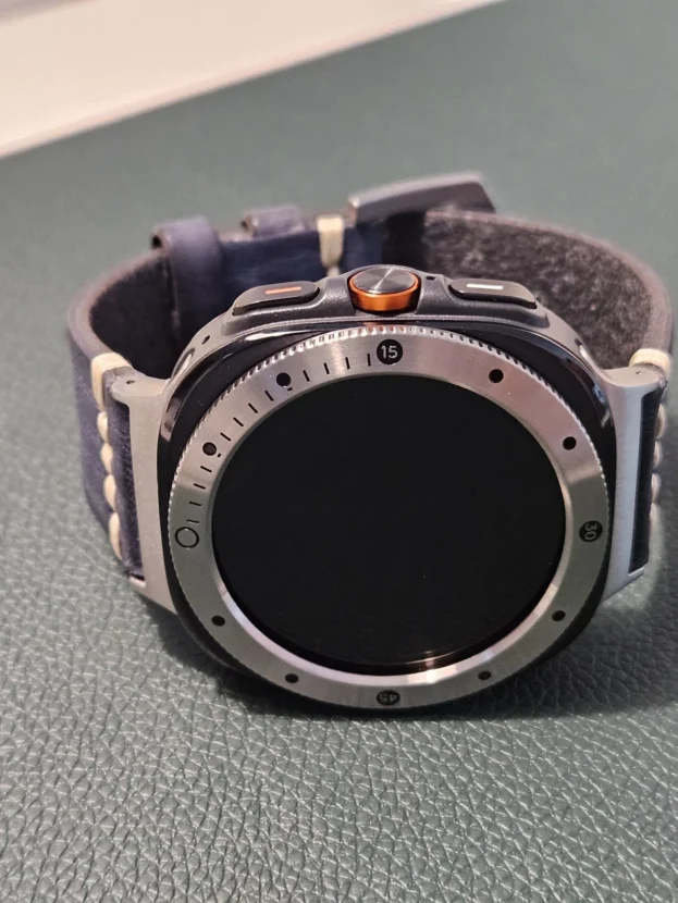
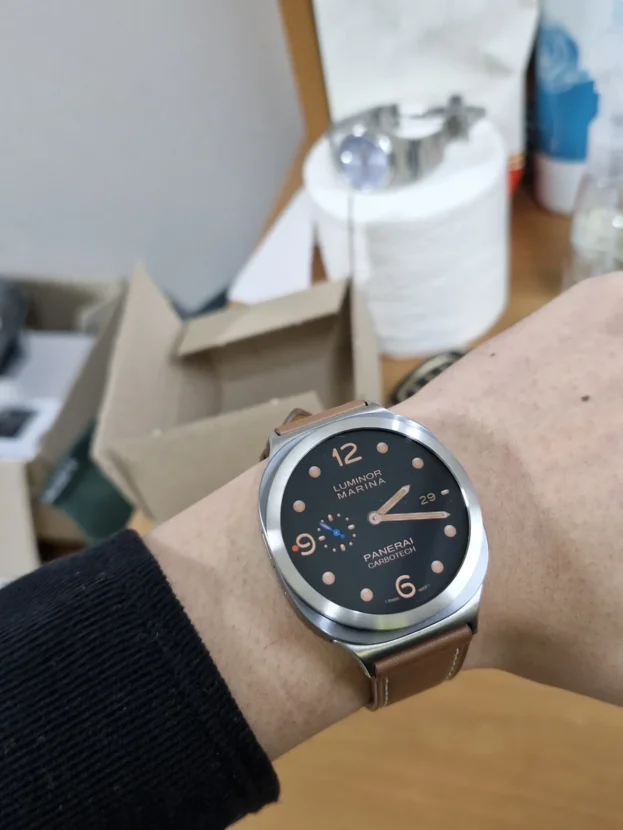
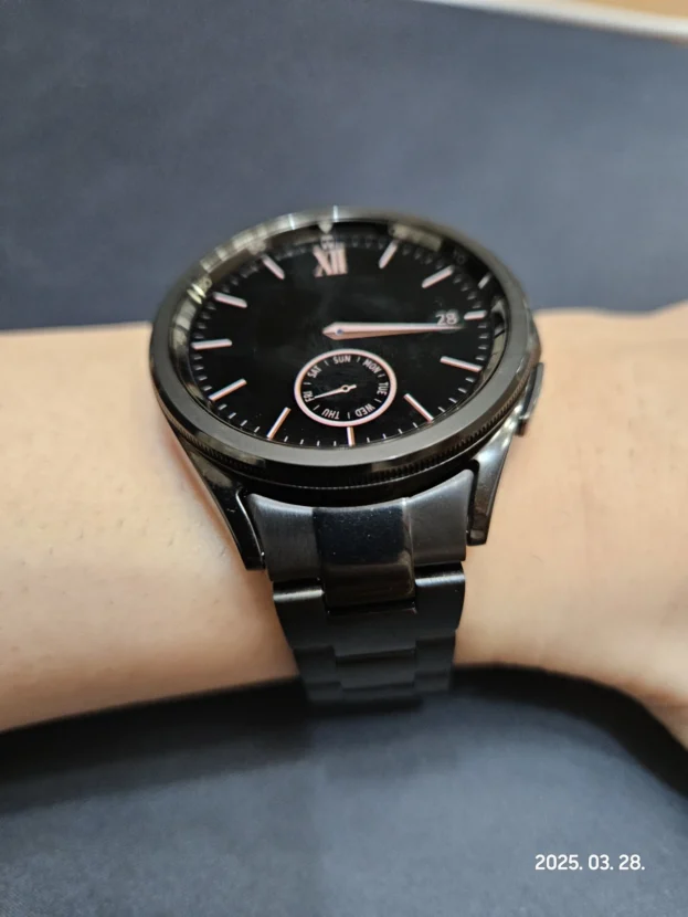
갤럭시워치 메탈 베젤링은 같은 실버 컬러 안에서도 표면에 따라 전혀 다른 인상을 만듭니다. 숫자 눈금이 들어간 베젤은 도구적인 분위기를 더하고, 플루티드 홈은 손목의 움직임에 따라 빛을 잘게 나눕니다. 장식을 덜어낸 플레인 베젤은 워치페이스와 본체의 형태를 가장 담백하게 남깁니다.
스마트워치의 전면은 화면과 외곽선이 차지하는 비중이 큽니다. 스트랩보다 작은 갤럭시워치 메탈 베젤링도 폭, 표면 결, 안쪽 간격이 달라지면 다이얼이 보이는 크기와 케이스의 존재감을 함께 바꿉니다. 화면이 켜졌을 때뿐 아니라 검은 화면으로 남아 있을 때도 금속 테두리가 시계의 얼굴을 분명하게 잡아 줍니다.
실사용에서는 디자인만큼 조작 여유와 부착 상태가 중요합니다. 화면 가장자리의 스와이프가 자연스러운지, 측면 버튼을 누를 때 손가락이 걸리지 않는지, 접착면이 케이스 곡면을 따라 고르게 닿는지를 함께 봐야 합니다. 모델과 사이즈를 정확히 맞춘 뒤 표면 취향을 고르면 손목 위 비율과 사용감이 모두 안정됩니다.

다른 제품 하루만에 떨어져 박살 났는데 퍼슬랏은 확실히 다르네요 고 품격입니다.추가상품 접착제를 해야하는데 필림을 잘못 추가했네요ㅠㅠ
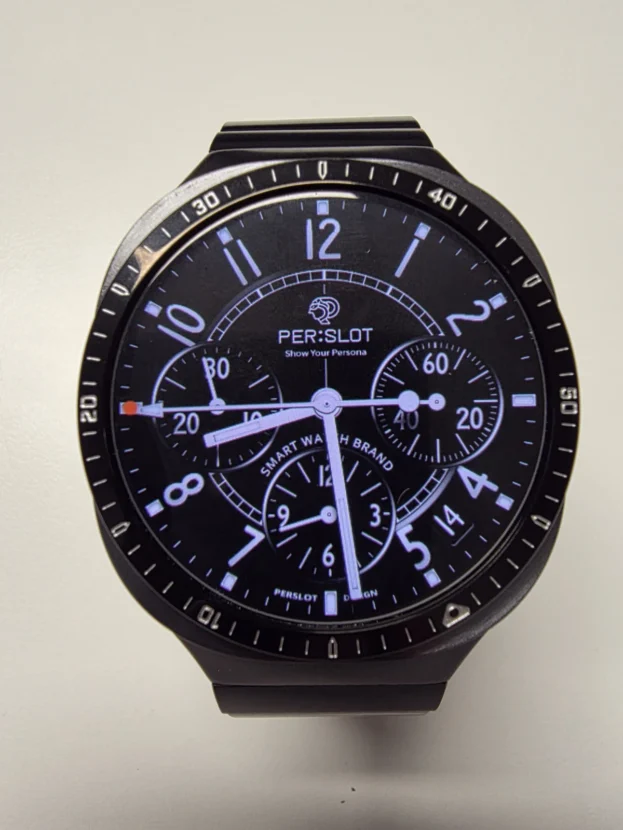
숫자 눈금이 만드는 도구적인 표정
20, 30, 40, 50 숫자와 짧은 인덱스가 배치된 갤럭시워치 메탈 베젤링은 워치페이스 바깥에 별도의 스케일을 만듭니다. 화면이 꺼져도 눈금이 남아 원형 다이얼의 방향을 분명히 하고, 검은 화면이 켜지면 밝은 숫자와 메탈 테두리 사이에 또렷한 대비가 생깁니다.
블랙 밴드처럼 반사가 적은 소재와 맞추면 전면의 실버 라인이 중심이 됩니다. 운동용 워치페이스나 크로노그래프처럼 정보가 많은 화면에서는 바깥 눈금이 구조를 이어 주고, 단순한 디지털 화면에서는 장식적인 프레임으로 작동합니다. 부착할 때는 12시와 6시 방향부터 맞춰 숫자가 한쪽으로 기울지 않게 잡는 것이 중요합니다.

깔끔하고 딱좋네요 ^^
장식을 덜어낸 브러시드 실버
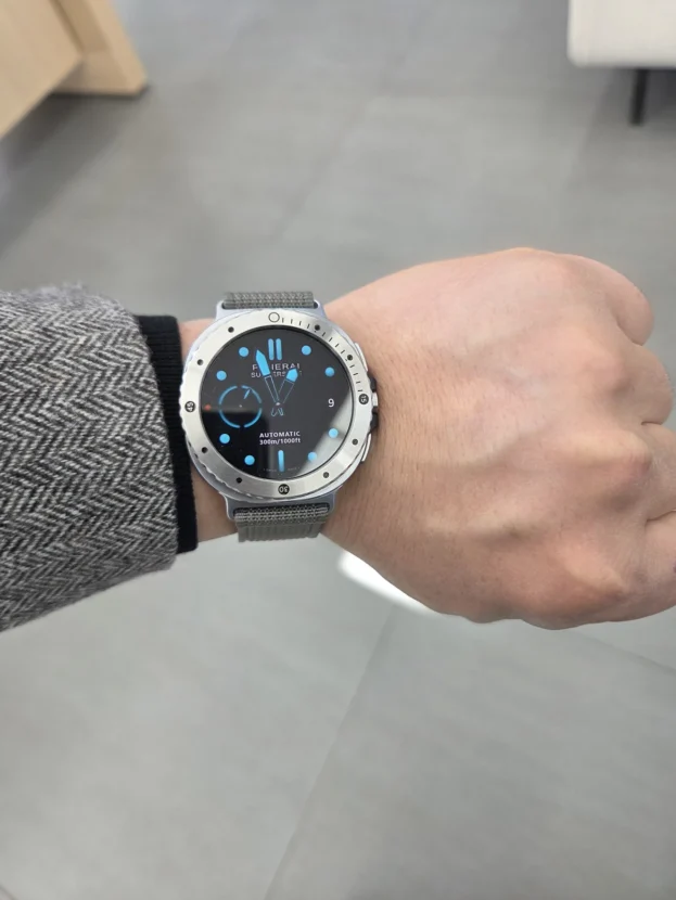
플레인 베젤링은 각인보다 금속의 폭과 결이 먼저 보입니다. 브러시드 표면은 빛을 넓고 부드럽게 퍼뜨려 유광처럼 번쩍이지 않으며, 화면 둘레에 얇은 명암만 남깁니다. 워치페이스를 자주 바꾸는 사용자에게 잘 맞는 이유도 특정 숫자나 패턴이 화면 디자인과 부딪치지 않기 때문입니다.
화이트 밴드와 조합하면 실버와 밝은 본체가 자연스럽게 이어지고, 화면이 꺼졌을 때 검은 원만 또렷하게 남습니다. 셔츠와 니트처럼 차분한 옷차림에서는 과한 장식 없이 시계다운 경계를 만들고, 주말의 가벼운 복장에서는 본체의 미니멀한 실루엣을 그대로 살립니다.

좋아용 좋아용 품질배송 최고!!
플루티드 홈에 나뉘는 빛
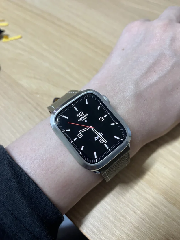
플루티드 표면은 일정한 간격의 홈이 둘레를 따라 반복됩니다. 손목을 돌리면 각 홈이 서로 다른 방향으로 빛을 받아 짧은 반사가 연속으로 이어집니다. 평면 베젤보다 존재감이 분명하지만 홈의 간격이 촘촘해 한 부분만 과하게 번쩍이지 않는 것이 특징입니다.
검은 가죽 스트랩과 함께 놓이면 광택의 차이가 선명해집니다. 가죽은 넓고 어두운 면으로 손목을 정리하고, 플루티드 베젤은 전면에서만 반사를 만듭니다. 같은 실버 워치라도 정장과 재킷에 가까운 분위기가 살아나며, 아날로그 워치페이스의 인덱스와 홈의 반복도 자연스럽게 연결됩니다.

리뷰도 없고, 타 업체들에 비해 금액대 저렴하지않아 구매를 망설였는데 받아보니 정말 대만족입니다!! 우선 케이스로 인해 액정 테두리 터치감이나 측면 버튼조작 방해하는 일 절대 없어 대대대 만족이구요!
터치와 버튼을 남겨 둔 구조
갤럭시워치 메탈 베젤링은 화면 가장자리를 보호하면서도 조작 영역을 침범하지 않아야 합니다. 안쪽 개구부가 화면에 지나치게 가까우면 가장자리 스와이프가 답답해지고, 측면이 두꺼우면 버튼을 누르는 손가락 각도까지 달라집니다. 케이스의 개구부와 버튼 주위 여유는 매일 쓰는 과정에서 바로 체감되는 부분입니다.
부착 전에는 케이스 안쪽의 접착 위치와 본체 버튼 방향을 먼저 맞춥니다. 한쪽부터 강하게 누르기보다 전체 위치를 가볍게 잡은 뒤 화면의 상하좌우 간격을 비교하면 치우침을 줄일 수 있습니다. 터치와 버튼이 자연스럽게 남아야 외관의 변화가 사용성을 방해하지 않습니다.

심플 이즈 베스트 추천 강추 찾던 베제링을 저렴하게 구매해서 아주 좋았습니다 감사합니다
워치페이스를 가리지 않는 간결한 원
장식이 적은 베젤은 워치페이스의 색과 정보를 그대로 보여줍니다. 해 질 무렵의 풍경처럼 화면 전체에 색이 퍼지는 배경에서는 바깥의 브러시드 실버가 얇은 액자처럼 작용하고, 검은 다이얼에서는 안쪽 원과 외곽선의 대비가 더 선명해집니다.
미니멀한 디자인의 장점은 스트랩 선택에서도 이어집니다. 실리콘, 가죽, 패브릭, 메쉬처럼 질감이 달라져도 베젤의 표면이 강하게 경쟁하지 않습니다. 워치 본체와 실버 톤을 먼저 맞춘 뒤 스트랩으로 계절과 옷차림을 바꾸기 쉬운 조합입니다.

매번 횡하던 부분이 깔금하게 채워지네요 게다가 뭔가 고급져 보이기까지 하고 많이 만족스럽네요
메쉬 결 위에 놓이는 정교한 원형
메쉬 밴드의 촘촘한 금속 결은 손목을 따라 유연하게 흐르고, 숫자 눈금 베젤링은 전면의 원을 단단하게 잡습니다. 같은 실버 계열이어도 메쉬는 작은 면이 반복되고 베젤은 넓은 원형 면을 이루기 때문에 질감이 단조롭지 않습니다.
손목 위에서 비어 보이던 부분이 채워졌다는 반응은 단순히 금속 장식이 늘었다는 의미와 다릅니다. 워치페이스와 본체 사이에 하나의 경계가 생기면서 화면, 케이스, 밴드가 순서대로 읽히기 시작합니다. 갤럭시워치 베젤링 착용 후기에 자주 등장하는 일체감은 이 세 요소의 간격이 고르게 맞을 때 생깁니다.
표면 취향과 사용감이 함께 맞는 선택
숫자 눈금, 플루티드 홈, 플레인 브러시드는 같은 실버라도 전혀 다른 빛을 만듭니다. 선명한 스케일을 원한다면 눈금형이 잘 맞고, 움직일 때 드러나는 반사를 좋아한다면 플루티드가 어울립니다. 워치페이스와 스트랩을 자주 바꾼다면 장식을 덜어낸 플레인 베젤이 가장 유연합니다.
디자인을 고른 뒤에는 정확한 모델과 사이즈, 화면 안쪽 간격, 측면 버튼의 여유를 살핍니다. 부착면의 먼지와 유분을 닦고 중심을 맞춘 뒤 둘레를 고르게 눌러야 금속 테두리가 한쪽으로 들뜨지 않습니다. 보호필름을 함께 사용할 때는 베젤링 내경에 맞춘 전용 규격을 사용해야 겹침과 들뜸을 줄일 수 있습니다.
갤럭시워치 메탈 베젤링은 화면과 버튼을 그대로 사용하면서 전면의 금속선만 세밀하게 바꿉니다. 손목 위 비율을 해치지 않고 표면과 조작감이 함께 맞으면 매일 보는 워치의 인상도 오래 안정적으로 남습니다.
Galaxy Watch Metal Bezel Review: Three Distinct Surface Finishes
A Galaxy Watch bezel can look markedly different even when every option is silver. A numbered scale introduces a precise, instrument-like character. Fluted grooves divide reflected light into a sequence of short highlights, while a plain brushed surface leaves the watch face and the original case profile as the main visual elements.
The front of a smartwatch is dominated by the display and its outer boundary. A small difference in bezel width, texture or inner clearance changes how large the dial appears and how firmly the case sits on the wrist. The metal edge remains visible when the screen is off, giving the circular face a clear and watch-like outline.
Daily use depends on more than appearance. Edge swipes should remain comfortable, side buttons need enough finger clearance, and the adhesive must sit evenly along the case. Selecting the exact watch model and size before choosing a surface finish keeps both the proportion and the controls in balance.
An Instrument-Like Character From A Numbered Scale
Another product fell off and broke after only a day, but PERSLOT feels clearly different and very refined. I meant to add the extra adhesive, but accidentally selected the film instead.
The 20, 30, 40 and 50 numerals form a secondary scale outside the watch face. They establish the direction of the circular dial even when the screen is dark, and create a crisp contrast between the black display, bright markings and the silver edge when the screen is on.
With a low-reflection black band, the metal line becomes the focal point at the front. Information-rich chronograph faces connect naturally with the outer scale, while simple digital faces use it as a restrained frame. During attachment, aligning twelve and six o’clock first prevents the numerals from sitting at a visible angle.
Brushed Silver With The Decoration Removed
Clean, and the fit is just right. ^^
A plain bezel is defined by its width and grain rather than engraving. Brushed metal spreads light softly across the surface instead of producing a sharp mirror reflection. It leaves only a controlled highlight around the display and remains compatible with a broad range of watch-face designs.
Paired with a white band, the silver edge blends naturally into the bright case while the black screen remains clearly outlined. The restrained finish works with a shirt or knitwear without appearing decorative, and preserves the watch’s minimal profile in more casual settings.
Light Divided By Fluted Grooves
I like it, I like it. Excellent quality and delivery!!
A fluted surface repeats evenly spaced grooves around the circumference. As the wrist turns, each groove catches light from a slightly different direction, creating a continuous sequence of brief reflections. It has more presence than a flat bezel without allowing one broad area to become overly bright.
The contrast is especially clear with a black leather strap. Leather settles the lower wrist with a broad, dark surface, while the fluted bezel concentrates reflection at the front. The combination feels closer to a dress watch, and analogue indices connect naturally with the rhythm of the grooves.
Clearance For Touch And Side Buttons
There were no reviews and the price was not low compared with other brands, so I hesitated. Once it arrived, however, I was extremely satisfied. The case does not interfere with edge touch gestures or the side buttons, which is especially pleasing.
A front accessory must protect the display edge without occupying the control area. If the inner opening sits too close to the screen, edge swipes feel restricted. If the side wall is too thick, the angle of the finger changes when pressing a button. The clearances around the opening and controls are details that become obvious in everyday use.
Before attachment, match the inner adhesive position with the orientation of the watch buttons. Set the component down lightly, compare the spacing on all four sides, and press the perimeter evenly only after the centre is correct. A visual change should never come at the expense of normal control.
A Simple Circle That Leaves The Watch Face Open
Simple is best. I strongly recommend it. I found the bezel I wanted at a good price, and I am very pleased. Thank you.
A minimally decorated bezel allows the colours and information of the watch face to remain dominant. With a full-colour landscape background, brushed silver acts like a slim picture frame. With a black dial, the contrast between the dark inner circle and the metal edge becomes more pronounced.
That restraint also makes strap changes easier. Silicone, leather, fabric and mesh can introduce very different textures without competing with the bezel. Matching the metal tone to the watch body first creates a stable base that can move between seasons and outfits.
A Precise Circle Above A Fine Mesh Texture
The area that used to feel empty now looks neatly finished. It even appears more refined, and I am very satisfied.
The fine metal texture of a mesh band follows the wrist, while a numbered bezel holds the circular front firmly in place. Although both are silver, the mesh consists of many small repeating surfaces and the bezel forms a broader ring, preventing the combination from feeling visually flat.
Filling the space around the display is not simply a matter of adding more metal. A clear boundary allows the eye to read the screen, case and band in sequence. The sense of cohesion often associated with a well-fitted bezel comes from keeping those intervals even.
Matching Surface Preference With Daily Use
Numbered, fluted and plain brushed finishes create three distinct types of reflection. A scale design suits users who want visible markers, fluting suits those who enjoy changing highlights, and a plain bezel remains the most flexible option for frequent watch-face and strap changes.
After selecting the finish, check the exact model, size, inner display clearance and side-button access. Clean dust and skin oil from the attachment area, centre the component and press the perimeter evenly. When a screen protector is used, choose the PERSLOT protector sized for the inner opening of the bezel to reduce overlap and lifting.
A well-proportioned bezel changes the metal outline while leaving the display and controls intact. Once the finish and daily usability are both right, the watch retains a composed appearance through repeated everyday wear.
추가 정보
갤럭시워치 메탈 베젤링의 표면 선택
착용 뒤 체감되는 차이는 표면의 반사, 화면 안쪽 간격, 조작 영역의 여유입니다. 숫자 눈금은 다이얼의 방향을 강조하고, 플루티드 홈은 움직임에 따라 반사를 나누며, 플레인 브러시드는 여러 워치페이스와 스트랩에 담백하게 이어집니다.
- 워치 세대와 사이즈에 맞는 전용 옵션을 선택합니다.
- 12시와 6시 방향을 먼저 맞춰 각인과 원의 중심을 잡습니다.
- 화면 가장자리 스와이프와 측면 버튼 주위의 손가락 여유를 봅니다.
- 접착면의 먼지와 유분을 제거하고 완전히 건조한 뒤 부착합니다.
- 일반 전면 보호필름보다 베젤링 내경에 맞춘 전용 보호필름을 사용합니다.
- 브러시드, 유광, 플루티드 중 스트랩과 비슷한 반사 강도를 고릅니다.
- 초기 부착 뒤에는 강한 물기와 반복 충격을 줄여 접착면을 안정시킵니다.
자주 묻는 질문
숫자 눈금 베젤링은 어떤 워치페이스와 잘 맞나요?
크로노그래프, 아날로그 인덱스, 운동 정보가 원형으로 배치된 워치페이스와 자연스럽게 이어집니다. 단순한 디지털 화면에서는 바깥 눈금이 별도의 프레임이 되어 전면의 방향을 분명하게 잡습니다.
플루티드와 플레인 베젤링의 차이는 무엇인가요?
플루티드는 홈이 빛을 잘게 나눠 손목을 움직일 때 반사가 풍부합니다. 플레인은 넓고 차분한 금속 면이 남아 워치페이스와 스트랩을 자주 바꾸는 사용자에게 더 유연합니다.
베젤링을 붙이면 터치가 불편해지나요?
모델과 사이즈가 정확히 맞고 중심이 올바르면 화면 가장자리의 조작 영역을 침범하지 않습니다. 부착 뒤에는 상하좌우 스와이프와 뒤로 가기 동작을 한 번씩 실행해 안쪽 간격이 고른지 살펴봅니다.
측면 버튼을 누를 때 무엇을 봐야 하나요?
버튼 위아래에 손가락이 들어갈 공간이 남아 있어야 하며 케이스가 한쪽으로 치우치지 않아야 합니다. 부착 전에 버튼 방향을 기준으로 가볍게 올려 보고, 조작 각도가 자연스러울 때 둘레를 눌러 고정합니다.
일반 보호필름과 함께 사용할 수 있나요?
일반 전면 보호필름은 베젤링 없이 화면 전체를 덮도록 설계되어 외경이 겹칠 수 있습니다. 퍼슬랏 전용 보호필름은 베젤링 내경에 맞춰 설계되므로 두 부품을 함께 사용할 때 간격이 안정적으로 남습니다.
부착 중심은 어떻게 맞추나요?
12시 방향을 먼저 잡고 6시, 3시, 9시 순서로 화면 안쪽 여백을 비교합니다. 위치가 맞기 전에는 강하게 누르지 않고, 네 방향의 간격이 비슷할 때 둘레를 나누어 눌러 줍니다.
금속 표면의 지문과 먼지는 어떻게 관리하나요?
부드러운 극세사 천으로 결을 따라 가볍게 닦습니다. 홈이나 각인 사이의 먼지는 마른 부드러운 브러시로 제거하고, 액체 세정제가 접착면 아래로 스며들지 않게 주의합니다.
색상과 호환 모델은 어디에서 비교하나요?
퍼슬랏 공식몰에서 워치 세대와 사이즈별 옵션, 색상, 상세 치수를 비교할 수 있습니다. 실제 반사와 부착 과정은 퍼슬랏 공식 유튜브의 착용 영상과 함께 보면 이해하기 쉽습니다.
표면에 따라 달라지는 손목 위 인상
눈금형 베젤과 정보 밀도
눈금형 디자인은 화면 안의 정보가 많을수록 바깥 구조와 연결되는 효과가 큽니다. 반대로 미니멀한 워치페이스에서는 숫자와 인덱스가 장식의 역할을 맡아 빈 화면 둘레에 일정한 리듬을 만듭니다.
플루티드 홈과 옷차림
촘촘한 홈은 재킷, 셔츠, 가죽 스트랩처럼 표면이 정돈된 옷차림과 잘 맞습니다. 손목을 움직일 때만 반사가 살아나므로 정면에서는 규칙적인 금속 테두리로, 측면에서는 입체적인 홈으로 보입니다.
브러시드 실버와 일상 착용
브러시드 표면은 지문과 작은 반사를 비교적 차분하게 받아들입니다. 색이 강한 워치페이스나 밝은 밴드와 조합해도 외곽선이 과하게 앞서지 않아 데일리 착용에 폭넓게 어울립니다.
접착면과 초기 관리
접착력은 표면을 누르는 힘보다 부착 전 세척과 중심 정렬의 영향을 크게 받습니다. 먼지와 유분을 닦고 건조한 뒤 정확한 위치를 잡아 둘레를 고르게 눌러야 한쪽 들뜸을 줄일 수 있습니다.
퍼슬랏의 스마트워치 액세서리 방향과 전체 라인업은 퍼슬랏 브랜드 사이트에서 이어서 살펴볼 수 있습니다.