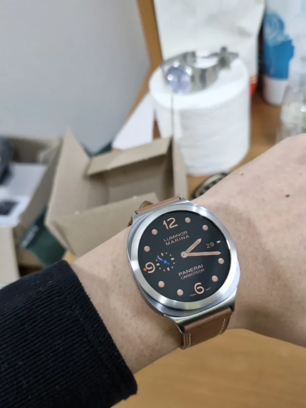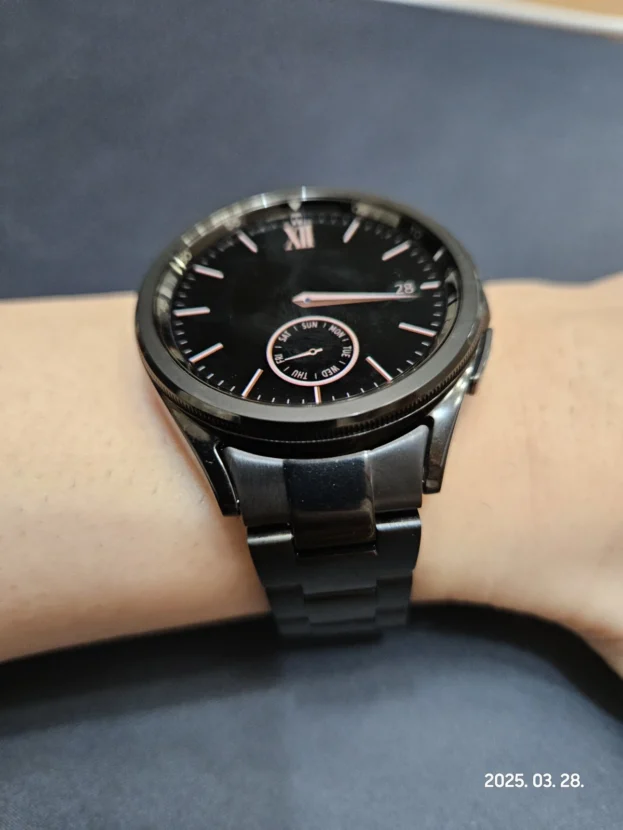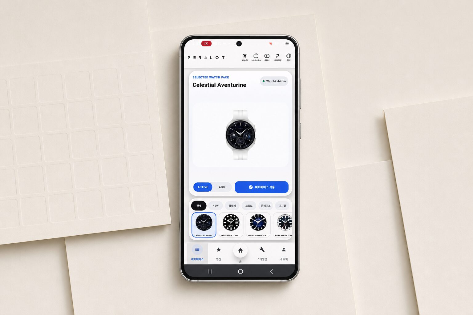



갤럭시워치 워치페이스와 베젤링, 인덱스가 이어지는 손목 위 다이얼
갤럭시워치 워치페이스는 화면 안에서 끝나지 않습니다. 시침과 분침, 서브 다이얼, 날짜 창이 만들어 낸 질서는 화면 바깥의 베젤링과 만날 때 비로소 하나의 다이얼로 읽힙니다. 검은 화면 둘레에 숫자 눈금이 이어지면 정보의 방향이 또렷해지고, 장식을 덜어낸 실버 원은 워치페이스의 색과 인덱스를 더 넓고 차분하게 남깁니다.
베젤링의 역할은 화면을 화려하게 꾸미는 데만 있지 않습니다. 다이얼 안쪽의 미닛 마커와 바깥쪽 눈금 간격이 맞으면 시선이 중심에서 외곽으로 자연스럽게 이동합니다. 반대로 화면의 정보가 많을 때는 외곽선을 단순하게 두어 밀도를 조절할 수 있습니다. 같은 워치 본체라도 어떤 워치페이스를 켜고 어떤 베젤을 두르느냐에 따라 필드 워치, 크로노그래프, 드레스 워치의 분위기가 분명하게 갈립니다.
손목 위 완성도는 모델과 사이즈, 부착 중심, 화면 안쪽 여백이 함께 맞아야 유지됩니다. 12시와 6시 방향을 먼저 맞추고 좌우 간격을 비교하면 숫자와 마커가 기울어 보이는 일을 줄일 수 있습니다. 터치 영역과 측면 버튼의 여유를 그대로 남기면서 다이얼의 외곽선만 정돈하는 것이 퍼슬랏 베젤링의 기본입니다.

일반.워치에 클래식을 더해서 오피스룩과도 잘 어울려요.
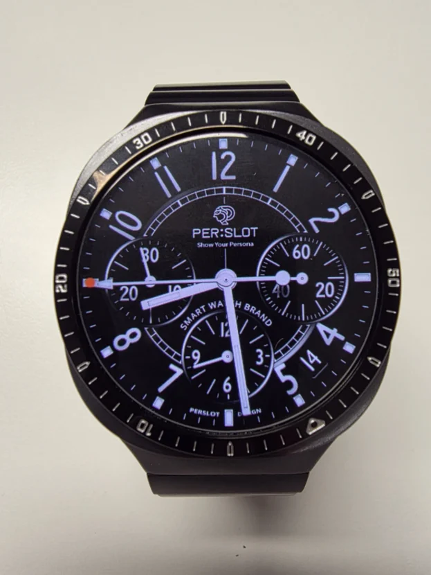
크로노그래프 바깥으로 이어지는 미닛 스케일
세 개의 서브 다이얼과 굵은 인덱스가 들어간 크로노그래프 화면은 정보 밀도가 높습니다. 이때 실버 베젤링의 숫자와 짧은 눈금이 워치페이스 바깥에서 같은 방향을 이어 주면 전면이 복잡하게 흩어지지 않습니다. 화면 안쪽의 흰 마커와 바깥 금속 눈금이 한 줄로 연결되면서 원형 다이얼의 크기도 또렷하게 드러납니다.
실버 표면은 검은 다이얼과 밝은 워치 본체 사이에 중간 톤을 만듭니다. 유광 면은 손목을 움직일 때 짧은 반사를 남기고, 각인된 숫자는 정면에서 차분하게 읽힙니다. 셔츠나 재킷처럼 선이 정돈된 옷차림에서는 화면의 디지털 느낌을 줄이고 아날로그 시계에 가까운 표정을 더합니다.

생각했던 필드워치 느낌나서 좋아요
필드 워치의 방향감을 만드는 검은 눈금
월과 날짜, 배터리, 활동 정보가 원형으로 배치된 화면에는 바깥 방향을 잡아 주는 선이 필요합니다. 검은 베젤링은 화면의 어두운 배경을 외곽까지 이어 주면서 밝은 숫자와 바늘이 먼저 보이게 합니다. 작은 눈금이 일정한 간격으로 둘레를 감싸면 많은 정보가 들어간 화면도 하나의 계기판처럼 정돈됩니다.
필드 워치의 분위기는 거친 장식보다 읽기 쉬운 대비에서 나옵니다. 어두운 테두리, 밝은 인덱스, 선명한 중심 바늘이 층을 나누어야 시각적인 방향이 빠르게 잡힙니다. 베젤링이 화면을 과하게 덮지 않고 가장자리만 정리하면 디지털 정보의 장점은 그대로 남고 전면에는 시계다운 긴장감이 더해집니다.

베젤링 이렇게 다양하고 퀄리티 좋게 파는 곳은 처음 보는 거 같습니다. 나중에 다른 제품도 사서 쟁여두고 싶네요.
블랙과 실버가 교차하는 입체 눈금
검은 면과 실버 테두리가 반복되는 베젤링은 평평한 원보다 깊이가 분명합니다. 밝은 숫자와 굵은 마커가 검은 바탕 위에서 떠오르고, 바깥의 실버 모서리는 주변 빛을 받아 전면의 형태를 한 번 더 강조합니다. 검은 크로노그래프 워치페이스와 맞추면 화면 안쪽과 베젤링 바깥쪽의 명암이 자연스럽게 이어집니다.
장식이 많은 디자인은 모든 요소를 같은 강도로 보이게 하면 답답해질 수 있습니다. 중앙의 바늘과 서브 다이얼은 밝게, 베젤의 검은 면은 깊게, 가장 바깥 금속선은 짧게 반사되도록 층을 나누면 전면의 정보가 순서대로 읽힙니다. 입체적인 베젤링을 고를 때 워치페이스의 배경색과 인덱스 굵기를 함께 보는 이유입니다.

블랙 실버 고민했는데 실버가 더 괜찮은거같아요 베젤링 돌리는 맛도 상당하네요
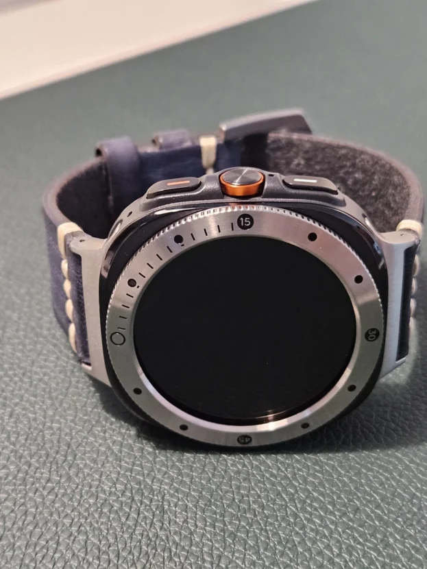
실버 표면 위에 놓인 검은 마커
실버 베젤링은 같은 금속색 안에서도 각인 방식에 따라 성격이 달라집니다. 검은 숫자와 원형 마커가 넓은 실버 면 위에 떨어져 있으면 눈금 사이에 여백이 생겨 전면이 한결 가볍게 보입니다. 블랙 모델보다 밝은 금속 면이 많이 드러나므로 워치 본체의 실버 톤과 연결되는 면적도 넓습니다.
회전 구조를 사용하는 베젤링은 마커의 위치가 바뀌면서 다이얼의 인상도 달라집니다. 조작할 때는 손가락이 걸리는 가장자리의 결, 회전 간격, 원위치에서 보이는 숫자의 정렬을 함께 살피게 됩니다. 화면이 꺼졌을 때도 검은 마커가 남아 있어 장식과 조작부의 역할이 동시에 드러납니다.

두번째 구입입니다. 아주 맘에 들러요.
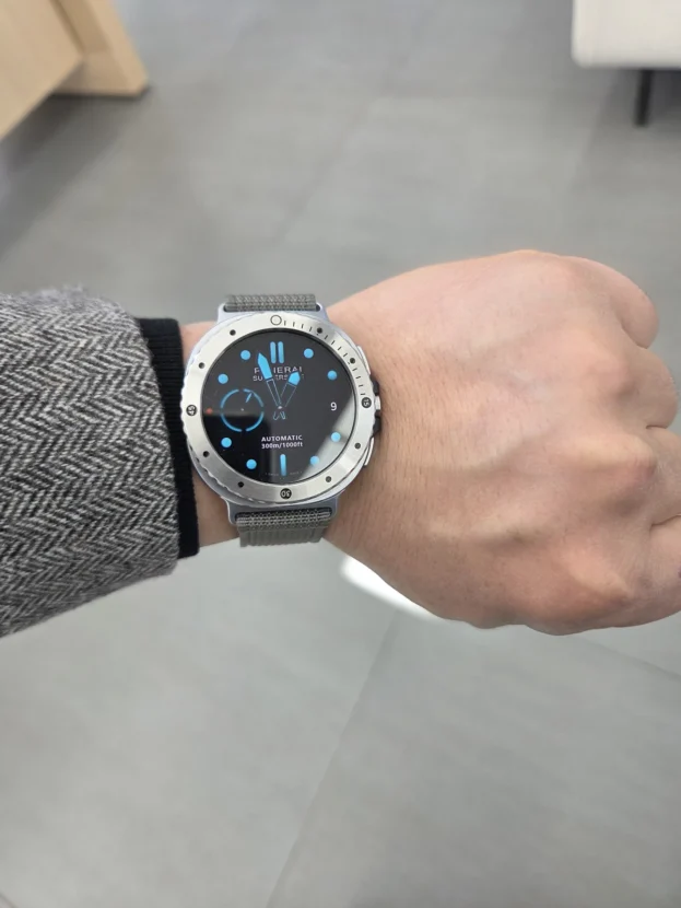
투톤 눈금과 어두운 다이얼의 대비
실버와 블랙이 한 원 안에서 나뉘는 투톤 베젤링은 다이얼의 방향을 강하게 표시합니다. 어두운 아날로그 화면과 맞추면 검은 구간은 화면에 스며들고, 실버 구간과 숫자만 바깥으로 떠오릅니다. 전면 전체가 한 가지 금속색으로 채워질 때보다 변화가 크면서도 중심의 시침과 분침은 또렷하게 남습니다.
투톤 디자인은 12시 방향과 좌우 균형이 특히 중요합니다. 숫자와 색 경계가 기울면 워치페이스의 인덱스까지 비뚤어 보일 수 있으므로 접착 전에 네 방향의 여백을 천천히 맞춥니다. 중심이 정확히 잡히면 화면과 베젤이 같은 축을 공유하면서 손목 위에서 안정된 원형을 만듭니다.

깔끔하고 고급스럽습니다.
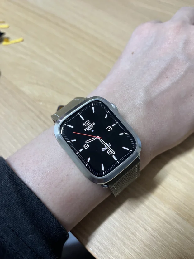
숫자를 덜어낸 실버 원과 밝은 다이얼
밝은 아날로그 워치페이스에는 장식이 적은 실버 베젤링이 잘 어울립니다. 숫자나 굵은 마커가 없는 금속 면은 다이얼의 색을 가리지 않고, 브러시드 결만 은은하게 남겨 화면과 케이스 사이를 정리합니다. 인덱스가 가늘고 여백이 많은 화면일수록 플레인 베젤의 차분한 폭이 선명하게 드러납니다.
화면 색을 자주 바꾸어도 실버 원은 특정 워치페이스에 묶이지 않습니다. 밝은 파스텔 톤에서는 깨끗한 경계를 만들고, 검은 화면에서는 금속 테두리가 또렷한 대비를 만듭니다. 다이얼을 주인공으로 두면서 손목 위에 시계다운 외곽선만 더하고 싶을 때 오래 활용하기 좋은 방식입니다.
워치페이스를 바꾸어도 남는 다이얼의 외곽선
숫자 눈금형, 블랙 인덱스형, 투톤, 플레인 실버는 워치페이스와 만나는 방식이 모두 다릅니다. 크로노그래프처럼 정보가 많은 화면에는 바깥 스케일을 이어 주는 디자인이 어울리고, 색과 여백을 즐기는 화면에는 장식을 덜어낸 금속 원이 안정적입니다. 다이얼 안쪽과 바깥쪽의 정보 밀도를 서로 반대로 맞추면 전면이 훨씬 편안하게 정리됩니다.
디자인을 정한 뒤에는 사용하는 갤럭시워치의 모델과 사이즈를 정확히 맞춥니다. 부착면의 먼지와 유분을 닦고 12시와 6시, 3시와 9시 순서로 여백을 비교한 뒤 둘레를 고르게 눌러야 합니다. 보호필름을 함께 사용할 때는 퍼슬랏 베젤링 내경에 맞춘 전용 필름을 사용해야 링과 필름이 겹치지 않고 화면 가장자리도 안정적으로 남습니다.
워치페이스는 하루에도 바꿀 수 있지만 손목 위에서 다이얼의 크기와 형태를 결정하는 외곽선은 계속 남습니다. 화면의 인덱스와 베젤링의 눈금, 케이스의 금속 톤이 같은 축에서 만날 때 갤럭시워치는 디지털 기기와 손목시계의 성격을 자연스럽게 함께 갖습니다.
Galaxy Watch Faces And Bezels: Extending The Index Beyond The Screen
A Galaxy Watch face does not end at the pixels of the display. Hands, sub-dials, date windows and minute markers form an internal order, and the bezel determines how that order meets the edge of the case. A numbered bezel can continue the direction of a dense dial, while a plain silver ring gives colour and negative space more room to breathe.
The bezel is not simply an ornamental border. When the spacing of the inner minute track and the outer markers feels consistent, the eye moves naturally from the centre to the perimeter. A busy display can be balanced with a quieter bezel, while a minimal face can gain a stronger watch-like outline from an engraved or two-tone design.
Accurate fit remains essential. The exact Galaxy Watch model and size, the alignment at twelve and six o’clock, the clearance around the display and access to the side buttons all affect everyday use. PERSLOT bezels are intended to refine the outline while leaving the screen and controls available.
A Minute Scale That Continues Beyond The Chronograph
It adds a classic character to an ordinary watch and works very well with office outfits.
A chronograph face already contains a high density of information through its sub-dials and bold indices. Silver numerals and short markers outside the display extend those directions without allowing the layout to scatter. The white markers inside the screen and the metal scale outside it read as one circular dial.
Silver also acts as a middle tone between a dark face and a bright watch body. The polished edges produce short highlights as the wrist moves, while the engraved scale remains restrained from the front. With a shirt or jacket, the additional metal boundary softens the purely digital character of the display.
Black Markers And The Direction Of A Field Watch
It creates exactly the field-watch character I had in mind.
A face showing the month, date, battery and activity information benefits from a clear outer direction. A black bezel carries the dark background to the perimeter and allows the bright numerals and hands to appear first. Regularly spaced marks around the edge hold a complex screen together like an instrument panel.
The field-watch quality comes from legibility rather than excessive decoration. A dark border, bright indices and a clear central hand need distinct visual layers. When the bezel refines only the perimeter, the practical information remains intact and the front gains the controlled tension associated with a purpose-built watch.
Dimensional Markers In Black And Silver
This is the first place where I have seen such a varied selection of bezels with this level of quality. I would like to buy and keep other designs as well.
A bezel that alternates black surfaces with silver edges has greater depth than a flat ring. Bright numerals rise from the dark background, while the outer metal edge catches the surrounding light and reinforces the shape of the case. On a black chronograph face, the contrast continues naturally from the display into the bezel.
Dense designs require a clear hierarchy. The hands and sub-dials can remain bright, the black bezel surface can provide depth, and only the outer metal edge needs to reflect sharply. Comparing the background colour and index weight of the watch face before choosing an elaborate bezel keeps the front from becoming visually crowded.
Black Markers Across A Broad Silver Surface
I considered black and silver, but silver looks better to me. The tactile feel of rotating the bezel is also very satisfying.
Silver bezels vary considerably according to how the engraving is arranged. Black numerals and circular markers placed across a broad metal surface leave visible intervals between the details, giving the front a lighter appearance. More of the bright surface is exposed, so the bezel connects readily with a silver watch body.
On a rotating design, the position of the markers changes the character of the dial as well. The grip along the outer edge, the spacing of each movement and the alignment at the home position become part of the experience. Even with the display off, the black markers remain visible and identify the component as both an ornament and a control.
Two-Tone Markers Against A Dark Analogue Face
This is my second purchase, and I am very pleased with it.
A two-tone bezel divides the direction of the dial more strongly than a single-colour ring. Against a dark analogue face, the black sections recede into the display while the silver sections and numerals project outward. The result is more dynamic than an uninterrupted metal edge without obscuring the hands at the centre.
Alignment is particularly important when colour boundaries and numerals share the same ring. If the bezel sits at an angle, the watch-face indices can appear misaligned as well. Comparing the spacing at twelve, six, three and nine o’clock before pressing the adhesive allows both parts to share the same axis.
A Plain Silver Circle Around A Light Dial
Clean and refined.
A light analogue face pairs naturally with a minimally decorated silver bezel. With no heavy numerals around the perimeter, the brushed grain remains visible without competing with the colour of the display. The restrained width creates a clear boundary between the dial and case.
The same ring remains flexible when the watch face changes. It provides a clean border for pale colours and a sharper contrast around a black screen. A plain finish is especially useful when the dial should remain the main feature and only a watch-like metal outline is needed.
The Outline That Remains As Watch Faces Change
Numbered scales, black markers, two-tone sections and plain silver surfaces all meet the display differently. Chronographs benefit from a scale that continues their internal structure, while colourful or spacious faces remain balanced with a quieter perimeter. Opposing the visual density of the face and bezel usually creates the most comfortable result.
After choosing the design, confirm the exact model and case size. Clean dust and skin oil from the attachment surface, compare the four directional gaps and press the perimeter evenly. When a screen protector is used, the PERSLOT protector made for the inner diameter of the bezel avoids the overlap that can occur with a full-width third-party film.
Watch faces can change throughout the day, but the metal outline continues to define the size and shape of the dial. When the on-screen indices, bezel markers and case tone share one axis, the Galaxy Watch carries the qualities of a digital device and a conventional wristwatch with equal confidence.
추가 정보
다이얼 안쪽과 바깥쪽의 연결
갤럭시워치 워치페이스와 베젤링을 함께 맞출 때는 화면의 정보량, 인덱스 방향, 외곽 금속선의 반사 정도를 함께 살핍니다. 안쪽이 복잡하면 바깥을 단순하게, 안쪽 여백이 넓으면 바깥 눈금을 선명하게 두는 방식이 전면의 균형을 잡는 데 도움이 됩니다.
- 아날로그 인덱스와 베젤링의 12시 방향을 같은 축에 맞춥니다.
- 크로노그래프 화면에는 미닛 스케일이나 숫자 눈금의 간격을 비교합니다.
- 밝은 다이얼에는 플레인 또는 브러시드 실버처럼 장식이 적은 표면이 자연스럽습니다.
- 검은 다이얼에는 실버, 블랙, 투톤의 명암 차이를 비교합니다.
- 화면 가장자리 스와이프와 측면 버튼 주위의 손가락 여유를 남깁니다.
- 베젤링 내경과 보호필름 외경이 겹치지 않는 전용 규격을 사용합니다.
- 접착 전 케이스의 먼지와 유분을 닦고 네 방향의 여백을 맞춥니다.
자주 묻는 질문
아날로그 워치페이스에는 어떤 베젤링이 잘 어울리나요?
굵은 인덱스와 서브 다이얼이 있는 화면은 숫자 눈금형이나 투톤 베젤링과 연결하기 좋습니다. 색과 여백이 중심인 화면은 플레인 실버처럼 장식이 적은 외곽선이 다이얼을 더 또렷하게 남깁니다.
디지털 워치페이스에도 눈금형 베젤링을 사용할 수 있나요?
시간과 운동 정보가 원형으로 배치된 디지털 화면은 바깥 눈금과 자연스럽게 이어집니다. 숫자가 화면 중앙에만 모여 있다면 눈금형 베젤링이 빈 외곽에 방향과 리듬을 더합니다.
워치페이스와 베젤링의 12시 방향은 왜 맞춰야 하나요?
화면의 인덱스와 베젤 숫자가 다른 축에 놓이면 원 전체가 기울어 보일 수 있습니다. 접착 전에 12시와 6시를 먼저 맞추고 3시와 9시의 안쪽 간격까지 비교하면 중심을 안정적으로 잡을 수 있습니다.
실버와 블랙 중 어떤 색이 더 활용하기 쉬운가요?
실버는 밝은 워치 본체와 자연스럽게 이어지고 다양한 화면색에 폭넓게 어울립니다. 블랙은 검은 다이얼의 범위를 바깥까지 확장해 화면과 베젤이 하나의 깊은 원처럼 보이게 합니다.
투톤 베젤링은 어떤 화면에서 효과가 큰가요?
검은 배경에 밝은 시침과 분침이 있는 아날로그 화면에서 색 경계와 숫자가 선명하게 드러납니다. 워치페이스의 인덱스가 지나치게 화려하지 않을수록 투톤의 대비가 답답하지 않게 남습니다.
베젤링을 부착하면 가장자리 터치가 불편해지나요?
사용 모델과 사이즈에 맞는 제품을 중심에 정확히 부착하면 화면 가장자리의 조작 공간이 유지됩니다. 부착 뒤에는 네 방향 스와이프와 측면 버튼을 차례로 사용해 안쪽 간격이 고른지 살펴봅니다.
일반 전면 보호필름을 함께 붙여도 되나요?
일반 필름은 베젤링이 없는 화면 전체를 기준으로 만들어져 외경이 링 안쪽과 겹칠 수 있습니다. 퍼슬랏 전용 보호필름은 베젤링 내경에 맞춘 규격이므로 두 부품 사이의 간격과 접착 상태를 안정적으로 유지하기 좋습니다.
모델별 옵션과 실제 부착 방법은 어디에서 볼 수 있나요?
퍼슬랏 공식몰에서 갤럭시워치 세대와 사이즈별 베젤링 옵션을 비교할 수 있습니다. 중심 정렬과 부착 과정은 퍼슬랏 공식 유튜브의 착용 영상을 함께 살펴보면 이해하기 쉽습니다.
워치페이스 성격에 맞춘 외곽선
아날로그 인덱스와 바깥 눈금
시침과 분침이 중심에서 뻗어 나가는 아날로그 화면은 12개의 인덱스가 다이얼의 방향을 결정합니다. 베젤링의 숫자와 마커를 같은 축에 맞추면 화면 안쪽의 시간 정보가 바깥 금속선까지 자연스럽게 이어집니다.
디지털 정보와 검은 테두리
날짜, 배터리, 활동량처럼 여러 정보가 들어간 화면은 검은 베젤링으로 외곽을 묶으면 정돈된 계기판에 가까워집니다. 밝은 텍스트가 먼저 읽히고 바깥 눈금은 정보의 방향만 조용히 보조합니다.
실버와 투톤의 반사 차이
실버는 주변 빛을 받아 워치 본체의 금속색과 이어지고, 투톤은 검은 구간과 밝은 구간을 나누어 다이얼에 강한 방향을 만듭니다. 같은 워치페이스라도 반사 면적과 숫자 색에 따라 전면의 깊이가 달라집니다.
부착 중심과 전용 보호필름
정확한 중심은 디자인과 조작감을 함께 좌우합니다. 접착 전에 네 방향 여백을 확인하고, 보호필름은 베젤링 내경에 맞춘 전용 규격을 사용해야 필름 가장자리가 링에 눌리거나 들뜨는 일을 줄일 수 있습니다.
퍼슬랏의 베젤링 색상과 갤럭시워치 모델별 구분은 퍼슬랏 브랜드 사이트에서 이어서 살펴볼 수 있습니다.