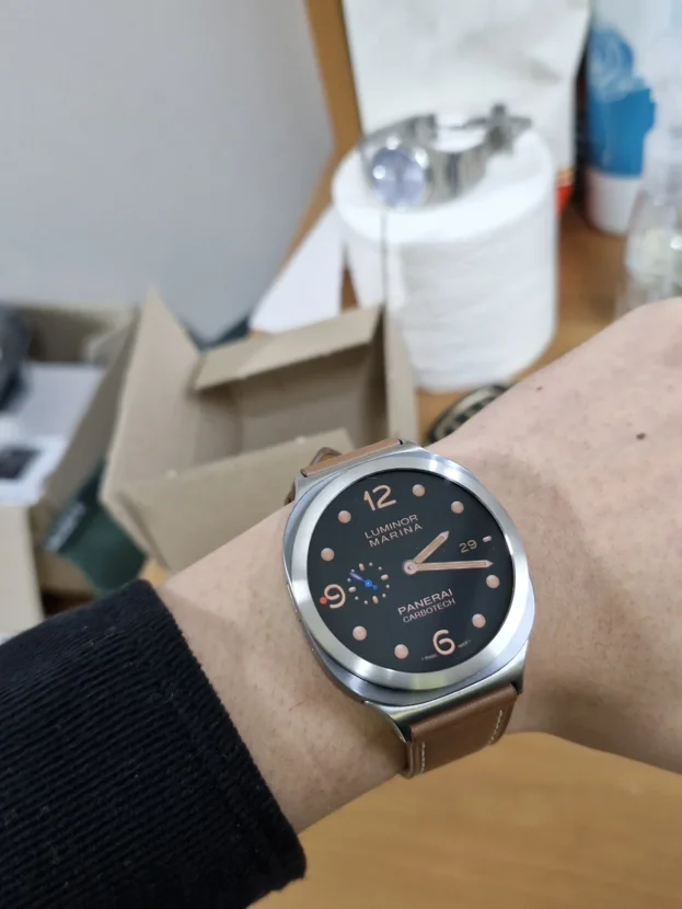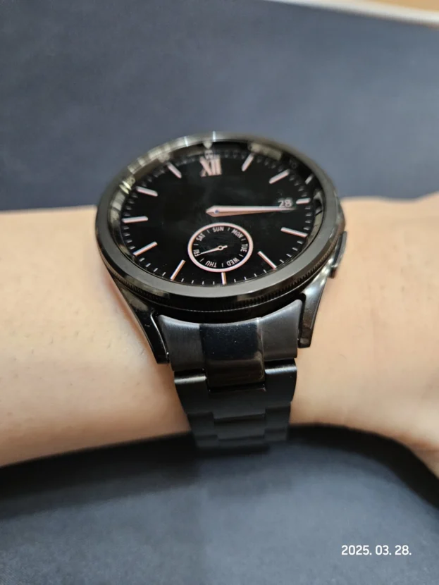



갤럭시워치 실버 베젤링 후기, 그라파이트 바디와 금속선의 대비
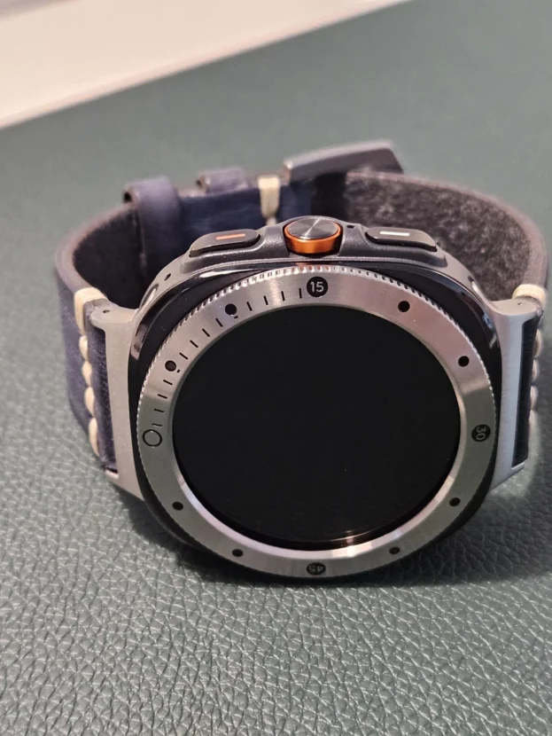
그라파이트 갤럭시워치는 케이스 자체가 빛을 강하게 반사하지 않아 화면과 본체가 한 덩어리처럼 보입니다. 여기에 실버 베젤링을 더하면 디스플레이 가장자리에 얇고 밝은 경계가 생기며, 검은 워치페이스와 어두운 케이스 사이에서 흐릿했던 원형 실루엣이 또렷해집니다. 색을 완전히 맞추는 방식이 아니라 서로 다른 명도를 이용해 시계의 얼굴을 분리하는 조합입니다.
실버라고 모두 같은 표정을 갖는 것은 아닙니다. 숫자 인덱스는 시간의 눈금을 화면 바깥으로 넓히고, 플루티드 커팅은 손목이 움직일 때 짧은 반사를 여러 방향으로 나눕니다. 스크루 포인트는 외곽에 구조적인 힘을 더해 같은 그라파이트 바디에서도 전혀 다른 표정을 만듭니다.
어두운 케이스와 밝은 링 사이에는 색 차이가 선명하게 남습니다. 그 대비가 일반 시계처럼 보이게 하는 장점이 되기도 하고, 같은 색으로 이어지는 조합보다 액세서리의 존재를 조금 더 드러내기도 합니다. 실버 케이스처럼 자연스럽게 녹아들기보다 그라파이트 위에 금속 테두리를 하나 더 그리는 조합입니다. 검은 여백이 넓은 워치페이스를 고르면 밝은 테두리가 과도하게 튀지 않고 중심을 안정적으로 잡습니다.
완성도는 색상보다 정렬에서 먼저 결정됩니다. 44mm처럼 전면 면적이 넓은 워치는 12시와 6시가 조금만 어긋나도 좌우 여백의 차이가 쉽게 보입니다. 부착면을 닦아 말린 뒤 네 방향의 간격을 확인하고, 위치가 맞았을 때 둘레를 눌러 점착해야 선명한 외곽선이 안정적으로 남습니다.
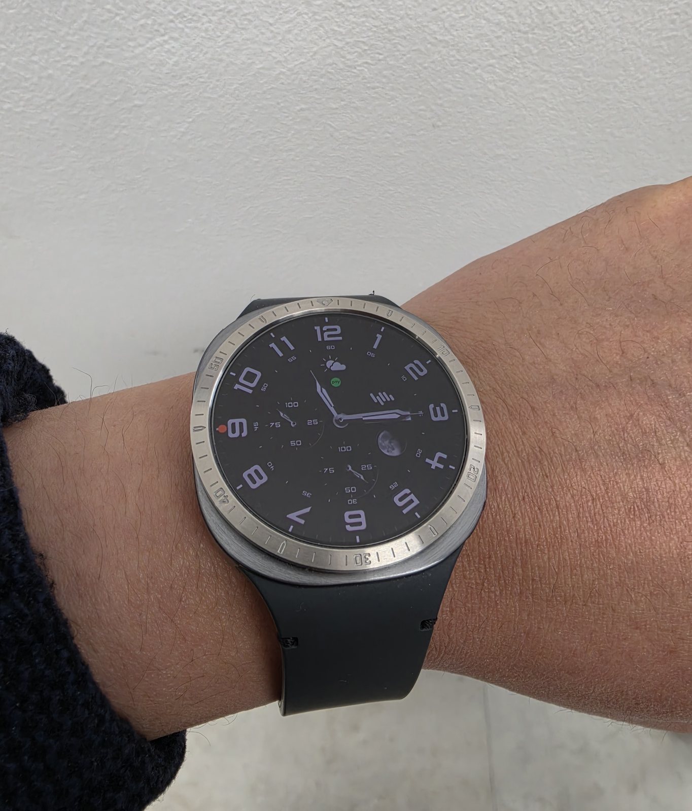
일치감 좋고 디자인도 좋고 마음에 들어서 상황에따라 변화를 주기 위해서 종류별로 구매했습니다.
그라파이트 바디를 가르는 밝은 숫자 링
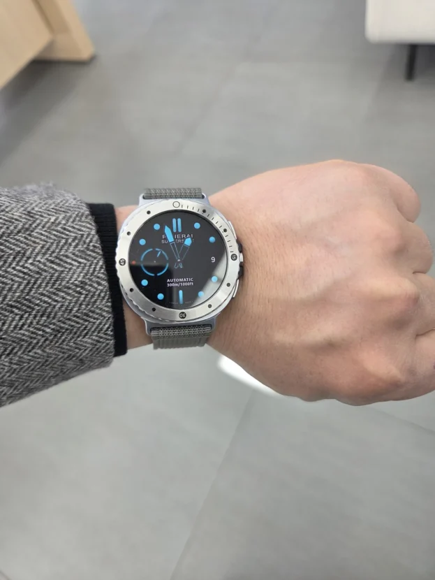
그라파이트 바디와 검은 워치페이스는 명도가 비슷해 화면이 꺼졌을 때 경계가 한층 조용해집니다. 실버 숫자 베젤링은 그 사이에 밝은 원을 세우고, 10분 단위의 숫자와 미닛 마커를 화면 바깥으로 이어줍니다. 디지털 디스플레이 안에 머물던 시계 정보가 금속 외곽까지 확장되면서 전면은 스포츠 워치에 가까운 구조를 갖습니다.
밝은 링의 효과는 손목을 돌릴 때 더 분명합니다. 브러시드 면은 넓게 번쩍이기보다 일부 구간만 짧게 밝아지고, 각인된 숫자는 그 음영 속에서 읽힙니다. 여러 종류를 번갈아 사용한다면 워치페이스를 바꾸는 것보다 더 크게 전면 분위기를 전환할 수 있습니다. 다만 밴드는 사용자가 착용 중인 제품이므로, 베젤링과 어울리는 색과 질감만 따로 살피는 편이 정확합니다.

생각보다 더 예뻐서 만족스러워요
브라운 가죽과 실버 금속의 온도 차이
브라운 가죽은 따뜻하고 부드러운 표면을 갖고, 실버 베젤링은 차갑고 또렷한 반사를 냅니다. 서로 다른 소재가 한 손목 위에 놓이면 워치가 지나치게 금속적으로 보이지 않으면서도 전면의 밝은 선은 유지됩니다. 셔츠나 니트처럼 질감이 드러나는 옷차림에서 이 조합이 편안하게 보이는 이유도 가죽이 금속의 긴장을 적당히 풀어주기 때문입니다.
링과 밴드 색을 완전히 일치시키지 않아도 됩니다. 케이스와 베젤링은 워치의 얼굴을 정리하고, 밴드는 손목 아래까지 이어지는 넓은 면을 맡습니다. 브라운, 다크 네이비, 차콜처럼 채도가 낮은 밴드는 실버 외곽선과 충돌하지 않으며 검은 다이얼을 가운데 단단히 남깁니다.
가죽 밴드를 사용하는 날에는 땀과 물기를 오래 남기지 않는 관리가 중요합니다. 베젤링은 부드러운 마른 천으로 가볍게 닦고, 밴드는 해당 소재의 관리법을 따로 적용해야 합니다. 서로 다른 재료를 한꺼번에 강한 세정제로 닦으면 표면감이 달라질 수 있습니다.

배송빠릅니다 .44mm 그라파이트 색상에 은색 베젤링으로 주문해서 붙여봤어요 살짝 이질감 있는건 어쩔수가 없네요 그래도 아무것도 없을때보다는 일반 시계 느낌이 나네요
44mm 그라파이트에서 보이는 실버의 간격
44mm 그라파이트 케이스에 실버 베젤링을 올리면 두 색의 경계가 숨지 않습니다. 어두운 본체와 은색 링 사이에 명확한 명암 차이가 생겨 액세서리를 더했다는 느낌이 남지만, 동시에 아무 장식이 없을 때보다 전면이 일반 손목시계에 가까워집니다. 화면 가장자리에서 바로 끝나던 디지털 기기의 표정이 금속 링과 인덱스를 만나면서 한 단계 더 바깥으로 넓어집니다.
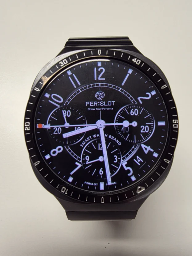
이질감을 줄이려면 워치페이스 안의 실버 요소를 이용하는 것이 좋습니다. 흰색 시침과 분침, 회색 인덱스, 스틸 톤의 작은 마커가 있는 다이얼은 바깥 실버 링과 시각적인 연결점을 만듭니다. 반대로 원색 그래픽이 화면 전체를 채우는 워치페이스는 링의 금속감과 따로 보일 수 있으므로, 검정과 회색의 여백이 충분한 화면이 안정적입니다.
사이즈 선택은 색상보다 먼저 확인해야 합니다. 같은 갤럭시워치 계열이라도 세대와 크기, 화면 가장자리 구조가 다르면 내경과 외경이 맞지 않습니다. 주문 전 워치 설정이나 본체 뒷면에서 모델을 확인하고, 옵션명에 표기된 호환 모델과 사이즈를 정확히 맞춰야 네 방향의 간격이 균일해집니다.
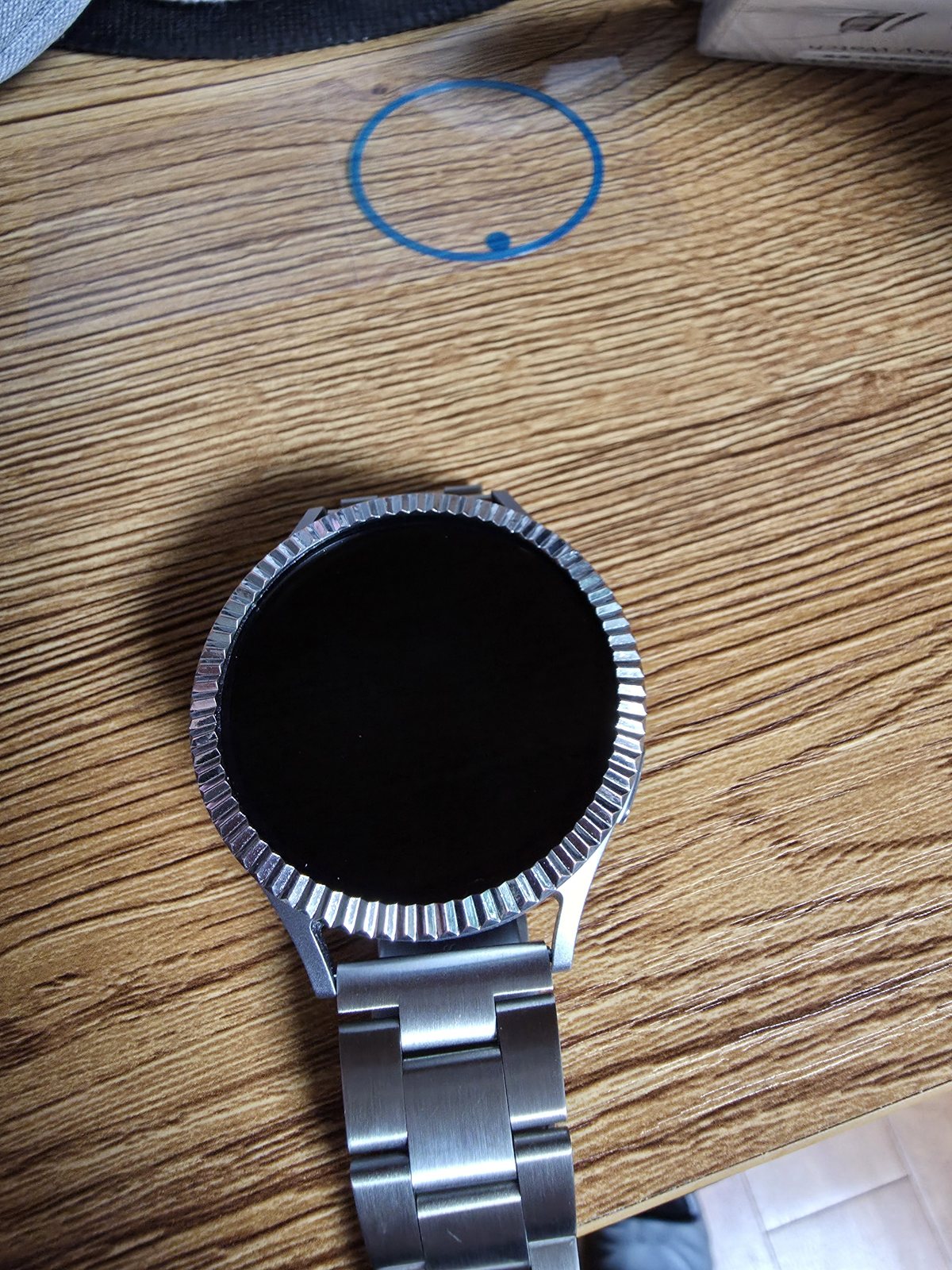
접착력은 우수 한 듯 한데.. 4장 사서 처음에 붙히는 요령이 없어서 2장은 날려 먹었네요 그래도 3번째 장으로 성공했고 요령 생겨서 이제 실패는 안하겠네요 ..
플루티드 커팅과 중심 정렬
플루티드 커팅은 한 면으로 이어진 실버 링과 달리 둘레를 잘게 나눈 홈이 빛을 여러 방향으로 반사합니다. 정면에서는 얇은 금속 테두리로 보이지만 손목이 기울어지면 홈마다 밝기가 달라져 외곽선이 살아납니다. 메탈 브레이슬릿과 함께 착용하면 작은 반사들이 링크의 결로 이어져 시계 전체의 금속 질감이 풍부해집니다.
접착력이 충분한 제품일수록 첫 위치를 신중하게 잡아야 합니다. 화면과 부착면의 먼지와 유분을 제거한 뒤 12시와 6시 기준점을 먼저 맞추고, 완전히 누르기 전에 3시와 9시의 안쪽 간격을 비교합니다. 한 번 강하게 눌러 점착면이 자리 잡은 뒤 억지로 들어 올리면 테이프가 늘어나거나 접착력이 약해질 수 있으므로, 초기에 손끝으로 가볍게 위치만 잡는 순서가 안전합니다.
정렬이 맞으면 둘레를 여러 번에 나눠 고르게 눌러줍니다. 한쪽부터 힘을 몰아주기보다 위, 아래, 왼쪽, 오른쪽을 번갈아 누르면 링이 기울어지는 것을 줄일 수 있습니다. 부착 직후에는 가장자리가 뜨지 않았는지 확인하고, 점착이 안정될 때까지 물이나 큰 충격을 피하는 편이 좋습니다.
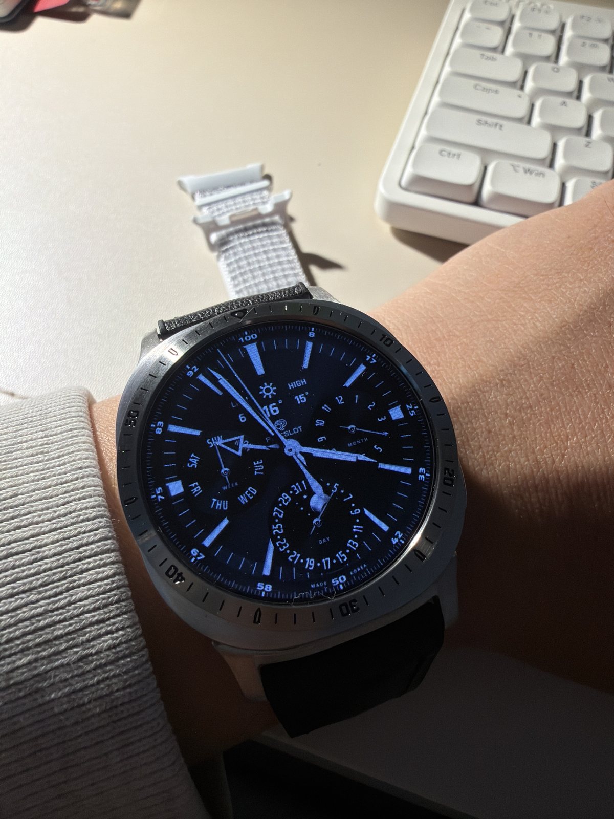
정말 예쁩니다. 순정같은 느낌
블루 크로노그래프를 둘러싼 실버 인덱스
블루 크로노그래프 워치페이스는 서브 다이얼과 작은 눈금, 컬러 포인트가 많아 화면 자체의 정보 밀도가 높습니다. 실버 베젤링은 또 하나의 장식을 더하기보다 검은 화면과 그라파이트 케이스 사이를 밝게 끊어 외곽을 정리합니다. 바깥 숫자 인덱스가 화면 안의 시침과 분침을 방해하지 않도록 다이얼 가장자리에는 검은 여백이 남아 있는 편이 좋습니다.
순정처럼 보인다는 인상은 색이 같아서만 생기지 않습니다. 링의 중심, 화면과의 간격, 케이스 측면으로 이어지는 높이가 안정적일 때 별도의 부품이 아니라 워치 외형의 일부처럼 읽힙니다. 밝은 실버가 어두운 본체 위에서 드러나는 조합이라도 원이 정확히 맞으면 시각적인 이질감은 크게 줄어듭니다.

깔끔하고예뻐요 원하던베젤
스크루 포인트가 더하는 구조적인 표정
스크루 포인트가 배치된 실버 베젤링은 매끈한 플레인 링보다 외곽의 구조를 적극적으로 드러냅니다. 일정한 간격으로 놓인 포인트가 화면 중심을 둘러싸면서 케이스를 하나의 프레임처럼 보이게 하고, 검은 워치페이스와 은색 금속 사이의 대비도 강해집니다. 장식이 분명한 만큼 다이얼은 복잡하지 않은 구성을 고르면 전면이 안정됩니다.
원하던 베젤이라는 만족감은 착용자의 평소 스타일과 링의 밀도가 맞을 때 오래갑니다. 미니멀한 인상을 선호한다면 플레인이나 얇은 숫자 링이 편하고, 러기드한 금속 디테일을 즐긴다면 스크루 포인트처럼 형태가 분명한 디자인이 잘 맞습니다. 워치를 여러 상황에 활용한다면 하나의 링에 모든 분위기를 기대하기보다 옷차림과 워치페이스에 따라 교체하는 방법도 자연스럽습니다.
교체 과정에서는 링을 비틀어 들어 올리지 않는 것이 중요합니다. 제거가 필요할 때는 제품 안내에 맞춰 가장자리부터 천천히 분리하고, 본체에 남은 점착 잔여물은 표면을 긁지 않는 부드러운 방법으로 닦아야 합니다. 재부착에는 새 점착 테이프를 사용하는 편이 중심 정렬과 고정력을 안정적으로 유지하는 데 유리합니다.
그라파이트 위에 남는 실버의 이유
그라파이트 갤럭시워치와 실버 베젤링은 같은 색으로 매끈하게 이어지는 조합이 아닙니다. 어두운 케이스 위에 밝은 금속선을 분명하게 남기고, 디지털 화면의 끝을 시계다운 외곽으로 바꾸는 방식입니다. 숫자 링은 스포츠 워치의 인덱스를 더하고, 플루티드 커팅은 빛의 움직임을 잘게 나누며, 스크루 포인트는 전면에 단단한 구조감을 남깁니다.
워치페이스가 복잡할수록 링은 단순하게, 화면에 여백이 많을수록 바깥 인덱스는 조금 더 적극적으로 고를 수 있습니다. 실버와 그라파이트 사이의 색 차이가 부담스럽다면 검정과 회색이 중심인 워치페이스로 연결점을 만들고, 밝은 선을 강조하고 싶다면 흰색 시침과 인덱스가 분명한 다이얼을 선택하면 됩니다. 사용 중인 밴드는 링과 같은 제품군으로 오인하지 말고, 색과 소재가 전면과 어떤 균형을 이루는지만 보는 것이 좋습니다.
마지막 완성은 정확한 호환성과 중심 정렬에서 결정됩니다. 모델과 사이즈를 확인하고, 부착면을 닦아 말린 뒤 네 방향의 여백을 맞추며, 위치가 잡힌 다음 둘레를 고르게 눌러야 합니다. 화면이 꺼졌을 때도 금속 원이 한쪽으로 치우치지 않고 케이스의 중심을 따라간다면, 실버 베젤링은 그라파이트 바디 위에서 오래 보아도 안정적인 외곽선으로 남습니다.
Silver Bezel Contrast On A Graphite Galaxy Watch
A graphite Galaxy Watch absorbs much of the light around its case, so the dark display and body can appear almost continuous. Adding a silver bezel creates a bright, narrow boundary at the edge of the screen. The circular outline becomes clearer, especially when the display is off, and the watch begins to resemble a conventional timepiece rather than a single dark digital surface.
Silver bezels do not all perform the same visual role. A numbered ring extends minute markers beyond the digital display. Fluted cutting divides reflections into short flashes as the wrist turns, while screw accents give the perimeter a more structural character. On the same graphite body, these details can shift the watch from restrained and classic to sporty or industrial.
The colour difference remains visible. That contrast is what gives the combination its definition, but it can also make the added accessory more noticeable than it would be on a silver case. A black or grey watch face with silver hands and indices connects the two tones naturally. Bright graphics that fill the entire screen may compete with the metal edge.
Alignment matters more than colour. On a 44mm watch, a small offset at twelve or six o’clock is easy to notice because the front is broad. Clean and dry the attachment surface, compare the clearance in four directions and press around the circumference only after the centre is correct. The option must also match the exact Galaxy Watch model and size.
A Bright Numbered Ring Across A Graphite Case
The fit and design are good, and I like it enough that I bought several styles to change the look depending on the occasion.
A graphite case and black watch face have similar brightness, creating a calm boundary when the screen is off. A silver numbered bezel inserts a clear circle between them and carries ten-minute numerals and minute markers beyond the display. The result is closer to the structure of a sports watch, with time information extending from the digital face to the metal perimeter.
The effect becomes more distinct as the wrist turns. A brushed surface does not flash across its entire area; only selected sections catch the light, while the engraved numerals remain legible in the changing shade. Different bezel styles can alter the front more noticeably than changing the watch face alone. The band shown is the user’s own band and is discussed only as part of the colour and texture combination.
Brown Leather Against Cool Silver
It looks even better than I expected, so I am very satisfied.
Brown leather has a warm, soft surface, while a silver bezel produces a cool and precise reflection. Placed together, they keep the watch from becoming overly metallic without losing the bright line around the face. The balance works particularly well with shirts, knitwear and other clothing where texture remains visible.
The ring and band do not need to be identical in colour. The case and bezel organise the face of the watch, while the band forms a larger surface that continues beneath the wrist. Low-saturation brown, dark navy and charcoal sit comfortably beside silver and leave the black dial firmly at the centre.
Leather and metal require different care. Wipe the bezel gently with a dry, soft cloth and follow the appropriate care method for the user’s leather band. Strong cleaning products applied to both materials at once can alter their surfaces in different ways.
Silver Clearance On A 44mm Graphite Case
Delivery was fast. I ordered a silver bezel for my 44mm graphite model and attached it. A slight difference in tone is unavoidable, but it looks more like a regular watch than it did without the bezel.
On a 44mm graphite case, the border between the dark body and silver bezel does not disappear. The contrast clearly reveals that an accessory has been added, yet it also gives the front the character of a conventional wristwatch. What previously ended at the edge of the digital screen continues outward through a metal ring and visible indices.
Silver elements within the watch face can reduce the sense of separation. White hands, grey indices and small steel-toned markers create a bridge to the outer ring. Faces dominated by vivid graphics can make the bezel appear independent, so a black or charcoal dial with enough open space is usually more balanced.
Compatibility comes before colour. Different generations and case sizes can have different inner diameters, outer shapes and display clearances. Confirm the model in the watch settings or on the back of the case, then choose the option labelled for that exact model and size.
Fluted Cutting And Careful Alignment
The adhesion seems strong. I bought four pieces but lost two while learning how to attach them. I succeeded with the third one, and now that I know the method, I do not expect to fail again.
Fluted cutting divides the perimeter into small facets that reflect light in several directions. From the front it remains a narrow metal border, but the individual grooves brighten at different moments when the wrist moves. Combined with the user’s metal bracelet, those short reflections continue into the links and give the watch a richer metallic texture.
Strong adhesive makes the first position especially important. Remove dust and oil from the display edge, let the surface dry, then align twelve and six o’clock before comparing the inner clearance at three and nine. Touch the bezel down lightly until its position is correct and apply firm pressure only after all four directions are balanced.
Press the circumference in several stages rather than forcing one side down first. Alternating between the top, bottom, left and right reduces the chance of a tilted ring. Check for any lifted edge after attachment and avoid water or a strong impact while the adhesive settles.
Silver Indices Around A Blue Chronograph Face
It is really beautiful and feels like an original part of the watch.
A blue chronograph face contains sub-dials, fine marks and colour accents, so its information density is already high. The silver bezel separates the black display from the graphite case instead of simply adding another ornament. Leaving a dark margin near the edge of the face prevents the external numerals from competing with the hands and sub-dials.
An original-looking result is not created by colour matching alone. Accurate centring, even clearance and a stable transition into the case allow the ring to appear as part of the watch. Even when bright silver is clearly visible against a dark body, precise geometry reduces visual separation.
The Structure Of Screw Accents
It is clean and beautiful, exactly the bezel I wanted.
A silver bezel with screw accents is more assertive than a plain ring. Repeated points around the perimeter make the case read as a defined frame, strengthening the contrast between the dark watch face and the metal edge. Because the bezel already carries visible detail, a relatively simple watch face keeps the front composed.
Long-term satisfaction depends on matching the density of the design to personal style. Plain or slim numbered rings suit a restrained appearance, while screw accents work well for users who prefer rugged metal detail. Switching the bezel with clothing and watch faces can be more natural than asking one style to cover every situation.
When removal is necessary, do not twist the ring upward. Lift it gradually according to the product instructions and remove adhesive residue with a method that will not scratch the case. A fresh adhesive ring is preferable for reinstallation because it preserves both centring and holding strength.
Why Silver Remains Distinct On Graphite
A graphite Galaxy Watch and a silver bezel are not intended to merge into one colour. The bright metal line remains visible on the dark case and changes the edge of the digital display into a watch-like perimeter. Numbered rings add sports-watch indices, fluted cutting divides moving light and screw accents create a stronger structural finish.
The more complex the watch face, the simpler the bezel can be. A face with generous open space can support a more active outer index. If the contrast between silver and graphite feels strong, use a black or grey dial with silver hands as a bridge. The user’s band should be treated as a separate styling element rather than identified as a PERSLOT product.
The final result depends on exact compatibility and alignment. Confirm the model and size, clean and dry the surface, balance the clearance in four directions and press evenly only after the position is correct. When the metal circle remains centred even with the display off, the silver bezel becomes a stable and lasting outline on the graphite body.
추가 정보
그라파이트 워치와 실버 베젤링의 조합
갤럭시워치 실버 베젤링은 어두운 그라파이트 케이스와 검은 디스플레이 사이에 밝은 금속 경계를 만듭니다. 숫자 인덱스, 플루티드 커팅, 스크루 포인트처럼 외곽의 밀도가 다른 디자인을 고르면 같은 워치에서도 스포츠, 클래식, 인더스트리얼 무드를 구분할 수 있습니다.
- 그라파이트 바디에서는 실버 링의 색 차이가 분명하게 남으며 원형 실루엣이 또렷해집니다.
- 숫자 인덱스는 워치페이스 바깥까지 시간의 눈금을 넓혀 스포츠 워치의 표정을 더합니다.
- 플루티드 커팅은 손목이 움직일 때 홈마다 다른 반사를 만들어 외곽선에 깊이를 줍니다.
- 스크루 포인트가 있는 링은 장식 밀도가 높으므로 단순한 다이얼과 조합할 때 안정적입니다.
- 44mm처럼 전면이 넓은 모델은 12시와 6시 기준점이 어긋나면 좌우 여백 차이가 쉽게 보입니다.
- 부착면의 유분과 먼지를 제거하고 완전히 말린 뒤 위치를 잡아야 점착력이 고르게 유지됩니다.
- 사용자가 착용 중인 밴드는 별도 제품일 수 있으므로 베젤링과 같은 퍼슬랏 제품으로 단정하지 않습니다.
- 물과 땀은 오래 남기지 않고 부드러운 마른 천으로 닦아 각인과 표면 결과 코팅을 관리합니다.
자주 묻는 질문
그라파이트 케이스에 실버 베젤링이 어색하지 않나요?
두 색은 자연스럽게 섞이기보다 명확한 대비를 만듭니다. 검정이나 회색 워치페이스에 흰색 시침, 실버 인덱스가 있는 화면을 사용하면 안쪽 다이얼과 바깥 링 사이에 연결점이 생겨 조합이 안정됩니다.
44mm용 베젤링은 다른 크기의 워치에도 붙일 수 있나요?
모델과 크기에 따라 화면 가장자리, 내경, 외경과 버튼 주변 구조가 달라집니다. 같은 갤럭시워치 계열이라도 세대와 사이즈가 맞지 않으면 네 방향의 간격이 고르지 않거나 외곽선이 뜰 수 있으므로 옵션명을 정확히 확인해야 합니다.
실버 숫자 베젤링은 어떤 워치페이스와 잘 맞나요?
검정이나 차콜 바탕에 시침과 분침이 분명하고 바깥쪽 여백이 남은 아날로그, 크로노그래프 워치페이스와 잘 맞습니다. 화면 끝까지 원색 그래픽이 채워진 다이얼은 금속 인덱스와 경쟁할 수 있어 외곽이 복잡해 보일 수 있습니다.
베젤링을 중앙에 맞추는 순서는 무엇인가요?
화면을 켜 12시와 6시 기준점을 먼저 맞춘 다음, 점착면을 세게 누르기 전에 3시와 9시의 안쪽 간격을 비교합니다. 네 방향의 여백이 같으면 위아래와 좌우를 번갈아 누르며 둘레 전체를 고르게 고정합니다.
부착에 실패한 점착 테이프를 다시 사용할 수 있나요?
한 번 강하게 눌렀다가 떼어낸 테이프는 늘어나거나 접착면에 먼지가 붙어 고정력이 고르지 않을 수 있습니다. 재부착이 필요하다면 기존 잔여물을 안전하게 제거하고 규격에 맞는 새 점착 테이프를 사용하는 편이 안정적입니다.
보호필름과 실버 베젤링을 함께 사용할 수 있나요?
베젤링 없이 화면 전체를 덮도록 만든 일반 필름은 금속 링의 안쪽과 겹칠 수 있습니다. 함께 사용할 때는 베젤링 내경 안으로 들어가도록 설계된 퍼슬랏 전용 보호필름을 선택하고, 필름 외곽이 링을 밀어내지 않는지 확인해야 합니다.
실버 베젤링 표면은 어떻게 관리하나요?
땀과 물기를 부드러운 마른 천으로 닦고, 각인이나 홈 사이의 먼지는 결이 고운 브러시로 가볍게 제거합니다. 거친 수세미, 금속 도구와 연마 성분이 강한 세정제는 브러시드 결과 코팅을 바꿀 수 있으므로 피합니다.
베젤링을 제거할 때 주의할 점은 무엇인가요?
링을 한 번에 비틀어 들어 올리면 워치 외곽에 힘이 집중될 수 있습니다. 제품 안내에 따라 가장자리부터 천천히 분리하고, 남은 점착 성분은 케이스를 긁지 않는 부드러운 방법으로 제거합니다.
착용 완성도를 좌우하는 네 가지 디테일
그라파이트와 실버의 명암
어두운 본체 위의 실버 링은 부착한 액세서리의 존재를 분명하게 드러냅니다. 같은 색으로 이어지는 일체감보다 디스플레이 외곽을 밝게 구획하는 효과가 중심이며, 검정과 회색 워치페이스에 실버 시침이나 인덱스를 두면 색의 연결이 자연스럽습니다.
링의 표면과 빛
브러시드 면은 넓게 번쩍이지 않고 손목의 각도에 따라 일부만 짧게 밝아집니다. 플루티드 홈은 작은 반사를 여러 방향으로 나누고, 스크루 포인트는 외곽에 규칙적인 구조를 더합니다. 정면과 측면에서 모두 보아야 실제 두께와 반사 강도를 판단할 수 있습니다.
중심 정렬과 점착
화면과 링이 같은 중심을 공유해야 숫자와 미닛 마커가 안정적으로 보입니다. 부착면을 닦아 말리고 네 방향의 간격을 확인한 뒤 눌러야 하며, 한쪽부터 강하게 고정하기보다 위아래와 좌우를 번갈아 눌러 점착력을 분산시키는 편이 좋습니다.
워치페이스와 밴드의 역할
워치페이스는 실버 링과 직접 맞닿는 색과 정보 밀도를 결정하고, 밴드는 손목 아래까지 이어지는 넓은 면을 만듭니다. 베젤링을 선택할 때는 다이얼과의 대비를 먼저 보고, 사용 중인 밴드는 그다음 단계에서 색과 소재의 균형을 맞추는 편이 정확합니다.
모델과 사이즈별 베젤링 및 전용 보호필름은 퍼슬랏 공식몰에서 구분할 수 있습니다. 중심 정렬과 실제 부착 방법은 퍼슬랏 공식 유튜브의 착용 영상을 함께 보면 이해하기 쉽습니다.