


퍼슬랏 실버 인덱스 베젤링 후기, 워치페이스별 실제 조합
스마트워치는 화면을 바꿀 때마다 분위기가 달라집니다. 하지만 본체는 그대로라서, 마음에 드는 워치페이스를 골라도 어딘가 가볍게 느껴질 때가 있습니다. 퍼슬랏 실버 인덱스 베젤링은 그 빈자리에 작은 금속 테두리를 더하는 제품입니다. 화면 가장자리에 숫자와 눈금이 생기면서, 손목 위의 워치가 조금 더 시계다운 모습으로 바뀝니다.
이 글이 다루는 것은 복잡하지 않습니다. 실버 베젤링이 초록 아날로그 화면에서는 어떤 표정을 만들고, 큰 숫자 다이얼에서는 어떻게 어울리며, 정보가 많은 디지털 화면에서는 왜 다른 느낌을 주는지입니다. 사진마다 달라지는 것은 워치페이스지만, 화면 바깥의 실버 링은 같은 역할을 합니다.
그래서 선택 기준도 분명합니다. 화면을 꾸미는 액세서리보다 메탈 시계 같은 분위기를 더하고 싶은지, 평소 쓰는 다이얼이 숫자와 눈금을 받아들일 여백이 있는지, 내 워치의 정확한 모델과 크기에 맞는 옵션이 있는지를 보면 됩니다. 실제 착용 사진과 고객 후기를 따라가며 그 판단을 쉽게 풀어봤습니다.
역시 베젤링을 붙여야 디자인 완성이네요. 퀄리티고 최고에요.
초록 아날로그 화면을 감싸는 실버 한 줄
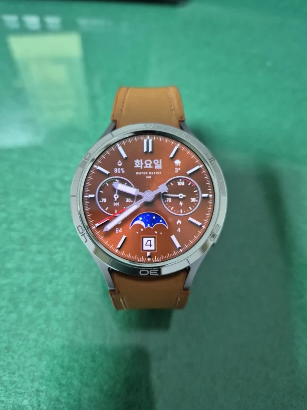
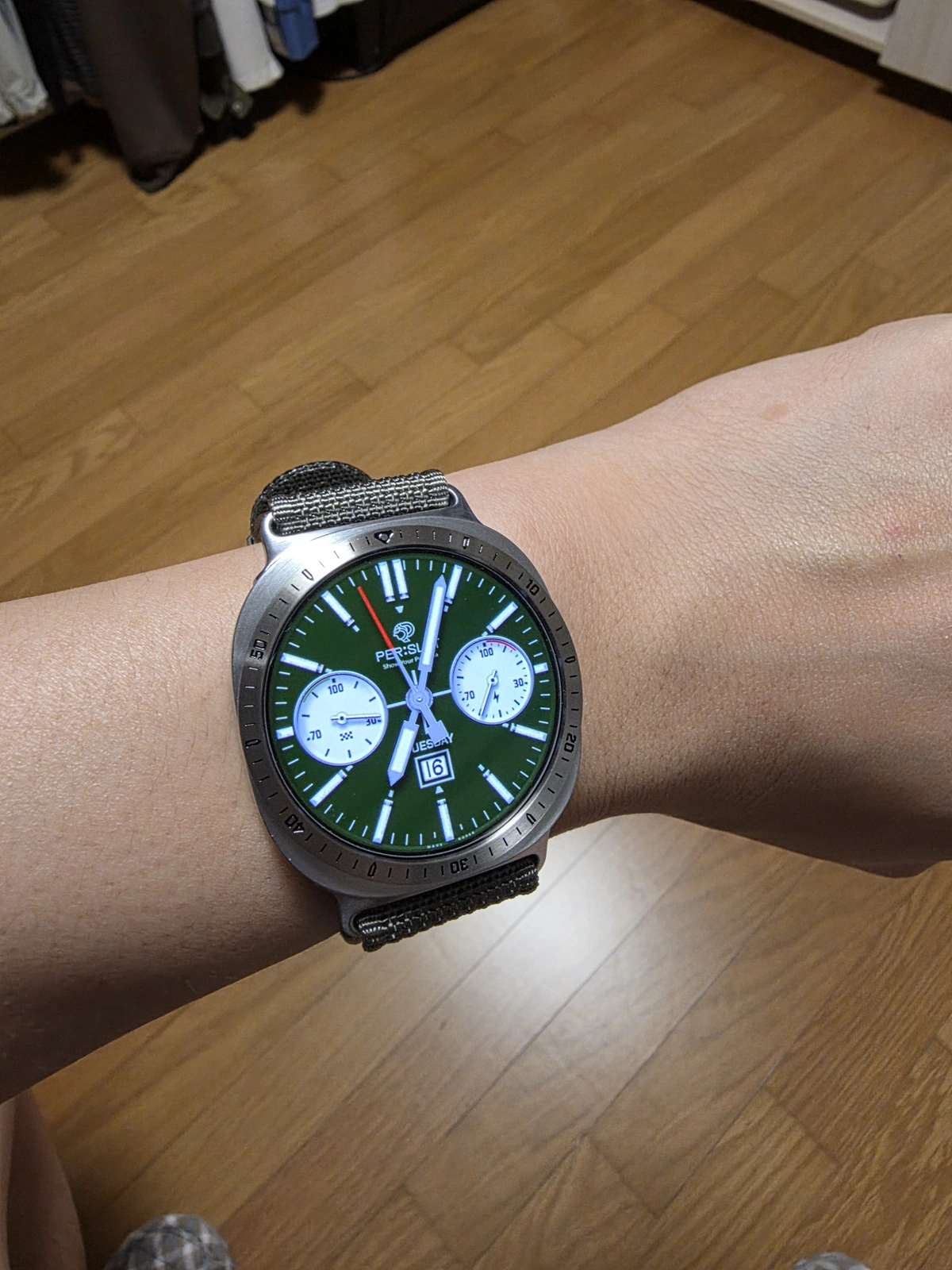
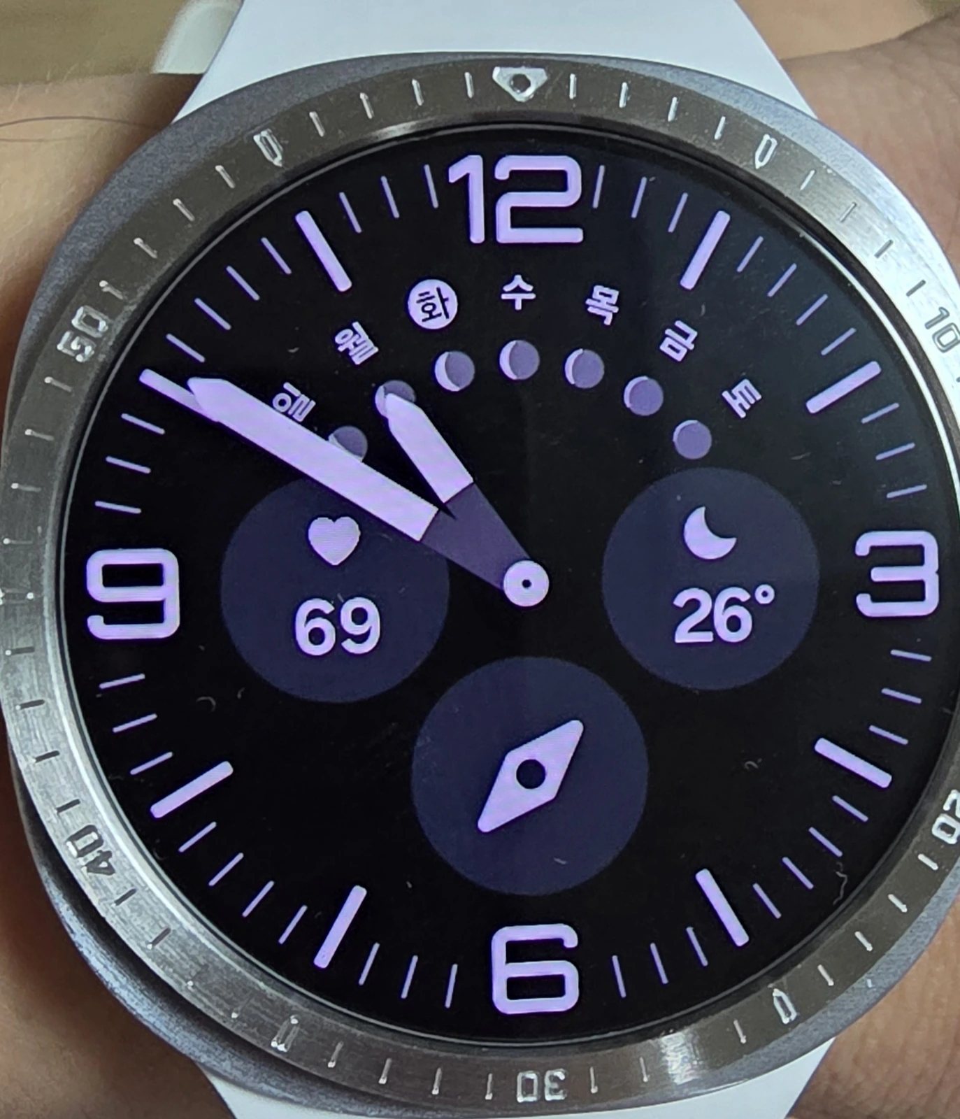
첫 사진의 초록색 워치페이스는 밝은 핸즈와 서브 다이얼이 중심을 채우고 있습니다. 여기에 실버 베젤링을 더하면 화면 안쪽의 아날로그 얼굴은 그대로 두고, 바깥에는 금속 시계의 다이얼을 닮은 테두리가 생깁니다. 화면만 봤을 때보다 워치 전체의 둥근 형태가 또렷해지는 이유가 여기에 있습니다.
실버 면 위의 검은 표식은 초록 화면과 너무 경쟁하지 않습니다. 오히려 밝은 핸즈와 은은하게 이어지며 전면을 한 번 더 정돈합니다. 아날로그 워치페이스를 자주 쓰고, 스마트워치에도 전통적인 시계의 분위기를 조금 더하고 싶은 사람이라면 가장 먼저 떠올려 볼 만한 조합입니다.
고급집니다. 딱 맞네요. 잘 붙어요
작은 표식들이 만드는 시계다운 분위기
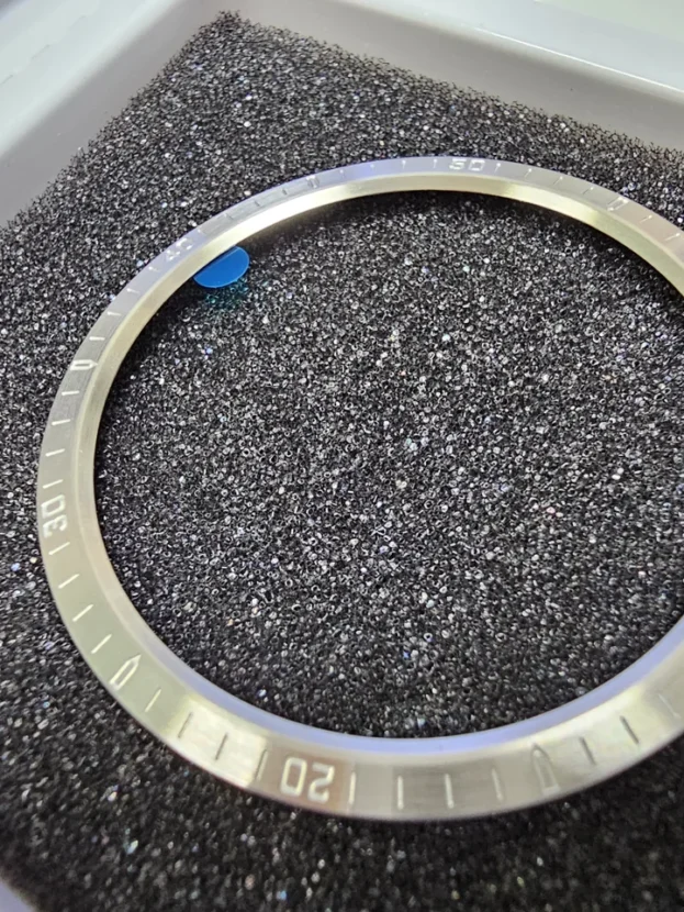
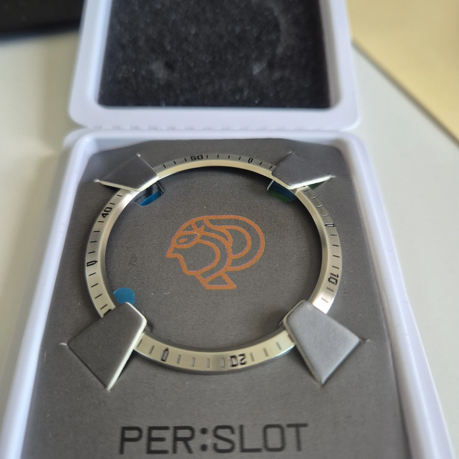
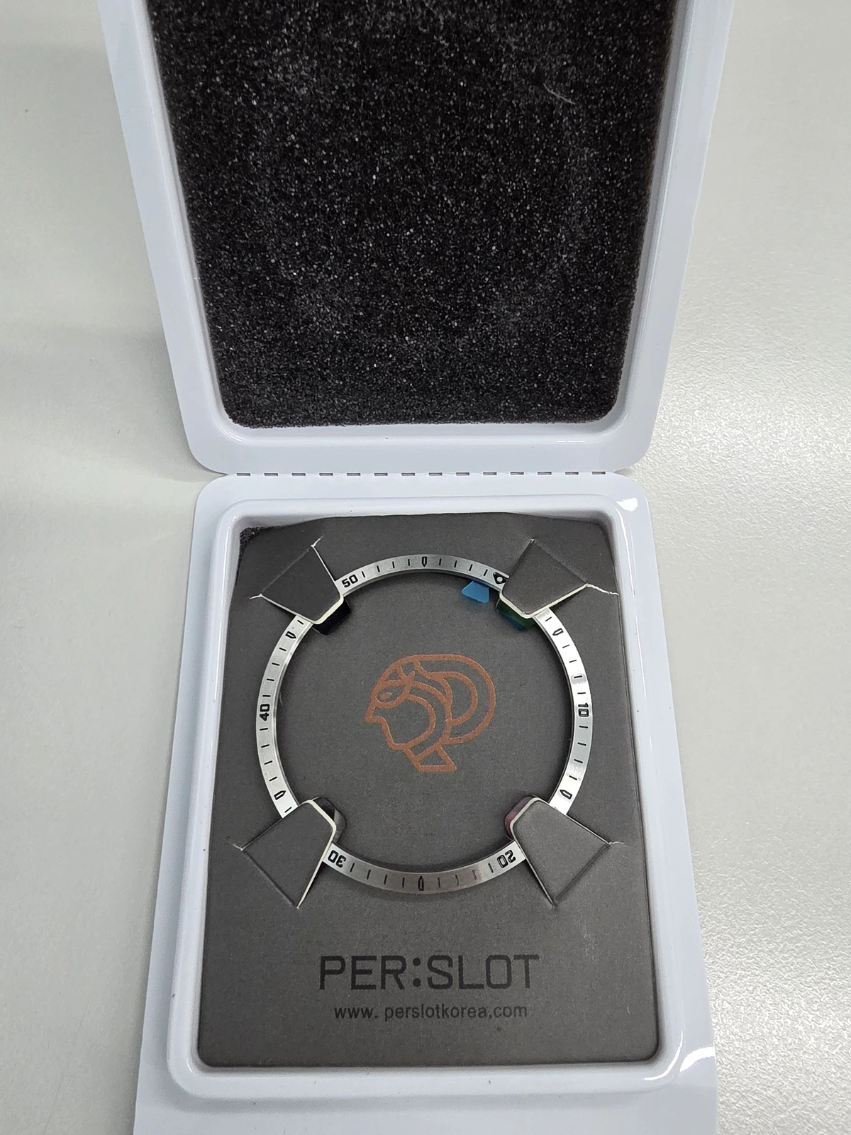
패키지 안에 놓인 링을 보면 이 베젤링의 성격이 더 분명해집니다. 위쪽에는 방향을 알려 주는 표식이 있고, 둘레에는 시간을 떠올리게 하는 숫자와 짧은 눈금이 이어집니다. 단순한 실버 장식이라면 매끈한 원으로 끝날 부분에, 클래식한 시계 다이얼의 문법을 더한 셈입니다.
중요한 것은 숫자를 읽는 기능이 아니라 보이는 방식입니다. 화면이 꺼져 있어도 워치 바깥에는 얇은 실버 프레임과 검은 표식이 남습니다. 평소 미니멀한 화면을 좋아하더라도 본체가 너무 밋밋해 보이지 않길 바란다면, 이 정도의 디테일이 좋은 균형이 될 수 있습니다.
고급스럽고 부착도 용이하고 좋습니다~
화면과 케이스 사이에 생기는 금속의 깊이
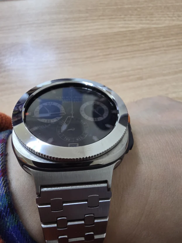
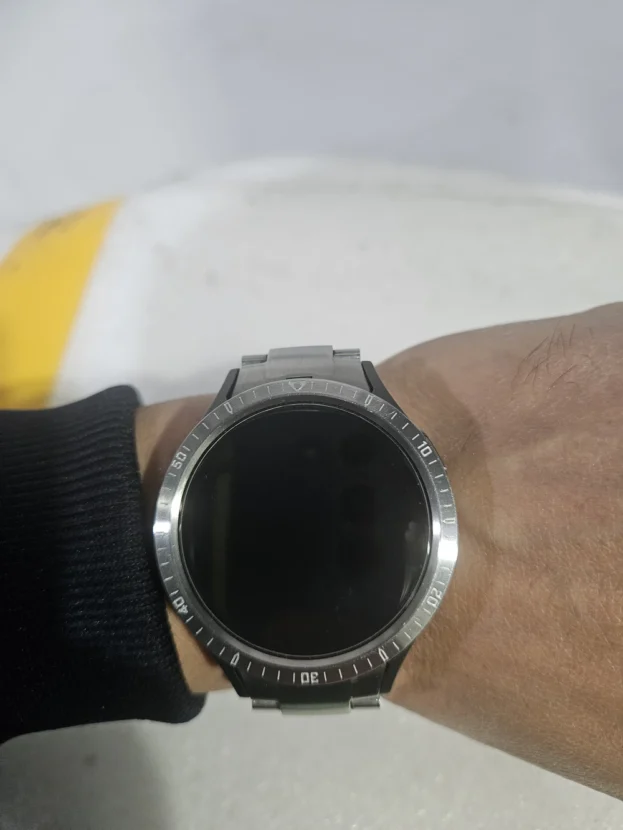
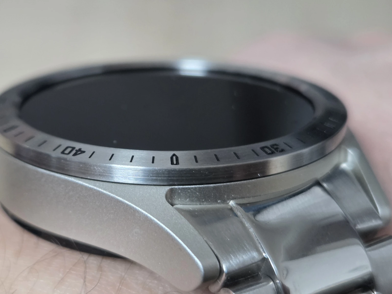
낮은 각도에서 보면 검은 화면, 실버 베젤링, 워치 케이스가 차례로 이어집니다. 베젤링 표면에는 원을 따라 가는 결이 보이고, 빛을 받을 때는 밝은 은색으로, 그늘에서는 차분한 회색으로 달라집니다. 반짝임만 앞세운 장식보다 표면의 질감이 남는 쪽에 가까운 모습입니다.
링과 케이스는 같은 실버 계열이지만 서로 다른 면으로 보입니다. 그 사이의 얇은 경계가 화면을 살짝 들어 올려 보이게 하고, 검은 표식은 전면에 작은 포인트를 만듭니다. 본체의 금속 느낌을 살리되 과한 장식은 피하고 싶은 경우라면 이 측면 사진이 가장 현실적인 판단 기준이 됩니다.
예뻐요 ㅎㅎ 잘쓸게요
큰 숫자 다이얼과 자연스럽게 어울리는 이유
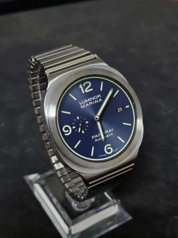
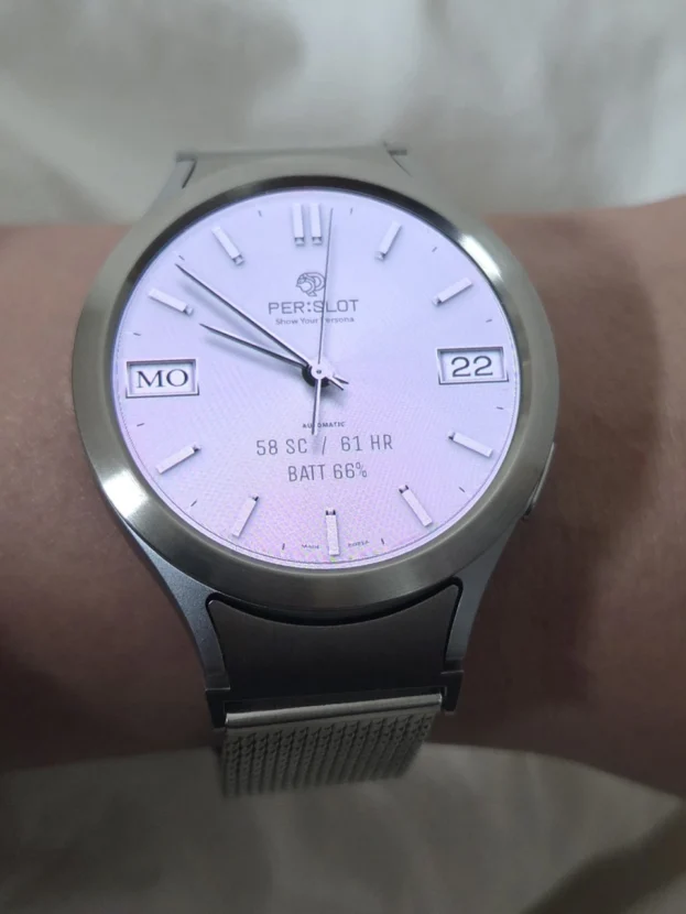
화면 안에 큰 숫자가 들어간 워치페이스에서는 베젤링의 존재가 더 쉽게 읽힙니다. 안쪽의 큰 숫자는 시간을 보여 주고, 바깥의 작은 표식은 워치 전체를 감싸는 장식이 됩니다. 둘은 같은 일을 하지 않기 때문에, 숫자가 겹쳐 답답해 보이기보다 안쪽은 화면, 바깥은 케이스라는 역할이 또렷하게 나뉩니다.
이런 조합은 화면 가장자리에 어느 정도 여백이 있을수록 편안합니다. 위젯과 글자가 끝까지 차 있는 얼굴보다, 큼직한 숫자나 간결한 인덱스가 있는 다이얼이 실버 베젤링의 분위기를 더 잘 받아줍니다. 주문 전에는 가장 자주 쓰는 워치페이스를 한 번 켜 보고, 그 화면에 이 정도의 디테일이 필요한지 생각해 보면 충분합니다.
디지털 화면을 더 단정하게 보이게 하는 외곽
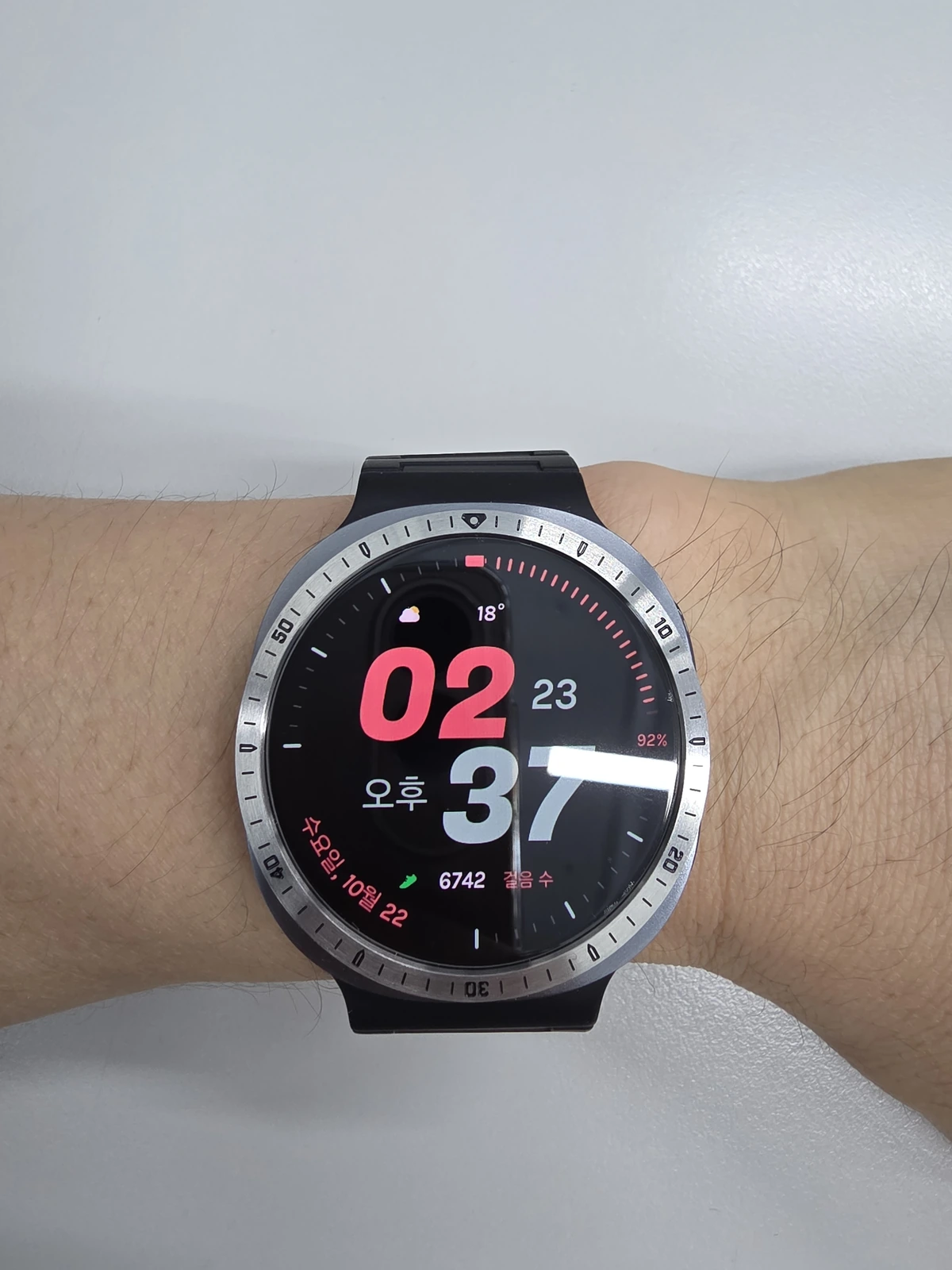
디지털 워치페이스는 시간뿐 아니라 날씨, 배터리, 활동 정보처럼 서로 다른 내용을 한 화면에 담습니다. 이런 화면에서는 색과 글자가 계속 바뀌지만, 실버 베젤링은 바깥에서 워치의 둥근 인상을 붙잡아 줍니다. 기능을 바꾸는 것은 아니지만, 정보가 많은 디스플레이도 조금 더 완성된 시계처럼 보이게 하는 이유입니다.
아날로그 화면에서는 베젤링이 다이얼의 일부처럼 자연스럽게 섞이고, 디지털 화면에서는 변화가 많은 화면을 감싸는 금속 프레임처럼 느껴집니다. 워치페이스를 자주 바꾸는 사람에게 이 차이는 꽤 큽니다. 어떤 화면을 고르더라도 본체의 실버 톤과 시계다운 분위기를 계속 가져갈 수 있기 때문입니다.
열린 패키지에서 확인하는 마지막 선택 기준
마지막 사진은 열린 PER:SLOT 패키지 안에 담긴 링 전체를 보여 줍니다. 착용 사진에서는 놓치기 쉬운 표식의 방향과 실버 테두리의 비례를 한 번에 볼 수 있습니다. 실착 사진이 손목 위의 분위기를 보여 준다면, 패키지 사진은 내가 원하는 것이 단순한 장식인지, 아니면 시계다운 외곽을 만드는 베젤링인지 다시 확인하게 합니다.
주문 직전에는 사진의 느낌보다 옵션을 먼저 봐야 합니다. 사용하는 워치의 정확한 모델명과 본체 크기를 공식 상품 안내와 대조하고, 같은 크기 숫자라고 해서 서로 다른 세대에 모두 맞는다고 생각하지 않는 편이 좋습니다. 부착 방법과 다른 액세서리와의 조합도 선택한 옵션의 공식 안내를 기준으로 확인하면 됩니다.
화면은 바뀌어도 워치의 인상은 남는다
퍼슬랏 실버 인덱스 베젤링은 스마트워치에 없던 기능을 더하는 제품이 아닙니다. 대신 화면 가장자리에 작은 금속 다이얼을 더해, 워치페이스를 바꿔도 손목 위의 인상이 너무 가볍게 흐르지 않도록 해 줍니다. 화면은 디지털이지만, 보이는 분위기는 조금 더 금속 시계에 가까워지는 방식입니다.
아날로그 얼굴을 즐기거나 디지털 화면을 자주 바꾸면서도 본체의 실버 톤을 살리고 싶은 사람에게 잘 맞습니다. 반대로 숫자와 눈금이 전혀 없는 미니멀한 화면만 선호한다면 존재감이 클 수 있습니다. 평소 사용하는 다이얼, 원하는 분위기, 정확한 모델 옵션 세 가지만 맞춰 보면 이 베젤링이 내 워치에 필요한 이유는 충분히 선명해집니다.
PERSLOT Silver Index Bezel Review, A More Watch-Like Finish
A smartwatch can feel different every time its face changes. The display may switch from a colourful analogue dial to large numerals or a compact digital dashboard, while the body of the watch stays exactly the same. The PERSLOT silver index bezel changes that outer impression by adding a slim metal, dial-like border around the display.
This is not a review about new software functions. It is about the look of the watch on the wrist: how a silver ring with small black markers can make a screen-led device feel a little closer to a traditional timepiece. The photographs move from analogue faces to digital information screens, then return to the package for the checks that matter before ordering.
The decision is ultimately personal. Some people want the cleanest possible display, while others want a little more metal, depth and watch-like detail. Your usual face style, the space near the edge of that face, and the official option for your exact watch are the three useful things to compare.
The design really feels complete once the bezel ring is on. The quality is excellent.
A silver line around a green analogue face
The green analogue face in the first photograph already has bright hands and sub-dials at its centre. The silver bezel leaves those details untouched, but adds a second circle around them. The result is not a different screen; it is a watch whose full round shape becomes easier to notice at a glance.
The black markers on the silver surface do not fight against the green face. They sit quietly around it, while the silver tone connects with the bright hands. For someone who often uses an analogue face and wants a little more of the atmosphere of a metal watch, this is the most natural pairing in the set.
It looks refined. It fits just right and adheres well.
Small markers with the feel of a classic dial
The package view makes the bezel’s character easy to understand. A top marker gives the ring direction, while numbers and short marks continue around the rest of the circle. A plain silver border would simply frame the screen; these details make it resemble the outer edge of a classic watch dial.
The point is appearance, not an extra timing feature. Even when the screen is dark, the silver frame and black details remain visible. That can be a good balance for people who enjoy a minimal face but do not want the watch body itself to feel completely plain.
It looks refined, and it was easy to attach. I like it.
Metal depth between the display and the case
From a low angle, the dark display, the silver bezel and the watch case appear in sequence. Fine lines can be seen following the curve of the ring. Under brighter light it looks more silver; in shadow it becomes a quieter grey. The impression is about visible texture rather than a highly polished ornament.
The case and bezel belong to the same silver family, but they still read as separate surfaces. That narrow division gives the front of the watch a little more depth, while the dark markers add a restrained point of contrast. It is the best photograph to consider if you want to preserve the metal character of the case without adding an overly decorative accessory.
It’s pretty, haha. I’ll enjoy using it.
Why it pairs well with large numeral faces
When the display uses large numerals, the role of the bezel becomes especially easy to see. The big numbers inside the screen tell the time. The smaller marks outside become part of the watch’s exterior styling. They do not compete because they occupy different places and serve different visual roles.
This kind of pairing works best when the face has some room near its edge. A face packed with tiny widgets and text may draw attention back to the display, while a simpler face with broad numerals or clean indices lets the silver bezel show its character more naturally. Checking your most-used face before ordering is usually enough.
A calmer edge around a digital display
A digital face can place time, weather, battery and activity information in several colours across one screen. The silver bezel does not change those functions. It gives the changing information a fixed round outline, so the watch can still feel like a complete object rather than only a small screen on the wrist.
On an analogue face the bezel can blend in with hands and markers. On a digital face it reads more like a metal frame around a lively display. That difference matters for people who change faces often but still want to keep the silver tone and watch-like mood of the case consistent.
The final check in the open package
The open PER:SLOT package shows the full ring before it is worn. It is a good way to check the direction of the top marker, the proportion of the silver edge and the overall amount of detail. Together with the wrist photographs, it makes it easier to decide whether you want a discreet accent or a clearly watch-like outer border.
Before ordering, compare the exact watch model and case size with the official option and product guidance. A shared size number should not be treated as proof of fit across every generation. Installation guidance and compatibility with other accessories should also be confirmed for the selected option.
A lasting watch-like impression
The PERSLOT silver index bezel does not turn a smartwatch into a different device. It adds a small metal dial around the display, helping analogue and digital faces keep a more considered, watch-like outer appearance. It suits people who change faces often but do not want the overall look on the wrist to change completely each time.
If an entirely blank and minimal display is the priority, its visible details may be more than you want. Compare your usual face, the mood you want from the watch and the official option for your exact model. When those points align, the bezel can be a simple and elegant way to add more character to a silver smartwatch.
추가 정보
퍼슬랏 실버 인덱스 베젤링은 스마트워치 화면 바깥에 금속 시계 같은 디테일을 더하는 스타일링 제품입니다. 화면 기능을 바꾸기보다, 워치페이스가 달라져도 손목 위에 남는 실버 테두리와 작은 표식으로 전체 인상을 완성합니다.
이 베젤링의 매력
- 화면 가장자리에 더해지는 실버 메탈 톤
- 위쪽 방향을 잡아 주는 표식과 둘레의 작은 눈금
- 아날로그 다이얼에 더해지는 클래식한 분위기
- 디지털 화면을 감싸는 단정한 금속 프레임
- 조명에 따라 달라지는 차분한 실버 표면
- PER:SLOT 패키지에서 확인할 수 있는 링 전체 비례
워치페이스 고르는 법
큰 숫자나 간결한 인덱스가 있는 워치페이스는 베젤링의 디테일과 자연스럽게 어울립니다. 반대로 작은 글자와 위젯이 가장자리까지 많은 화면은 디스플레이가 먼저 눈에 들어올 수 있습니다. 평소 가장 자주 쓰는 화면을 켠 뒤, 화면 바깥에 이 정도의 디테일을 더했을 때의 분위기를 생각해 보세요.
주문 전 확인
사용 중인 워치의 정확한 모델명과 본체 크기를 먼저 확인하세요. 같은 크기 숫자가 보인다고 해서 서로 다른 세대나 다른 케이스에 모두 맞는 것은 아닙니다. 주문할 옵션, 부착 방법, 다른 액세서리와의 조합은 선택한 옵션의 공식 상품 안내를 기준으로 확인하는 것이 좋습니다.
자주 묻는 질문
베젤링이 워치 기능을 바꾸나요?
아니요. 이 제품은 화면 바깥의 디자인을 바꾸는 스타일링 제품입니다. 앱, 센서, 화면 기능이 추가된다는 뜻은 아닙니다.
아날로그와 디지털 화면 모두에 어울리나요?
두 방식 모두 사진에서 확인할 수 있습니다. 다만 더 자연스러운 조합은 평소 쓰는 워치페이스의 색과 가장자리 여백에 따라 달라집니다.
어떤 워치페이스와 잘 어울리나요?
큰 숫자나 단순한 인덱스가 있고 화면 가장자리에 여백이 있는 얼굴에서 베젤링의 디테일이 비교적 잘 보입니다.
상단 표식은 어떤 역할인가요?
사진에서는 워치의 위쪽 방향을 알려 주는 시각 표식으로 보입니다. 정확한 제작 방식이나 기능은 공식 상품 안내에서 확인하는 것이 좋습니다.
숫자와 눈금으로 시간을 더 정확히 읽을 수 있나요?
이 리뷰에서 다루는 숫자와 눈금은 디자인입니다. 시간 측정 기능이나 판독 성능을 보장하는 내용은 아닙니다.
옵션은 어떻게 골라야 하나요?
워치의 정확한 모델명과 본체 크기를 공식 옵션 표기와 대조하세요. 크기 숫자만 같다고 다른 모델과의 호환을 단정하지 않는 편이 좋습니다.
다른 케이스나 보호 제품과 함께 써도 되나요?
사진만으로 모든 조합의 호환 여부를 판단할 수는 없습니다. 함께 쓰려는 제품이 있다면 각 상품의 공식 규격과 안내를 먼저 비교하세요.
실버 표면의 느낌은 어떤가요?
사진에서는 원을 따라 가는 미세한 결이 보이고, 조명에 따라 밝은 은색과 차분한 회색으로 달라집니다. 소재나 코팅 방식은 공식 상품 안내를 확인하세요.
관련 Review
관련 키워드
퍼슬랏 실버 인덱스 베젤링, 퍼슬랏 베젤링 후기, 갤럭시워치 베젤링, 실버 베젤링, 숫자 인덱스 베젤링, 워치페이스 스타일링, 아날로그 워치페이스 베젤링, 디지털 워치페이스 베젤링, 스마트워치 메탈 스타일링, PERSLOT bezel review, silver index bezel, watch face styling