


갤럭시워치 베젤링 후기, 플레인과 인덱스 디자인의 차이
갤럭시워치의 전면은 워치페이스와 케이스 사이에 별도의 경계가 거의 없어 화면 그래픽이 곧 제품의 표정이 됩니다. 베젤링을 더하면 그 경계가 금속으로 분명해지고, 같은 워치페이스도 플레인 링인지 인덱스가 새겨진 링인지에 따라 전혀 다른 시계처럼 보입니다. 작은 부품이지만 다이얼의 끝을 어디로 정할지 결정하는 역할은 선명합니다.
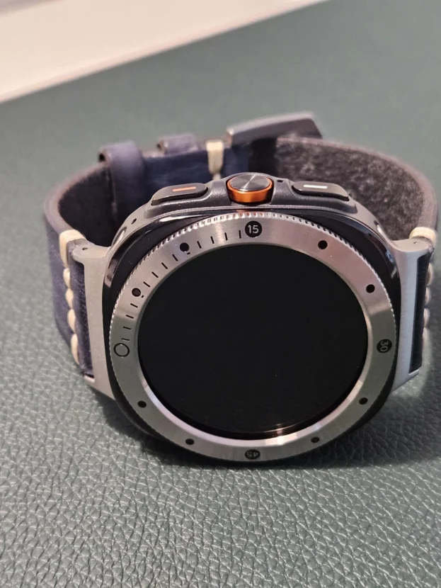
플레인 베젤링은 숫자와 장식을 덜어내고 금속의 폭, 색, 표면 결에 집중합니다. 정보가 많은 크로노그래프나 데이터 화면 주변을 차분하게 정리하기 좋습니다. 반대로 숫자와 미닛 마커가 있는 디자인은 화면 안의 시침과 분침을 바깥으로 확장해 스포츠 워치 특유의 계측 인상을 더합니다.
선택의 기준은 화려함보다 밀도의 균형에 가깝습니다. 다이얼 안에 서브 다이얼과 수치가 많다면 외곽은 단순하게 두는 편이 편안하고, 화면에 넓은 검은 여백이 있다면 인덱스가 있는 링도 안정적으로 들어갑니다. 블랙은 화면과 이어져 한층 조용하고, 실버는 케이스 가장자리를 밝게 들어 올려 원형 실루엣을 또렷하게 남깁니다.
부착 후의 완성도는 모델 호환성과 중심 정렬에서 갈립니다. 워치 세대와 크기에 맞는 옵션을 고르고 12시와 6시, 3시와 9시의 간격을 차례로 맞춰야 합니다. 보호필름을 함께 사용할 때는 전면 전체를 덮는 일반 필름이 아니라 베젤링 내경 안으로 들어가도록 설계된 퍼슬랏 전용 보호필름을 사용해야 링과 필름이 서로 밀어내지 않습니다.

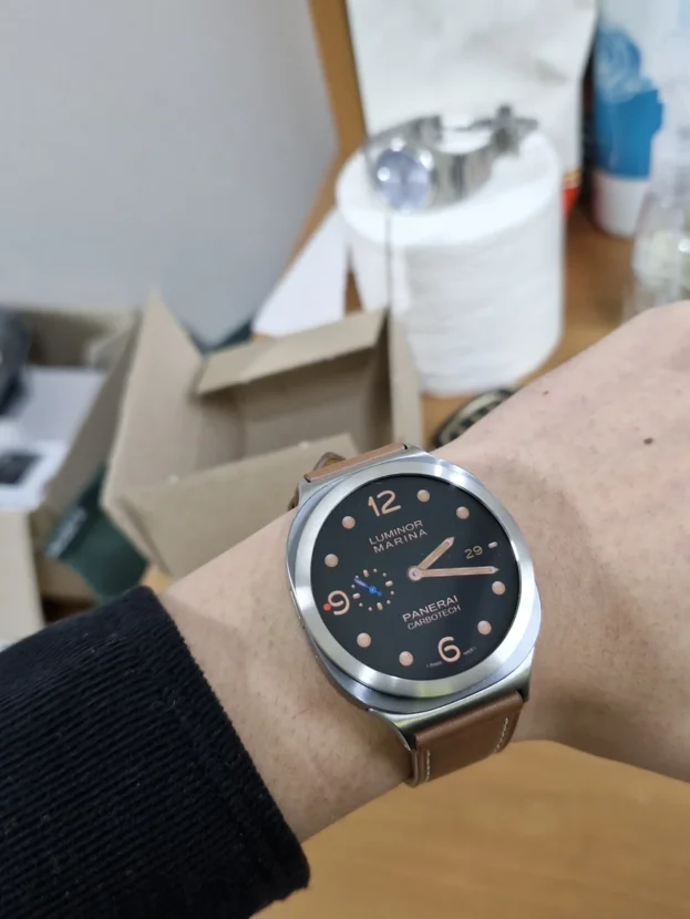
🥭 배송도 빠르고 물건도 좋네요
어두운 화면을 밝게 나누는 실버 인덱스
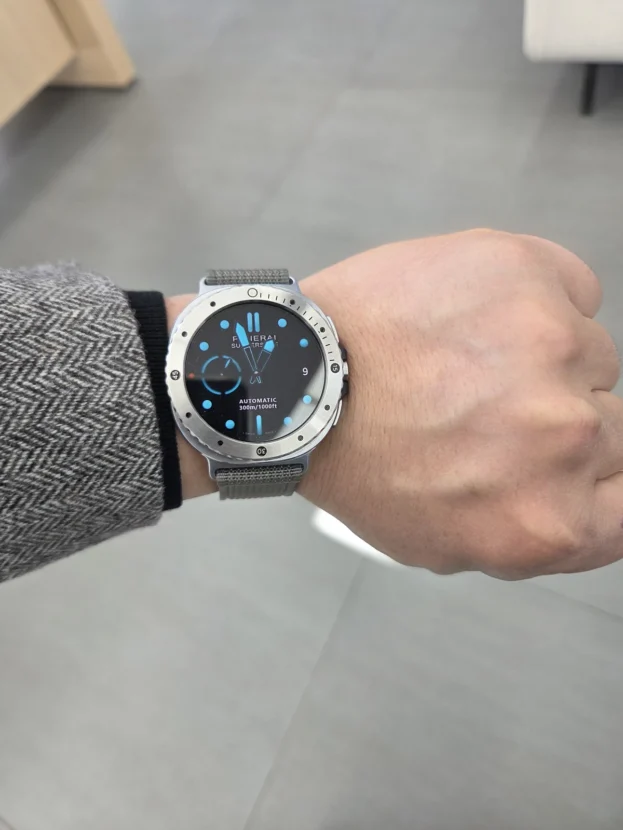
검은 화면에 수치와 그래프가 배치된 워치페이스는 정보가 화면 안쪽에 집중됩니다. 실버 인덱스 베젤링은 그 바깥에 밝은 원을 하나 더 만들고, 일정한 간격의 마킹으로 디스플레이의 끝을 분명하게 나눕니다. 화면과 케이스가 비슷한 톤으로 이어질 때보다 원형 다이얼이 선명해지고 손목 위에서 시계의 윤곽도 빠르게 읽힙니다.
실버 표면은 조명 전체를 거울처럼 반사하기보다 손목의 각도에 따라 일부 구간만 짧게 밝아집니다. 숫자가 크지 않고 미닛 마커가 가늘게 배치된 디자인이라면 데이터가 많은 화면에도 과한 장식으로 보이지 않습니다. 사용 중인 밴드는 별도 제품일 수 있으므로, 이 조합에서는 밝은 금속 톤이 케이스와 얼마나 자연스럽게 이어지는지만 살피는 편이 정확합니다.

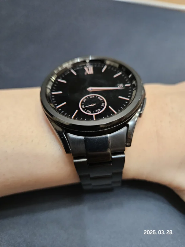
간지나고이쁩니다 맘에들어요~~~~~~~~~~
강한 색 사이에서 중심을 잡는 블랙
오렌지처럼 채도가 높은 밴드는 손목 아래까지 이어지는 넓은 면을 차지합니다. 베젤링까지 밝은 색이나 복잡한 각인으로 채우면 워치페이스보다 주변 장식이 먼저 보일 수 있습니다. 검은 플레인 링은 화면의 어두운 바탕과 이어지면서 바깥 색을 한 번 끊어주고, 케이스 전면을 단정한 원으로 묶습니다.
다이얼 안에는 여러 서브 다이얼과 인덱스가 들어 있지만 바깥 링에 별도의 숫자가 없어 정보가 겹치지 않습니다. 화면의 오렌지 시침과 사용 중인 밴드 색이 서로 연결되고, 블랙 베젤링은 그 사이에서 배경처럼 물러납니다. 색을 많이 쓰는 조합일수록 모든 부품을 강조하기보다 한 요소를 조용하게 두는 편이 전체 비율을 안정시킵니다.
블랙 표면은 작은 먼지나 마른 물자국이 밝은 실버보다 눈에 띌 수 있습니다. 운동이나 외출 뒤에는 부드러운 마른 천으로 둘레를 가볍게 닦고, 날카로운 도구로 안쪽을 긁지 않아야 표면과 코팅의 균일한 톤이 오래 유지됩니다. 각인 홈이 없는 플레인 디자인일수록 넓은 면의 상태가 그대로 드러나므로 가벼운 관리만으로도 단정한 인상을 지킬 수 있습니다.

물품이 2번이나 잘못와서 반품도 2번이나 하는 불편을 겪었지만 빠른대응과 베젤링의 좋은 품질에 만족하여 5점 드립니다.
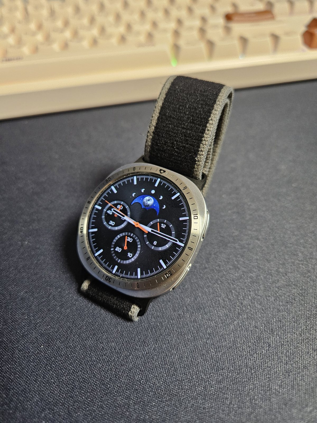
크로노그래프 밖으로 이어지는 숫자 인덱스
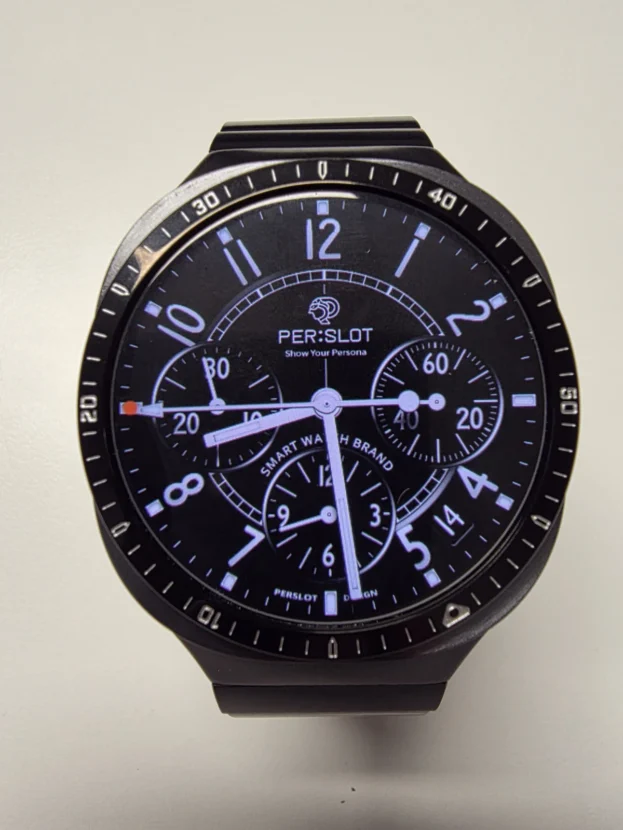
크로노그래프 워치페이스는 시침과 분침뿐 아니라 보조 다이얼, 수치, 색상 포인트가 촘촘하게 배치됩니다. 블랙 인서트의 베젤링은 화면과 같은 어두운 바탕을 유지하면서 실버 외곽선과 숫자 인덱스로 다이얼의 반경을 넓힙니다. 정보가 갑자기 끊기지 않고 금속 테두리까지 이어져 전통적인 스포츠 워치에 가까운 전면 구성이 완성됩니다.
인덱스가 있는 디자인은 중심이 조금만 어긋나도 쉽게 눈에 띕니다. 12시의 기준 마커를 워치페이스 중심선에 맞춘 뒤 6시 위치를 보고, 점착면을 세게 누르기 전에 3시와 9시의 안쪽 간격을 비교해야 합니다. 원이 정확히 맞으면 복잡한 다이얼도 한쪽으로 치우쳐 보이지 않고, 각인된 숫자 역시 화면 그래픽과 같은 축을 공유합니다.
제품을 받는 과정에 불편이 있었더라도 실제 착용에서 남는 판단은 금속 표면, 각인 상태, 외곽의 정렬과 점착입니다. 검은 인서트와 밝은 테두리의 경계가 흐리지 않고 숫자 깊이가 일정해야 손목을 움직일 때에도 전면의 인상이 흐트러지지 않습니다. 가까이 볼 때는 각인 안쪽의 마감과 원 둘레의 균일한 폭까지 함께 살피게 됩니다.
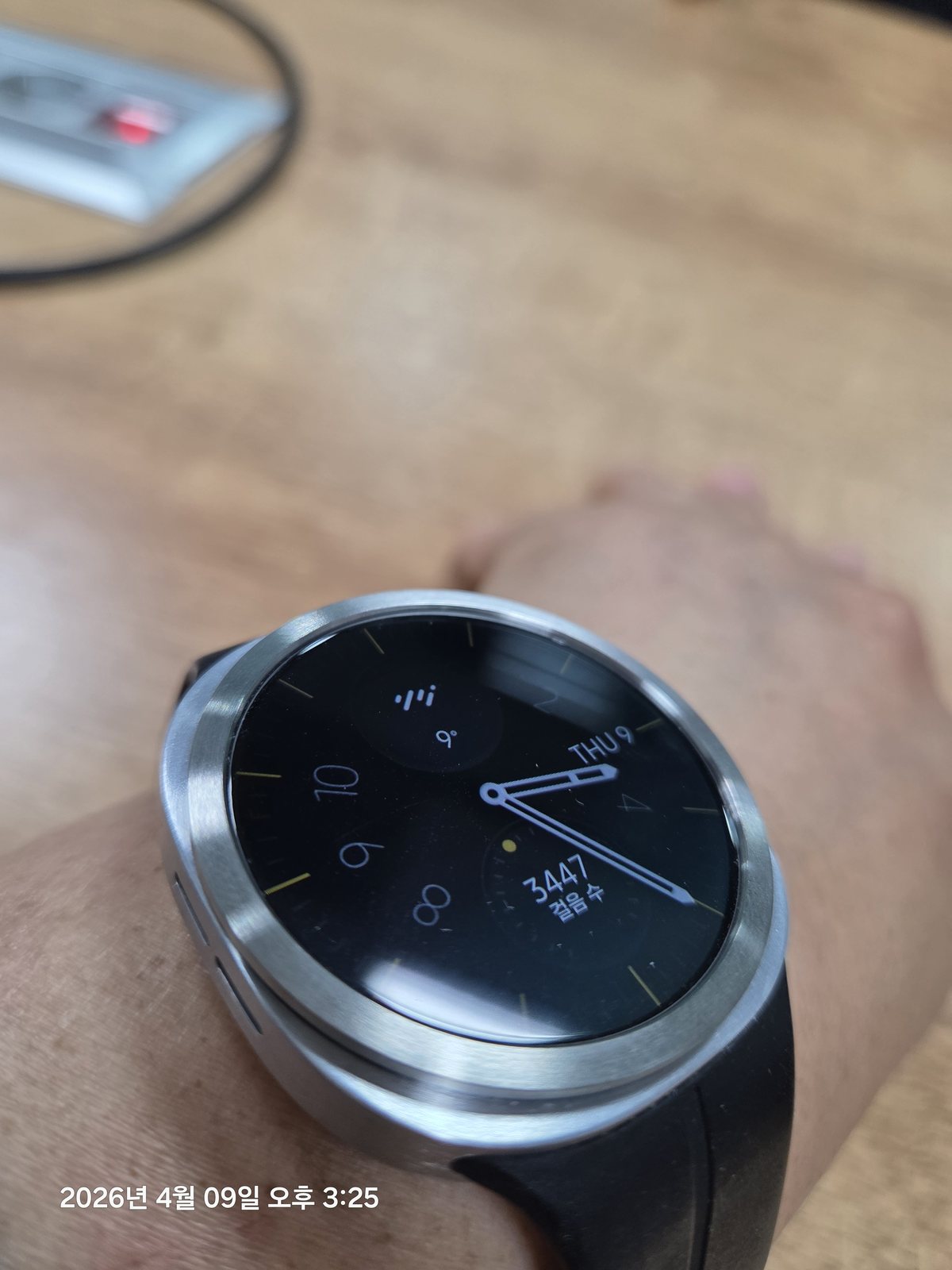
심플하니 만족합니다.
플레인 실버가 남기는 넓은 여백
플레인 실버 베젤링은 숫자나 스크루 포인트 없이 하나의 금속 면으로 다이얼을 감쌉니다. 화면에 이미 시간, 날짜, 걸음 수가 들어가 있어도 바깥에 새로운 정보가 추가되지 않습니다. 검은 워치페이스의 여백은 그대로 남고, 브러시드 실버의 결만 케이스 가장자리를 따라 이어집니다.
가까이서 보면 이 단순함은 색보다 표면에서 드러납니다. 헤어라인이 원 둘레와 같은 방향으로 정돈되어 있으면 반사가 한곳에 몰리지 않고 넓고 부드럽게 퍼집니다. 유광 인덱스 링보다 차분해 셔츠와 니트, 가죽 소품처럼 질감이 분명한 옷차림에도 부담 없이 연결됩니다.
화면 가장자리를 완전히 덮는 풀커버와 달리 베젤링은 디스플레이 중앙을 가리지 않습니다. 그만큼 외곽선의 간격이 중요하며, 링 안쪽과 화면 사이의 검은 여백이 네 방향에서 비슷해야 플레인 디자인의 정돈된 비율이 살아납니다. 화면이 꺼진 상태에서도 밝은 원이 한쪽으로 치우치지 않아야 금속 테두리가 케이스의 일부처럼 보입니다.

좋습니다. 잘 사용할께요
정보형 워치페이스와 밝은 외곽선
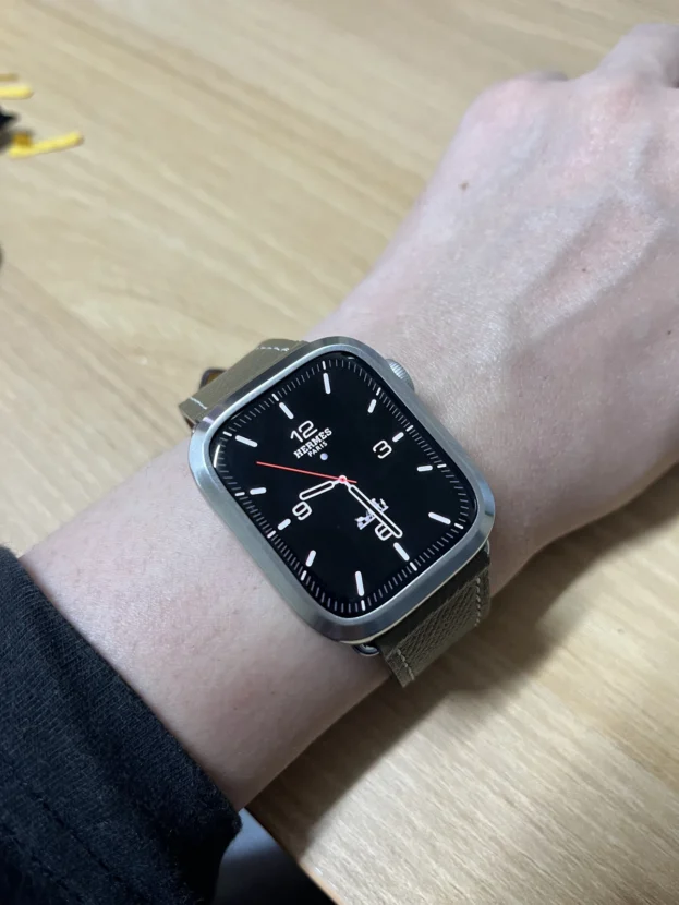
걸음 수, 시간, 상태 정보가 한 화면에 모인 워치페이스는 읽어야 할 요소가 많습니다. 실버 인덱스 베젤링은 화면 안의 데이터를 다시 설명하지 않고 외곽에 일정한 리듬을 더합니다. 검은 디스플레이와 밝은 금속 사이의 대비가 커지면서 작은 글자와 그래프가 모인 중심부가 하나의 다이얼로 정리됩니다.
화면 안쪽 마커와 바깥 인덱스가 모두 촘촘하다면 워치페이스의 가장자리에는 어느 정도 빈 공간이 필요합니다. 시침과 분침이 외곽까지 길게 뻗거나 원색 그래픽이 테두리를 채우는 화면보다는, 검정 바탕에 정보가 중앙으로 모인 구성이 편안합니다. 다이얼을 바꿀 때마다 베젤링까지 교체할 필요는 없지만 자주 쓰는 화면의 정보량을 기준으로 링을 고르면 조합이 오래갑니다.
베젤링과 필름 붙이니 찰떡이내요 잘쓰겠습니다.
베젤링 안쪽에 맞춘 전용 보호필름
베젤링과 보호필름을 함께 사용할 때는 두 부품이 만나는 위치가 정확해야 합니다. 시중의 일반 필름이나 삼성 스토어에서 판매하는 전면형 필름은 베젤링 없이 디스플레이를 넓게 덮는 규격이어서 링의 내경과 겹칠 수 있습니다. 겹친 필름 가장자리를 베젤링이 누르면 점착면이 들뜨거나 링이 충분히 밀착되지 않을 수 있습니다.
퍼슬랏 보호필름은 베젤링 내경 안으로 들어가도록 맞춘 전용 규격입니다. 필름을 먼저 화면 중심에 붙인 뒤 가장자리의 들뜸과 먼지를 확인하고, 베젤링을 올려 네 방향의 간격을 맞추면 금속 링과 투명 필름이 서로 밀어내지 않습니다. 보호 범위는 유지하면서 화면 가장자리의 금속 디테일까지 함께 살리는 조합입니다.
부착 직후에는 링 둘레가 완전히 눌렸는지, 필름 가장자리에 기포나 들뜸이 없는지 살펴야 합니다. 물이나 땀이 스며든 상태에서 링을 세게 누르기보다 부착면을 충분히 말린 뒤 작업하고, 교체가 필요할 때는 필름과 링을 각각 천천히 분리하는 편이 안전합니다.
다이얼에 맞춰 달라지는 금속의 표정
플레인과 인덱스 베젤링의 차이는 장식의 많고 적음에서 끝나지 않습니다. 플레인 링은 화면의 여백을 남기고 금속의 색과 표면 결로 전면을 정리합니다. 숫자와 미닛 마커가 있는 링은 워치페이스 안의 시간 정보를 화면 밖까지 이어 스포츠 워치의 성격을 더 분명하게 만듭니다. 블랙은 다이얼 속으로 물러나고 실버는 원형 외곽을 밝게 들어 올립니다.
워치페이스를 자주 바꾼다면 평소 가장 많이 쓰는 화면부터 보는 것이 좋습니다. 크로노그래프나 데이터 화면처럼 정보가 많은 다이얼에는 플레인 또는 톤이 낮은 블랙 링이 편안하고, 검은 여백이 넓은 아날로그 화면에는 밝은 실버 인덱스도 자연스럽게 들어갑니다. 사용 중인 밴드는 별도의 스타일 요소이며, 퍼슬랏 제품으로 단정하지 않고 색과 질감이 베젤링과 이루는 관계만 살피면 됩니다.
마지막은 정확한 호환성과 부착 순서입니다. 모델과 크기에 맞는 옵션을 고르고 화면과 링의 중심을 맞춘 뒤, 위치가 잡혔을 때 둘레를 고르게 눌러야 합니다. 보호필름을 함께 쓴다면 베젤링 내경에 맞춘 퍼슬랏 전용 필름을 사용해야 간섭과 들뜸을 줄일 수 있습니다. 화면이 켜졌을 때와 꺼졌을 때 모두 원의 간격이 고르면, 작은 금속 링은 워치의 외곽으로 자연스럽게 자리 잡습니다.
Plain And Indexed Bezels Around A Galaxy Watch Dial
The front of a Galaxy Watch has very little separation between the digital face and the case, which means the on-screen graphics largely define its appearance. A bezel introduces a physical metal boundary. The same watch face can look restrained with a plain ring or more instrument-like with engraved numerals and minute indices around its perimeter.
A plain bezel removes secondary information and relies on its width, colour and surface finish. It is particularly useful around chronograph or data-heavy watch faces. An indexed bezel does the opposite: it extends the visual language of hands and time markers beyond the display, giving the watch the structure of a traditional sports watch.
The most convincing combination comes from balancing visual density. A face filled with sub-dials and figures usually benefits from a quieter perimeter, while a dial with broad black margins can support an active outer index. Black recedes into the display. Silver catches light at the edge and makes the circular silhouette more visible.
Compatibility and alignment determine the final result. Select the option for the exact watch generation and size, then compare the clearance at twelve, six, three and nine o’clock before pressing the adhesive firmly. When a screen protector is also used, it must fit inside the bezel’s inner diameter. PERSLOT bezel-specific protectors are designed for that relationship, while full-face protectors from general retailers or Samsung stores may overlap the metal ring.
Silver Indices Across A Dark Data Face
🥭 Delivery was fast and the product is good.
A dark watch face containing figures and graphs concentrates information toward the centre. The silver indexed bezel creates a second, brighter circle outside it and defines the edge of the display with evenly spaced marks. The dial becomes easier to distinguish from a case of similar tone, and the circular profile reads more quickly on the wrist.
Silver does not need to reflect like a mirror. As the wrist moves, only selected sections of the surface become bright, while the fine indices remain visible through changing light. The user’s band may be a separate product, so the accurate point to observe here is how the bright bezel tone connects the display to the watch case.
Black Restraint Between Strong Colours
It looks stylish and beautiful. I really like it.
A saturated orange band occupies a broad area around the wrist. If the bezel also carries bright colour and dense engraving, the accessories can compete with the face. A plain black ring continues the dark background of the display, interrupts the surrounding colour and binds the front of the case into a clean circle.
The face already contains several sub-dials and markers, so an unnumbered perimeter prevents the information from doubling. The orange hands connect with the user’s band, while the black bezel remains visually quiet between them. In combinations that use strong colour, allowing one component to recede is often more effective than emphasizing every part.
Dust and dried water marks can be more noticeable on a uniform black surface. After exercise or outdoor wear, wipe the circumference gently with a soft, dry cloth. Avoid scraping the inner edge with a sharp tool so the coating retains an even tone.
Numerals Continuing Beyond A Chronograph
The wrong item arrived twice and I had to return it twice, which was inconvenient. However, the response was quick and I am satisfied with the quality of the bezel, so I give it five stars.
A chronograph face places hands, sub-dials, figures and colour accents close together. A bezel with a black insert keeps the same dark foundation while using a silver outline and engraved numerals to extend the radius of the dial. The information does not stop abruptly at the display, giving the front the construction of a conventional sports watch.
An indexed design makes even a small alignment error visible. Match the reference marker at twelve o’clock to the vertical axis of the watch face, check six o’clock, then compare the inner clearance at three and nine before applying firm pressure. Accurate centring allows the engraved scale and the digital graphics to share the same axis.
After delivery issues are resolved, the lasting assessment comes from the metal finish, the clarity of the engraving, the outer alignment and adhesion. A clean boundary between the black insert and the bright edge should remain stable as the wrist moves.
The Open Space Of A Plain Silver Ring
It is simple and I am satisfied.
A plain silver bezel surrounds the dial with one continuous metal surface, without numerals or screw accents. It does not add new information to a face that already shows time, date or activity data. The black margin remains open, while the brushed silver grain follows the case edge.
At close range, this restraint is expressed through texture rather than decoration. When the hairline finish follows the circumference, reflected light remains broad and soft instead of gathering in a single bright spot. The result is calmer than a polished indexed ring and works comfortably beside shirts, knitwear and leather accessories.
Unlike a full-cover case, a bezel does not cover the centre of the display. This places greater importance on even clearance. The narrow black margin between the inner edge and the screen should remain similar in all four directions for the plain geometry to look deliberate.
A Bright Boundary Around A Data-Rich Face
It is good. I will use it well.
A watch face that combines steps, time and status data contains many elements to read. A silver indexed bezel does not repeat that data; it adds a consistent rhythm at the perimeter. The contrast between the black display and bright metal gathers the small figures and graphs into one distinct dial.
When both the screen and the bezel contain numerous marks, the edge of the watch face needs some empty space. A black background with information concentrated toward the centre is generally calmer than graphics that reach all the way to the outer edge. Choosing the ring around the face used most often produces a combination that remains comfortable over time.
A Bezel-Specific Protector Inside The Metal Ring
The bezel and film fit perfectly together. I will use them well.
A bezel and screen protector must meet at the correct point. General full-face films and protectors sold through Samsung stores are designed to cover a broad display without a bezel. Their edges can overlap the inner diameter of a metal ring. If the bezel presses against that overlap, the film may lift or the ring may fail to adhere evenly.
PERSLOT screen protectors for bezel use are cut to sit within the inner diameter of the bezel. Centre the film first, check that its edge is clean and flat, then position the metal ring with equal clearance in four directions. The protector and bezel can then retain their respective roles without pushing against one another.
After installation, check the entire circumference for a lifted edge and inspect the film for trapped dust or bubbles. Work only on a clean, fully dry surface. If replacement becomes necessary, remove the film and bezel separately and gradually rather than pulling both components at once.
How The Metal Perimeter Changes The Dial
The difference between plain and indexed bezels is not simply the amount of decoration. A plain ring preserves space and organises the front through colour and texture. An indexed ring carries time markings beyond the digital screen and strengthens the character of a sports watch. Black recedes into the dial, while silver lifts the circular outline into the light.
Start with the face used most often. A chronograph or information-rich display usually works well with a plain or low-contrast black ring. A dark analogue face with generous margins can support a brighter silver index. The user’s band remains a separate styling element and should not be identified as a PERSLOT product unless its origin is known.
The final steps are exact compatibility and careful installation. Match the model and size, centre the ring before pressing it down and use a PERSLOT bezel-specific protector when film is required. When the clearance remains even with the display both on and off, the metal ring settles naturally into the architecture of the watch.
추가 정보
베젤링과 워치페이스를 함께 보는 기준
갤럭시워치 베젤링은 화면 바깥에 금속 경계를 만들고 다이얼의 정보량과 전면 비율을 바꿉니다. 플레인은 여백과 표면 결을 살리고, 인덱스가 새겨진 디자인은 시간의 마킹을 디스플레이 밖까지 이어 스포츠 워치의 성격을 더합니다.
- 정보가 많은 크로노그래프와 데이터 화면에는 플레인 또는 블랙 링이 편안하게 어울립니다.
- 검은 여백이 넓은 아날로그 화면에는 실버 인덱스 베젤링이 또렷한 외곽선을 더합니다.
- 블랙은 화면과 이어져 장식을 줄이고, 실버는 원형 실루엣과 케이스 가장자리를 밝게 드러냅니다.
- 사용 중인 밴드는 별도 제품일 수 있으므로 베젤링과 같은 퍼슬랏 제품으로 단정하지 않습니다.
- 모델 세대와 크기가 다르면 베젤 내경과 외경, 화면 가장자리의 간격도 달라질 수 있습니다.
- 12시와 6시의 축을 먼저 맞춘 뒤 3시와 9시의 안쪽 여백을 비교해야 중심이 안정됩니다.
- 일반 전면형 필름은 링과 겹칠 수 있어 베젤링 전용 보호필름과 구분해야 합니다.
- 땀과 물기는 오래 남기지 않고 부드러운 마른 천으로 닦아 금속의 결을 관리합니다.
자주 묻는 질문
플레인과 인덱스 베젤링은 어떻게 고르나요?
워치페이스 안에 숫자, 그래프와 서브 다이얼이 많다면 플레인 링이 화면의 여백을 지키기 쉽습니다. 검은 바탕이 넓고 시침과 분침이 단순한 화면에는 숫자와 미닛 마커가 있는 디자인을 더해 외곽까지 시계의 구조를 이어갈 수 있습니다.
블랙과 실버 중 어느 색이 더 자연스럽나요?
블랙은 검은 디스플레이와 연결되어 링의 존재를 낮추고, 실버는 케이스 가장자리를 밝게 분리합니다. 자연스럽게 숨는 조합은 블랙에 가깝고, 원형 다이얼을 분명하게 드러내고 싶다면 실버가 적합합니다.
정보가 많은 워치페이스에도 인덱스 베젤링이 어울리나요?
화면 가장자리에 검은 여백이 충분하면 함께 사용할 수 있습니다. 다만 그래픽과 수치가 화면 끝까지 차 있다면 외곽 인덱스와 겹쳐 복잡해 보일 수 있으므로, 정보가 중앙에 모인 다이얼을 고르는 편이 안정적입니다.
모델과 사이즈가 다르면 호환되지 않나요?
갤럭시워치는 세대와 크기에 따라 케이스 외형, 화면 지름과 가장자리 구조가 달라집니다. 주문 전 설정 메뉴나 본체 뒷면에서 모델을 확인하고, 상품 옵션의 호환 모델과 사이즈를 정확히 맞춰야 합니다.
베젤링을 중앙에 맞추는 쉬운 방법이 있나요?
화면을 켜 수직 기준이 분명한 워치페이스를 띄우고 12시와 6시를 먼저 맞춥니다. 점착면을 세게 누르기 전에 3시와 9시의 안쪽 간격을 비교하고, 네 방향이 같을 때 둘레를 번갈아 눌러 고정합니다.
일반 보호필름을 베젤링과 함께 써도 되나요?
시중 제품이나 삼성 스토어의 전면형 필름은 베젤링 없이 화면을 넓게 덮도록 만들어져 링의 내경과 겹칠 수 있습니다. 함께 사용할 때는 베젤링 안쪽으로 들어가도록 설계된 퍼슬랏 전용 보호필름을 선택해야 필름 들뜸과 점착 간섭을 줄일 수 있습니다.
부착 직후 물에 닿아도 되나요?
점착면이 안정되기 전에는 물과 땀, 큰 충격을 피하는 편이 좋습니다. 부착면이 젖은 상태에서 눌러 붙이지 말고 완전히 말린 뒤 작업하며, 사용 전 링 둘레에 뜬 부분이 없는지 확인합니다.
금속 표면은 어떻게 닦아야 하나요?
부드러운 마른 천으로 둘레를 가볍게 닦고 홈이나 각인 사이의 먼지는 결이 고운 브러시로 제거합니다. 거친 수세미, 금속 도구와 연마 성분이 강한 세정제는 표면 결이나 코팅을 바꿀 수 있으므로 피합니다.
착용 전 알아둘 네 가지
다이얼의 정보량
워치페이스의 중심과 가장자리 중 어디에 정보가 모여 있는지 먼저 봅니다. 수치와 그래프가 중앙에 모여 있으면 인덱스가 있는 링도 부담이 적고, 화면 끝까지 그래픽이 채워져 있다면 플레인 링이 시각적인 충돌을 줄입니다.
금속의 색과 표면
같은 실버라도 브러시드 면은 반사가 부드럽고 유광 면은 빛이 선명합니다. 블랙은 화면과 경계를 좁히고 실버는 케이스 외곽을 또렷하게 분리하므로, 자주 쓰는 워치페이스의 바탕색과 시침 색을 함께 비교해야 합니다.
부착 순서와 점착
먼지와 유분을 닦아낸 뒤 네 방향의 간격을 맞추고, 위치가 정확할 때 둘레를 고르게 눌러줍니다. 한쪽부터 강하게 고정하거나 이미 눌러 붙인 링을 반복해서 들어 올리면 점착 테이프가 늘어나 고정력이 일정하지 않을 수 있습니다.
보호필름의 실제 규격
보호필름이라는 이름이 같아도 덮는 범위는 다릅니다. 전면형 필름은 화면 바깥까지 넓게 올라오고, 퍼슬랏 베젤링 전용 필름은 링의 내경 안에 들어가도록 설계됩니다. 두 부품을 함께 쓸 때는 필름 외곽과 금속 링 사이에 간섭이 없는 규격을 선택해야 합니다.
모델과 사이즈별 갤럭시워치 베젤링 및 전용 보호필름은 퍼슬랏 공식몰에서 구분할 수 있습니다. 중심 정렬과 실제 부착 과정은 퍼슬랏 공식 유튜브의 영상을 함께 보면 이해하기 쉽습니다.