


갤럭시워치 베젤링 후기, 실버와 블랙의 금속 디테일
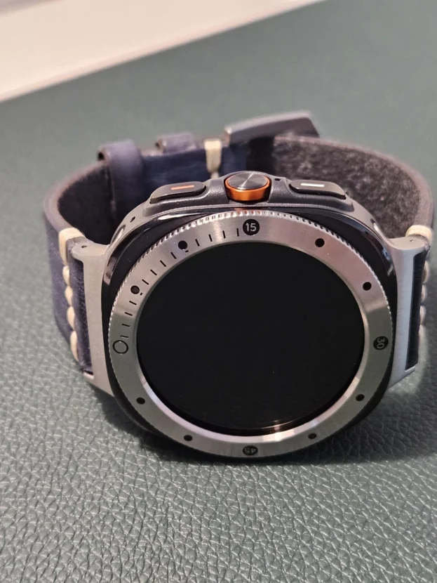
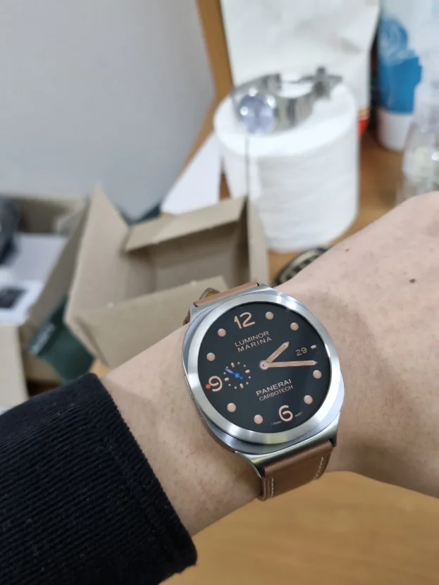
갤럭시워치의 인상은 화면이 켜졌을 때보다 손목에 올렸을 때 더 분명해집니다. 검은 디스플레이와 케이스가 만나는 가장자리에 얇은 금속선이 더해지면, 본체를 두껍게 감싸지 않아도 원형 실루엣이 또렷해집니다. 퍼슬랏 베젤링은 바로 그 가장자리를 정교하게 다듬어 스마트워치의 얼굴을 시계에 가까운 비율로 바꿉니다.
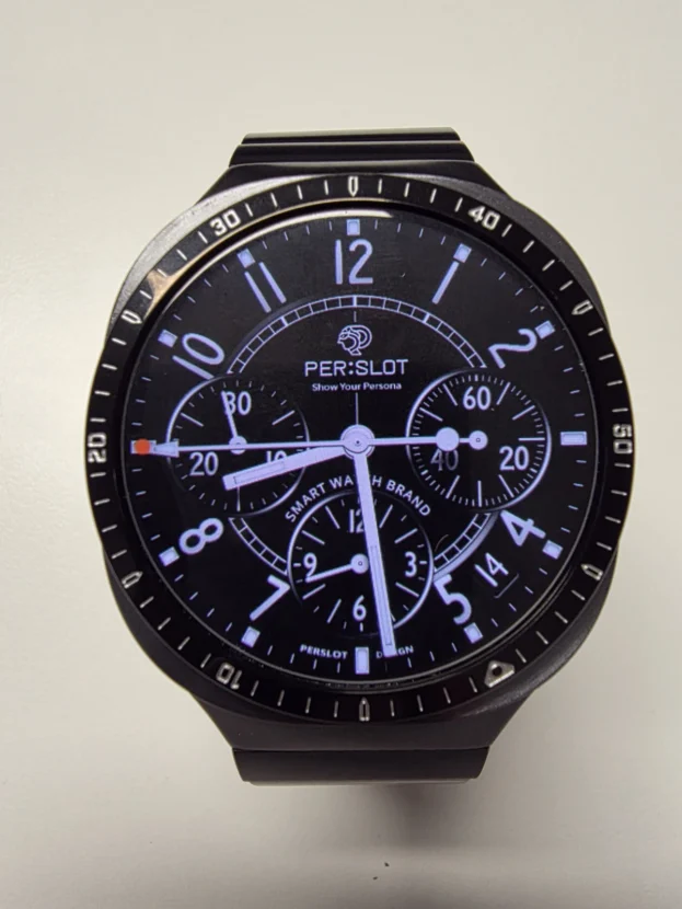
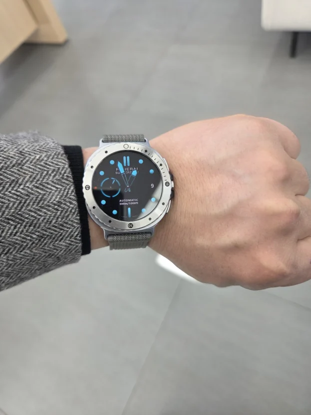
장식을 절제한 실버 마감은 밝은 케이스와 자연스럽게 이어지면서 디지털 워치페이스의 여백을 깨끗하게 남깁니다. 반면 각인 디테일이 더해진 실버와 블랙 마감은 아날로그 다이얼, 크로노그래프 화면, 메탈이나 가죽 스트랩과 만났을 때 존재감이 선명해집니다. 같은 원형 액세서리라도 표면의 밝기와 각인의 밀도, 워치페이스의 정보량이 맞물리면 손목 위 분위기는 생각보다 크게 달라집니다.
외관만큼 중요한 부분은 정확한 치수와 부착 위치입니다. 사용 중인 워치의 모델과 사이즈에 맞는 옵션을 고른 뒤 네 방향의 간격을 고르게 맞춰야 화면과 금속이 한 개의 원처럼 보입니다. 보호필름을 함께 쓸 때도 화면 전체를 덮는 일반 필름이 아니라 베젤링 내경에 맞춘 퍼슬랏 전용 보호필름을 사용해야 가장자리가 겹치거나 들뜨는 일을 줄일 수 있습니다.
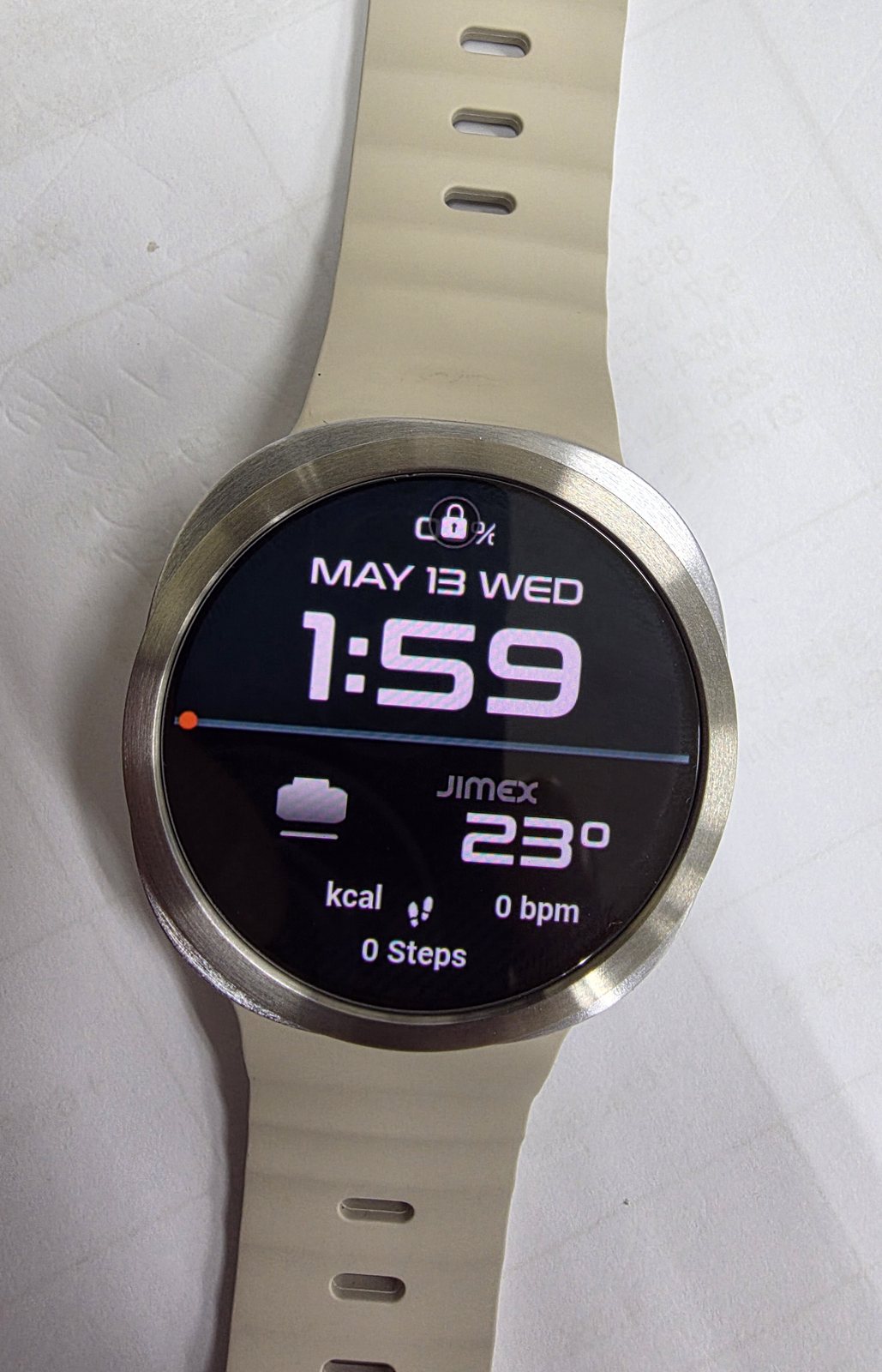
아주 좋습니다. 다른색도 추가구매 해야겠어요. 다만 액정보호 강화유리 사이즈가 살짝 작아서 일체감이 좀 떨어지고 틈사이 먼지 침투 예상됩니다.
장식을 덜어낸 실버 마감
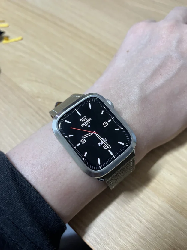
넓고 담백한 실버 면은 큰 숫자와 알림이 중심이 되는 디지털 워치페이스와 잘 어울립니다. 검은 화면 바깥에 밝은 금속 테두리가 얇게 남아 원형 디스플레이가 선명해지고, 밝은 기본 밴드와 연결했을 때도 어느 한쪽이 과하게 도드라지지 않습니다. 소매 아래로 살짝 보이는 순간에는 장식품보다 정돈된 시계 테두리에 가까운 인상을 남깁니다.
강화유리나 보호필름을 함께 쓴다면 외경을 먼저 봐야 합니다. 일반 전면 필름과 삼성 스토어에서 판매하는 필름은 베젤링이 없는 화면 전체를 기준으로 제작되어 금속 안쪽과 겹칠 수 있습니다. 퍼슬랏 전용 보호필름은 베젤링 내경 안에 들어가도록 치수를 맞췄기 때문에 필름 가장자리를 누르지 않으며, 화면과 금속 사이에 필요한 여백도 일정하게 남깁니다.
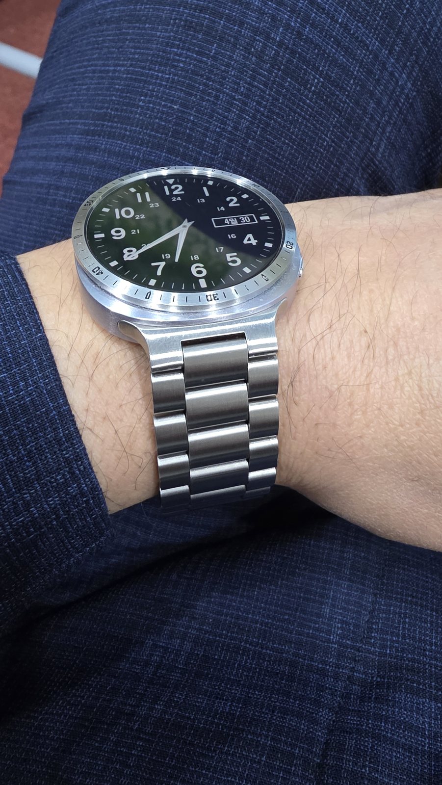
워치의 재미는 꾸밈입니다. 질리지 않는 이유도 여기에 있습니다.
메탈 스트랩과 이어지는 실버 톤
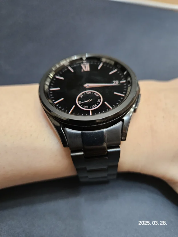
실버 베젤링과 메탈 스트랩을 함께 맞추면 워치 본체 위아래의 금속 톤이 끊기지 않습니다. 케이스만 가운데 떠 있는 듯한 느낌이 줄고, 정면의 얇은 원에서 손목 아래의 링크까지 하나의 시계처럼 이어집니다. 짙은 다이얼과 밝은 외곽 사이의 대비가 생겨 시간을 볼 때 시선도 자연스럽게 화면 중심으로 모입니다.
손목을 돌릴 때는 반사의 방향이 조금씩 달라집니다. 베젤링의 좁은 면은 빛을 짧게 받아내고, 스트랩의 넓은 링크는 더 부드러운 광택을 남깁니다. 모든 금속이 똑같이 번쩍이지 않기 때문에 오히려 입체감이 살아나며, 셔츠와 재킷처럼 선이 또렷한 옷에도 부담 없이 어울립니다.
각인 디테일이 있는 제품은 부착 방향을 더욱 세심하게 잡아야 합니다. 먼저 12시와 6시를 화면 중심축에 맞추고, 접착면을 누르기 전에 3시와 9시의 안쪽 간격을 번갈아 봅니다. 네 방향의 여백이 같을 때 둘레를 천천히 눌러야 금속 디테일과 워치페이스가 비뚤어지지 않고, 정면에서도 안정적인 원형을 유지합니다.
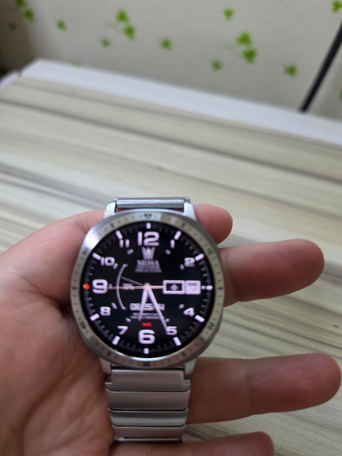
배송도 빠르고 만족 합니다
아날로그 다이얼과 금속의 깊이
아날로그 워치페이스에는 시침과 분침, 날짜 창, 시간 인덱스가 하나의 중심을 따라 놓입니다. 실버 베젤링이 그 바깥을 감싸면 화면 안에서 끝나던 원형 구성이 케이스 가장자리까지 이어지고, 평면 디스플레이에도 얕은 단차와 금속의 깊이가 생깁니다. 화면이 꺼진 뒤에도 반듯한 외곽선이 남아 손목시계다운 비율을 유지하는 이유입니다.
메탈 스트랩을 연결한 상태에서는 색상만 맞추는 것으로 끝나지 않습니다. 링크의 브러시 결, 케이스의 매끈한 면, 베젤링 모서리의 반사가 서로 다른 속도로 빛을 받으면서 전체 표정이 완성됩니다. 검은 다이얼처럼 대비가 분명한 화면을 사용하면 이 차이가 더 또렷해져, 금속이 많아도 무겁거나 복잡해 보이지 않습니다.
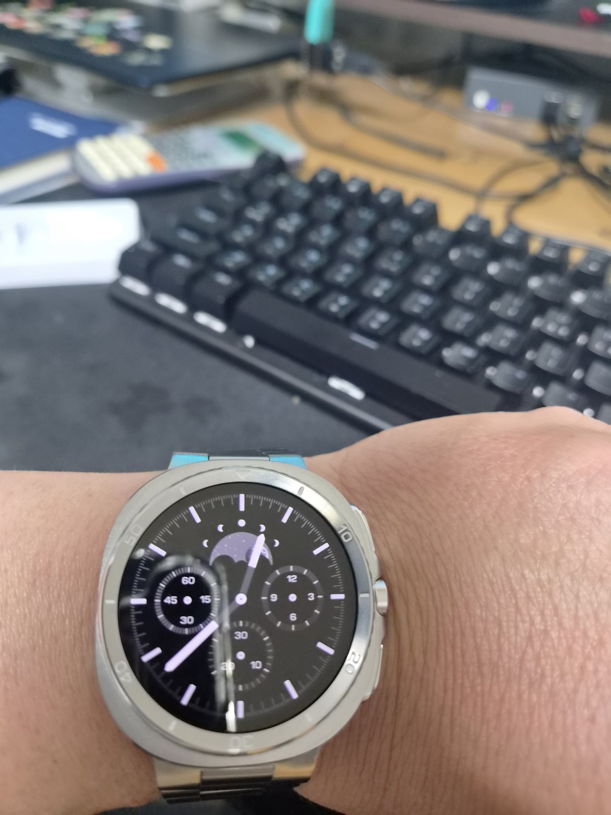
배송도 빠르고 좋아요
정보가 많은 워치페이스의 균형
여러 개의 서브 다이얼과 가는 인덱스가 들어간 화면은 작은 공간 안에 많은 정보를 담고 있습니다. 이때 실버 베젤링은 화면을 덮지 않으면서 바깥 원을 분명하게 잡아, 각각의 표시가 금속 테두리 안에서 정돈되어 보이도록 합니다. 복잡한 화면일수록 이 얇은 외곽선의 역할이 더욱 분명해집니다.
빛이 강한 야외에서는 밝은 금속과 흰색 인덱스가 동시에 도드라질 수 있습니다. 그래서 다이얼 안쪽에 검은 여백이 충분히 남아 있는지가 중요합니다. 화면 가장자리가 답답하지 않으면 실버의 반짝임은 정보를 방해하기보다 워치의 윤곽을 또렷하게 만들고, 손목을 내렸을 때도 전면의 중심을 쉽게 찾게 합니다.
이 조합은 작은 기울어짐도 비교적 잘 보입니다. 부착면에 남은 먼지와 유분을 닦고 완전히 말린 다음, 화면을 켠 상태에서 상하좌우 간격을 확인하는 편이 좋습니다. 처음부터 한쪽을 강하게 누르면 반대편 여백이 달라질 수 있으므로 중심을 잡은 뒤 원을 따라 힘을 나누어 압착해야 깔끔한 비율이 오래갑니다.
착용한 뒤에는 화면 가장자리의 터치 반응도 살펴봅니다. 손가락이 움직이는 영역을 금속이 침범하지 않고 전용 보호필름과 링 사이에 가는 틈이 고르게 남아 있다면, 외관을 정리하면서도 스마트워치의 조작감은 그대로 유지됩니다. 손목을 움직이는 동안에도 화면 조작의 흐름이 끊기지 않습니다.
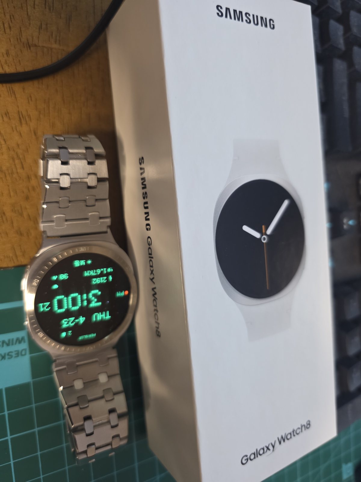
깔끔하니 아주 맘에 듭니다
갤럭시워치8의 둥근 전면
갤럭시워치8의 둥근 케이스에는 실버 베젤링의 얇은 외곽선이 자연스럽게 이어집니다. 화면과 본체 사이에 경계가 하나 더 생기지만 두께를 크게 늘리지 않아, 워치 자체의 부드러운 실루엣은 그대로 남습니다. 메탈 스트랩까지 같은 계열로 연결하면 전면만 꾸민 느낌보다 처음부터 하나의 금속 시계로 설계된 듯한 일체감이 살아납니다.
실내 조명 아래에서는 넓은 면보다 가장자리의 짧은 반사가 먼저 보입니다. 손목을 움직일 때마다 빛이 한 바퀴를 모두 돌지 않고 일부 구간에만 머물러 과한 광택을 피합니다. 흰색이나 회색 셔츠에서는 실버가 깨끗하게 드러나고, 짙은 니트나 재킷에서는 검은 화면과 밝은 금속의 대비가 더욱 선명해집니다.
매일 사용하는 만큼 관리는 단순해야 합니다. 손을 씻거나 운동한 뒤 물기와 땀이 남았다면 부드러운 마른 천으로 둘레를 눌러 닦고, 각인이나 접합부에 낀 미세한 먼지는 결이 고운 브러시로 가볍게 털어냅니다. 거친 수세미와 연마 성분이 강한 세정제는 브러시 결과 표면 코팅을 바꿀 수 있어 피하는 편이 좋습니다.

좋아요, 부착도 쉽네요, 베젤링 먼저 부착 후 안에다 떨구면 되요
블랙 베젤링과 다크 다이얼
블랙 베젤링은 어두운 워치페이스의 색을 케이스 끝까지 이어주며 화면을 한층 깊어 보이게 합니다. 밝게 새겨진 디테일은 필요한 위치에서만 드러나고, 중앙의 다이얼은 검은 외곽 안쪽으로 차분하게 자리 잡습니다. 블랙 가죽 스트랩과 연결하면 스마트워치의 디지털 인상은 줄어들고, 셔츠나 코트에 어울리는 단정한 스포츠 워치의 표정이 살아납니다.
부착 순서는 외관의 완성도와 사용감에 모두 영향을 줍니다. 화면과 링의 기준점을 맞춘 뒤 베젤링을 먼저 고정하고, 퍼슬랏 전용 보호필름을 안쪽에 정확히 내려놓으면 간격을 고르게 잡기 쉽습니다. 필름 가장자리가 금속에 눌리지 않고 네 방향의 여백이 일정하며, 화면 끝의 터치가 자연스럽다면 일상에서 들뜸이나 간섭을 걱정하지 않고 사용할 수 있습니다.
색보다 오래 남는 금속의 비율
실버와 블랙 베젤링의 차이는 단순한 색상 대비로 끝나지 않습니다. 장식을 절제한 실버는 디지털 워치페이스의 여백과 케이스 본래의 원형을 깨끗하게 남기고, 각인 디테일이 있는 실버는 아날로그 화면과 메탈 스트랩 사이에 시계다운 구조를 더합니다. 블랙은 다크 다이얼과 가죽 스트랩을 한 톤으로 묶어 전면에 깊고 차분한 인상을 남깁니다.
평소 자주 사용하는 워치페이스를 켜 두고 비교하면 조합의 차이가 빠르게 보입니다. 표시가 많은 화면에는 장식을 덜어낸 실버가 편안하고, 여백이 넓은 아날로그 다이얼에는 각인된 금속선이 자연스럽게 어울립니다. 스트랩 색만 맞추기보다 케이스의 광택과 다이얼의 명암까지 함께 보는 것이 좋습니다.
작은 금속 부품이지만 마지막 인상은 치수와 정렬에서 갈립니다. 모델과 사이즈를 정확히 맞추고, 중심축과 안쪽 간격을 고르게 잡고, 베젤링 전용 보호필름까지 같은 원 안에 안정적으로 놓여야 합니다. 화면이 켜져 있을 때는 워치페이스를 또렷하게 감싸고, 화면이 꺼진 뒤에는 정돈된 금속 외곽만 남습니다. 매일 손목을 볼 때 부담 없이 느껴지는 그 차이가 퍼슬랏 베젤링의 완성도입니다.
Galaxy Watch Bezels In Silver And Black
A Galaxy Watch takes on its clearest character after it is placed on the wrist. A slim metal perimeter at the meeting point of the display and case sharpens the circular silhouette without enclosing the whole body. PERSLOT bezels refine that narrow boundary, bringing the proportions of a traditional watch to the digital face while preserving the original thickness of the case.
Minimal silver leaves open space around digital information, whereas engraved silver and black become more expressive beside analog dials, chronograph layouts, metal links and leather straps. Finish, reflection and the density of the watch face work together, so two bezels with the same circular form can produce very different results in daily wear. Fit remains just as important. The bezel must match the exact model and case size, then sit with equal clearance on all four sides. A protector also needs to fit inside the opening; general full-screen films can extend beneath the metal, while the PERSLOT protector is dimensioned specifically for the bezel interior.
Minimal Silver Finish
It is very good. I would like to purchase another colour as well. The tempered-glass protector feels slightly small, however, so the fit is less seamless and I expect dust may enter the gap.
The broad, restrained silver surface works comfortably with a digital face built around large numerals and notifications. It draws a clear line between the black display and the bright case without competing for attention. Paired with a light original band, it looks less like an added ornament and more like a clean watch perimeter slipping beneath a shirt or knit cuff.
The outer diameter of the protector needs to be considered before installation. General films and protectors intended for an uncovered screen may overlap the inner edge of the metal.
A PERSLOT bezel-specific protector sits inside the opening rather than beneath the ring. This leaves a deliberate, even clearance between glass and metal and prevents the protector edge from being pressed upward after the bezel is secured.
Silver Continuity With Metal Links
The pleasure of a watch lies in styling it. That is also why it does not become tiresome.
When a silver bezel meets a metal strap, the finish continues above and below the watch body. The case no longer appears suspended between separate accessories; the circular front and the links beneath the wrist read as one composed object. Against a dark dial, the bright perimeter also guides the eye quickly towards the time display.
Movement introduces a quieter layer of detail. The narrow bezel catches a short, crisp reflection, while the broader links return a softer glow. Because the two surfaces do not shine in exactly the same way, the watch gains depth without appearing overly polished. Engraved details also require careful alignment: set the twelve and six positions on the centre axis, compare the inner clearances at three and nine, and only then press around the circumference. This keeps the metal markings and the watch face visually balanced.
Depth Around An Analog Dial
Delivery was fast and I am satisfied.
An analog face arranges hands, indices and a date window around one centre. A silver bezel carries that geometry beyond the display and towards the edge of the case. The screen gains a shallow physical boundary, and the watch retains a familiar timepiece proportion even when the display is off.
Colour matching alone is not enough with a metal strap. The brushed grain of the links, the smooth plane of the case and the small reflection along the bezel edge respond to light at different speeds.
A dark face gives those changes enough contrast to remain refined rather than heavy. The result is not one continuous polished surface, but a sequence of controlled reflections that becomes visible as the wrist moves.
Balance Around A Detailed Watch Face
Delivery was fast and the product is good.
Sub-dials and fine indices put a considerable amount of information into a small circle. The silver perimeter defines the outside without covering the display, allowing each element to remain contained within a clear boundary. In strong daylight, bright metal and pale indices can both become prominent, so the dark space inside the dial is what keeps the composition calm. With enough breathing room around the information, the reflection of the bezel clarifies the outline instead of distracting from it.
Minor alignment errors are easier to notice on a dense face. Remove dust and skin oil, let the surface dry completely, and check all four clearances with the display active. Pressure should be distributed around the circle only after the centre is settled. Once fitted, edge gestures should remain unobstructed; equal space between the bezel and its dedicated protector preserves the clean appearance while leaving the touch area comfortable in everyday use.
The Rounded Front Of Galaxy Watch8
It looks clean and I like it very much.
A slim silver perimeter follows the rounded case of Galaxy Watch8 without making the body look bulky.
When a metal strap continues in the same family of tones, the result feels less like a watch with added parts and more like a single metal timepiece designed as a whole. The circular front and links beneath the wrist remain visually connected even when the display is off.
Indoor light first appears along the edge rather than across the entire surface. Short reflections travel only through part of the circle as the wrist turns, keeping the finish controlled. Silver looks crisp beside a pale shirt and gains stronger contrast against a dark knit or jacket.
Care is straightforward. Dry water and perspiration with a soft cloth, then use a fine brush around engraved details and joints. Rough pads and abrasive cleaners can alter the grain or coating and should not be used.
Black Beside A Dark Dial
It is good and easy to attach. Fit the bezel first, then lower the protector into the opening.
A black bezel extends the tone of a dark watch face towards the outside of the case. Bright engraved accents remain visible only where they are needed, while the centre dial sits deeper within the black perimeter. A black leather strap completes a restrained sports-watch character that works naturally with shirts and coats.
Installation affects both finish and operation. Secure the aligned bezel first, then lower the PERSLOT protector into its opening. When the film is not pressed by the metal, the clearance is even in every direction and edge gestures remain natural, the assembly is ready for daily wear.
Proportion That Outlasts Colour
Silver and black differ through more than colour. Minimal silver preserves the open space of a digital display, engraved silver gives analog faces and metal links a stronger watch structure, and black connects a dark dial with leather in one calm tone.
The watch face used most often is the most useful reference. Detailed information sits comfortably beside a restrained silver surface, while an open analog layout can carry engraved metal without feeling crowded. Case finish and dial contrast matter as much as strap colour.
Final quality comes from the exact option, even alignment and the correct protector clearance. The bezel should frame the active display cleanly and leave a precise metal circle after the screen turns off. That quiet consistency is what gives a PERSLOT bezel its place in daily wear.
추가 정보
베젤링을 맞추기 전 살펴볼 부분
실버와 블랙은 단순히 밝고 어두운 색으로만 나뉘지 않습니다. 케이스의 표면 결, 자주 사용하는 워치페이스의 여백, 스트랩 소재가 함께 맞아야 금속 외곽이 손목 위에서 자연스럽게 이어집니다.
장식이 적은 실버는 정보가 많은 디지털 화면을 깨끗하게 감싸고, 각인 디테일은 아날로그 다이얼이나 크로노그래프 화면에 시계다운 구조를 더합니다. 블랙은 다크 다이얼과 가죽 스트랩 사이의 색을 차분하게 연결합니다.
- 워치 모델과 케이스 사이즈에 맞는 전용 옵션을 고릅니다.
- 부착 전에 화면 둘레의 먼지, 유분, 수분을 완전히 제거합니다.
- 12시와 6시를 먼저 맞춘 뒤 3시와 9시의 안쪽 간격을 비교합니다.
- 일반 전면 필름 대신 베젤링 내경에 맞춘 퍼슬랏 전용 보호필름을 사용합니다.
- 부착 뒤 화면 가장자리 터치와 필름 간격, 측면 들뜸을 차례로 살펴봅니다.
- 물이나 땀이 묻으면 부드러운 마른 천으로 금속 표면과 접합부를 닦습니다.
자주 묻는 질문
실버 베젤링은 어떤 워치페이스와 잘 어울리나요?
정보가 많은 디지털 화면에는 장식을 절제한 실버가 편안합니다. 아날로그 화면에는 각인 디테일이 있는 실버를 맞추면 화면 안쪽의 원형 구성이 금속 외곽까지 자연스럽게 이어집니다.
블랙 베젤링은 전면이 답답해 보이지 않나요?
검은 워치페이스와 연결하면 화면 경계가 부드럽게 이어져 오히려 전면이 깊어 보입니다. 밝은 각인과 시간 인덱스가 충분히 남아 있다면 시인성도 자연스럽게 유지됩니다.
일반 보호필름을 함께 사용할 수 있나요?
일반 전면 필름과 삼성 스토어에서 판매하는 필름은 베젤링 없이 화면 전체를 덮도록 만들어져 금속 안쪽과 겹칠 수 있습니다. 퍼슬랏 전용 보호필름은 베젤링 내경에 맞춰 설계되어 필요한 간격을 남깁니다.
중심은 어떻게 맞추나요?
접착면을 누르기 전에 12시와 6시의 축을 먼저 맞춥니다. 이후 3시와 9시의 안쪽 여백을 비교하고 네 방향이 균일할 때 둘레를 나누어 눌러 고정합니다.
부착 직후 무엇을 살펴봐야 하나요?
필름 가장자리가 금속에 눌리지 않는지, 화면 끝의 터치가 자연스러운지, 측면에서 들뜬 부분이 없는지 봅니다. 작은 먼지가 접착면에 남으면 한쪽이 뜰 수 있으므로 부착 전 청소가 특히 중요합니다.
운동 뒤에는 어떻게 관리하나요?
땀과 물기를 부드러운 마른 천으로 닦고 접합부를 충분히 말립니다. 각인 주변의 미세한 먼지는 결이 고운 브러시로 털어내며, 거친 수세미와 연마제는 사용하지 않습니다.
메탈 스트랩과 색을 꼭 같게 맞춰야 하나요?
같은 실버 계열은 케이스에서 스트랩까지 자연스럽게 이어지지만 반드시 한 톤일 필요는 없습니다. 표면의 광택과 브러시 결이 서로 지나치게 충돌하지 않는지가 더 중요합니다.
손목 위에서 달라지는 디테일
빛을 받는 금속 면
실버는 움직임에 따라 짧고 선명한 반사를 남깁니다. 넓은 면 전체가 번쩍이기보다 모서리와 일부 구간에만 빛이 머물러, 케이스와 스트랩 사이에 자연스러운 입체감이 생깁니다.
다이얼의 정보량
서브 다이얼과 인덱스가 많은 화면에는 담백한 외곽이 잘 맞습니다. 여백이 넓은 아날로그 다이얼은 각인 디테일을 더해도 복잡해 보이지 않으며, 중심축이 정확히 맞을수록 완성도가 높아집니다.
전용 보호필름의 간격
필름과 금속 사이에는 눈에 거슬리지 않을 정도의 균일한 여백이 필요합니다. 이 간격이 있어야 필름 가장자리가 눌리지 않고, 화면 끝의 터치와 스와이프도 편안하게 이어집니다.
모델별 옵션과 호환 사이즈는 퍼슬랏 공식몰에서 볼 수 있습니다. 실제 부착 순서와 손의 움직임은 퍼슬랏 공식 유튜브의 영상으로 함께 살펴볼 수 있습니다.