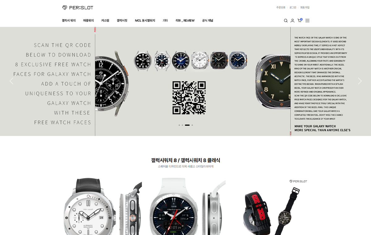
CORUM 같은 전통 시계의 이미지는 스마트워치 액세서리를 볼 때도 기준이 됩니다. 러그, 베젤, 다이얼, 케이스 두께가 어떻게 보이는지 알면 작은 파츠 하나의 차이도 더 선명하게 보입니다.
전통 시계의 선을 그대로 복제할 필요는 없습니다. 대신 금속의 두께, 다이얼의 여백, 스트랩의 연결감을 스마트워치에 맞게 다시 조정하는 것이 퍼슬랏의 방식입니다.
Traditional watch images, including CORUM, become a reference when looking at smartwatch accessories. Once you notice lugs, bezels, dials and case thickness, small parts become easier to read.
The goal is not to copy a traditional watch. It is to translate thickness, dial space and strap connection into a modern wearable object.