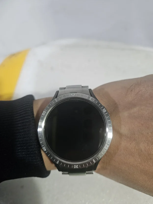



갤럭시워치 실버 베젤링 후기, 다이얼을 감싸는 금속의 선
갤럭시워치 실버 베젤링 선택은 화면이 꺼진 뒤 남는 검은 원에서 시작됩니다. 이때 워치의 인상을 결정하는 것은 화면 속 그래픽보다 케이스와 디스플레이 사이의 경계입니다. 퍼슬랏은 그 경계에 얇은 금속선을 더해 디지털 화면의 윤곽을 시계 다이얼처럼 정돈합니다.
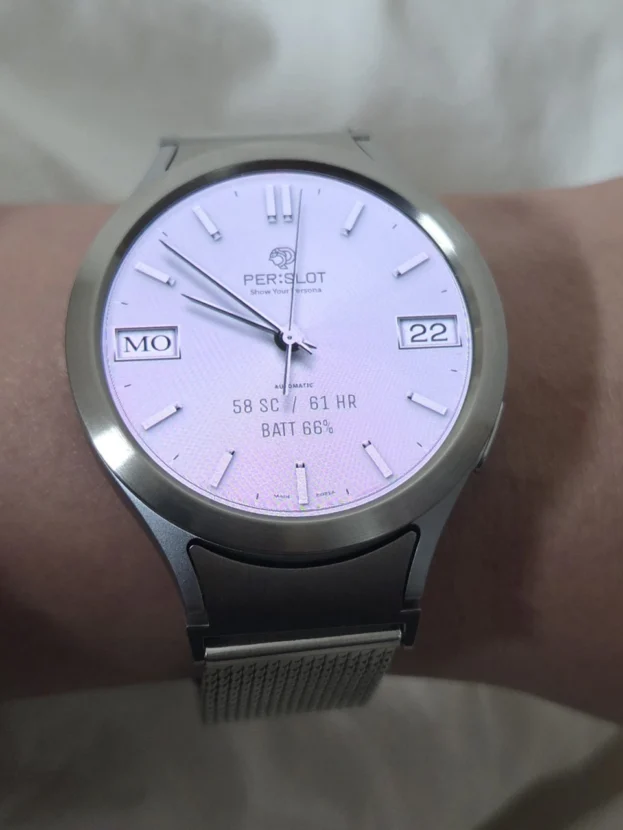
갤럭시워치 실버 베젤링 색상은 밝은 워치 바디와 자연스럽게 이어지지만 그라파이트처럼 어두운 케이스 위에서는 대비가 훨씬 또렷합니다. 같은 베젤링이라도 워치페이스의 바탕색, 인덱스의 밀도, 화면이 켜지고 꺼지는 상태에 따라 폭과 반사감이 다르게 보입니다. 그래서 색상 선택은 단순한 취향보다 손목 위에서 남기고 싶은 명암과 관계가 깊습니다.
플레인 디자인은 워치페이스의 정보를 가리지 않고 바깥 원만 정리합니다. 미닛 마커나 숫자가 들어간 인덱스 디자인은 화면 안의 다이얼을 금속 가장자리까지 이어 시계다운 밀도를 높입니다. 두 방식 모두 화면 전체를 덮는 풀커버 케이스와 달리 갤럭시워치 본체의 두께와 측면선을 그대로 남깁니다.
금속 링이 얇아 보여도 부착 후의 완성도는 모델과 사이즈, 중심 정렬, 안쪽 여백에서 갈립니다. 네 방향의 간격이 고르게 맞고 버튼 쪽으로 치우치지 않아야 화면과 베젤링이 같은 중심을 공유합니다. 실버 표면의 반사까지 더해지면 작은 오차가 눈에 잘 드러나는 만큼, 부착 전 건식 맞춤과 표면 정리가 중요합니다.
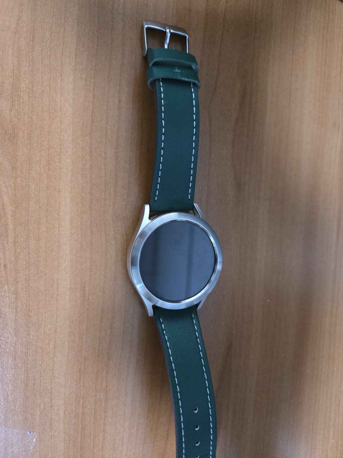
깔끔하고 디자인이 마음에 들어요.
브러시드 실버가 남기는 얇은 외곽선
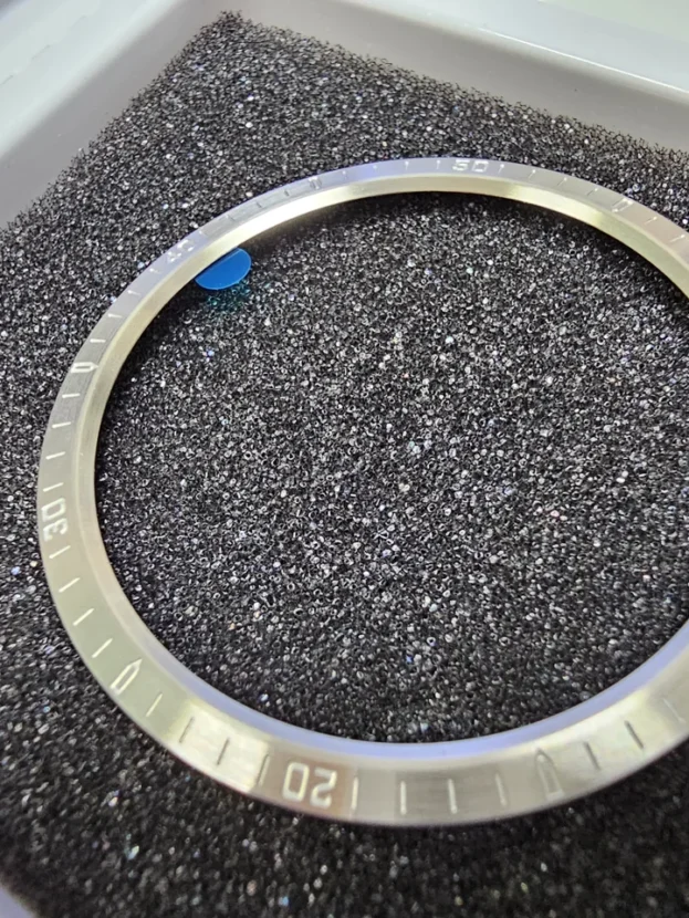
플레인 실버 베젤링은 화면 바깥을 복잡하게 채우지 않고 디스플레이와 케이스 사이에 얇은 금속 경계만 남깁니다. 브러시드 결은 정면에서 차분하게 보이고, 손목이 움직일 때 외곽선에 짧은 반사가 생겨 다이얼의 원형을 또렷하게 잡습니다.
화면이 꺼진 상태에서도 실버 링은 전면의 중심을 흐리지 않으며, 밝은 워치페이스에서는 케이스와 화면 사이를 자연스럽게 이어 줍니다. 각인이나 숫자가 없는 디자인이라 워치페이스를 자주 바꿔도 정보가 겹쳐 보이지 않고, 기본 실루엣을 유지한 채 금속의 질감만 더해집니다.
부착할 때는 12시와 6시 방향의 간격을 먼저 맞춘 뒤 좌우 여백을 확인합니다. 링의 얇은 폭이 한쪽으로 기울면 실버 외곽선이 더 쉽게 드러나므로, 점착 보호지를 떼기 전에 화면 중심과 외경이 같은 축에 놓이는지 가볍게 올려보는 과정이 중요합니다.
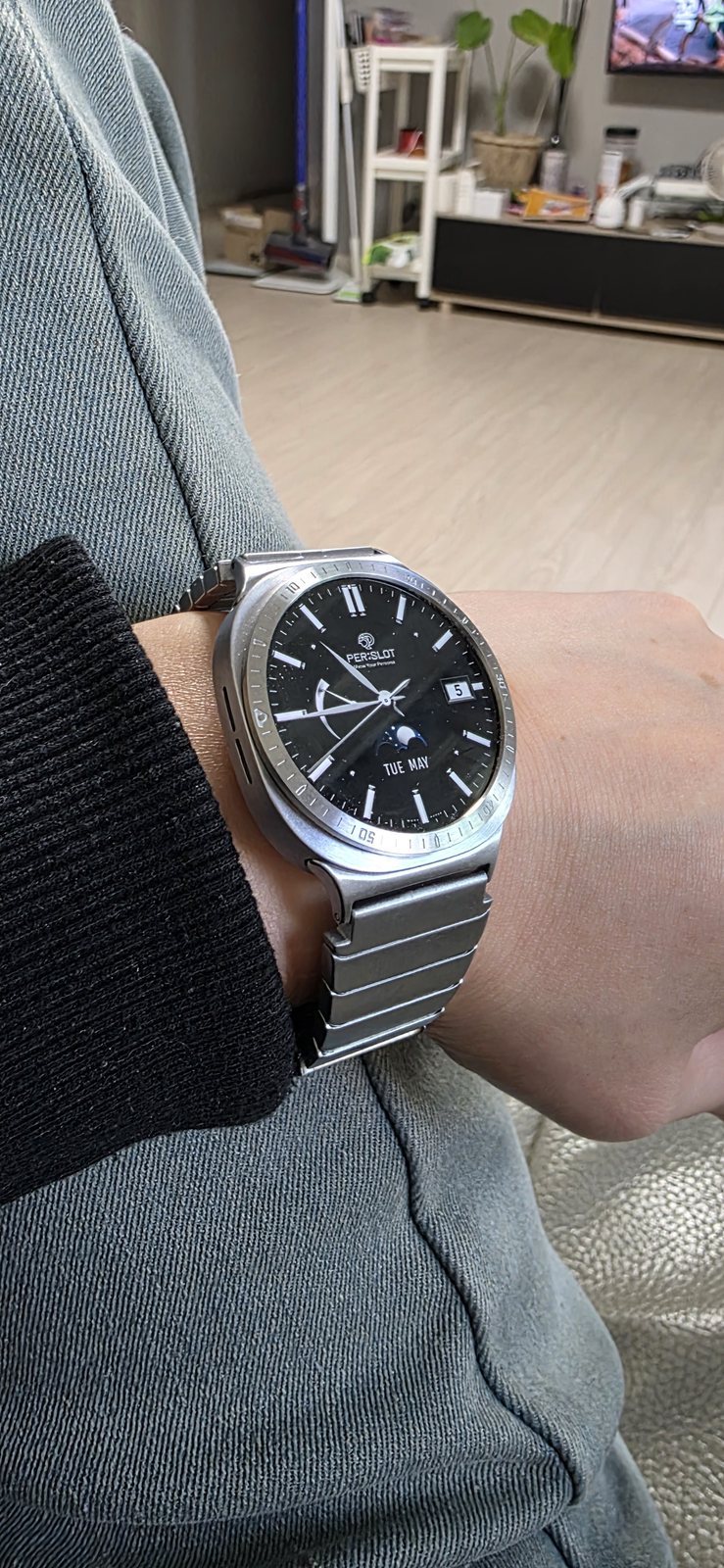
좋아요 잘 사용하고 있습니다.
갤럭시워치 실버 베젤링과 다이얼의 바깥 원
미닛 마커가 들어간 실버 베젤링은 워치페이스 바깥에도 시간의 단위를 이어줍니다. 화면 속 인덱스와 금속 링의 눈금이 같은 축을 공유하면 디지털 그래픽이 실제 다이얼 위에 놓인 듯한 깊이가 생깁니다. 검은 배경의 워치페이스일수록 실버 각인과의 명암 차이가 분명해져 스포츠 워치에 가까운 표정이 나타납니다.
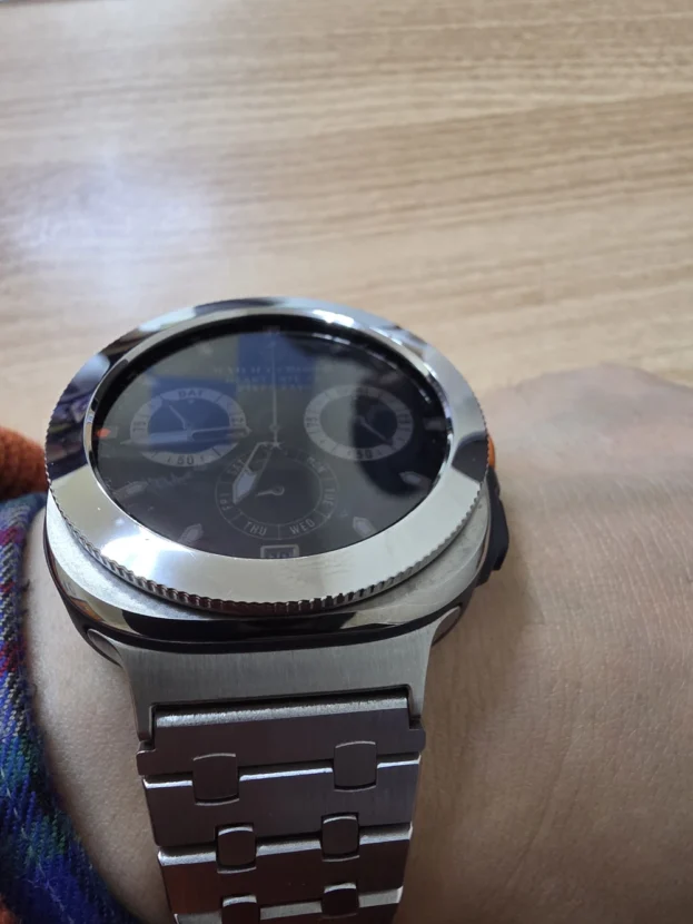
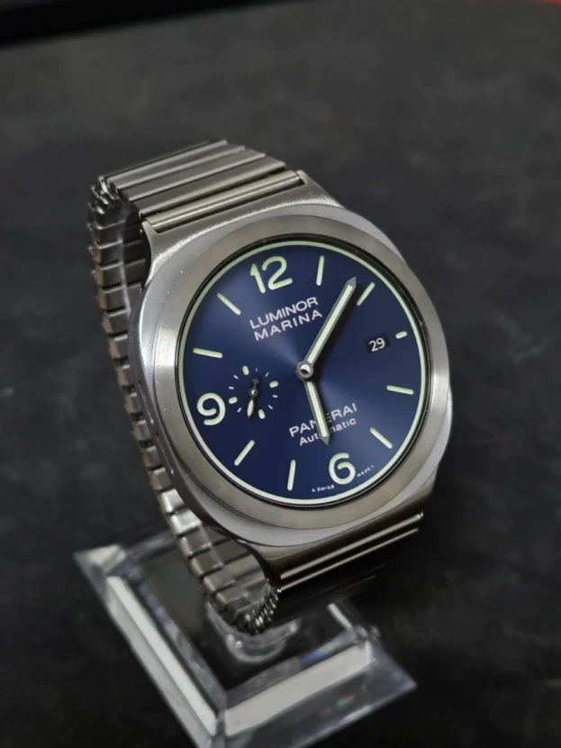
전면의 링과 손목 아래쪽 금속 소재가 같은 색조로 이어지면 워치가 여러 부품의 조합보다 하나의 시계처럼 보입니다. 밴드의 소재와 브랜드가 달라져도 베젤링의 역할은 같습니다. 화면 가장자리의 원을 또렷하게 잡고 워치 본체의 전면을 정돈해, 손목 위에서 보이는 중심과 외곽의 관계를 안정적으로 만듭니다.
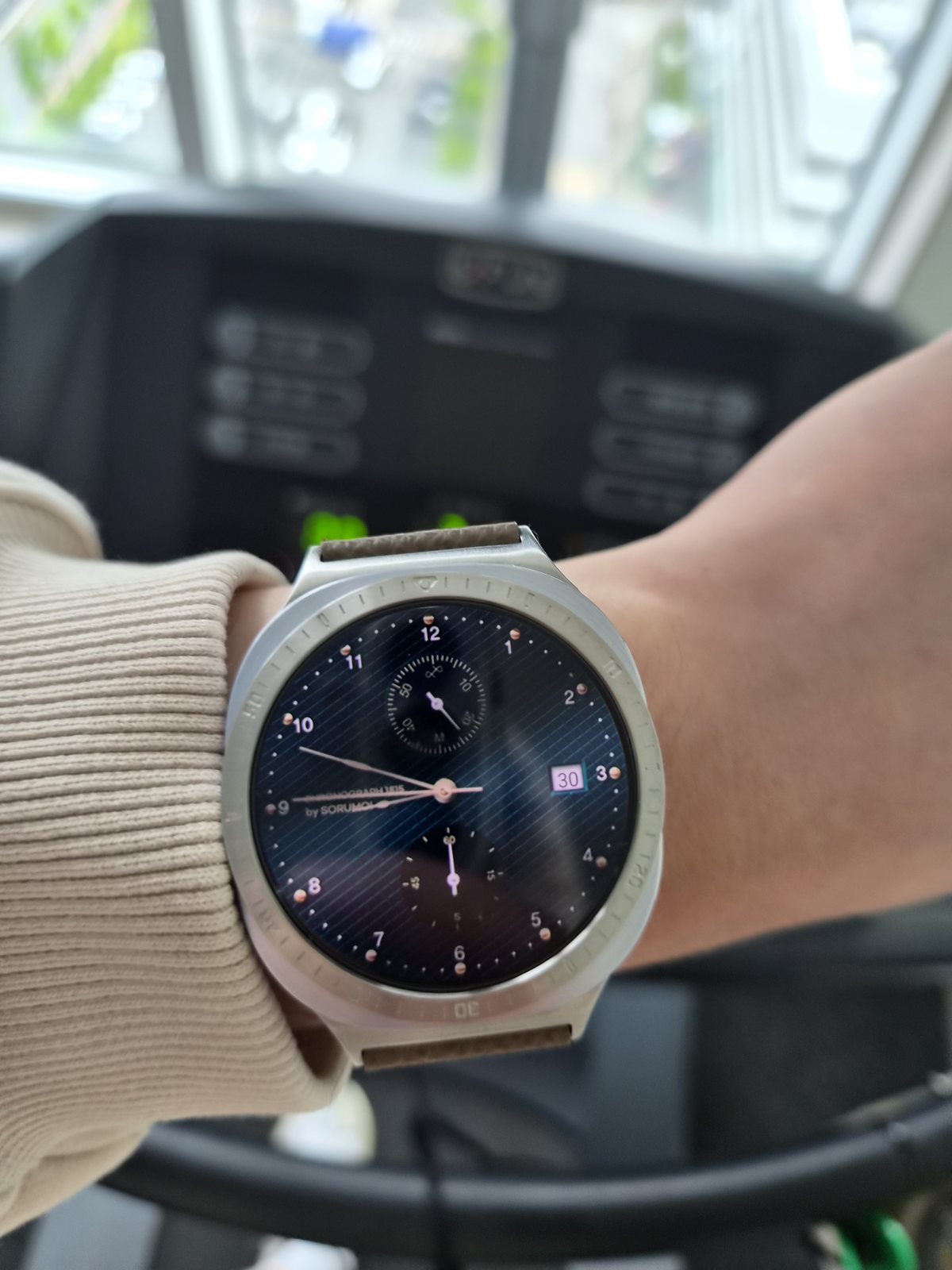
고급스럽고 만족스럽습니다. 그리고 누락배송이 있었는데 직원분께서 대처가 깔끔하시고 일을 너무 잘하시네요. 교환할때 또 이용할거 같습니다.
얇은 폭에서 드러나는 표면의 차이
갤럭시워치 실버 베젤링 디자인에서 슬림한 폭은 화면을 크게 남기면서도 맨 바깥에 금속의 질감을 더합니다. 정면에서는 워치페이스가 중심이 되고, 비스듬한 각도에서는 측면의 높이와 표면 결이 드러납니다. 두꺼운 장식보다 디스플레이 비율을 유지하고 싶은 경우에 잘 맞는 구조입니다.
실버 표면은 주변 색을 받아들이기 때문에 실내 조명 아래에서는 회색에 가깝고, 창가나 야외에서는 밝은 백색광을 띱니다. 유광 한 가지로 번쩍이는 대신 면과 모서리가 서로 다른 방향으로 빛을 받으면 작은 링에서도 입체감이 생깁니다. 워치 바디와 완전히 같은 색이 아니더라도 금속의 온도가 비슷하면 조합이 자연스럽습니다.
배송이나 교환 과정에서 생긴 문제에 빠르게 대응하는 일도 제품 경험의 일부입니다. 작은 액세서리는 옵션과 규격이 세분되어 있어 누락이나 오배송을 바로잡는 속도가 중요합니다. 정확한 모델과 색상을 다시 확인하고 부착 전 상태를 점검하면 교환 이후의 설치까지 깔끔하게 이어집니다.
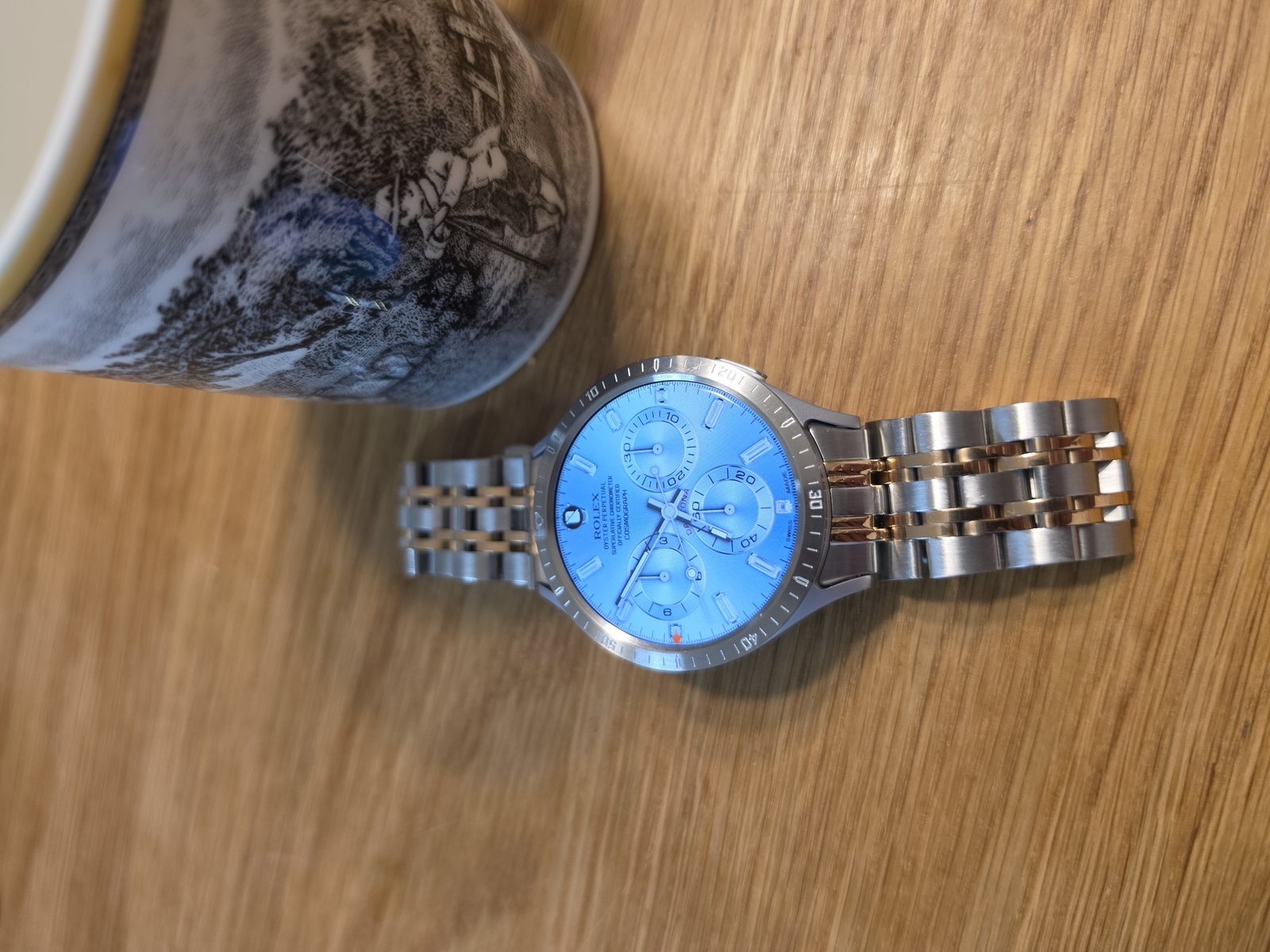
좋아요, 간지 납니다. 다음에도 구매 하겠습니다.
컬러 워치페이스를 정리하는 차가운 경계
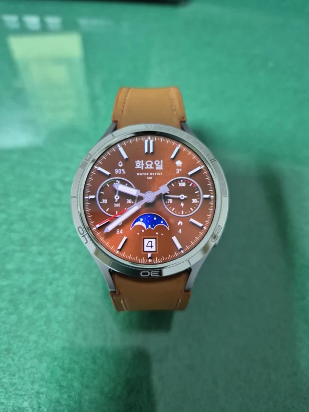
갤럭시워치 실버 베젤링 조합에서 채도가 높은 워치페이스는 화면 안쪽의 중심이 됩니다. 실버는 색을 하나 더 보태기보다 바깥선을 차갑고 명확하게 닫아 화면의 컬러가 케이스까지 번져 보이지 않도록 정리합니다. 파란색, 적색, 흰색 인덱스가 함께 있는 다이얼에서도 금속 링은 중립적인 경계로 남습니다.
인덱스 베젤링을 사용할 때는 워치페이스의 숫자와 링의 각인이 겹쳐 복잡해지지 않는지 살펴봅니다. 화면 안쪽 정보가 많다면 각인이 단순한 링이 안정적이고, 여백이 넓은 다이얼에는 미닛 마커가 있는 디자인이 바깥 공간을 채웁니다. 화면이 켜진 상태와 항상 표시 화면에서 모두 균형을 보는 편이 정확합니다.

퀄리티가 생각보다 좋아요. 맘에 듭니다.
부착 전에 먼저 보이는 가공의 기본
갤럭시워치 실버 베젤링 상태는 손목에 올리기 전에 안쪽 원과 바깥 원을 함께 보면 분명해집니다. 원이 끊김 없이 이어지는지, 표면 결이 한 방향으로 정리되어 있는지, 점착 테이프가 밖으로 튀어나오거나 내경 안으로 말려 들어오지 않았는지가 기본입니다. 부착 후에는 가려지는 뒷면도 이때 살필 수 있습니다.
점착 보호지를 벗기기 전 워치 위에 가볍게 올려보면 외경과 버튼 주변의 간격을 확인할 수 있습니다. 링이 한쪽에서 뜨거나 케이스보다 과하게 벗어나면 힘으로 눌러 맞추지 않고 모델과 사이즈 옵션을 다시 봅니다. 유분과 먼지를 닦은 뒤 완전히 마른 면에 한 번에 내려놓아야 얇은 금속선이 수평을 유지합니다.
실버 베젤링의 마감은 화려한 장식보다 모서리의 정돈 상태에서 차이가 납니다. 손가락으로 바깥선을 가볍게 훑었을 때 거친 부분이 없고, 정면과 측면의 경계가 일정하면 실제 착용에서도 소매에 걸리는 느낌이 적습니다. 작은 원일수록 기본 가공이 그대로 드러납니다.

배송빠릅니다. 44mm 그라파이트 색상에 은색 베젤링으로 주문해서 붙여봤어요. 살짝 이질감 있는 건 어쩔 수가 없네요. 그래도 아무것도 없을 때보다는 일반 시계 느낌이 나네요.
갤럭시워치 실버 베젤링, 그라파이트 위의 명암
그라파이트 워치 바디와 실버 베젤링은 색을 맞추는 조합이 아니라 대비를 만드는 조합입니다. 어두운 케이스 위에 밝은 원이 올라오면 전면 지름이 한층 또렷해지고, 화면이 꺼져도 시계의 윤곽이 남습니다. 처음에는 금속 링이 선명하게 느껴질 수 있지만 검은 워치페이스와 연결하면 중심과 외곽의 단계가 분명해집니다.
이 대비가 자연스러운지는 링의 폭과 표면 밝기에 달려 있습니다. 폭이 지나치게 넓으면 본체보다 베젤링이 먼저 보이고, 얇은 폭은 그라파이트 측면을 충분히 남겨 두 색이 균형을 이룹니다. 실버 인덱스가 있는 아날로그 워치페이스를 쓰면 화면 속 바늘과 바깥 금속이 같은 계열로 이어져 이질감도 한결 줄어듭니다.
44mm처럼 전면 면적이 넓은 모델에서는 네 방향의 안쪽 간격이 더욱 잘 보입니다. 부착 전 12시와 6시를 맞춘 뒤 좌우 여백을 확인하고, 한쪽을 먼저 강하게 누르지 않습니다. 중심이 잡힌 상태에서 원 둘레를 여러 구간으로 나눠 압착하면 밝은 실버 선이 한쪽으로 기울어 보이는 일을 피할 수 있습니다.
갤럭시워치 실버 베젤링, 화면과 케이스 사이의 금속선
갤럭시워치 실버 베젤링 선택은 워치의 기능보다 화면이 시작되고 끝나는 위치를 바꿉니다. 플레인은 디지털 다이얼의 여백을 지키고, 인덱스 디자인은 화면 속 시간 정보를 금속 바깥 원까지 확장합니다. 워치페이스의 밀도와 본체 색상을 함께 보면 같은 실버 안에서도 훨씬 정확한 선택이 가능합니다.
밝은 워치 바디에서는 베젤링과 케이스가 하나의 금속 덩어리처럼 이어지고, 그라파이트 바디에서는 실버 원이 전면을 선명하게 구분합니다. 어느 쪽이 더 낫다기보다 손목 위에서 원하는 명암이 다릅니다. 차분한 일체감을 원하면 비슷한 색조를, 다이얼의 존재감을 높이고 싶다면 밝고 어두운 대비를 고르면 됩니다.
마지막 완성도는 정확한 규격과 중심에서 결정됩니다. 점착 보호지를 제거하기 전에 외경과 버튼 간격을 맞추고, 부착 뒤에는 화면 가장자리 터치와 원 둘레의 들뜸을 확인합니다. 표면을 부드러운 천으로 관리하면 실버의 반사와 각인도 오래 또렷하게 남습니다.
The Metal Line Around A Galaxy Watch Dial
When the Galaxy Watch display turns off, the front becomes a single dark circle. At that moment, the boundary between the display and the case has more visual influence than the graphics that were on the screen. A PERSLOT silver bezel adds a slim metal line to this boundary and gives the digital display the composed outline of a watch dial.
Silver blends naturally into a bright watch body, while it creates a much sharper contrast on a graphite case. The same bezel can appear wider or quieter depending on the background colour of the watch face, the density of its indices and whether the display is on or off. Choosing silver is therefore closely related to the degree of contrast that should remain on the wrist.
A plain design defines only the outer circle and leaves the watch-face information open. An indexed design extends minute marks or numerals beyond the screen and gives the dial a denser, more traditional watch character. Both retain the original case thickness and side profile instead of enclosing the entire watch in a full-cover case.
Although the metal ring is slim, its finished appearance depends on the exact model, size, central alignment and inner clearance. Equal spacing in four directions keeps the display and bezel on the same centre. Because a silver surface makes small alignment errors easier to see, dry fitting and careful surface preparation are essential.
A Brushed Silver Line Around The Display
It looks clean and I like the design.
A plain silver bezel leaves a narrow metal boundary between the display and the case without adding unnecessary visual density. Its brushed grain remains calm from the front, then catches a short reflection as the wrist moves. This small change gives the circular dial a clearer outline.
When the display is off, the silver ring keeps the front composed without overwhelming the dark screen. With a bright watch face, it connects the display and case through a neutral metal edge. Because there are no numerals or engraved markers, the bezel remains compatible with a wide range of watch-face layouts.
For installation, align the twelve and six o’clock positions before comparing the left and right clearance. A slim silver line makes even a small tilt easier to notice, so dry fitting the ring and checking that the screen and outer diameter share the same centre helps preserve an even front proportion.
Extending The Dial With A Metal Index
I like it and have been using it well.
A silver bezel with minute markers carries the scale of time beyond the digital display. When the indices on the screen and the marks on the metal ring share the same axis, the graphics gain the depth of a dial assembled from separate layers. A dark watch face creates the strongest contrast with silver engraving and moves the character closer to a sports watch.
When metal tones continue from the front of the watch toward the wrist, the watch appears more like one object than a collection of separate parts. The material and brand of the band do not alter the bezel’s function. It defines the circular edge of the screen and composes the front of the watch, whether the band is metal, leather or another material.
Surface Character Within A Slim Width
It looks refined and I am satisfied. An item was missing from the delivery, but the staff handled it cleanly and professionally. I would use the store again when I replace it.
A slim silver bezel preserves a large display area while adding the texture of metal at the outermost edge. From the front, the watch face remains dominant. At an angle, the side height and surface grain become more visible. It suits users who want to retain the display proportion rather than introduce a thick decorative frame.
Silver receives the colours around it. Indoors it can look closer to grey, while daylight produces a brighter white reflection. When the flat surface and edge catch light from different directions, even a small ring gains depth without relying on one continuous mirror-like shine. A close match is not required if the metals share a similar visual temperature.
Clear handling of a delivery or exchange issue is also part of the product experience. Small accessories have detailed model, size and colour options, so resolving a missing or incorrect item promptly matters. Rechecking the replacement before installation keeps the final fitting process orderly.
A Cool Boundary Around A Coloured Watch Face
It looks great. I will buy again next time.
A highly saturated watch face already has enough presence inside the display. The silver bezel does not need to add another colour. Instead, it closes the outside edge with a cool neutral boundary, preventing the screen colour from appearing to spill into the case. Blue, red and white indices can coexist while the metal remains visually neutral.
With an indexed bezel, compare the density of the watch-face numerals with the engraving on the ring. A busy display is usually more composed with a simpler bezel, while a face with open space can accommodate minute markers around the outside. Check both the active display and the always-on screen before choosing the density of the bezel design.
Machining Details Visible Before Installation
The quality is better than I expected. I like it.
Before placing the bezel on the wrist, inspect its inner and outer circles in the package. The circumference should remain continuous, the surface grain should follow a consistent direction and the adhesive tape should not project outside the ring or curl into the inner diameter. The underside is easiest to inspect before installation.
Dry fit the bezel over the watch before removing the adhesive liner. This reveals the outside diameter and the clearance around the buttons. If one side lifts or the ring extends beyond the case, do not force it down; confirm the model and size option. Lowering it once onto a clean, dry surface helps the slim metal line remain level.
The finish of a silver bezel is visible in the order of its edges rather than in elaborate decoration. A smooth outside perimeter and a consistent transition from front to side reduce the chance of catching on a sleeve. Basic machining is especially easy to judge on a small, simple circle.
Silver Contrast On A Graphite Watch Body
Delivery was fast. I ordered the silver bezel for a 44 mm graphite watch and attached it. The contrast feels slightly different, which is unavoidable, but it gives the watch more of a traditional timepiece character than leaving it plain.
A graphite watch body and a silver bezel form a contrast rather than a colour match. The bright circle makes the front diameter more distinct and leaves a visible outline even when the display is off. The metal can feel pronounced at first, but a dark watch face creates clear stages from the centre to the case.
The naturalness of this contrast depends on the width and brightness of the ring. An excessively wide bezel can dominate the body, while a slim width leaves enough graphite visible to balance the two tones. A watch face with silver hands or indices connects the screen graphics with the outer metal and softens the transition.
On a larger case such as 44 mm, uneven inner clearance is easier to see. Align twelve and six before comparing the left and right spacing, and avoid pressing one side firmly at the beginning. Once the centre is established, apply pressure in several sections around the circumference.
One Metal Line Between Screen And Case
A Galaxy Watch silver bezel does not change the functions of the watch, but it makes the beginning and end of the display more deliberate. A plain ring protects visual space around a digital dial, while an indexed ring extends the language of time into the outer metal circle. Considering the watch-face density and case colour together leads to a more accurate choice.
On a bright watch body, the bezel and case can read as one metal form. On graphite, the silver circle separates the front with stronger contrast. Neither approach is universally better: similar tones create quiet integration, while light and dark contrast gives the dial a more pronounced presence.
The final quality depends on exact dimensions and centring. Dry fit the ring, compare the outside diameter and button clearance, then check edge touch and adhesive contact after installation. Gentle maintenance with a soft cloth preserves the silver reflection and engraved details over time.
추가 정보
실버 베젤링을 고를 때 볼 기준
갤럭시워치 실버 베젤링 선택은 색상 하나에서 끝나지 않습니다. 워치 바디의 밝기, 워치페이스의 정보 밀도, 플레인과 인덱스 디자인, 링의 폭과 안쪽 여백이 함께 맞아야 손목 위에서 안정적인 원이 완성됩니다.
- 플레인 실버는 정보가 많은 워치페이스 바깥에 시각적인 여백을 남깁니다.
- 인덱스 실버는 단순한 다이얼 바깥으로 미닛 마커와 숫자를 이어줍니다.
- 밝은 워치 바디에는 금속의 일체감이, 그라파이트에는 선명한 명암 대비가 생깁니다.
- 안쪽 원과 화면 가장자리의 간격은 상하좌우가 같은 폭으로 남아야 합니다.
- 화면이 켜진 상태와 꺼진 상태를 모두 보면 링의 실제 폭을 판단하기 쉽습니다.
- 부착 전에는 점착 보호지를 제거하지 않은 채 외경과 버튼 간격을 먼저 맞춥니다.
- 실버 표면은 부드러운 마른 천으로 닦고 거친 연마제와 금속 도구는 피합니다.
- 밴드의 소재와 브랜드를 베젤링의 제품 사양과 혼동하지 않습니다.
자주 묻는 질문
실버 베젤링은 어떤 워치 바디에 잘 어울리나요?
실버 워치 바디에서는 케이스와 링이 자연스럽게 이어지고, 그라파이트나 블랙 바디에서는 밝은 금속 원이 선명한 대비를 만듭니다. 차분한 일체감을 원하면 비슷한 색조를, 다이얼의 윤곽을 강조하려면 어두운 바디와의 대비를 선택할 수 있습니다.
플레인과 인덱스 디자인은 어떻게 고르나요?
숫자와 서브 다이얼이 많은 워치페이스에는 플레인이 바깥 여백을 지키기 쉽습니다. 화면 구성이 단순하거나 아날로그 다이얼의 인상을 강화하고 싶다면 미닛 마커와 숫자가 있는 인덱스 디자인이 잘 맞습니다.
실버 베젤링이 너무 밝게 보이지는 않나요?
실버는 조명과 표면 결에 따라 밝기가 달라집니다. 브러시드 면은 정면에서 차분하고 모서리에서만 반사를 만들며, 어두운 워치 바디에서는 대비가 더 크게 느껴집니다. 폭이 얇은 디자인을 고르면 본체 색을 충분히 남길 수 있습니다.
워치페이스 색상도 함께 고려해야 하나요?
검은 워치페이스는 실버의 명암을 가장 또렷하게 보여주고, 컬러 워치페이스에는 중립적인 바깥 경계를 만듭니다. 화면 속 인덱스가 촘촘하다면 단순한 링을, 여백이 넓다면 각인이 있는 링을 조합하는 편이 안정적입니다.
베젤링의 중심은 어떻게 맞추나요?
부착면을 닦고 완전히 말린 뒤 12시와 6시의 수직축을 먼저 맞춥니다. 강하게 누르기 전에 3시와 9시의 안쪽 여백을 비교하고 네 방향이 같은 폭으로 남을 때 원 둘레를 여러 구간으로 나눠 압착합니다.
화면 가장자리 터치에 영향을 주나요?
정확한 모델과 사이즈의 베젤링을 중앙에 부착하면 화면 중앙과 가장자리의 터치 영역은 열려 있습니다. 부착 뒤에는 화면 끝에서 시작하는 스와이프와 측면 버튼 조작을 직접 확인해 한쪽으로 치우치지 않았는지 점검합니다.
보호필름과 함께 사용할 수 있나요?
퍼슬랏 베젤링 전용 보호필름은 링의 내경 안으로 들어가도록 설계됩니다. 일반 시중 제품이나 삼성 스토어의 전면형 필름은 베젤링 없이 화면 전체를 넓게 덮는 규격이라 외곽이 링 아래에 겹칠 수 있습니다.
실버 표면은 어떻게 관리하나요?
땀과 물자국은 마르기 전에 부드러운 천으로 닦고, 각인 홈은 결이 고운 브러시로 정리합니다. 거친 수세미와 강한 연마제는 표면 결을 바꿀 수 있으며, 접착부 안쪽을 날카로운 도구로 긁지 않습니다.
손목 위 비율을 다듬는 세부 요소
워치 바디와 금속의 온도
실버 바디와 실버 링은 색의 차이를 줄여 하나의 금속 케이스처럼 보입니다. 그라파이트 바디에서는 차가운 실버가 바깥 원을 강조합니다. 스트랩 색보다 먼저 워치 본체와 링이 맞닿는 전면의 명암을 결정하면 조합의 방향이 분명해집니다.
워치페이스와 각인의 밀도
화면 안과 금속 링에 정보가 동시에 많으면 원의 바깥이 복잡해질 수 있습니다. 디지털 정보가 많은 화면에는 플레인 디자인이 여백을 남기고, 단순한 아날로그 화면에는 인덱스 디자인이 다이얼의 단위를 이어줍니다.
안쪽 여백과 중심 정렬
실버 링은 밝기 때문에 검은 화면과의 간격이 잘 보입니다. 상하좌우의 여백이 같아야 워치페이스의 중심과 베젤링의 중심이 겹치며, 화면이 꺼졌을 때도 금속 원이 한쪽으로 기울지 않습니다.
부착 전 점검과 일상 관리
점착 보호지를 제거하기 전에 링을 올려 외경과 버튼 주변을 확인합니다. 부착 뒤에는 들뜬 부분과 좌우 움직임이 없는지 살피고, 사용 중에는 수분과 먼지를 부드러운 천으로 닦습니다. 정확한 규격과 기본 관리가 얇은 금속선의 수명을 좌우합니다.
모델과 사이즈별 실버 베젤링은 퍼슬랏 공식몰에서 구분할 수 있습니다. 다른 착용 조합은 퍼슬랏 리뷰에서 이어서 볼 수 있으며, 실제 부착 순서와 손목 위 반사감은 퍼슬랏 공식 유튜브의 영상으로 함께 살펴볼 수 있습니다.