


8클래식에 맞춘 메탈 톤
갤럭시워치8 클래식 리뷰에서 눈에 먼저 들어오는 건 본체, 스트랩, 베젤링이 같은 방향으로 이어지는지입니다. 갤럭시워치8 클래식은 기본 형태부터 시계다운 느낌이 강한 모델이라, 스트랩과 베젤링의 톤이 맞으면 손목 위에서 훨씬 안정적으로 보입니다. 퍼슬랏 링크브레이슬릿은 러그에서 손목 아래까지 금속의 흐름을 이어주고, 베젤링은 화면 가장자리의 원형 라인을 또렷하게 잡아줍니다.
이번 착용 사진들은 8클래식용 스트랩과 베젤링을 함께 맞춘 실제 사용 장면입니다. 손목 착용, 버클 안쪽, 링크 구조, 글로시 베젤링, 패키지까지 이어지기 때문에 제품을 받기 전 궁금한 지점들이 꽤 잘 보입니다. 특히 메탈 브레이슬릿을 기다려 구매했다는 리뷰와 함께 보면, 단순히 줄 하나를 바꾼 느낌보다 워치 전체의 인상이 정리되는 쪽에 가깝습니다.
과거 주문했던 제품들이 모두 높은 품질을 보여주어 좋은 인상만 있던 퍼슬랏이기에, 어쩌다보니 퍼슬랏의 8클래식용 스트랩과 베젤링을 모두 구매했습니다.
손목 위의 링크브레이슬릿과 베젤링
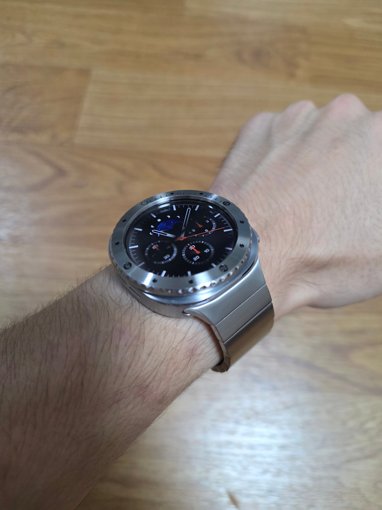
손목에 올렸을 때 가장 먼저 눈에 들어오는 건 링크브레이슬릿의 폭과 베젤링의 외곽선입니다. 메탈 브레이슬릿이 러그 쪽에서 본체와 이어지고, 베젤링은 화면 가장자리를 한 번 더 잡아주면서 워치가 더 묵직한 시계처럼 보입니다. 검은 워치페이스와 실버 메탈의 대비도 선명합니다.
갤럭시워치8 클래식은 본체 자체의 존재감이 있는 모델입니다. 그래서 스트랩이 너무 가볍게 보이면 전체 균형이 흐트러질 수 있습니다. 링크브레이슬릿은 그 무게감을 손목 아래쪽까지 이어주고, 베젤링은 전면의 원형 라인을 정리합니다. 두 파츠를 같이 맞췄을 때 스마트워치의 기능적인 얼굴보다 메탈 시계에 가까운 분위기가 먼저 살아납니다.
버클 쪽에서 보는 체결감
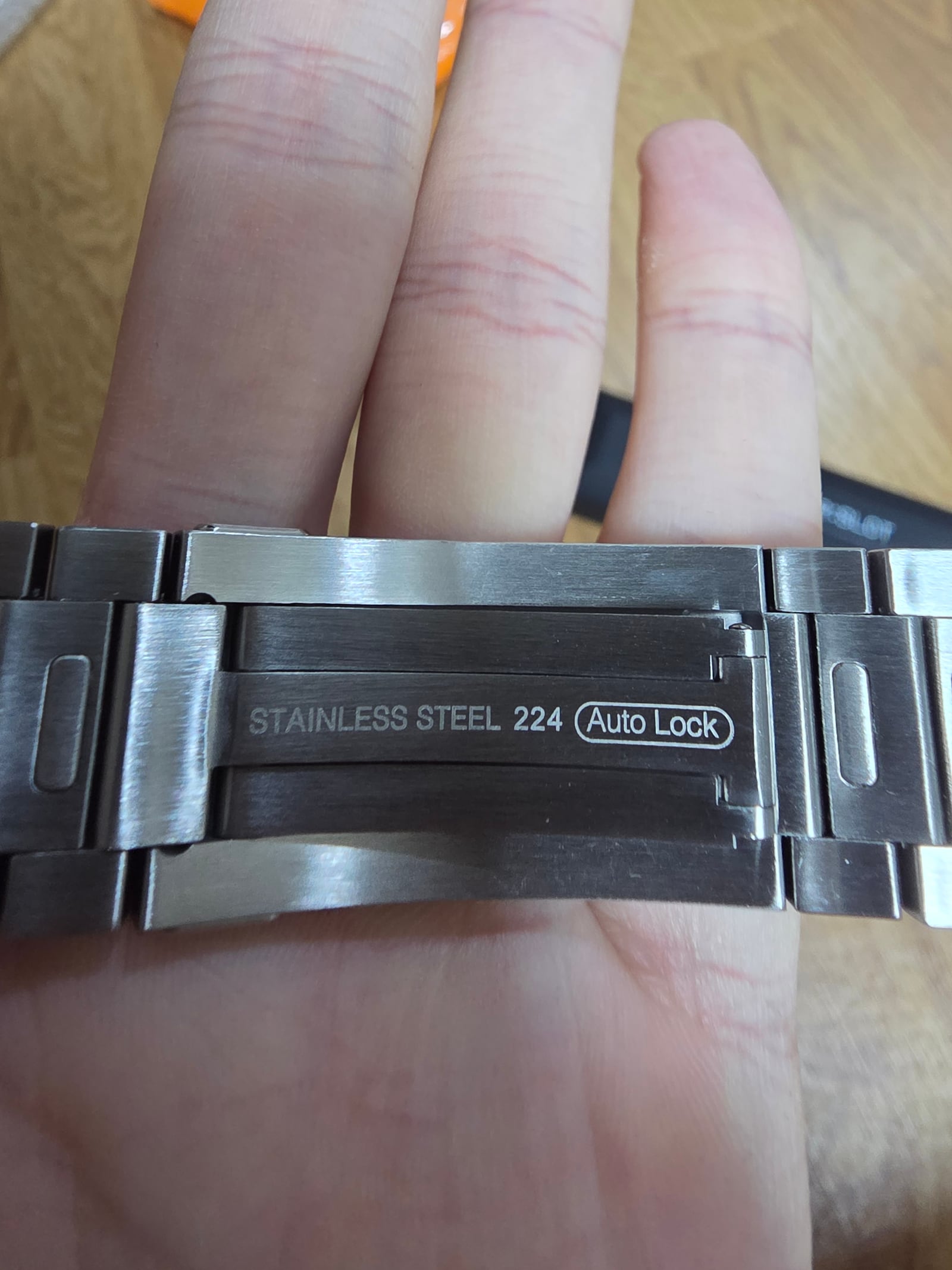
버클과 안쪽 체결부를 보면 링크브레이슬릿의 사용감이 더 분명해집니다. 손목에 직접 닿는 부분은 겉에서 보이는 광택보다 더 중요합니다. 버클이 너무 투박하면 착용 중 걸리는 느낌이 생기고, 반대로 얇게만 만들면 메탈 스트랩 특유의 안정감이 약해질 수 있습니다.
퍼슬랏 링크브레이슬릿은 안쪽에서 보아도 시계줄처럼 정리된 인상을 줍니다. 링크 간 간격이 일정하게 이어지고, 버클 쪽 금속 면이 넓게 받쳐주기 때문에 손목을 움직일 때 스트랩이 따로 노는 느낌보다 본체와 함께 움직이는 느낌에 가깝습니다.
링크 구조의 밀도
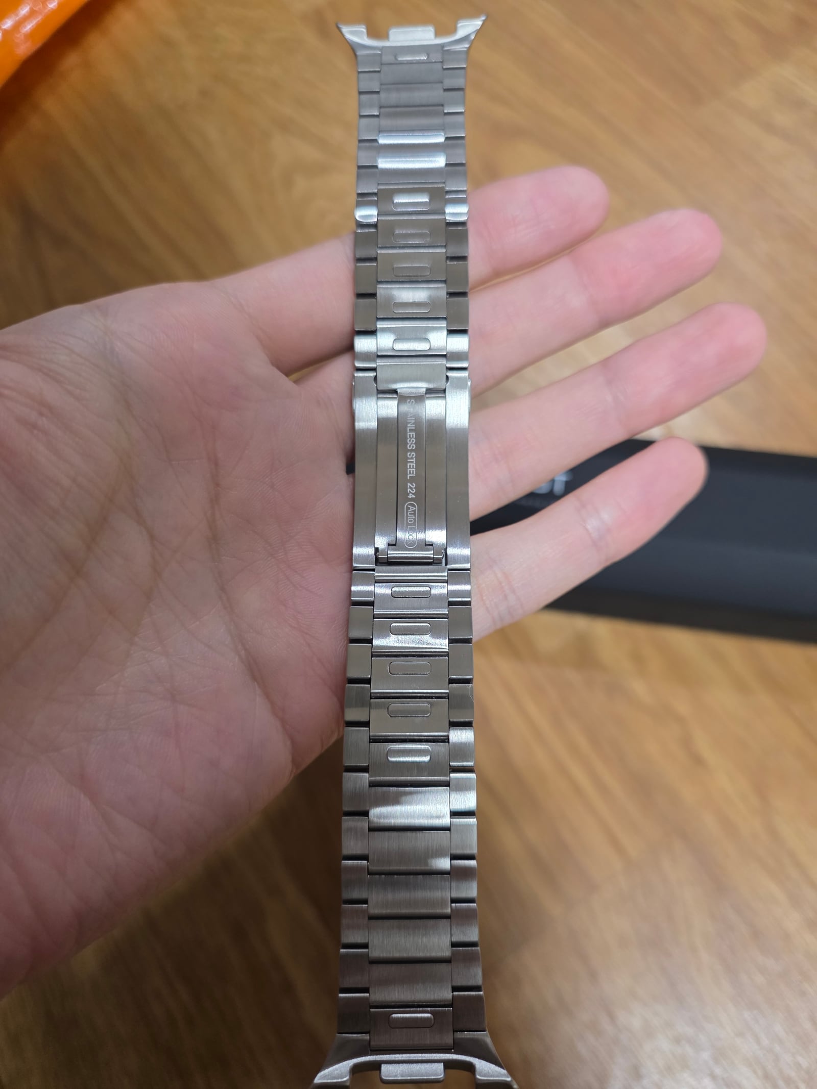
브레이슬릿을 손에 들고 보면 링크 구조의 밀도가 보입니다. 갤럭시워치8 클래식처럼 원형 케이스가 큰 모델은 스트랩의 폭과 링크 간격이 전체 인상을 좌우합니다. 링크가 지나치게 얇거나 간격이 불규칙하면 워치 본체의 무게감과 어울리지 않습니다.
가까이 보면 링크가 일정한 방향으로 이어지고, 빛을 받는 면과 그림자가 생기는 면이 반복됩니다. 이 반복이 메탈 브레이슬릿 특유의 깊이를 만듭니다. 손목에 착용했을 때 단순히 반짝이는 줄이 아니라, 시계 케이스와 이어지는 구조물처럼 보이는 이유가 여기에 있습니다.
메탈 표면과 손목 밸런스
브레이슬릿을 펼쳐 들면 링크의 폭, 길이, 표면 광택이 한눈에 들어옵니다. 손목 위에서는 작게 보이는 부분이지만 실제로는 착용감과 분위기를 동시에 결정합니다. 표면이 너무 거칠면 데일리 착용에서 부담이 생기고, 너무 가벼워 보이면 8클래식 본체와의 균형이 약해집니다.
퍼슬랏 링크브레이슬릿은 메탈 표면이 차분하게 이어져 정장, 셔츠, 니트처럼 단정한 옷차림과 잘 맞습니다. 동시에 워치 본체가 가진 스마트 기기의 느낌을 조금 누그러뜨립니다. 매일 차는 워치를 좀 더 시계답게 보이게 하고 싶을 때 이런 브레이슬릿 구조가 큰 차이를 만듭니다.
글로시한 광택과 함께 굉장히 예쁘네요 ㅎㅎ
글로시 베젤링의 광택
글로시한 베젤링은 포장 상태에서도 반사가 먼저 보입니다. 베젤링은 크기가 작은 부품이지만 전면에 올라가면 화면 둘레 전체를 감싸기 때문에 광택의 차이가 바로 드러납니다. 실버 계열의 밝은 반사는 워치 전면을 또렷하게 만들고, 검은 화면과 만났을 때 대비가 더 살아납니다.
이런 광택은 단순히 화려한 느낌만을 위한 것이 아닙니다. 화면 바깥에 얇은 금속 프레임을 더하면서 워치의 원형 실루엣을 또렷하게 잡아줍니다. 링크브레이슬릿과 함께 사용하면 스트랩의 메탈감과 베젤링의 반사가 이어져 전체 조합이 더 깔끔하게 보입니다.
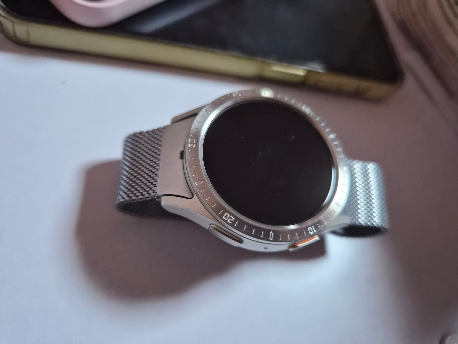
줄도 퍼슬랏 쓰고 있습니다! 베젤링 중앙 맞추려다가 뭔가 착하고 붙어가지고.. 약간 빗나갔어요 ㅋㅋㅋ
중앙 정렬과 부착감
베젤링은 붙이는 순간 위치가 중요합니다. 원형 파츠라 조금만 기울어져도 화면과 링의 간격이 달라 보일 수 있습니다. 접착면이 빠르게 자리를 잡을 수 있으니, 부착 전에는 워치 상단과 하단의 기준선을 먼저 맞추고 천천히 내려놓는 편이 좋습니다.
착용된 모습에서는 베젤링이 워치페이스 바깥을 또렷하게 감싸고, 함께 사용한 퍼슬랏 스트랩이 손목 아래쪽까지 같은 톤으로 이어집니다. 중앙이 아주 미세하게 어긋나도 전체적인 완성도는 스트랩과 본체의 조합에서 크게 좌우됩니다. 다만 처음부터 기준선을 맞추면 더 깨끗한 전면 라인을 만들 수 있습니다.
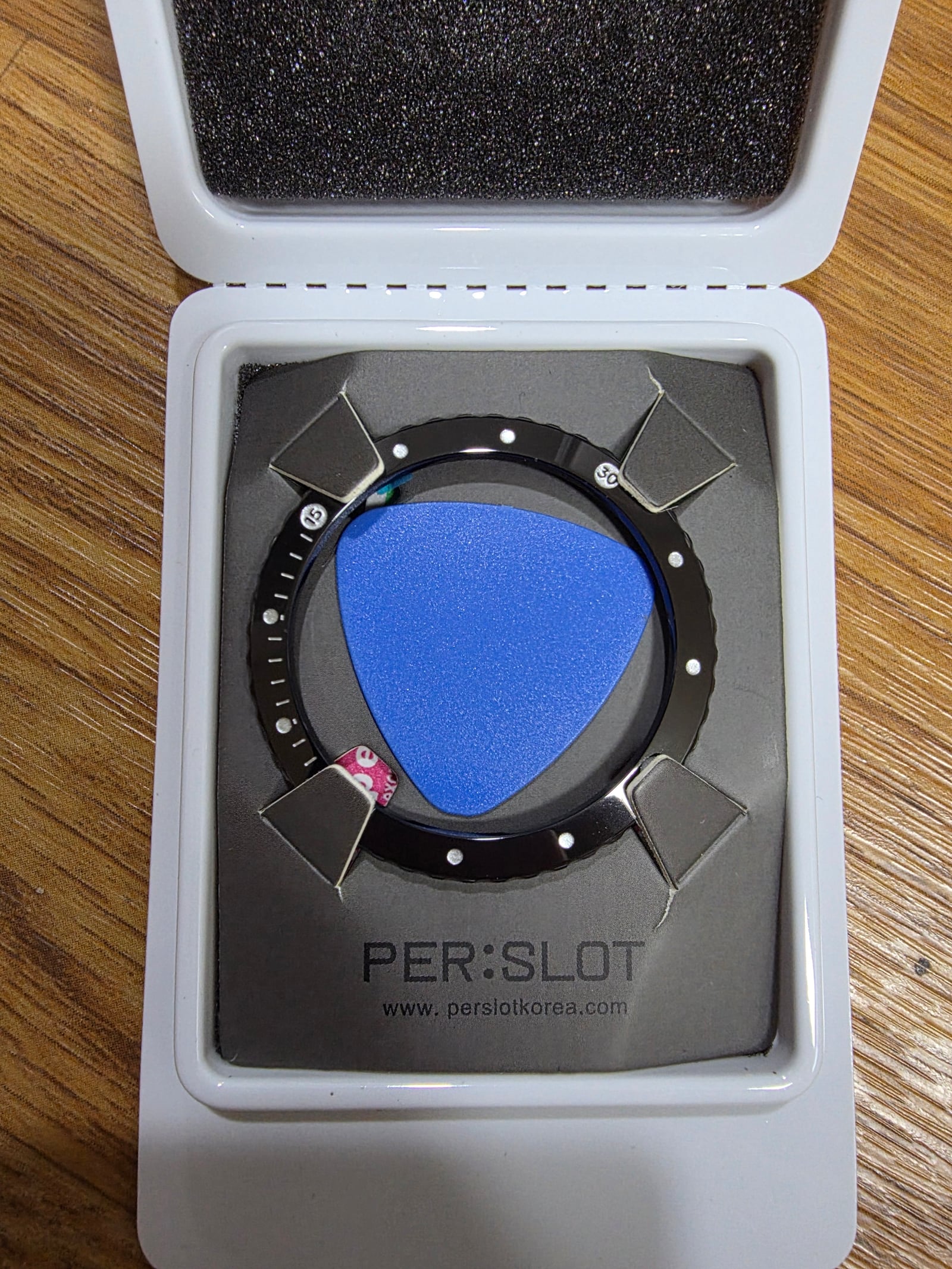
오래 기다렸던 제품인데 드디어 구매했네요. 케이스는 LED까지 있고, 고급스럽네요. 일체감 좋습니다. 기다린 보람이 있어요.
패키지와 첫인상
패키지는 제품을 처음 만나는 순간의 온도를 정합니다. 리뷰에서 언급한 LED 케이스는 단순한 포장 이상의 인상을 남깁니다. 메탈 스트랩이나 베젤링처럼 표면 반사가 중요한 제품은 포장 안에서 보이는 첫 광택과 정돈감도 꽤 크게 다가옵니다.
기다린 제품을 받아 열었을 때 케이스, 제품 배치, 금속 표면이 깔끔하게 보이면 구매 경험 자체가 더 또렷하게 남습니다. 퍼슬랏 리뷰에서 반복적으로 나오는 일체감이라는 말도 결국 이런 작은 부분들이 쌓여 만들어집니다. 손목에 올리기 전부터 제품의 방향이 분명하게 느껴지는 구성이 중요합니다.
하나의 시계처럼 이어지는 조합
갤럭시워치8 클래식은 본체만으로도 존재감이 있지만, 링크브레이슬릿과 베젤링을 함께 맞추면 느낌이 더 분명해집니다. 스트랩은 손목 아래쪽까지 금속의 무게감을 이어주고, 베젤링은 화면 가장자리의 원형 라인을 정리합니다. 손목 위에서 봤을 때 본체, 스트랩, 베젤링이 따로 보이지 않고 하나의 시계처럼 이어지는 점이 이 조합의 가장 큰 매력입니다.
사진 속 착용감은 과하게 꾸민 쪽보다 단정하게 맞춘 쪽에 가깝습니다. 링크브레이슬릿의 링크 간격, 버클 안쪽의 체결감, 글로시 베젤링의 반사, 패키지의 첫인상까지 모두 같은 방향을 향합니다. 갤럭시워치8 클래식을 더 묵직하고 정돈된 메탈 워치처럼 착용하고 싶다면, 스트랩과 베젤링을 함께 보는 편이 훨씬 자연스럽습니다.
A Metal Tone Built For Galaxy Watch 8 Classic
This Galaxy Watch 8 Classic review begins with one simple question: do the case, bracelet and bezel feel like they belong together? The Watch 8 Classic already has a stronger watch-like shape, so the metal tone around it matters more than it might on a lighter model. The PERSLOT link bracelet carries the metal line from the lug area down around the wrist, while the bezel sharpens the circular edge around the display.
The photos show a real Watch 8 Classic setup using both the bracelet and the bezel. Wrist fit, clasp detail, link structure, glossy bezel shine and packaging all appear in one flow. This makes the review useful for checking the details that are hard to judge from a product name alone: how the metal sits on the wrist, how the finish catches light, and how unified the watch feels after both parts are installed.
Link Bracelet And Bezel On The Wrist
I already had a good impression of PERSLOT because the products I ordered before all showed strong quality, so I ended up buying both the strap and the bezel for my Watch 8 Classic.
On the wrist, the first visible detail is the balance between the width of the link bracelet and the outline of the bezel. The bracelet connects visually from the lugs, and the bezel gives the display edge a cleaner metal frame. Against a dark watch face, the contrast between black and silver becomes clear.
The Galaxy Watch 8 Classic has enough presence by itself. If the strap looks too light, the overall balance can feel weak. The link bracelet carries the weight of the case toward the underside of the wrist, while the bezel organizes the circular front line. Worn together, the watch feels closer to a metal timepiece than to a smartwatch with separate accessories attached.
Clasp And Inner Fit
The clasp and inner side of the bracelet say a lot about daily wear. The surface that touches the wrist matters just as much as the visible shine on the outside. A clasp that feels too bulky can catch during movement, while a bracelet that feels too thin may not match the weight of the Watch 8 Classic case.
The PERSLOT link bracelet looks organized even from the inside. The spacing between links stays consistent, and the clasp area gives the wrist a broad metal support point. This helps the bracelet move with the watch body rather than feeling like a separate band.
Density Of The Link Structure
When the bracelet is held in the hand, the density of the links becomes easier to see. On a round case like the Galaxy Watch 8 Classic, strap width and link spacing strongly affect the final look. If the links are too thin or irregular, the strap can look disconnected from the case.
Up close, each link repeats a rhythm of light and shadow. That repetition gives the bracelet depth. Once worn, it does not look like a simple shiny band; it feels like a metal structure continuing from the watch case.
Metal Surface And Wearing Balance
When the bracelet is opened, its width, length and surface finish are visible at once. These details look small, but they decide both comfort and mood on the wrist. A rough surface would feel distracting in daily wear, while a strap that looks too light would not hold the visual weight of the Watch 8 Classic.
The PERSLOT link bracelet has a calm metal surface that works well with shirts, knitwear and more formal outfits. It also softens the digital impression of the smartwatch. For users who want their daily smartwatch to look more like a watch, this kind of bracelet structure makes a visible difference.
Glossy Bezel Shine
The glossy shine looks really beautiful.
The glossy bezel shows its character even before installation. A bezel is a small part, but once it sits on the front of the watch, it surrounds the entire display edge. That is why the difference in shine is easy to notice. A bright silver reflection gives the screen a sharper outline, especially with a black watch face.
This shine is not only decorative. It adds a slim metal frame around the display and strengthens the circular silhouette of the Watch 8 Classic. When paired with the link bracelet, the metal character of the strap and the reflection of the bezel connect naturally.
Center Alignment And Attachment
I am also using a PERSLOT strap. While trying to center the bezel, it caught and stuck a little quickly, so it ended up slightly off center.
Alignment matters when attaching a bezel. Because the part is circular, even a slight angle can change the spacing between the display and the ring. The adhesive can catch quickly, so it helps to line up the top and bottom of the watch first and lower the bezel slowly.
In the wearing photo, the bezel clearly wraps around the watch face, while the PERSLOT strap continues the same metal tone around the wrist. A very small shift in the center does not ruin the entire look, because the overall impression still comes from the case, bracelet and bezel working together. Still, careful first placement gives the front line a cleaner finish.
Package And First Impression
I had waited a long time for this product and finally bought it. The case even has LED lighting, it feels premium, and the overall unity is great. It was worth the wait.
Packaging shapes the first moment of ownership. The LED case mentioned in the review leaves a stronger impression than ordinary packaging. For metal accessories such as a bracelet and bezel, the first view of the surface, reflection and layout can make the product feel more complete before it even reaches the wrist.
When the case, product placement and metal finish feel organized, the purchase experience becomes more memorable. This is why the word unity fits the Watch 8 Classic setup well. The direction of the product is already clear before installation: metal, weight, shine and a more watch-like finish.
A Setup That Feels Like One Watch
The Galaxy Watch 8 Classic already has presence, but the bracelet and bezel make that presence more consistent. The bracelet carries the metal weight around the wrist, and the bezel refines the circular line around the display. From the front and side, the case, bracelet and bezel do not feel like separate additions; they read as one connected watch.
The strongest part of this setup is restraint. It does not push the watch into an overly decorative direction. The link spacing, clasp fit, glossy bezel reflection and premium case all point toward the same mood. For users who want the Watch 8 Classic to feel more substantial and more refined, looking at the strap and bezel together makes the most sense.
추가 정보
리뷰에서 확인할 부분
이 갤럭시워치8 클래식 리뷰는 링크브레이슬릿과 베젤링을 함께 착용했을 때의 금속 톤, 손목 비율, 전면 라인, 패키지 첫인상을 함께 보여줍니다. 스트랩만 바꿨을 때보다 베젤링까지 맞췄을 때 본체와 액세서리의 경계가 훨씬 자연스럽게 이어집니다.
구매 전 체크
- 갤럭시워치8 클래식용 제품인지 모델 호환을 먼저 확인합니다.
- 링크브레이슬릿은 손목 둘레에 맞춰 링크 조절 여유를 확인하는 편이 좋습니다.
- 베젤링은 부착 전 워치 상단과 하단 기준선을 먼저 잡으면 전면 라인이 더 깔끔합니다.
- 글로시 베젤링은 어두운 워치페이스와 조합했을 때 실버 반사가 더 선명하게 보입니다.
- 메탈 스트랩과 베젤링을 함께 맞추면 본체, 스트랩, 화면 외곽의 톤이 하나로 정리됩니다.
- 패키지 구성은 보관과 첫인상까지 함께 보는 요소가 될 수 있습니다.
착용 사진별 포인트
손목 착용
손목 위에서는 링크브레이슬릿의 폭과 베젤링의 원형 라인이 함께 보입니다. 본체가 따로 떠 보이지 않고 스트랩 쪽으로 금속 톤이 이어지는지가 핵심입니다.
버클과 링크 구조
버클 안쪽은 실제 착용감과 직접 연결됩니다. 링크 간격, 체결부 두께, 손목 안쪽에 닿는 면이 안정적으로 정리되어야 오래 착용해도 부담이 적습니다.
글로시 베젤링
글로시한 베젤링은 작은 파츠지만 워치 전면 전체의 인상을 바꿉니다. 화면 주변에 얇은 금속 반사가 생기면 검은 다이얼이나 클래식 워치페이스가 더 또렷하게 보입니다.
자주 묻는 질문
갤럭시워치8 클래식 리뷰에서 가장 먼저 볼 부분은 무엇입니까?
스트랩과 베젤링이 워치 본체와 자연스럽게 이어지는지 먼저 보는 것이 좋습니다. 손목 착용 컷에서는 본체, 브레이슬릿, 베젤링의 금속 톤이 함께 보여 전체 일체감을 확인하기 쉽습니다.
링크브레이슬릿은 어떤 옷차림에 잘 어울립니까?
링크브레이슬릿은 셔츠, 재킷, 니트처럼 단정한 옷차림과 잘 맞습니다. 기본 실리콘 밴드보다 메탈 워치에 가까운 분위기를 만들어 비즈니스와 데일리 모두에 활용하기 좋습니다.
베젤링 부착 시 가장 중요한 점은 무엇입니까?
중앙 정렬입니다. 원형 베젤링은 위치가 조금만 틀어져도 화면과 링의 간격이 달라 보일 수 있으므로, 부착 전 상단과 하단 기준선을 먼저 맞추는 편이 좋습니다.
글로시 베젤링은 어떤 차이가 있습니까?
글로시 표면은 빛을 더 선명하게 받아 화면 바깥의 실버 라인을 또렷하게 만듭니다. 어두운 워치페이스나 메탈 브레이슬릿과 함께 쓰면 전면의 대비가 잘 살아납니다.
스트랩과 베젤링을 같이 맞추는 이유는 무엇입니까?
스트랩은 손목 아래쪽의 착용선을 만들고, 베젤링은 화면 주변의 전면 라인을 정리합니다. 두 파츠를 같은 금속 톤으로 맞추면 갤럭시워치8 클래식이 하나의 메탈 시계처럼 보입니다.
패키지 사진도 참고할 만합니까?
패키지는 제품을 처음 받았을 때의 정돈감과 보관 구성을 보여줍니다. 메탈 액세서리는 표면 마감과 보관 상태가 중요하기 때문에 케이스 구성도 구매 경험의 일부가 됩니다.


