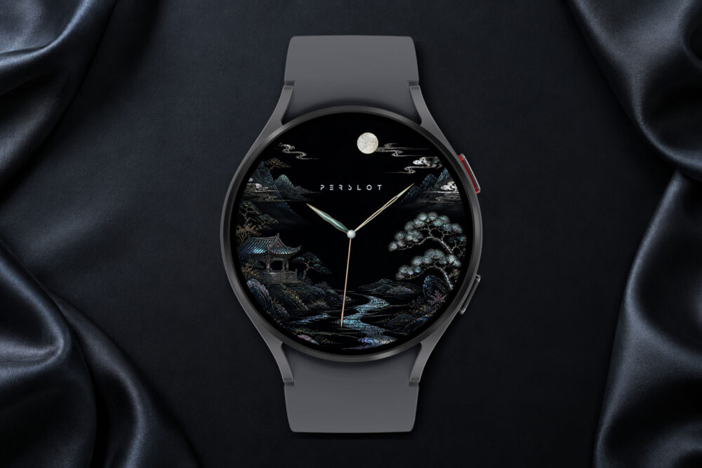
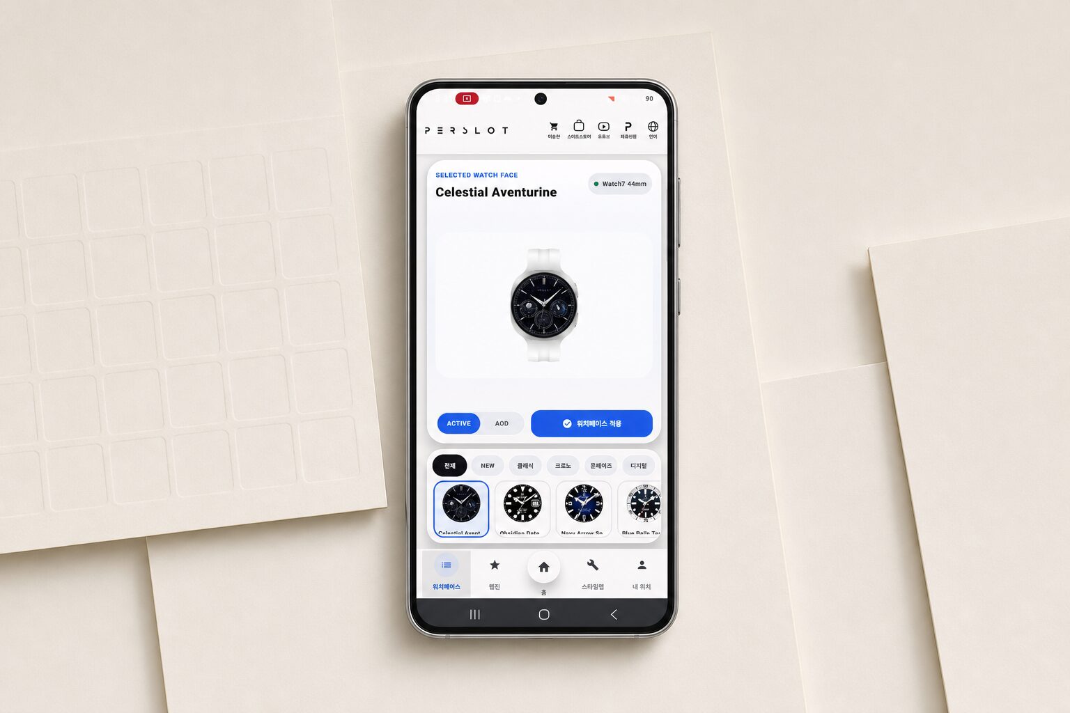
크로노그래프 워치페이스는 화면을 단순히 예쁘게 채우는 디자인이 아닙니다. 시간, 보조 다이얼, 작은 눈금, 정보 표시가 한 화면 안에서 균형을 잡아야 손목을 볼 때 읽기 쉽습니다.
[PRODUCT OVERVIEW]
Chronograph Watch Faces
A focused product overview of Chronograph Watch Faces, covering dial hierarchy, glance readability and harmony with the watch hardware and the details that matter in daily wear.
Category: Watch Face
Designed For: Galaxy Watch
Design Focus: Dial hierarchy, glance readability and harmony with the watch hardware
Check Point: Wear OS support, information layout, color balance and everyday legibility
Design Intent
During movement, the hands must be clear. On a commute, date and battery information should be easy to find. The film shows how that density can still feel controlled on the wrist.
퍼슬랏의 크로노그래프형 화면은 검은 다이얼 위에 흰 인덱스와 작은 계기판을 촘촘하게 배치합니다. 베젤링이나 메탈 스트랩과 함께 쓰면 디지털 화면이 기계식 시계의 전면처럼 보이는 순간이 생깁니다.
Design Standards
01.
핵심 포인트
Chronograph Watch Faces의 핵심은 서브 다이얼과 인덱스가 촘촘히 배치된 기술적인 화면입니다. 형태와 소재, 정보의 우선순위를 함께 살펴 손목 위에서 제품의 성격이 분명하게 읽히도록 정리했습니다.
02.
손목 위 인상
Chronograph Watch Faces의 완성도는 인덱스와 핸즈, 보조 정보의 밝기를 기준으로 베젤링과 스트랩의 소재를 맞출 때 손목 위에서 더 분명하게 드러납니다.
03.
스타일링 방향
톤이 가까운 부품은 일체감을 만들고, 대비가 큰 조합은 전면의 존재감을 선명하게 만듭니다.
04.
확인 사항
Galaxy Watch 호환성과 사이즈, 체결 방식, 소재 마감, 실제 착용 환경을 구매 전에 함께 확인해 주세요.
“Chronograph Watch Faces의 핵심은 서브 다이얼과 인덱스가 촘촘히 배치된 기술적인 화면입니다. 형태와 소재, 정보의 우선순위를 함께 살펴 손목 위에서 제품의 성격이 분명하게 읽히도록 정리했습니다.”
“Chronograph Watch Faces is presented through proportion, surface and clarity, with each detail considered as part of the complete wrist experience.”
PERSLOT
Chronograph Watch Faces / Galaxy Watch
Material & Daily Wear
Chronograph Watch Faces의 완성도는 인덱스와 핸즈, 보조 정보의 밝기를 기준으로 베젤링과 스트랩의 소재를 맞출 때 손목 위에서 더 분명하게 드러납니다.
Chronograph Watch Faces feels most complete when the markers, hands and information density are balanced with the material and color of the bezel and strap.
Styling Direction
Wrist Character:
서브 다이얼과 인덱스가 촘촘히 배치된 기술적인 화면
Daily Context:
출근, 일상, 운동과 주말 외출처럼 실제 착용 장면을 기준으로 균형을 살펴봅니다.
Best Pairing:
톤이 가까운 부품은 일체감을 만들고, 대비가 큰 조합은 전면의 존재감을 선명하게 만듭니다.
Product Details
Category
Watch Face
Designed For
Galaxy Watch
Design Focus
Dial hierarchy, glance readability and harmony with the watch hardware
Source
PERSLOT product collection
Key Points
01
Chronograph Watch Faces defines a clear first impression on the wrist.
02
Dial hierarchy, glance readability and harmony with the watch hardware.
03
Tone-on-tone parts create continuity, while stronger contrast gives the front silhouette a more defined presence.
04
Compatibility, fit and finish should be checked together before selection.
[PERSLOT PERSPECTIVE]
“좋은 워치페이스는 정보를 많이 보여주는 화면이 아니라, 시간과 보조 정보가 자연스러운 순서로 읽히고 워치 하드웨어와 하나의 다이얼처럼 연결되는 화면입니다.”
“A refined watch face is defined by hierarchy, legibility and the way its color and dial structure connect with the watch hardware.”